SHAP is the predominant way to interpret black-box ML models, especially for tree-based models with the blazingly fast TreeSHAP algorithm.
For general models, two slower SHAP algorithms exist:
Permutation SHAP (Štrumbelj and Kononenko, 2010)
Kernel SHAP (Lundberg and Lee, 2017)
Kernel SHAP was introduced in [2] as an approximation to permutation SHAP.
The 0.4.0 CRAN release of our {kernelshap} package now contains an exact permutation SHAP algorithm for up to 14 features, and thus it becomes easy to make experiments between the two approaches.
Some initial statements about permutation SHAP and Kernel SHAP
Exact permutation SHAP and exact Kernel SHAP have the same computational complexity.
Technically, exact Kernel SHAP is still an approximation of exact permutation SHAP, so you should prefer the latter.
Kernel SHAP assumes feature independence. Since features are never independent in practice: does this mean we should never use Kernel SHAP?
Kernel SHAP can be calculated almost exactly for any number of features, while permutation SHAP approximations get more and more inprecise when the number of features gets too large.
Simulation 1
We will first work with the iris data because it has extremely strong correlations between features. To see the impact of having models with and without interactions, we work with a random forest model of increasing tree depth. Depth 1 means no interactions, depth 2 means pairwise interactions etc.
library(kernelshap)
library(ranger)

differences <- numeric(4)

set.seed(1)

for (depth in 1:4) {
  fit <- ranger(
    Sepal.Length ~ .,
    mtry = 3,
    data = iris,
    max.depth = depth
  )
  ps <- permshap(fit, iris[2:5], bg_X = iris)
  ks <- kernelshap(fit, iris[2:5], bg_X = iris)
  differences[depth] <- mean(abs(ks$S - ps$S))
}

differences  # for tree depth 1, 2, 3, 4
# 5.053249e-17 9.046443e-17 2.387905e-04 4.403375e-04

# SHAP values of first two rows with tree depth 4
ps
#      Sepal.Width Petal.Length Petal.Width      Species
# [1,]  0.11377616   -0.7130647  -0.1956012 -0.004437022
# [2,] -0.06852539   -0.7596562  -0.2259017 -0.006575266

ks
#      Sepal.Width Petal.Length Petal.Width      Species
# [1,]  0.11463191   -0.7125194  -0.1951810 -0.006258208
# [2,] -0.06828866   -0.7597391  -0.2259833 -0.006647530
Up to pairwise interactions (tree depth 2), the mean absolute difference between the two (150 x 4) SHAP matrices is 0.
Even for interactions of order three or higher, the differences are small. This is unexpected – in the end all iris features are strongly correlated!
Simulation 2
Let’s now use a different data set with more features: miami house price data. As modeling technique, we use XGBoost where we would normally use TreeSHAP. Also here, we increase tree depth from 1 to 3 for increasing interaction depth.
library(xgboost)
library(shapviz)

colnames(miami) <- tolower(colnames(miami))
miami$log_ocean <- log(miami$ocean_dist)
x <- c("log_ocean", "tot_lvg_area", "lnd_sqfoot", "structure_quality", "age", "month_sold")

# Train/valid split
set.seed(1)
ix <- sample(nrow(miami), 0.8 * nrow(miami))

y_train <- log(miami$sale_prc[ix])
y_valid <- log(miami$sale_prc[-ix])
X_train <- data.matrix(miami[ix, x])
X_valid <- data.matrix(miami[-ix, x])

dtrain <- xgb.DMatrix(X_train, label = y_train)
dvalid <- xgb.DMatrix(X_valid, label = y_valid)

# Fit via early stopping (depth 1 to 3)
differences <- numeric(3)

for (i in 1:3) {
  fit <- xgb.train(
    params = list(learning_rate = 0.15, objective = "reg:squarederror", max_depth = i),
    data = dtrain,
    watchlist = list(valid = dvalid),
    early_stopping_rounds = 20,
    nrounds = 1000,
    callbacks = list(cb.print.evaluation(period = 100))
  )
  ps <- permshap(fit, X = head(X_valid, 500), bg_X = head(X_valid, 500))
  ks <- kernelshap(fit, X = head(X_valid, 500), bg_X = head(X_valid, 500))
  differences[i] <- mean(abs(ks$S - ps$S))
}
differences # for tree depth 1, 2, 3
# 2.904010e-09 5.158383e-09 6.586577e-04

# SHAP values of top two rows for tree depth 3
ps
# log_ocean tot_lvg_area lnd_sqfoot structure_quality        age  month_sold
# 0.2224359   0.04941044  0.1266136         0.1360166 0.01036866 0.005557032
# 0.3674484   0.01045079  0.1192187         0.1180312 0.01426247 0.005465283

ks
# log_ocean tot_lvg_area lnd_sqfoot structure_quality        age  month_sold
# 0.2245202  0.049520308  0.1266020         0.1349770 0.01142703 0.003355770
# 0.3697167  0.009575195  0.1198201         0.1168738 0.01544061 0.003450425
Again the same picture as with iris: Essentially no differences for interactions up to order two, and only small differences with interactions of higher order.
Wrap-Up
Use kernelshap::permshap() to crunch exact permutation SHAP values for models with not too many features.
In real-world applications, exact Kernel SHAP and exact permutation SHAP start to differ (slightly) with models containing interactions of order three or higher.
Since Kernel SHAP can be calculated almost exactly also for many features, it remains an excellent way to crunch SHAP values for arbitrary models.
This question sends shivers down the poor modelers spine…
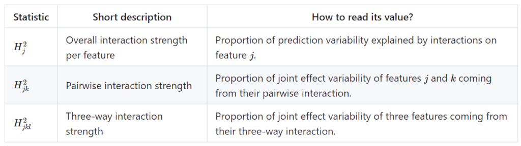
The {hstats} R package introduced in our last post measures their strength using Friedman’s H-statistics, a collection of statistics based on partial dependence functions.
On Github, the preview version of {hstats} 1.0.0 out – I will try to bring it to CRAN in about one week (October 2023). Until then, try it via devtools::install_github("mayer79/hstats")
The current version offers:
H statistics per feature, feature pair, and feature triple
Multivariate predictions at no additional cost
A convenient API
Other important tools from explainable ML:
performance calculations
permutation importance (e.g., to select features for calculating H-statistics)
Case-weights are available for all methods, which is important, e.g., in insurance applications
The option for fast quantile approximation of H-statistics
This post has two parts:
Example with house-prices and XGBoost
Naive benchmark against {iml}, {DALEX}, and my old {flashlight}.
1. Example
Let’s model logarithmic sales prices of houses sold in Miami Dade County, a dataset prepared by Prof. Dr. Steven Bourassa, and available in {shapviz}. We use XGBoost with interaction constraints to provide a model additive in all structure information, but allowing for interactions between latitude/longitude for a flexible representation of geographic effects.
The following code prepares the data, splits the data into train and validation, and then fits an XGBoost model.
Now it is time for a compact analysis with {hstats} to interpret the model:
average_loss(fit, X = X_valid, y = y_valid) # 0.0247 MSE -> 0.157 RMSE
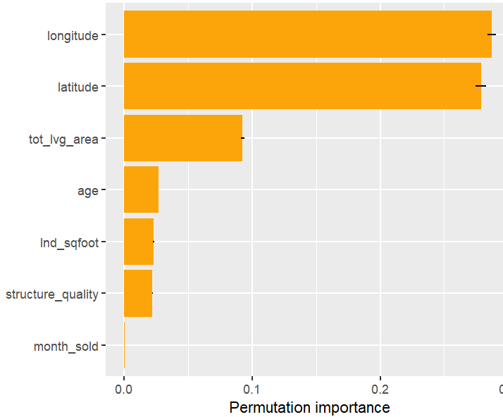
perm_importance(fit, X = X_valid, y = y_valid) |>
plot()
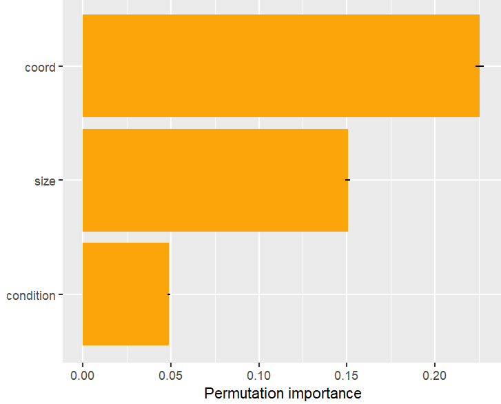
# Or combining some features
v_groups <- list(
coord = c("longitude", "latitude"),
size = c("lnd_sqfoot", "tot_lvg_area"),
condition = c("age", "structure_quality")
)
perm_importance(fit, v = v_groups, X = X_valid, y = y_valid) |>
plot()
H <- hstats(fit, v = x, X = X_valid)
H
plot(H)
plot(H, zero = FALSE)
h2_pairwise(H, zero = FALSE, squared = FALSE, normalize = FALSE)
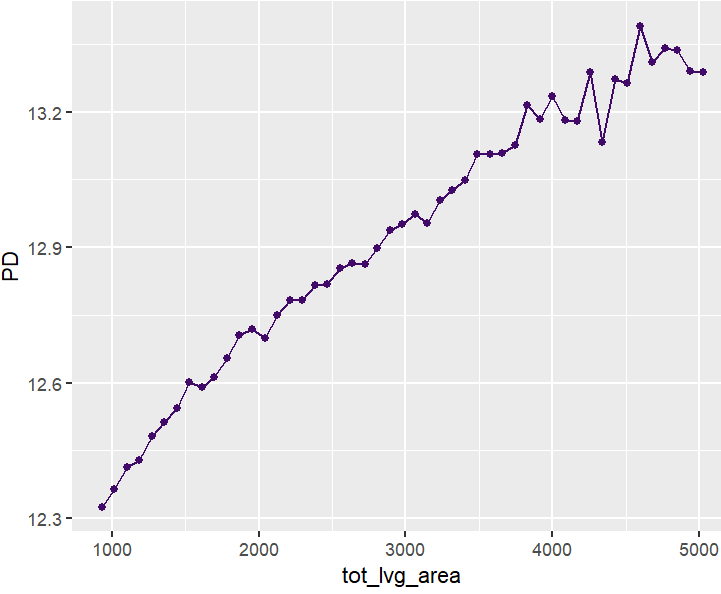
partial_dep(fit, v = "tot_lvg_area", X = X_valid) |>
plot()
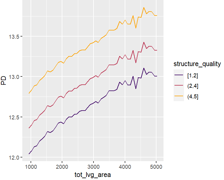
partial_dep(fit, v = "tot_lvg_area", X = X_valid, BY = "structure_quality") |>
plot(show_points = FALSE)
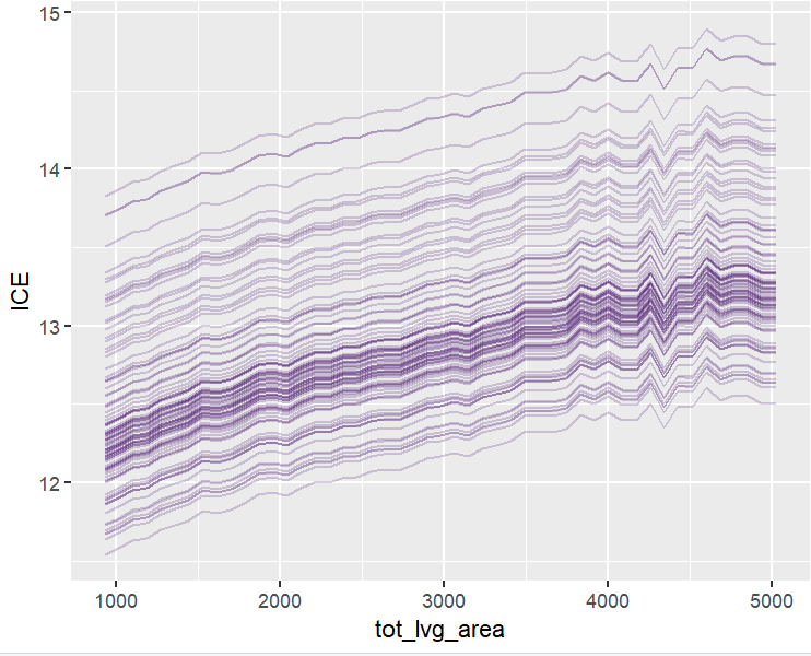
plot(ii <- ice(fit, v = "tot_lvg_area", X = X_valid))
plot(ii, center = TRUE)
# Spatial plots
g <- unique(X_valid[, coord])
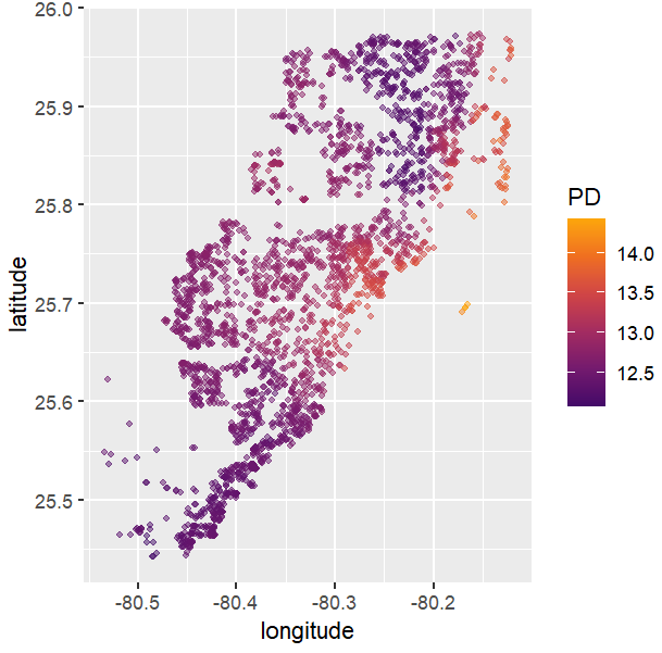
pp <- partial_dep(fit, v = coord, X = X_valid, grid = g)
plot(pp, d2_geom = "point", alpha = 0.5, size = 1) +
coord_equal()
# Takes some seconds because it generates the last plot per structure quality
partial_dep(fit, v = coord, X = X_valid, grid = g, BY = "structure_quality") |>
plot(pp, d2_geom = "point", alpha = 0.5) +
coord_equal()
)
Results summarized by plots
Permutation importance
Figure 1: Permutation importance (4 repetitions) on the validation data. Error bars show standard errors of the estimated increase in MSE from shuffling feature values.Figure 2: Feature groups can be shuffled together – accounting for issues of permutation importance with highly correlated features
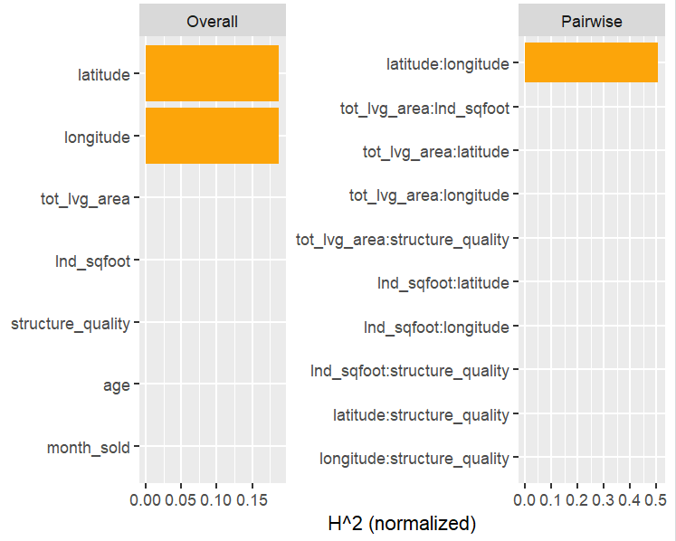
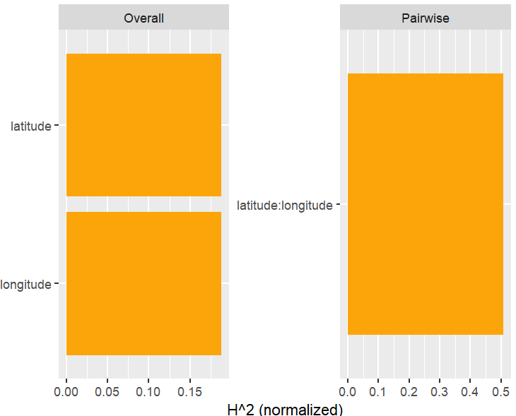
H-Statistics
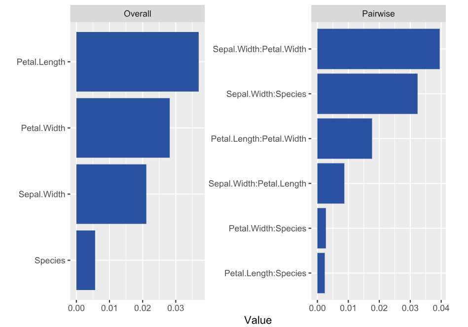
Let’s now move on to interaction statistics.
Figure 3: Overall and pairwise H-statistics. Overall H^2 gives the proportion of prediction variability explained by all interactions of the feature. By default, {hstats} picks the five features with largest H^2 and calculates their pairwise H^2. This explains why not all 21 feature pairs appear in the figure on the right-hand side. Pairwise H^2 is differently scaled than overall H^2: It gives the proportion of joint effect variability of the two features explained by their interaction.Figure 4: Use “zero = FALSE” to drop variable (pairs) with value 0.
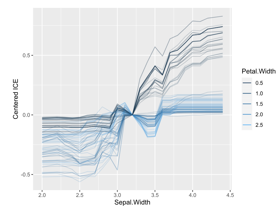
PDPs and ICEs
Figure 5: A partial dependence plot of living area.Figure 6: Stratification shows indeed: no interactions between structure quality and living area.Figure 7: ICE plots also show no interations with any other feature. The interaction constraints of XGBoost did a good job.Figure 8: This two-dimensional PDP evaluated over all unique coordinates shows a realistic profile of house prices in Miami Dade County (mind the log scale).Figure 8: Same, but grouped by structure quality (5 is best). Since there is no interaction between location and structure quality, the plots are just shifted versions of each other. (You can’t really see it on the plots.)
Naive Benchmark
All methods in {hstats} are optimized for speed. But how fast are they compared to other implementations? Note that: this is just a simple benchmark run on a Windows notebook with Intel i7-8650U CPU.
Note that {iml} offers a parallel backend, but we could not make it run with XGBoost and Windows. Let me know how fast it is using parallelism and Linux!
Setup + benchmark on permutation importance
Always using the full validation dataset and 10 repetitions.
library(iml)  # Might benefit of multiprocessing, but on Windows with XGB models, this is not easy
library(DALEX)
library(ingredients)
library(flashlight)
library(bench)

set.seed(1)

# iml
predf <- function(object, newdata) predict(object, data.matrix(newdata[x]))
mod <- Predictor$new(fit, data = as.data.frame(X_valid), y = y_valid,
                     predict.function = predf)

# DALEX
ex <- DALEX::explain(fit, data = X_valid, y = y_valid)

# flashlight (my slightly old fashioned package)
fl <- flashlight(
  model = fit, data = valid, y = "log_price", predict_function = predf, label = "lm"
)

# Permutation importance: 10 repeats over full validation data (~2700 rows)
bench::mark(
  iml = FeatureImp$new(mod, n.repetitions = 10, loss = "mse", compare = "difference"),
  dalex = feature_importance(ex, B = 10, type = "difference", n_sample = Inf),
  flashlight = light_importance(fl, v = x, n_max = Inf, m_repetitions = 10),
  hstats = perm_importance(fit, X = X_valid, y = y_valid, m_rep = 10, verbose = FALSE),
  check = FALSE,
  min_iterations = 3
)

# expression      min   median `itr/sec` mem_alloc `gc/sec` n_itr  n_gc total_time
# iml           1.58s    1.58s     0.631   209.4MB    2.73      3    13      4.76s
# dalex      566.21ms 586.91ms     1.72     34.6MB    0.572     3     1      1.75s
# flashlight 587.03ms 613.15ms     1.63     27.1MB    1.63      3     3      1.84s
# hstats     353.78ms 360.57ms     2.79     27.2MB    0         3     0      1.08s
{hstats} is about 30% faster as the second, {DALEX}.
Partial dependence
Here, we study the time for crunching partial dependence of a continuous feature and a discrete feature.
{hstats} is 1.5 to 2 times faster than {flashlight}, and about four times as fast as the other packages. It’s memory foodprint is much lower.
H-statistics
How fast can overall H-statistics be computed? How fast can it do pairwise calculations?
{DALEX} does not offer these statistics yet. {iml} was the first model-agnostic implementation of H-statistics I am aware of. It uses quantile approximation by default, but we purposely force it to calculate exact, in order to compare the numbers. Thus, we made it slower than it actually is.
# H-Stats -> we use a subset of 500 rows
X_v500 <- X_valid[1:500, ]
mod500 <- Predictor$new(fit, data = as.data.frame(X_v500), predict.function = predf)
fl500 <- flashlight(fl, data = as.data.frame(valid[1:500, ]))

# iml  # 225s total, using slow exact calculations
system.time(  # 90s
  iml_overall <- Interaction$new(mod500, grid.size = 500)
)
system.time(  # 135s for all combinations of latitude
  iml_pairwise <- Interaction$new(mod500, grid.size = 500, feature = "latitude")
)

# flashlight: 14s total, doing only one pairwise calculation, otherwise would take 63s
system.time(  # 12s
  fl_overall <- light_interaction(fl500, v = x, grid_size = Inf, n_max = Inf)
)
system.time(  # 2s
  fl_pairwise <- light_interaction(
    fl500, v = coord, grid_size = Inf, n_max = Inf, pairwise = TRUE
  )
)

# hstats: 3s total
system.time({
  H <- hstats(fit, v = x, X = X_v500, n_max = Inf)
  hstats_overall <- h2_overall(H, squared = FALSE, zero = FALSE)
  hstats_pairwise <- h2_pairwise(H, squared = FALSE, zero = FALSE)
}
)

# Overall statistics correspond exactly
iml_overall$results |> filter(.interaction > 1e-6)
#     .feature .interaction
# 1:  latitude    0.2458269
# 2: longitude    0.2458269

fl_overall$data |> subset(value > 0, select = c(variable, value))
#   variable  value
# 1 latitude  0.246
# 2 longitude 0.246

hstats_overall
# longitude  latitude
# 0.2458269 0.2458269

# Pairwise results match as well
iml_pairwise$results |> filter(.interaction > 1e-6)
#              .feature .interaction
# 1: longitude:latitude    0.3942526

fl_pairwise$data |> subset(value > 0, select = c(variable, value))
# latitude:longitude 0.394

hstats_pairwise
# latitude:longitude
# 0.3942526
{hstats} is about four times as fast as {flashlight}.
Since one often want to study relative and absolute H-statistics, in practice, the speed-up would be about a factor of eight.
In multi-classification/multi-output settings with m categories, the speed-up would be even m times larger.
The fast approximation via quantile binning is again a factor of four faster. The difference would diminish if we would calculate many pairwise or three-way H-statistics.
Forcing all three packages to calculate exact statistics, all results match.
Wrap-Up
{hstats} is much faster than other XAI packages, at least in our use-case. This includes H-statistics, permutation importance, and partial dependence. Note that making good benchmarks is not my strength, so forgive any bias in the results.
The memory foodprint is lower as well.
With multivariate output, the potential is even larger.
What makes a ML model a black-box? It is the interactions. Without any interactions, the ML model is additive and can be exactly described.
Studying interaction effects of ML models is challenging. The main XAI approaches are:
Looking at ICE plots, stratified PDP, and/or 2D PDP.
Study vertical scatter in SHAP dependence plots, or even consider SHAP interaction values.
Check partial-dependence based H-statistics introduced in Friedman and Popescu (2008), or related statistics.
This post is mainly about the third approach. Its beauty is that we get information about all interactions. The downside: it is as good/bad as partial dependence functions. And: the statistics are computationally very expensive to compute (of order n^2).
Different R packages offer some of these H-statistics, including {iml}, {gbm}, {flashlight}, and {vivid}. They all have their limitations. This is why I wrote the new R package {hstats}:
It is very efficient.
Has a clean API. DALEX explainers and meta-learners (mlr3, Tidymodels, caret) work out-of-the-box.
Supports multivariate predictions, including classification models.
Allows to calculate unnormalized H-statistics. They help to compare pairwise and three-way statistics.
Contains fast multivariate ICE/PDPs with optional grouping variable.
In Python, there is the very interesting project artemis. I will write a post on it later.
Statistics supported by {hstats}
Furthermore, a global measure of non-additivity (proportion of prediction variability unexplained by main effects), and a measure of feature importance is available. For technical details and references, check the following pdf or github.
Classification example
Let’s fit a probability random forest on iris species.
R
library(ranger)
library(ggplot2)
library(hstats)
v <- setdiff(colnames(iris), "Species")
fit <- ranger(Species ~ ., data = iris, probability = TRUE, seed = 1)
s <- hstats(fit, v = v, X = iris) # 8 seconds run-time
s
# Proportion of prediction variability unexplained by main effects of v:
# setosa versicolor virginica
# 0.002705945 0.065629375 0.046742035
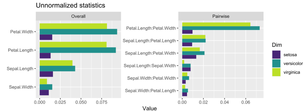
plot(s, normalize = FALSE, squared = FALSE) +
ggtitle("Unnormalized statistics") +
scale_fill_viridis_d(begin = 0.1, end = 0.9)
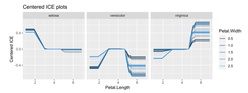
ice(fit, v = "Petal.Length", X = iris, BY = "Petal.Width", n_max = 150) |>
plot(center = TRUE) +
ggtitle("Centered ICE plots")
Unnormalized H-statistics, i.e., values are roughly on the scale of the predictions (here: probabilities).Centered ICE plots per class.
Interpretation:
The features with strongest interactions are Petal Length and Petal Width. These interactions mainly affect species “virginica” and “versicolor”. The effect for “setosa” is almost additive.
Unnormalized pairwise statistics show that the strongest absolute interaction happens indeed between Petal Length and Petal Width.
The centered ICE plots shows how the interaction manifests: The effect of Petal Length heavily depends on Petal Width, except for species “setosa”. Would a SHAP analysis show the same?
DALEX example
Here, we consider a random forest regression on “Sepal.Length”.
library(DALEX)
library(ranger)
library(hstats)

set.seed(1)

fit <- ranger(Sepal.Length ~ ., data = iris)
ex <- explain(fit, data = iris[-1], y = iris[, 1])

s <- hstats(ex)  # 2 seconds
s  # Non-additivity index 0.054
plot(s)
plot(ice(ex, v = "Sepal.Width", BY = "Petal.Width"), center = TRUE)
H-statisticsCentered ICE plot of strongest relative interactions.
Interpretation
Petal Length and Width show the strongest overall associations. Since we are considering normalized statistics, we can say: “About 3.5% of prediction variability comes from interactions with Petal Length”.
The strongest relative pairwise interaction happens between Sepal Width and Petal Width: Again, because we study normalized H-statistics, we can say: “About 4% of total prediction variability of the two features Sepal Width and Petal Width can be attributed to their interactions.”
Overall, all interactions explain only about 5% of prediction variability (see text output).
Try it out!
The complete R script can be found here. More examples and background can be found on the Github page of the project.
🚀Version 1.0.0 of the new Python package for model-diagnostics was just released on PyPI. If you use (machine learning or statistical or other) models to predict a mean, median, quantile or expectile, this library offers tools to assess the calibration of your models and to compare and decompose predictive model performance scores.🚀
By the way, I really never wanted to write a plotting library. But it turned out that arranging results until they are ready to be visualised amounts to quite a large part of the source code. I hope this was worth the effort. Your feedback is very welcome, either here in the comments or as feature request or bug report under https://github.com/lorentzenchr/model-diagnostics/issues.
For a jump start, I recommend to go directly to the two examples:
This is the next article in our series “Lost in Translation between R and Python”. The aim of this series is to provide high-quality R and Python code to achieve some non-trivial tasks. If you are to learn R, check out the R tab below. Similarly, if you are to learn Python, the Python tab will be your friend.
This post is heavily based on the new {shapviz} vignette.
Setting
Besides other features, a model with geographic components contains features like
latitude and longitude,
postal code, and/or
other features that depend on location, e.g., distance to next restaurant.
Like any feature, the effect of a single geographic feature can be described using SHAP dependence plots. However, studying the effect of latitude (or any other location dependent feature) alone is often not very illuminating – simply due to strong interaction effects and correlations with other geographic features.
That’s where the additivity of SHAP values comes into play: The sum of SHAP values of all geographic components represent the total geographic effect, and this sum can be visualized as a heatmap or 3D scatterplot against latitude/longitude (or any other geographic representation).
A first example
For illustration, we will use a beautiful house price dataset containing information on about 14’000 houses sold in 2016 in Miami-Dade County. Some of the columns are as follows:
SALE_PRC: Sale price in USD: Its logarithm will be our model response.
LATITUDE, LONGITUDE: Coordinates
CNTR_DIST: Distance to central business district
OCEAN_DIST: Distance (ft) to the ocean
RAIL_DIST: Distance (ft) to the next railway track
HWY_DIST: Distance (ft) to next highway
TOT_LVG_AREA: Living area in square feet
LND_SQFOOT: Land area in square feet
structure_quality: Measure of building quality (1: worst to 5: best)
age: Age of the building in years
(Italic features are geographic components.) For more background on this dataset, see Mayer et al [2].
We will fit an XGBoost model to explain log(price) as a function of lat/long, size, and quality/age.
R
Python
devtools::install_github("ModelOriented/shapviz", dependencies = TRUE)
library(xgboost)
library(ggplot2)
library(shapviz)  # Needs development version 0.9.0 from github

head(miami)

x_coord <- c("LATITUDE", "LONGITUDE")
x_nongeo <- c("TOT_LVG_AREA", "LND_SQFOOT", "structure_quality", "age")
x <- c(x_coord, x_nongeo)

# Train/valid split
set.seed(1)
ix <- sample(nrow(miami), 0.8 * nrow(miami))
X_train <- data.matrix(miami[ix, x])
X_valid <- data.matrix(miami[-ix, x])
y_train <- log(miami$SALE_PRC[ix])
y_valid <- log(miami$SALE_PRC[-ix])

# Fit XGBoost model with early stopping
dtrain <- xgb.DMatrix(X_train, label = y_train)
dvalid <- xgb.DMatrix(X_valid, label = y_valid)

params <- list(learning_rate = 0.2, objective = "reg:squarederror", max_depth = 5)

fit <- xgb.train(
  params = params,
  data = dtrain,
  watchlist = list(valid = dvalid),
  early_stopping_rounds = 20,
  nrounds = 1000,
  callbacks = list(cb.print.evaluation(period = 100))
)
%load_ext lab_black

import numpy as np
import matplotlib.pyplot as plt
from sklearn.datasets import fetch_openml

df = fetch_openml(data_id=43093, as_frame=True)
X, y = df.data, np.log(df.target)
X.head()

# Data split and model
from sklearn.model_selection import train_test_split
import xgboost as xgb

x_coord = ["LONGITUDE", "LATITUDE"]
x_nongeo = ["TOT_LVG_AREA", "LND_SQFOOT", "structure_quality", "age"]
x = x_coord + x_nongeo

X_train, X_valid, y_train, y_valid = train_test_split(
    X[x], y, test_size=0.2, random_state=30
)

# Fit XGBoost model with early stopping
dtrain = xgb.DMatrix(X_train, label=y_train)
dvalid = xgb.DMatrix(X_valid, label=y_valid)

params = dict(learning_rate=0.2, objective="reg:squarederror", max_depth=5)

fit = xgb.train(
    params=params,
    dtrain=dtrain,
    evals=[(dvalid, "valid")],
    verbose_eval=100,
    early_stopping_rounds=20,
    num_boost_round=1000,
)
SHAP dependence plots
Let’s first study selected SHAP dependence plots, evaluated on the validation dataset with around 2800 observations. Note that we could as well use the training data for this purpose, but it is a bit large.
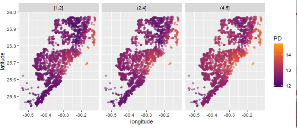
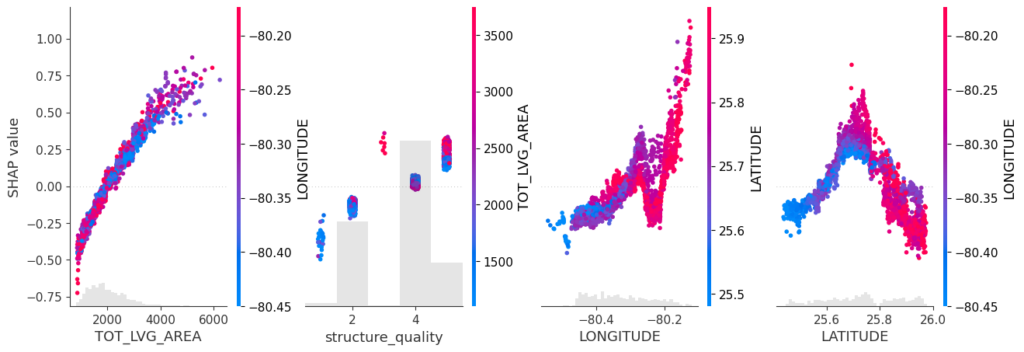
Sum of SHAP values on color scale against coordinates (Python output).
The last plot gives a good impression on price levels, but note:
Since we have modeled logarithmic prices, the effects are on relative scale (0.1 means about 10% above average).
Due to interaction effects with non-geographic components, the location effects might depend on features like living area. This is not visible in above plot. We will modify the model now to improve this aspect.
Two modifications
We will now change above model in two ways, not unlike the model in Mayer et al [2].
We will use additional geographic features like distance to railway track or to the ocean.
We will use interaction constraints to allow only interactions between geographic features.
The second step leads to a model that is additive in each non-geographic component and also additive in the combined location effect. According to the technical report of Mayer [1], SHAP dependence plots of additive components in a boosted trees model are shifted versions of corresponding partial dependence plots (evaluated at observed values). This allows a “Ceteris Paribus” interpretation of SHAP dependence plots of corresponding components.
R
Python
# Extend the feature set
more_geo <- c("CNTR_DIST", "OCEAN_DIST", "RAIL_DIST", "HWY_DIST")
x2 <- c(x, more_geo)
X_train2 <- data.matrix(miami[ix, x2])
X_valid2 <- data.matrix(miami[-ix, x2])
dtrain2 <- xgb.DMatrix(X_train2, label = y_train)
dvalid2 <- xgb.DMatrix(X_valid2, label = y_valid)
# Build interaction constraint vector
ic <- c(
list(which(x2 %in% c(x_coord, more_geo)) - 1),
as.list(which(x2 %in% x_nongeo) - 1)
)
# Modify parameters
params$interaction_constraints <- ic
fit2 <- xgb.train(
params = params,
data = dtrain2,
watchlist = list(valid = dvalid2),
early_stopping_rounds = 20,
nrounds = 1000,
callbacks = list(cb.print.evaluation(period = 100))
)
# SHAP analysis
sv2 <- shapviz(fit2, X_pred = X_valid2)
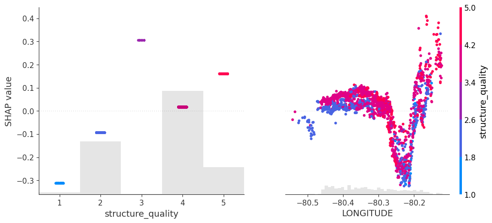
# Two selected features: Thanks to additivity, structure_quality can be read as
# Ceteris Paribus
sv_dependence(sv2, v = c("structure_quality", "LONGITUDE"), alpha = 0.2)
# Total geographic effect (Ceteris Paribus thanks to additivity)
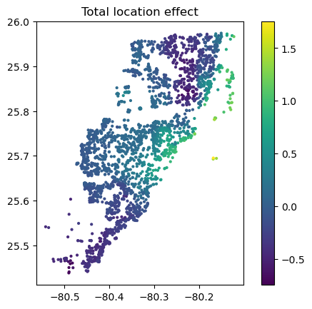
sv_dependence2D(sv2, x = "LONGITUDE", y = "LATITUDE", add_vars = more_geo) +
coord_equal()
# Extend the feature set
more_geo = ["CNTR_DIST", "OCEAN_DIST", "RAIL_DIST", "HWY_DIST"]
x2 = x + more_geo

X_train2, X_valid2 = train_test_split(X[x2], test_size=0.2, random_state=30)

dtrain2 = xgb.DMatrix(X_train2, label=y_train)
dvalid2 = xgb.DMatrix(X_valid2, label=y_valid)

# Build interaction constraint vector
ic = [x_coord + more_geo, *[[z] for z in x_nongeo]]

# Modify parameters
params["interaction_constraints"] = ic

fit2 = xgb.train(
    params=params,
    dtrain=dtrain2,
    evals=[(dvalid2, "valid")],
    verbose_eval=100,
    early_stopping_rounds=20,
    num_boost_round=1000,
)

# SHAP analysis
xgb_explainer2 = shap.Explainer(fit2)
shap_values2 = xgb_explainer2(X_valid2)

v = ["structure_quality", "LONGITUDE"]
shap.plots.scatter(shap_values2[:, v], color=shap_values2[:, v])

# Total location effect
shap_coord2 = shap_values2[:, x_coord]
c = shap_values2[:, x_coord + more_geo].values.sum(axis=1)
plt.scatter(*list(shap_coord2.data.T), c=c, s=4)
ax = plt.gca()
ax.set_aspect("equal", adjustable="box")
plt.colorbar()
plt.title("Total location effect")
plt.show()
SHAP dependence plots of an additive feature (structure quality, no vertical scatter per unique feature value) and one of the geographic features (Python output).Sum of all geographic features (color) against coordinates. There are no interactions to non-geographic features, so the effect can be read Ceteris Paribus (Python output).
Again, the resulting total geographic effect looks reasonable.
Wrap-Up
SHAP values of all geographic components in a model can be summed up and plotted on the color scale against coordinates (or some other geographic representation). This gives a lightning fast impression of the location effects.
Interaction constraints between geographic and non-geographic features lead to Ceteris Paribus interpretation of total geographic effects.
Mayer, Michael, Steven C. Bourassa, Martin Hoesli, and Donato Flavio Scognamiglio. 2022. “Machine Learning Applications to Land and Structure Valuation.” Journal of Risk and Financial Management.
Applied statistics is dominated by the ubiquitous mean. For a change, this post is dedicated to quantiles. I will give my best to provide a good mix of theory and practical examples.
While the mean describes only the central tendency of a distribution or random sample, quantiles are able to describe the whole distribution. They appear in box-plots, in childrens’ weight-for-age curves, in salary survey results, in risk measures like the value-at-risk in the EU-wide solvency II framework for insurance companies, in quality control and in many more fields.
Often, one talks about quantiles, but rarely defines them. In what fallows, I borrow from Gneiting (2011).
Definition 1: Quantile
Given a cumulative probability distribution (CDF) F(x)=\mathbb{P}(X\leq x), the quantile at level \alpha \in (0,1) (ɑ-quantile for short), q_\alpha(F), is defined as
The inequalities of this definition are called coverage conditions. It is very important to note that quantiles are potentially set valued. Another way to write this set is as an interval:
For q_\alpha^-, we recover the usual quantile definition as the generalized inverse of F. But this is only one possible value. I will discuss examples of quantile intervals later on.
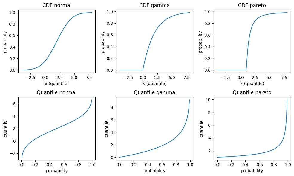
To get acquainted a bit more, let’s plot the cumulative distribution function and the quantile function for some continuous distributions: Normal, Gamma and Pareto distribution. The parametrisation is such that all have mean 2, Normal and Gamma have variance 4, and Pareto has an infinite variance. For those continuous and strictly increasing distributions, all quantiles are unique, and therefore simplify to the inverse CDF q_\alpha^- in the above equations. Note that those three distributions have very different tail behaviour: The density of the Normal distribution has the famously fast decrease \propto e^{-x^2}, the Gamma density has an exponentially decreasing tail \propto e^{-x} and the Pareto density has a fat tail, i.e. an inverse power \propto \frac{1}{x^\alpha}.
CDF (top) and quantile function (bottom) of several distributions: Normal N(\mu=2, \sigma^2=2)(left), Gamma Ga(\alpha=2, \beta=\frac{1}{2}) (middle) and Pareto Pa(\alpha=2)(right).
There are at least two more equivalent ways to define quantiles. They will help us later to get a better visualisations.
Definition 2: Quantile as minimiser
Given a probability distribution F, the ɑ-quantile q_\alpha(F) is defined as any minimiser of the expected scoring function S
The scoring function or loss function S can be generalized to S_\alpha(x, y) = (\mathbb{1}_{x\geq y} – \alpha)(g(x) – g(y)) for any increasing function g, but the above version in definition 2 is by far the simplest one and coincides with the pinball loss used in quantile regression.
This definition is super useful because it provides a tool to assess whether a given value really is a quantile. A plot will suffice.
Having a definition in terms of a convex optimisation problem, there is another definition in terms of the first order condition of optimality. For continuous, strictly increasing distributions, this would be equivalent to setting the first derivative to zero. For our non-smooth scoring function with potentially set-valued solution, this gets more complicated, e.g. subdifferential or subgradients replacing derivatives. In the end, it amounts to a sign change of the expectation of the so called identification function V(x, y)=\mathbf{1}_{x\geq y}-\alpha.
Empirical Distribution
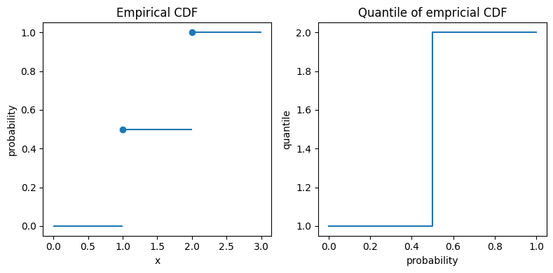
The empirical distribution provides an excellent example. Given a sample of n observations y_1, \ldots, y_n, the empirical distribution is given by F_n(x)=\frac{1}{n}\sum_{i=1}^n \mathbf{1}_{x\geq y_i}. Let us start simple and take two observations y_1=1 and y_2=2. Plugging in this distribution in the definition 1 of quantiles gives the exact quantiles of this 2-point empirical CDF:
Here we encounter the interval [1, 2] for \alpha=\frac{1}{2}. Again, I plot both the (empirical) CDF F_n and the quantiles.
Empirical distribution function and exact quantiles of observations y=1 and y=2.
In the left plot, the big dots unambiguously mark the values at x=1 and x=2. For the quantiles in the right plot, the vertical line at probability 0.5 really means that all those values between 1 and 2 are possible 0.5-quantiles, also known as median.
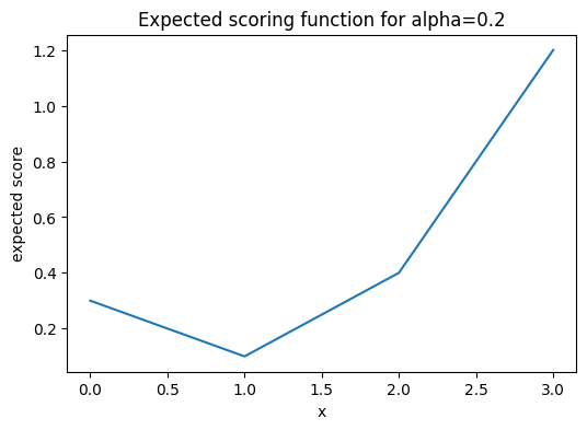
If you wonder about the value 1 for quantiles of level smaller than 50%, the minimisation formulation helps. The following plot shows \mathbb{E}(S_\alpha(x, Y)) for \alpha=0.2 with a clear unique minimum at x=1.
Expected scoring function (pinball loss) for \alpha=0.2 for the empirical CDF with observations 1 and 2.
A note for the interested reader: The above empirical distribution is the same as the distribution of a Bernoulli random variable, except that the x-values are shifted, i.e. the Bernoulli random variables are canonically set to 0 and 1 instead of 1 and 2. Furthermore, there is a direct connection between quantiles and classification via the cost-weighted misclassification error, see Fissler, Lorentzen & Mayer (2022).
Empirical Quantiles
From the empirical CDF, it is only a small step to empirical quantiles. But what’s the difference anyway? While we saw the exact quantile of the empirical distribution, q_\alpha(F_n), an empirical or sample quantile estimate the true (population) quantile given a data sample, i.e. \hat{q}_\alpha(\{y_i\}) \approx q_\alpha(F).
As an empirical CDF estimates the CDF of the true underlying (population) distribution, F_n=\hat{F} \approx F, one immediate way to estimate a quantile is:
Estimate the CDF via the empirical CDF F_n.
Use the exact quantile in analogy to Eq.(1) as an estimate.
Very importantly, this is just one way to estimate quantiles from a sample. There are many, many more. Here is the outcome of the 20%-quantile of our tiny data sample y_1=1 and y_2=2.
import numpy as np

methods = [
    'inverted_cdf',
    'averaged_inverted_cdf',
    'closest_observation',
    'interpolated_inverted_cdf',
    'hazen',
    'weibull',
    'linear',
    'median_unbiased',
    'normal_unbiased',
    'nearest',
    'lower',
    'higher',
    'midpoint',
]
alpha = 0.2
for m in methods:
    estimate = np.quantile([1, 2], 0.2, method=m)
    print(f"{m:<25} {alpha}-quantile estimate = {estimate}")
Note that the first 9 methods are the ones discussed in a famous paper of Hyndman & Fan (1996). The default method of both Python’s numpy.quantile and R’s quantile is linear, i.e. number 7 in Hyndman & Fan. Somewhat surprisingly, we observe that this default method is clearly biased in this case and overestimates the true quantile.
For large sample sizes, the differences will get tiny and all methods converge finally to a true quantile, at least for continuous distributions. In order to assess the bias with small sample sizes for each method, I do a simulation. This is where the fun starts😄
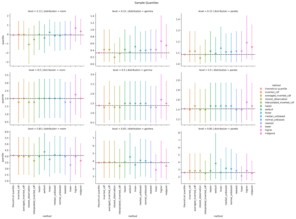
For all three selected distributions and for quantile levels 15%, 50% and 85%, I simulate 10000 random samples, each of sample size 10 and calculate the sample quantile. Then I take the mean over all 10000 simulations as well as the 5% and the 95% quantiles as a measure of uncertainty, i.e. 90% confidence intervals. After some coding, this results in the following plot. (I spare you the code at this point. You can find it in the linked notebook at the bottom of this post).
Small sample bias (n=10) of different empirical quantile estimation methods (x-axis and color) based on 10000 simulations. Dots are the mean values, error bars cover a 90% confidence interval. The dotted horizontal line is the theoretical quantile value. left: Normal distribution; mid: Gamma distribution; right: Pareto distribution top: 15%-quantile; mid: 50%-quantile; bottom: 85%-quantile
For the 15%-quantile, the default linear method always overestimates, but it does surprisingly well for the 85%-quantile of the Pareto distribution. Overall, I personally would prefer the median unbiased or the Hazen method. Interestingly, the Hazen method is one of the oldest, namely from Hazen (1914), and is the only one that fulfills all proposed properties of Hyndman & Fan, who propose the median unbiased method as default.
Quantile Regression
So far, the interest was in the quantile of a sample or distribution. To go one step further, one might ask for the conditional quantile of a response variable Y given some features or covariates X, q_\alpha(Y|X)=q_\alpha(F_{Y|X}). This is the realm of quantile regression as invented by Koenker & Bassett (1978). To stay within linear models, one simply replaces the squared error of ordinary least squares (OLS) by the pinball loss.
Without going into any more details, I chose the Palmer’s penguin dataset and the body mass in gram as response variable, all the other variables as feature variables. And again, I model the 15%, 50% and 85% quantiles.
import seaborn as sns

df = sns.load_dataset("penguins").dropna()
df
species
island
bill_length_mm
bill_depth_mm
flipper_length_mm
body_mass_g
sex
0
Adelie
Torgersen
39.1
18.7
181.0
3750.0
Male
1
Adelie
Torgersen
39.5
17.4
186.0
3800.0
Female
2
Adelie
Torgersen
40.3
18.0
195.0
3250.0
Female
4
Adelie
Torgersen
36.7
19.3
193.0
3450.0
Female
5
Adelie
Torgersen
39.3
20.6
190.0
3650.0
Male
…
…
…
…
…
…
…
…
338
Gentoo
Biscoe
47.2
13.7
214.0
4925.0
Female
340
Gentoo
Biscoe
46.8
14.3
215.0
4850.0
Female
341
Gentoo
Biscoe
50.4
15.7
222.0
5750.0
Male
342
Gentoo
Biscoe
45.2
14.8
212.0
5200.0
Female
343
Gentoo
Biscoe
49.9
16.1
213.0
5400.0
Male
from sklearn.base import clone
from sklearn.compose import ColumnTransformer
from sklearn.linear_model import QuantileRegressor
from sklearn.pipeline import Pipeline
from sklearn.preprocessing import OneHotEncoder, SplineTransformer

y = df["body_mass_g"]
X = df.drop(columns="body_mass_g")
qr50 = Pipeline([
    ("column_transformer",
     ColumnTransformer([
         ("ohe", OneHotEncoder(drop="first"), ["species", "island", "sex"]),
         ("spline", SplineTransformer(n_knots=3, degree=2), ["bill_length_mm", "bill_depth_mm", "flipper_length_mm"]),

     ])
    ),
    ("quantile_regressor",
     QuantileRegressor(quantile=0.5, alpha=0, solver="highs")
    )
])
qr15 = clone(qr50)
qr15.set_params(quantile_regressor__quantile=0.15)
qr85 = clone(qr50)
qr85.set_params(quantile_regressor__quantile=0.85)

qr15.fit(X, y)
qr50.fit(X, y)
qr85.fit(X, y)
This code snippet gives the three fitted linear quantile models. That was the easy part. I find it much harder to produce good visualisations.
import polars as pl # imported and used much earlier in the notebook
df_obs = df.copy()
df_obs["type"] = "observed"
dfs = [pl.from_pandas(df_obs)]
for m, name in [(qr15, "15%-q"), (qr50, "median"), (qr85, "85%-q")]:
df_pred = df.copy()
df_pred["type"] = "predicted_" + name
df_pred["body_mass_g"] = m.predict(X)
dfs.append(pl.from_pandas(df_pred))
df_pred = pl.concat(dfs).to_pandas()
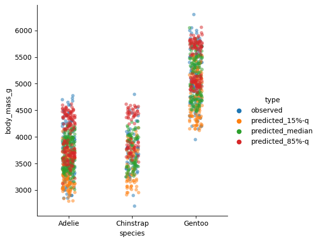
sns.catplot(df_pred, x="species", y="body_mass_g", hue="type", alpha=0.5)
Quantile regression estimates and observed values for species (x-axis).
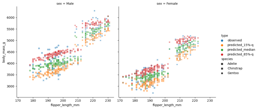
This plot per species seems suspicious. We would expect the 85%-quantile prediction in red to mostly be larger than the median (green), instead we detect several clusters. The reason behind it is the sex of the penguins which also enters the model. To demonstrate this fact, I plot the sex separately and make the species visible by the plot style. This time, I put the flipper length on the x-axis.
Quantile regression estimates and observed values vs flipper length (x-axis). Left: male; right: female
This is a really nice plot:
One immediately observes the differences in sex on the left and right subplot.
The two clusters in each subplot can be well explained by the penguin species.
The 3 quantiles are now vertically in the expected order, 15% quantile in yellow the lowest, 85%-quantile in red the highest, the median in the middle, and some observations beyond those predicted quantiles.
The models are linear in flipper length with a positive, but slightly different slope per quantile level.
As a final check, let us compute the coverage of each quantile model (in-sample).
In this recent post, we have explained how to use Kernel SHAP for interpreting complex linear models. As plotting backend, we used our fresh CRAN package “shapviz“.
“shapviz” has direct connectors to a couple of packages such as XGBoost, LightGBM, H2O, kernelshap, and more. Multiple times people asked me how to combine shapviz when the XGBoost model was fitted with Tidymodels. The workflow was not 100% clear to me as well, but the answer is actually very simple, thanks to Julia’s post where the plots were made with SHAPforxgboost, another cool package for visualization of SHAP values.
Example with shiny diamonds
Step 1: Preprocessing
We first write the data preprocessing recipe and apply it to the data rows that we want to explain. In our case, its 1000 randomly sampled diamonds.
The next step is to tune and build the model. For simplicity, we skipped the tuning part. Bad, bad 🙂
R
# Just for illustration - in practice needs tuning!
xgboost_model <- boost_tree(
  mode = "regression",
  trees = 200,
  tree_depth = 5,
  learn_rate = 0.05,
  engine = "xgboost"
)

dia_wf <- workflow() %>%
  add_recipe(dia_recipe) %>%
  add_model(xgboost_model)

fit <- dia_wf %>%
  fit(diamonds)
Step 3: SHAP Analysis
We now need to call shapviz() on the fitted model. In order to have neat interpretations with the original factor labels, we not only pass the prediction data prepared in Step 1 via bake(), but also the original data structure.
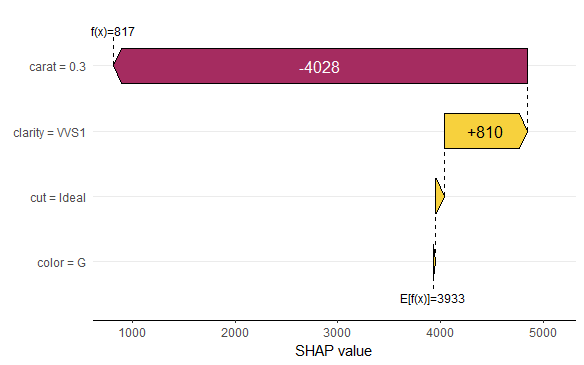
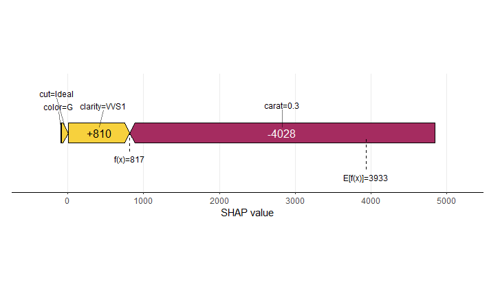
Variable importance plot overlaid with SHAP summary beeswarmsDependence plot for carat. Note that clarity is shown with original labels, not only integers.Dependence plot for clarity. Note again that the x-scale uses the original factor levels, not the integer encoded values.Force plot of the first observationWaterfall plot for the first observation
Summary
Making SHAP analyses with XGBoost Tidymodels is super easy.
One of the reasons why we love the “dplyr” package: it plays so well together with the forward pipe operator `%>%` from the “magrittr” package. Actually, it is not a coincidence that both packages were released quite at the same time, in 2014.
What does the pipe do? It puts the object on its left as the first argument into the function on its right: iris %>% head() is a funny way of writing head(iris). It helps to avoid long function chains like f(g(h(x))), or repeated assignments.
In 2021 and version 4.1, R has received its native forward pipe operator |> so that we can write nice code like this:
Imagine this without pipe…
Since version 4.2, the piped object can be referenced by the underscore _, but just once for now, see an example below.
To use the native pipe via CTRL-SHIFT-M in Posit/RStudio, tick this:
Combined with the many great functions from the standard distribution of R, we can get a real “dplyr” feeling without even loading dplyr. Don’t get me wrong: I am a huge fan of the whole Tidyverse! But it is a great way to learn “Standard R”.
Data chains
Here a small selection of standard functions playing well together with the pipe: They take a data frame and return a modified data frame:
subset(): Select rows and columns of data frame
transform(): Add or overwrite columns in data frame
aggregate(): Grouped calculations
rbind(), cbind(): Bind rows/columns of data frame/matrix
merge(): Join data frames by key
head(), tail(): First/last few elements of object
reshape(): Transposition/Reshaping of data frame (no, I don’t understand the interface)
R
library(ggplot2) # Need diamonds
# What does the native pipe do?
quote(diamonds |> head())
# OUTPUT
# head(diamonds)
# Grouped statistics
diamonds |>
aggregate(cbind(price, carat) ~ color, FUN = mean)
# OUTPUT
# color price carat
# 1 D 3169.954 0.6577948
# 2 E 3076.752 0.6578667
# 3 F 3724.886 0.7365385
# 4 G 3999.136 0.7711902
# 5 H 4486.669 0.9117991
# 6 I 5091.875 1.0269273
# 7 J 5323.818 1.1621368
# Join back grouped stats to relevant columns
diamonds |>
subset(select = c(price, color, carat)) |>
transform(price_per_color = ave(price, color)) |>
head()
# OUTPUT
# price color carat price_per_color
# 1 326 E 0.23 3076.752
# 2 326 E 0.21 3076.752
# 3 327 E 0.23 3076.752
# 4 334 I 0.29 5091.875
# 5 335 J 0.31 5323.818
# 6 336 J 0.24 5323.818
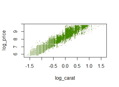
# Plot transformed values
diamonds |>
transform(
log_price = log(price),
log_carat = log(carat)
) |>
plot(log_price ~ log_carat, col = "chartreuse4", pch = ".", data = _)
A simple scatterplot
The plot does not look quite as sexy as “ggplot2”, but its a start.
Other chains
The pipe not only works perfectly with functions that modify a data frame. It also shines with many other functions often applied in a nested way. Here two examples:
R
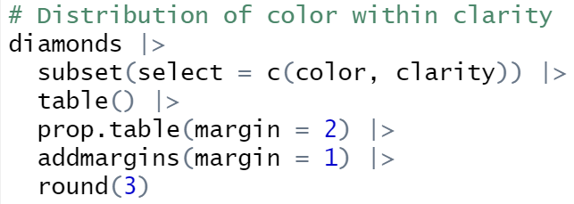
# Distribution of color within clarity
diamonds |>
subset(select = c(color, clarity)) |>
table() |>
prop.table(margin = 2) |>
addmargins(margin = 1) |>
round(3)
# OUTPUT
# clarity
# color I1 SI2 SI1 VS2 VS1 VVS2 VVS1 IF
# D 0.057 0.149 0.159 0.138 0.086 0.109 0.069 0.041
# E 0.138 0.186 0.186 0.202 0.157 0.196 0.179 0.088
# F 0.193 0.175 0.163 0.180 0.167 0.192 0.201 0.215
# G 0.202 0.168 0.151 0.191 0.263 0.285 0.273 0.380
# H 0.219 0.170 0.174 0.134 0.143 0.120 0.160 0.167
# I 0.124 0.099 0.109 0.095 0.118 0.072 0.097 0.080
# J 0.067 0.052 0.057 0.060 0.066 0.026 0.020 0.028
# Sum 1.000 1.000 1.000 1.000 1.000 1.000 1.000 1.000
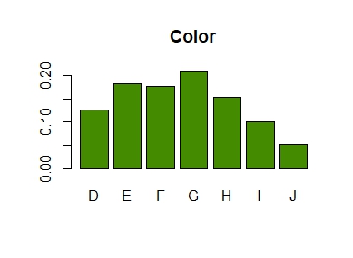
# Barplot from discrete column
diamonds$color |>
table() |>
prop.table() |>
barplot(col = "chartreuse4", main = "Color")
A linear model with complex interaction effects can be almost as opaque as a typical black-box like XGBoost.
XGBoost models are often interpreted with SHAP (Shapley Additive eXplanations): Each of e.g. 1000 randomly selected predictions is fairly decomposed into contributions of the features using the extremely fast TreeSHAP algorithm, providing a rich interpretation of the model as a whole. TreeSHAP was introduced in the Nature publication by Lundberg and Lee (2020).
Can we do the same for non-tree-based models like a complex GLM or a neural network? Yes, but we have to resort to slower model-agnostic SHAP algorithms:
“kernelshap” (Mayer and Watson) implements the Kernel SHAP algorithm by Lundberg and Lee (2017). It uses a constrained weighted regression to calculate the SHAP values of all features at the same time.
In the limit, the two algorithms provide the same SHAP values.
House prices
We will use a great dataset with 14’000 house prices sold in Miami in 2016. The dataset was kindly provided by Prof. Steven Bourassa for research purposes and can be found on OpenML.
The model
We will model house prices by a Gamma regression with log-link. The model includes factors, linear components and natural cubic splines. The relationship of living area and distance to central district is modeled by letting the spline bases of the two features interact.
Thanks to parallel processing and some implementation tricks, we were able to decompose 1000 predictions within 10 seconds! By default, kernelshap() uses exact calculations up to eight features (exact regarding the background data), which would need an infinite amount of Monte-Carlo-sampling steps.
Note that glm() has a very efficient predict() function. GAMs, neural networks, random forests etc. usually take more time, e.g. 5 minutes to do the crunching.
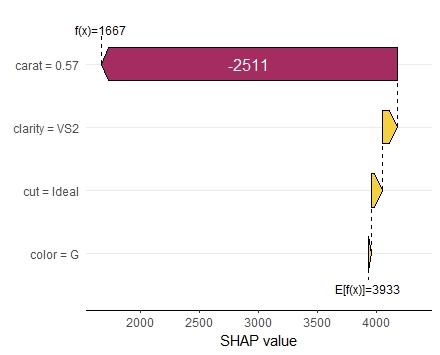
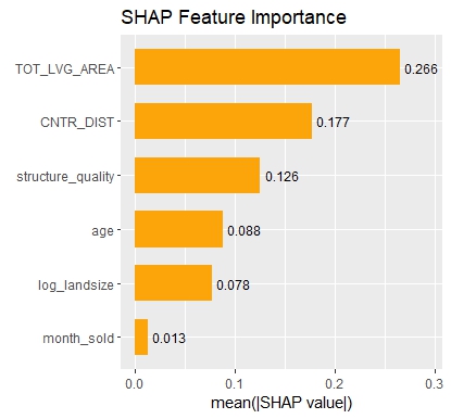
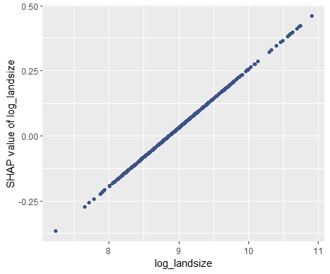
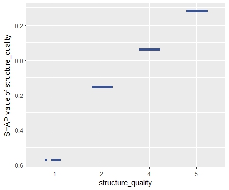
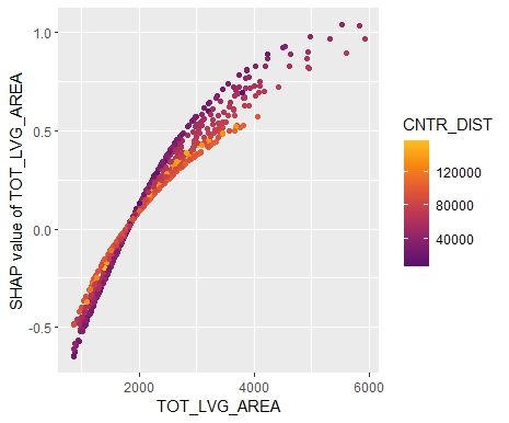
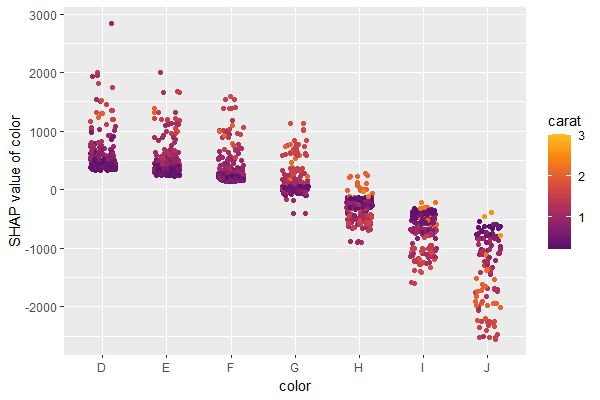
SHAP Importance: Living area and the distance to the central district are the two most important predictors. The month (within 2016) impacts the predicted prices by +-1.3% on average.SHAP dependence plot of “log_landsize”. The effect is linear. The slope 0.22559 agrees with the model coefficient.Dependence plot for “structure_quality”: The difference between structure quality 4 and 5 is 0.2184365. This equals the difference in regression coefficients.Dependence plot of “living_area”: The effect is very steep. The more central, the steeper. We cannot easily compare these numbers with the output of the linear regression.
Summary
Interpreting complex linear models with SHAP is an option. There seems to be a correspondence between regression coefficients and SHAP dependence, at least for additive components.
Kernel SHAP in R is fast. For models with slower predict() functions (e.g. GAMs, random forests, or neural nets), we often need to wait a couple of minutes.
Fairness in Artificial Intelligence (AI) and Machine Learning (ML) is a recent and hot topic. As ML models are used in insurance pricing, the fairness topic also applies there. Just last month, Lindholm, Richman, Tsanakas and Wüthrich published a discussion paper on this subject that sheds new light on established AI fairness criteria. This post provides a short summary of this discussion paper with a few comments of my own. I recommend the interested reader to jump to the original: A Discussion of Discrimination and Fairness in Insurance Pricing.
First of all, I’d like to state that fairness in the form of solidarity and risk sharing was always at the heart of insurance and, as such, is very very old. The recent discussions regarding fairness has a different focus. It comes with the rise of successful ML models that can easily make use of the information contained in large amounts of data (many feature variables). A statistician might just call that multivariate statistical models. Insurance pricing is a domain where ML models (including GLMs) are successfully applied for quite some time (at least since the 1990s), and where at the same time protected information like gender and ethnicity might be available in the data. This led the European Council to forbid gender in insurance pricing.
The important point is—and here speaks the statistician again—that not using a certain features does in no way guarantee that this protected information is not used by a model. A car model or type, for instance, is correlated with the gender of the owner. This is called proxy discrimination.
The brilliant idea of Lindholm et al. was to construct an example where a protected feature does not influence the actuarial best price. So, everyone would agree that this is a fair model. But it turns out that the most common (statistical) definitions of AI fairness all fail. All of them judge this best price model as unfair. To be explicit, the following three group fairness axioms were analysed:
On top of that, these 3 fairness criteria may force different insurance companies to exclude different non-protected variables from their pricing models.
How to conclude? It turns out that fairness is a complicated matter. It has many sociological, cultural and moral aspects. Apart from this broad spectrum, one particular challenge is to give precise mathematical definitions. This topic seems to be, as the paper suggests, open for discussion.
This is the next article in our series “Lost in Translation between R and Python”. The aim of this series is to provide high-quality R and Python code to achieve some non-trivial tasks. If you are to learn R, check out the R tab below. Similarly, if you are to learn Python, the Python tab will be your friend.
Kernel SHAP
SHAP is one of the most used model interpretation technique in Machine Learning. It decomposes predictions into additive contributions of the features in a fair way. For tree-based methods, the fast TreeSHAP algorithm exists. For general models, one has to resort to computationally expensive Monte-Carlo sampling or the faster Kernel SHAP algorithm. Kernel SHAP uses a regression trick to get the SHAP values of an observation with a comparably small number of calls to the predict function of the model. Still, it is much slower than TreeSHAP.
Two good references for Kernel SHAP:
Scott M. Lundberg and Su-In Lee. A Unified Approach to Interpreting Model Predictions. Advances in Neural Information Processing Systems 30, 2017.
Ian Covert and Su-In Lee. Improving KernelSHAP: Practical Shapley Value Estimation Using Linear Regression. Proceedings of The 24th International Conference on Artificial Intelligence and Statistics, PMLR 130:3457-3465, 2021.
In our last post, we introduced our new “kernelshap” package in R. Since then, the package has been substantially improved, also by the big help of David Watson:
The package now supports multi-dimensional predictions.
It received a massive speed-up
Additionally, parallel computing can be activated for even faster calculations.
The interface has become more intuitive.
If the number of features is small (up to ten or eleven), it can provide exact Kernel SHAP values just like the reference Python implementation.
For a larger number of features, it now uses partly-exact (“hybrid”) calculations, very similar to the logic in the Python implementation.
With those changes, the R implementation is about to meet the Python version at eye level.
Example with four features
In the following, we use the diamonds data to fit a linear regression with
log(price) as response
log(carat) as numeric feature
clarity, color and cut as categorical features (internally dummy encoded)
interactions between log(carat) and the other three “C” variables. Note that the interactions are very weak
Then, we calculate SHAP decompositions for about 1000 diamonds (every 53th diamond), using 120 diamonds as background dataset. In this case, both R and Python will use exact calculations based on m=2^4 – 2 = 14 possible binary on-off vectors (a value of 1 representing a feature value picked from the original observation, a value of 0 a value picked from the background data).
R
Python
library(ggplot2)
library(kernelshap)

# Turn ordinal factors into unordered
ord <- c("clarity", "color", "cut")
diamonds[, ord] <- lapply(diamonds[ord], factor, ordered = FALSE)

# Fit model
fit <- lm(log(price) ~ log(carat) * (clarity + color + cut), data = diamonds)

# Subset of 120 diamonds used as background data
bg_X <- diamonds[seq(1, nrow(diamonds), 450), ]

# Subset of 1018 diamonds to explain
X_small <- diamonds[seq(1, nrow(diamonds), 53), c("carat", ord)]

# Exact KernelSHAP (5 seconds)
system.time(
  ks <- kernelshap(fit, X_small, bg_X = bg_X)
)
ks

# SHAP values of first 2 observations:
#          carat     clarity     color        cut
# [1,] -2.050074 -0.28048747 0.1281222 0.01587382
# [2,] -2.085838  0.04050415 0.1283010 0.03731644

# Using parallel backend
library("doFuture")

registerDoFuture()
plan(multisession, workers = 2)  # Windows
# plan(multicore, workers = 2)   # Linux, macOS, Solaris

# 3 seconds on second call
system.time(
  ks3 <- kernelshap(fit, X_small, bg_X = bg_X, parallel = TRUE)
)

# Visualization
library(shapviz)

sv <- shapviz(ks)
sv_importance(sv, "bee")
import numpy as np
import pandas as pd
from plotnine.data import diamonds
from statsmodels.formula.api import ols
from shap import KernelExplainer

# Turn categoricals into integers because, inconveniently, kernel SHAP
# requires numpy array as input
ord = ["clarity", "color", "cut"]
x = ["carat"] + ord
diamonds[ord] = diamonds[ord].apply(lambda x: x.cat.codes)
X = diamonds[x].to_numpy()

# Fit model with interactions and dummy variables
fit = ols(
  "np.log(price) ~ np.log(carat) * (C(clarity) + C(cut) + C(color))",
  data=diamonds
).fit()

# Background data (120 rows)
bg_X = X[0:len(X):450]

# Define subset of 1018 diamonds to explain
X_small = X[0:len(X):53]

# Calculate KernelSHAP values
ks = KernelExplainer(
  model=lambda X: fit.predict(pd.DataFrame(X, columns=x)),
  data = bg_X
)
sv = ks.shap_values(X_small)  # 74 seconds
sv[0:2]

# array([[-2.05007406, -0.28048747,  0.12812216,  0.01587382],
#        [-2.0858379 ,  0.04050415,  0.12830103,  0.03731644]])
SHAP summary plot (R model)
The results match, hurray!
Example with nine features
The computation effort of running exact Kernel SHAP explodes with the number of features. For nine features, the number of relevant on-off vectors is 2^9 – 2 = 510, i.e. about 36 times larger than with four features.
We now modify above example, adding five additional features to the model. Note that the model structure is completely non-sensical. We just use it to get a feeling about what impact a 36 times larger workload has.
Besides exact calculations, we use an almost exact hybrid approach for both R and Python, using 126 on-off vectors (p*(p+1) for the exact part and 4p for the sampling part, where p is the number of features), resulting in a significant speed-up both in R and Python.
R
Python
fit <- lm(
  log(price) ~ log(carat) * (clarity + color + cut) + x + y + z + table + depth,
  data = diamonds
)

# Subset of 1018 diamonds to explain
X_small <- diamonds[seq(1, nrow(diamonds), 53), setdiff(names(diamonds), "price")]

# Exact Kernel SHAP: 61 seconds
system.time(
  ks <- kernelshap(fit, X_small, bg_X = bg_X, exact = TRUE)
)
ks
#          carat        cut     color     clarity         depth         table          x           y            z
# [1,] -1.842799 0.01424231 0.1266108 -0.27033874 -0.0007084443  0.0017787647 -0.1720782 0.001330275 -0.006445693
# [2,] -1.876709 0.03856957 0.1266546  0.03932912 -0.0004202636 -0.0004871776 -0.1739880 0.001397792 -0.006560624

# Default, using an almost exact hybrid algorithm: 17 seconds
system.time(
  ks <- kernelshap(fit, X_small, bg_X = bg_X, parallel = TRUE)
)
#          carat        cut     color     clarity         depth         table          x           y            z
# [1,] -1.842799 0.01424231 0.1266108 -0.27033874 -0.0007084443  0.0017787647 -0.1720782 0.001330275 -0.006445693
# [2,] -1.876709 0.03856957 0.1266546  0.03932912 -0.0004202636 -0.0004871776 -0.1739880 0.001397792 -0.006560624
x = ["carat"] + ord + ["table", "depth", "x", "y", "z"]
X = diamonds[x].to_numpy()

# Fit model with interactions and dummy variables
fit = ols(
  "np.log(price) ~ np.log(carat) * (C(clarity) + C(cut) + C(color)) + table + depth + x + y + z",
  data=diamonds
).fit()

# Background data (120 rows)
bg_X = X[0:len(X):450]

# Define subset of 1018 diamonds to explain
X_small = X[0:len(X):53]

# Calculate KernelSHAP values: 12 minutes
ks = KernelExplainer(
  model=lambda X: fit.predict(pd.DataFrame(X, columns=x)),
  data = bg_X
)
sv = ks.shap_values(X_small)
sv[0:2]
# array([[-1.84279897e+00, -2.70338744e-01,  1.26610769e-01,
#          1.42423108e-02,  1.77876470e-03, -7.08444295e-04,
#         -1.72078182e-01,  1.33027467e-03, -6.44569296e-03],
#        [-1.87670887e+00,  3.93291219e-02,  1.26654599e-01,
#          3.85695742e-02, -4.87177593e-04, -4.20263565e-04,
#         -1.73988040e-01,  1.39779179e-03, -6.56062359e-03]])

# Now, using a hybrid between exact and sampling: 5 minutes
sv = ks.shap_values(X_small, nsamples=126)
sv[0:2]
# array([[-1.84279897e+00, -2.70338744e-01,  1.26610769e-01,
#          1.42423108e-02,  1.77876470e-03, -7.08444295e-04,
#         -1.72078182e-01,  1.33027467e-03, -6.44569296e-03],
#        [-1.87670887e+00,  3.93291219e-02,  1.26654599e-01,
#          3.85695742e-02, -4.87177593e-04, -4.20263565e-04,
#         -1.73988040e-01,  1.39779179e-03, -6.56062359e-03]])
Again, the results are essentially the same between R and Python, but also between the hybrid algorithm and the exact algorithm. This is interesting, because the hybrid algorithm is significantly faster than the exact one.
Wrap-Up
R is catching up with Python’s superb “shap” package.
For two non-trivial linear regressions with interactions, the “kernelshap” package in R provides the same output as Python.
The hybrid between exact and sampling KernelSHAP (as implemented in Python and R) offers a very good trade-off between speed and accuracy.
Our last posts were on SHAP, one of the major ways to shed light into black-box Machine Learning models. SHAP values decompose predictions in a fair way into additive contributions from each feature. Decomposing many predictions and then analyzing the SHAP values gives a relatively quick and informative picture of the fitted model at hand.
In their 2017 paper on SHAP, Scott Lundberg and Su-In Lee presented Kernel SHAP, an algorithm to calculate SHAP values for any model with numeric predictions. Compared to Monte-Carlo sampling (e.g. implemented in R package “fastshap”), Kernel SHAP is much more efficient.
I had one problem with Kernel SHAP: I never really understood how it works!
Then I found this article by Covert and Lee (2021). The article not only explains all the details of Kernel SHAP, it also offers an version that would iterate until convergence. As a by-product, standard errors of the SHAP values can be calculated on the fly.
This article motivated me to implement the “kernelshap” package in R, complementing “shapr” that uses a different logic.
The new “kernelshap” package in R
Bleeding edge version 0.1.1 on Github: https://github.com/mayer79/kernelshap
The interface is quite simple: You need to pass three things to its main function kernelshap():
X: matrix/data.frame/tibble/data.table of observations to explain. Each column is a feature.
pred_fun: function that takes an object like X and provides one number per row.
bg_X: matrix/data.frame/tibble/data.table representing the background dataset used to calculate marginal expectation. Typically, between 100 and 200 rows.
Example
We will use Keras to build a deep learning model with 631 parameters on diamonds data. Then we decompose 500 predictions with kernelshap() and visualize them with “shapviz”.
We will fit a Gamma regression with log link the four “C” features:
carat
color
clarity
cut
R
library(tidyverse)
library(keras)
# Response and covariates
y <- as.numeric(diamonds$price)
X <- scale(data.matrix(diamonds[c("carat", "color", "cut", "clarity")]))
# Input layer: we have 4 covariates
input <- layer_input(shape = 4)
# Two hidden layers with contracting number of nodes
output <- input %>%
layer_dense(units = 30, activation = "tanh") %>%
layer_dense(units = 15, activation = "tanh") %>%
layer_dense(units = 1, activation = k_exp)
# Create and compile model
nn <- keras_model(inputs = input, outputs = output)
summary(nn)
# Gamma regression loss
loss_gamma <- function(y_true, y_pred) {
-k_log(y_true / y_pred) + y_true / y_pred
}
nn %>%
compile(
optimizer = optimizer_adam(learning_rate = 0.001),
loss = loss_gamma
)
# Callbacks
cb <- list(
callback_early_stopping(patience = 20),
callback_reduce_lr_on_plateau(patience = 5)
)
# Fit model
history <- nn %>%
fit(
x = X,
y = y,
epochs = 100,
batch_size = 400,
validation_split = 0.2,
callbacks = cb
)
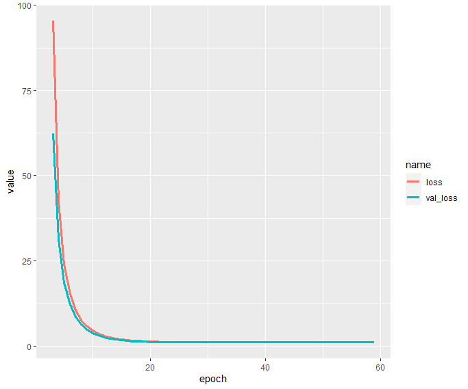
history$metrics[c("loss", "val_loss")] %>%
data.frame() %>%
mutate(epoch = row_number()) %>%
filter(epoch >= 3) %>%
pivot_longer(cols = c("loss", "val_loss")) %>%
ggplot(aes(x = epoch, y = value, group = name, color = name)) +
geom_line(size = 1.4)
Interpretation via KernelSHAP
In order to peak into the fitted model, we apply the Kernel SHAP algorithm to decompose 500 randomly selected diamond predictions. We use the same subset as background dataset required by the Kernel SHAP algorithm.
Afterwards, we will study
Some SHAP values and their standard errors
One waterfall plot
A beeswarm summary plot to get a rough picture of variable importance and the direction of the feature effects
A SHAP dependence plot for carat
R
# Interpretation on 500 randomly selected diamonds
library(kernelshap)
library(shapviz)

sample(1)
ind <- sample(nrow(X), 500)

dia_small <- X[ind, ]

# 77 seconds
system.time(
  ks <- kernelshap(
    dia_small,
    pred_fun = function(X) as.numeric(predict(nn, X, batch_size = nrow(X))),
    bg_X = dia_small
  )
)
ks

# Output
# 'kernelshap' object representing
# - SHAP matrix of dimension 500 x 4
# - feature data.frame/matrix of dimension 500 x 4
# - baseline value of 3744.153
#
# SHAP values of first 2 observations:
#         carat     color       cut   clarity
# [1,] -110.738 -240.2758  5.254733 -720.3610
# [2,] 2379.065  263.3112 56.413680  452.3044
#
# Corresponding standard errors:
#         carat      color       cut  clarity
# [1,] 2.064393 0.05113337 0.1374942 2.150754
# [2,] 2.614281 0.84934844 0.9373701 0.827563

sv <- shapviz(ks, X = diamonds[ind, x])
sv_waterfall(sv, 1)
sv_importance(sv, "both")
sv_dependence(sv, "carat", "auto")
Note the small standard errors of the SHAP values of the first two diamonds. They are only approximate because the background data is only a sample from an unknown population. Still, they give a good impression on the stability of the results.
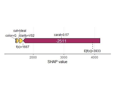
The waterfall plot shows a diamond with not super nice clarity and color, pulling down the value of this diamond. Note that, even if the model is working with scaled numeric feature values, the plot shows the original feature values.
SHAP waterfall plot of one diamond. Note its bad clarity.
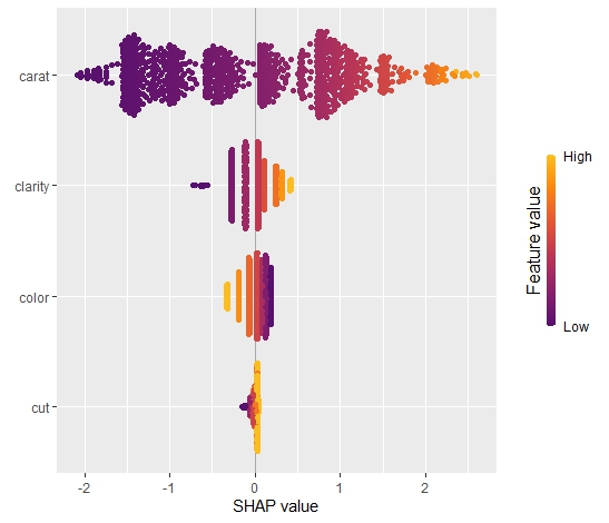
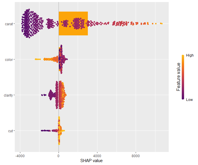
The SHAP summary plot shows that “carat” is, unsurprisingly, the most important variable and that high carat mean high value. “cut” is not very important, except if it is extremely bad.
SHAP summary plot with bars representing average absolute values as measure of importance.
Our last plot is a SHAP dependence plot for “carat”: the effect makes sense, and we can spot some interaction with color. For worse colors (H-J), the effect of carat is a bit less strong as for the very white diamonds.
Dependence plot for “carat”
Short wrap-up
Standard Kernel SHAP in R, yeahhhhh 🙂
The Github version is relatively fast, so you can even decompose 500 observations of a deep learning model within 1-2 minutes.
In a recent post, I introduced the initial version of the “shapviz” package. Its motto: do one thing, but do it well: visualize SHAP values.
The initial community feedback was very positive, and a couple of things have been improved in version 0.2.0. Here the main changes:
“shapviz” now works with tree-based models of the h2o package in R.
Additionally, it wraps the shapr package, which implements an improved version of Kernel SHAP taking into account feature dependence.
A simple interface to collapse SHAP values of dummy variables was added.
The default importance plot is now a bar plot, instead of the (slower) beeswarm plot. In later releases, the latter might be moved to a separate function sv_summary() for consistency with other packages.
Importance plot and dependence plot now work neatly with ggplotly(). The other plot types cannot be translated with ggplotly() because they use geoms from outside ggplot. At least I do not know how to do this…
Example
Let’s build an H2O gradient boosted trees model to explain diamond prices. Then, we explain the model with our “shapviz” package. Note that H2O itself also offers some SHAP plots. “shapviz” is directly applied to the fitted H2O model. This means you don’t have to write a single superfluous line of code.
R
library(shapviz)
library(tidyverse)
library(h2o)

h2o.init()

set.seed(1)

# Get rid of that darn ordinals
ord <- c("clarity", "cut", "color")
diamonds[, ord] <- lapply(diamonds[, ord], factor, ordered = FALSE)

# Minimally tuned GBM with 260 trees, determined by early-stopping with CV
dia_h2o <- as.h2o(diamonds)
fit <- h2o.gbm(
  c("carat", "clarity", "color", "cut"),
  y = "price",
  training_frame = dia_h2o,
  nfolds = 5,
  learn_rate = 0.05,
  max_depth = 4,
  ntrees = 10000,
  stopping_rounds = 10,
  score_each_iteration = TRUE
)
fit

# SHAP analysis on about 2000 diamonds
X_small <- diamonds %>%
  filter(carat <= 2.5) %>%
  sample_n(2000) %>%
  as.h2o()

shp <- shapviz(fit, X_pred = X_small)

sv_importance(shp, show_numbers = TRUE)
sv_importance(shp, show_numbers = TRUE, kind = "bee")
sv_dependence(shp, "color", "auto", alpha = 0.5)
sv_force(shp, row_id = 1)
sv_waterfall(shp, row_id = 1)
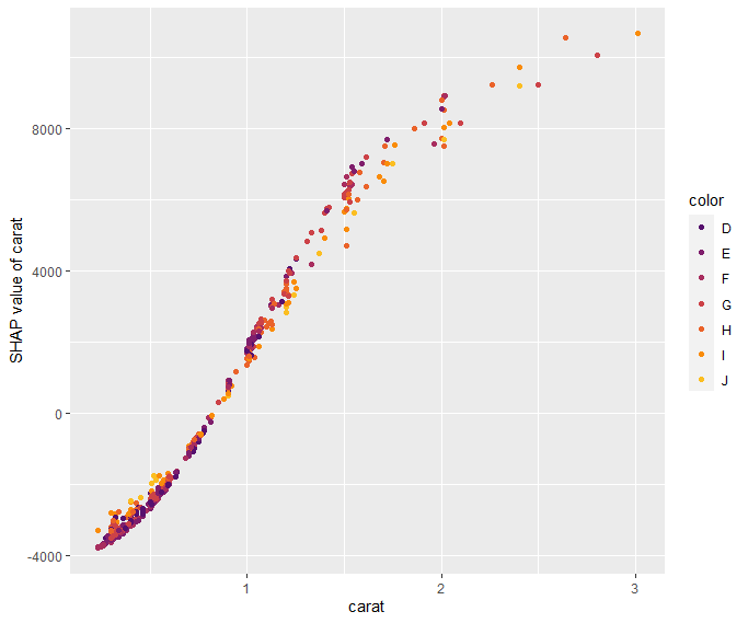
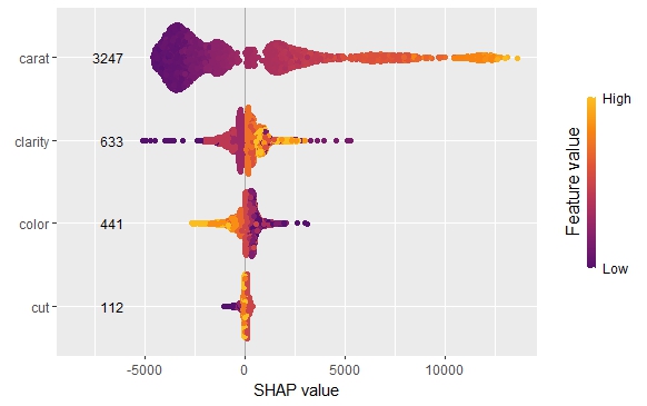
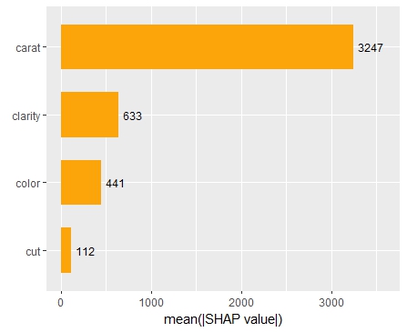
Summary and importance plots
The SHAP importance and SHAP summary plots clearly show that carat is the most important variable. On average, it impacts the prediction by 3247 USD. The effect of “cut” is much smaller. Its impact on the predictions, on average, is plus or minus 112 USD.
SHAP summary plotSHAP importance plot
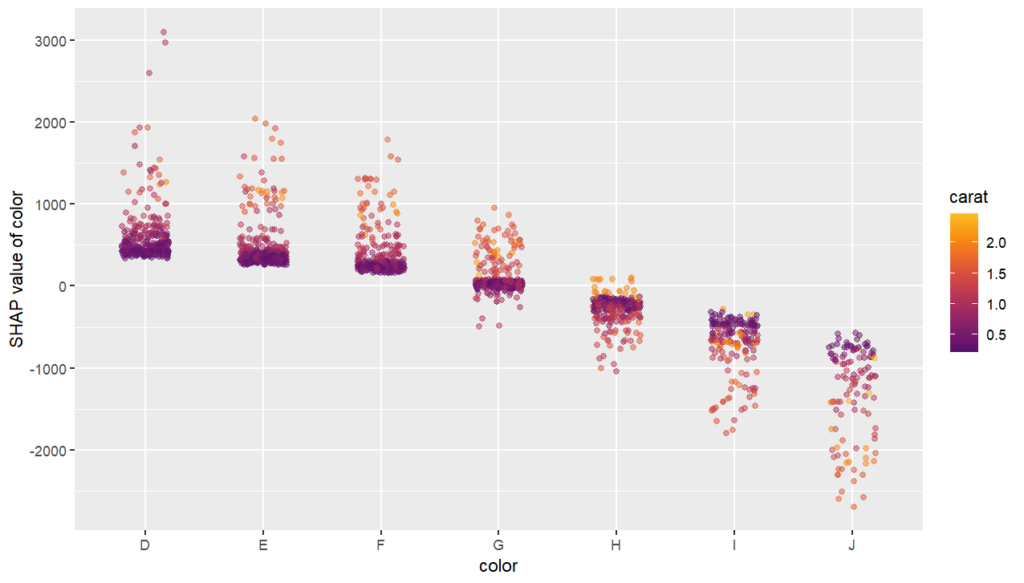
SHAP dependence plot
The SHAP dependence plot shows the effect of “color” on the prediction: The better the color (close to “D”), the higher the price. Using a correlation based heuristic, the plot selected carat on the color scale to show that the color effect is hightly influenced by carat in the sense that the impact of color increases with larger diamond weight. This clearly makes sense!
Dependence plot for “color”
Waterfall and force plot
Finally, the waterfall and force plots show how a single prediction is decomposed into contributions from each feature. While this does not tell much about the model itself, it might be helpful to explain what SHAP values are and to debug strange predictions.
Waterfall plotForce plot
Short wrap-up
Combining “shapviz” and H2O is fun. Okay, that one was subjective :-).
Good visualization of ML models is extremely helpful and reassuring.
SHAP (SHapley Additive exPlanations, Lundberg and Lee, 2017) is an ingenious way to study black box models. SHAP values decompose – as fair as possible – predictions into additive feature contributions.
When it comes to SHAP, the Python implementation is the de-facto standard. It not only offers many SHAP algorithms, but also provides beautiful plots. In R, the situation is a bit more confusing. Different packages contain implementations of SHAP algorithms, e.g.,
some of which with great visualizations. Plus there is SHAPforxgboost (see my recent post), originally designed to visualize the results of SHAP values calculated from XGBoost, but it can also be used more generally by now.
The shapviz package
In order to entangle calculation from visualization, the shapviz package was designed. It solely focuses on visualization of SHAP values. Closely following its README, it currently provides these plots:
sv_waterfall(): Waterfall plots to study single predictions.
sv_force(): Force plots as an alternative to waterfall plots.
sv_importance(): Importance plots (bar and/or beeswarm plots) to study variable importance.
sv_dependence(): Dependence plots to study feature effects (optionally colored by heuristically strongest interacting feature).
They require a “shapviz” object, which is built from two things only:
S: Matrix of SHAP values
X: Dataset with corresponding feature values
Furthermore, a “baseline” can be passed to represent an average prediction on the scale of the SHAP values.
A key feature of the “shapviz” package is that X is used for visualization only. Thus it is perfectly fine to use factor variables, even if the underlying model would not accept these.
To further simplify the use of shapviz, direct connectors to the packages
One line of code creates a shapviz object. It contains SHAP values and feature values for the set of observations we are interested in. Note again that X is solely used as explanation dataset, not for calculating SHAP values.
In this example we construct the shapviz object directly from the fitted XGBoost model. Thus we also need to pass a corresponding prediction dataset X_pred used for calculating SHAP values by XGBoost.
R
shp <- shapviz(fit, X_pred = data.matrix(X_small), X = X_small)
Explaining one single prediction
Let’s start by explaining a single prediction by a waterfall plot or, alternatively, a force plot.
R
# Two types of visualizations
sv_waterfall(shp, row_id = 1)
sv_force(shp, row_id = 1
Waterfall plot
Factor/character variables are kept as they are, even if the underlying XGBoost model required them to be integer encoded.
Force plot
Explaining the model as a whole
We have decomposed 2000 predictions, not just one. This allows us to study variable importance at a global model level by studying average absolute SHAP values as a bar plot or by looking at beeswarm plots of SHAP values.
Beeswarm plotBar plotBeeswarm plot overlaid with bar plot
A scatterplot of SHAP values of a feature like color against its observed values gives a great impression on the feature effect on the response. Vertical scatter gives additional info on interaction effects. shapviz offers a heuristic to pick another feature on the color scale with potential strongest interaction.
R
sv_dependence(shp, v = "color", "auto")
Dependence plot with automatic interaction colorization
Summary
The “shapviz” has a single purpose: making SHAP plots.
Its interface is optimized for existing SHAP crunching packages and can easily be used in future packages as well.
All plots are highly customizable. Furthermore, they are all written with ggplot and allow corresponding modifications.
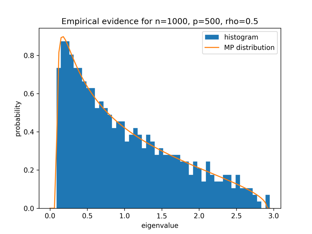
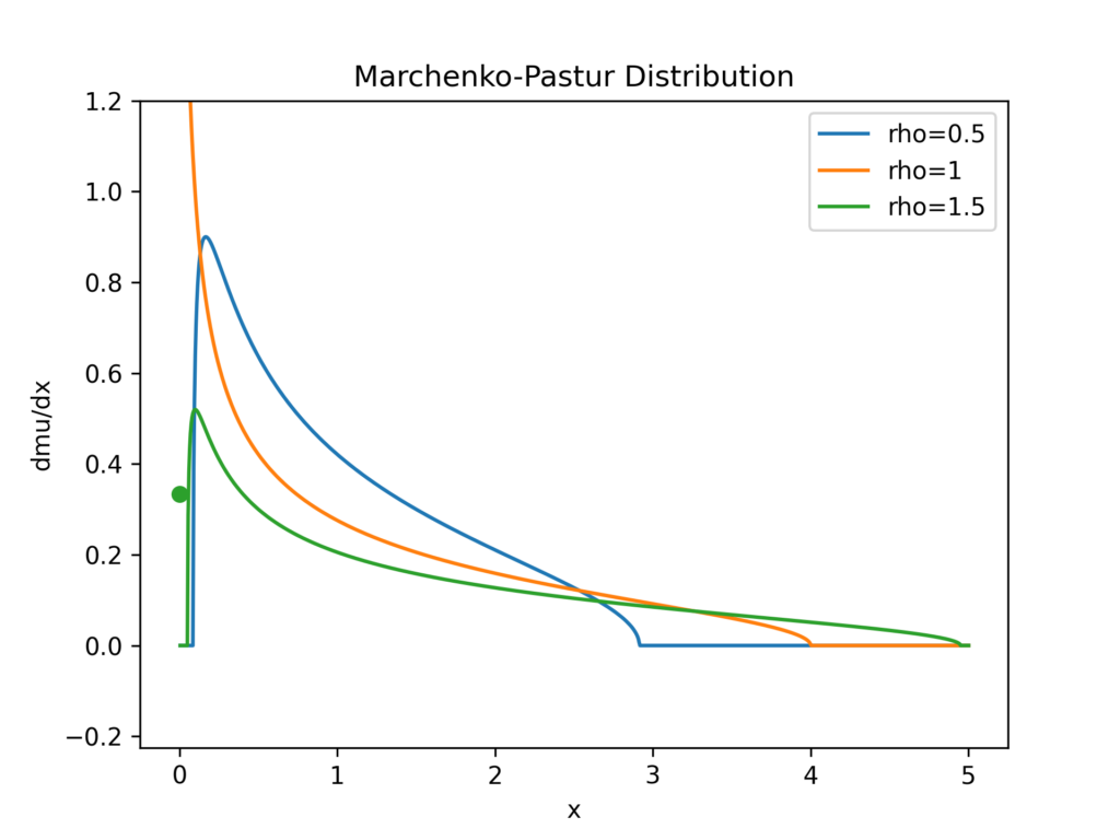
In this blog post, I tell the story how I learned about a theorem for random matrices of the two Ukrainian🇺🇦 mathematicians Vladimir Marchenko and Leonid Pastur. It all started with benchmarking least squares solvers in scipy.
Setting the Stage for Least Squares Solvers
Least squares starts with a matrix A \in \mathbb{R}^{n,p} and a vector b \in \mathbb{R}^{n} and one is interested in solution vectors x \in \mathbb{R}^{p} fulfilling
x^\star = \argmin_x ||Ax-b||_2^2 \,.
You can read more about least squares in our earlier post Least Squares Minimal Norm Solution. There are many possible ways to tackle this problem and many algorithms are available. One standard solver is LSQR with the following properties:
Iterative solver, which terminates when some stopping criteria are smaller than a user specified tolerance.
It only uses matrix-vector products. Therefore, it is suitable for large and sparse matrices A.
It effectively solves the normal equations A^T A = A^Tb based on a bidiagonalization procedure of Golub and Kahan (so never really calculating A^T A).
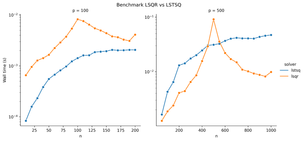
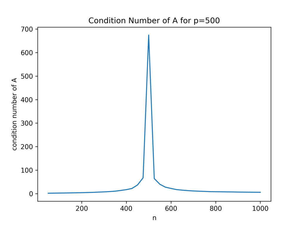
It is, unfortunately, susceptible to ill-conditioned matrices A, which we demonstrated in our earlier post.
Wait, what is an ill-conditioned matrix? This is most easily explained with the help of the singular value decomposition (SVD). Any real valued matrix permits a decomposition into three parts:
A = U S V^T \,.
U and V are orthogonal matrices, but not of further interest to us. The matrix S on the other side is (rectangular) diagonal with only non-negative entries s_i = S_{ii} \geq 0. A matrix A is said to be ill-conditioned if it has a large condition number, which can be defined as the ratio of largest and smallest singular value, \mathrm{cond}(A) = \frac{\max_i s_i}{\min_i s_i} = \frac{s_{\mathrm{max}}}{s_{\mathrm{min}}}. Very often, large condition numbers make numerical computations difficult or less precise.
Benchmarking LSQR
One day, I decided to benchmark the computation time of least squares solvers provided by scipy, in particular LSQR. I wanted results for different sizes n, p of the matrix dimensions. So I needed to somehow generate different matrices A. There are a myriad ways to do that. Naive as I was, I did the most simple thing and used standard Normal (Gaussian) distributed random matrices A_{ij} \sim \mathcal{N}(0, 1) and ran benchmarks on those. Let’s see how that looks in Python.
from collections import OrderedDict
from functools import partial

import matplotlib.pyplot as plt
import numpy as np
from scipy.linalg import lstsq
from scipy.sparse.linalg import lsqr
import seaborn as sns
from neurtu import Benchmark, delayed

plt.ion()

p_list = [100, 500]
rng = np.random.default_rng(42)
X = rng.standard_normal(max(p_list) ** 2 * 2)
y = rng.standard_normal(max(p_list) * 2)

def bench_cases():
    for p in p_list:
        for n in np.arange(0.1, 2.1, 0.1):
            n = int(p*n)
            A = X[:n*p].reshape(n, p)
            b = y[:n]
            for solver in ['lstsq', 'lsqr']:
                tags = OrderedDict(n=n, p=p, solver=solver)
                if solver == 'lstsq':
                    solve = delayed(lstsq, tags=tags)
                elif solver == 'lsqr':
                    solve = delayed(
                        partial(
                            lsqr, atol=1e-10, btol=1e-10, iter_lim=1e6
                        ),
                        tags=tags)

                yield solve(A, b)

bench = Benchmark(wall_time=True)
df = bench(bench_cases())

g = sns.relplot(x='n', y='wall_time', hue='solver', col='p',
            kind='line', facet_kws={'sharex': False, 'sharey': False},
            data=df.reset_index(), marker='o')
g.set_titles("p = {col_name}")
g.set_axis_labels("n", "Wall time (s)")
g.set(xscale="linear", yscale="log")

plt.subplots_adjust(top=0.9)
g.fig.suptitle('Benchmark LSQR vs LSTSQ')
for ax in g.axes.flatten():
    ax.tick_params(labelbottom=True)
Timing benchmark of LSQR and standard LAPACK LSTSQ solvers for different sizes of n on the x-axis and p=100 left, p=500 right.
The left plot already looks a bit suspicious around n=p. But what is happening on the right side? Where does this spike of LSQR come from? And why does the standard least squares solver, SVD-based lstsq, not show this spike?
When I saw these results, I thought something might be wrong with LSQR and opened an issue on the scipy github repository, see https://github.com/scipy/scipy/issues/11204. The community there is really fantastic. Brett Naul pointed me to ….
The Marchenko–Pastur Distribution
The Marchenko–Pastur distribution is the distribution of the eigenvalues (singular values of square matrices) of certain random matrices in the large sample limit. Given a random matrix A \in \mathbb{R}^{n,p} with i.i.d. entries A_{ij} having zero mean, \mathbb{E}[A_{ij}] = 0, and finite variance, \mathrm{Var}[A_{ij}] = \sigma^2 < \infty, we define the matrix Y_n = \frac{1}{n}A^T A \in \mathbb{R}^{p,p}. As square and even symmetric matrix, Y_n has a simpler SVD, namely Y_n = V \Sigma V^T. One can in fact show that V is the same as in the SVD of A and that the diagonal matrix \Sigma = \frac{1}{n}S^TS contains the squared singular values of A and \min(0, p-n) extra zero values. The (diagonal) values of \Sigma are called eigenvalues \lambda_1, \ldots, \lambda_p of Y_n. Note/ that the eigenvalues are themselves random variables, and we are interested in their probability distribution or probability measure. We define the (random) measure \mu_p(B) = \frac{1}{p} \#\{\lambda_j \in B\} for all intervals B \subset \mathbb{R}.
The theorem of Marchenko and Pastur then states that for n, p \rightarrow \infty with \frac{p}{n} \rightarrow \rho , we have \mu_p \rightarrow \mu, where
We can at least derive the point mass at zero for \rho>1 \Leftrightarrow p>n: We said above that \Sigma contains p-n extra zeros and those correspond to a density of \frac{p-n}{p}=1 – \frac{1}{\rho} at zero.
A lot of math so far. Just note that the assumptions on A are exactly met by the one in our benchmark above. Also note that the normal equations can be expressed in terms of Y_n as n Y_n x = A^Tb.
Empirical Confirmation of the Marchenko–Pastur Distribution
Before we come back to the spikes in our benchmark, let us have a look and see how good the Marchenko–Pastur distribution is approximated for finite sample size. We choose n=1000, p=500 which gives \rho=\frac{1}{2}. We plot a histrogram of the eigenvalues next to the Marchenko–Pastur distribution.
Hitogram of eigenvalues for n=100, p=500 versus Marchenko–Pastur distribution
I have to say, I am very impressed by this good agreement for n=1000, which is far from being huge.
Conclusion
Let’s visualize the Marchenko–Pastur distribution Y_n for several ratios \rho and fix \sigma=1:
fig, ax = plt.subplots()

rho_list = [0.5, 1, 1.5]
x = np.linspace(0, 5, 1000)[1:] # exclude 0
for rho in rho_list:
    y = marchenko_pastur_mu(x, rho)
    line, = ax.plot(x, y, label=f"rho={rho}")
    # plot zero point mass
    if rho > 1:
        ax.scatter(0, marchenko_pastur_mu(0, rho), color = line.get_color())

ax.set_ylim(None, 1.2)
ax.legend()
ax.set_title("Marchenko-Pastur Distribution")
ax.set_xlabel("x")
ax.set_ylabel("dmu/dx")
Marchenko-Pastur distribution for several ratios rho. The green dot is the point mass at zero.
From this figure it becomes obvious that the closer the ratio \rho = 1, the higher the probability for very tiny eigenvalues. This results in a high probability for an ill-conditioned matrix A^TA coming from an ill-conditioned matrix A. Let’s confirm that:
p = 500
n_vec = []
c_vec = []
for n in np.arange(0.1, 2.05, 0.05):
    n = int(p*n)
    A = X[:n*p].reshape(n, p)
    n_vec.append(n)
    c_vec.append(np.linalg.cond(A))

fig, ax = plt.subplots()
ax.plot(n_vec, c_vec)
ax.set_xlabel("n")
ax.set_ylabel("condition number of A")
ax.set_title("Condition Number of A for p=500")
Condition number of the random matrix A
As a result of the ill-conditioned A, the LSQR solver has problems to achieve its tolerance criterion, needs more iterations, and takes longer time. This is exactly what we observed in the benchmark plots: the peak occurred around n=p. The SVD-based lstsq solver, on the other hand, does not use an iterative scheme and does not need more time for ill-conditioned matrices.