Applied statistics is dominated by the ubiquitous mean. For a change, this post is dedicated to quantiles. I will give my best to provide a good mix of theory and practical examples.
While the mean describes only the central tendency of a distribution or random sample, quantiles are able to describe the whole distribution. They appear in box-plots, in childrens’ weight-for-age curves, in salary survey results, in risk measures like the value-at-risk in the EU-wide solvency II framework for insurance companies, in quality control and in many more fields.
Definitions
Often, one talks about quantiles, but rarely defines them. In what fallows, I borrow from Gneiting (2011).
Definition 1: Quantile
Given a cumulative probability distribution (CDF) F(x)=\mathbb{P}(X\leq x), the quantile at level \alpha \in (0,1) (ɑ-quantile for short), q_\alpha(F), is defined as
\begin{equation*}
q_\alpha(F) = \{x: \lim_{y\uparrow x} F(y)\leq \alpha \leq F(x)\} \,.
\end{equation*}
The inequalities of this definition are called coverage conditions. It is very important to note that quantiles are potentially set valued. Another way to write this set is as an interval:
\begin{align*}
q_\alpha(F) &\in [q_\alpha^-(F), q_\alpha^+(F)]
\\
q_\alpha^-(F) &= \sup\{x:F(x) < \alpha\} = \inf\{x:F(x) \geq \alpha\}
\\
q_\alpha^+(F) &= \inf\{x:F(x) > \alpha\} = \sup\{x:F(x) \leq \alpha\}
\end{align*}
For q_\alpha^-, we recover the usual quantile definition as the generalized inverse of F. But this is only one possible value. I will discuss examples of quantile intervals later on.
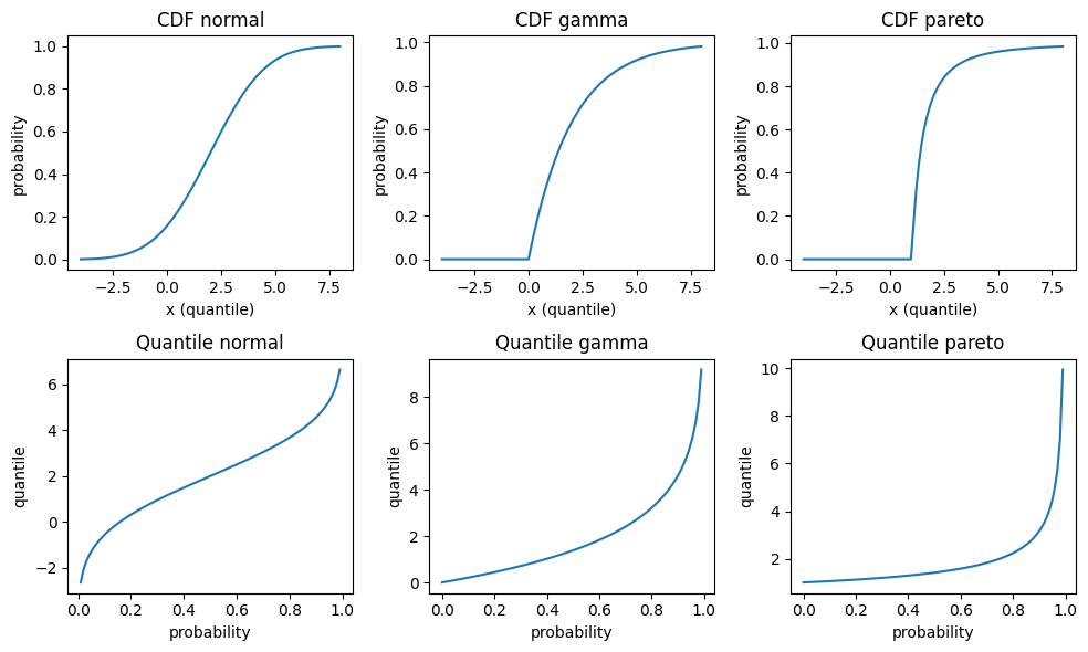
To get acquainted a bit more, let’s plot the cumulative distribution function and the quantile function for some continuous distributions: Normal, Gamma and Pareto distribution. The parametrisation is such that all have mean 2, Normal and Gamma have variance 4, and Pareto has an infinite variance. For those continuous and strictly increasing distributions, all quantiles are unique, and therefore simplify to the inverse CDF q_\alpha^- in the above equations. Note that those three distributions have very different tail behaviour: The density of the Normal distribution has the famously fast decrease \propto e^{-x^2}, the Gamma density has an exponentially decreasing tail \propto e^{-x} and the Pareto density has a fat tail, i.e. an inverse power \propto \frac{1}{x^\alpha}.
There are at least two more equivalent ways to define quantiles. They will help us later to get a better visualisations.
Definition 2: Quantile as minimiser
Given a probability distribution F, the ɑ-quantile q_\alpha(F) is defined as any minimiser of the expected scoring function S
\begin{align*}
q_\alpha(F) &\in \argmin_x \mathbb{E}(S_\alpha(x, Y))
\\
S_\alpha(x, y) &= (\mathbf{1}_{x\geq y} - \alpha)(x - y)
\end{align*}
where the expectation is taken over Y \sim F.
The scoring function or loss function S can be generalized to S_\alpha(x, y) = (\mathbb{1}_{x\geq y} – \alpha)(g(x) – g(y)) for any increasing function g, but the above version in definition 2 is by far the simplest one and coincides with the pinball loss used in quantile regression.
This definition is super useful because it provides a tool to assess whether a given value really is a quantile. A plot will suffice.
Having a definition in terms of a convex optimisation problem, there is another definition in terms of the first order condition of optimality. For continuous, strictly increasing distributions, this would be equivalent to setting the first derivative to zero. For our non-smooth scoring function with potentially set-valued solution, this gets more complicated, e.g. subdifferential or subgradients replacing derivatives. In the end, it amounts to a sign change of the expectation of the so called identification function V(x, y)=\mathbf{1}_{x\geq y}-\alpha.
Empirical Distribution
The empirical distribution provides an excellent example. Given a sample of n observations y_1, \ldots, y_n, the empirical distribution is given by F_n(x)=\frac{1}{n}\sum_{i=1}^n \mathbf{1}_{x\geq y_i}. Let us start simple and take two observations y_1=1 and y_2=2. Plugging in this distribution in the definition 1 of quantiles gives the exact quantiles of this 2-point empirical CDF:
\begin{equation}
q_\alpha(F_2)=
\begin{cases}
   1 &\text{if } \alpha<\frac{1}{2} \\
   [1, 2] &\text{if } \alpha=\frac{1}{2} \\
   2 &\text{else}
\end{cases}
\end{equation}
Here we encounter the interval [1, 2] for \alpha=\frac{1}{2}. Again, I plot both the (empirical) CDF F_n and the quantiles.
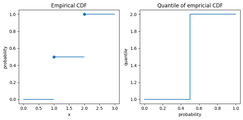
In the left plot, the big dots unambiguously mark the values at x=1 and x=2. For the quantiles in the right plot, the vertical line at probability 0.5 really means that all those values between 1 and 2 are possible 0.5-quantiles, also known as median.
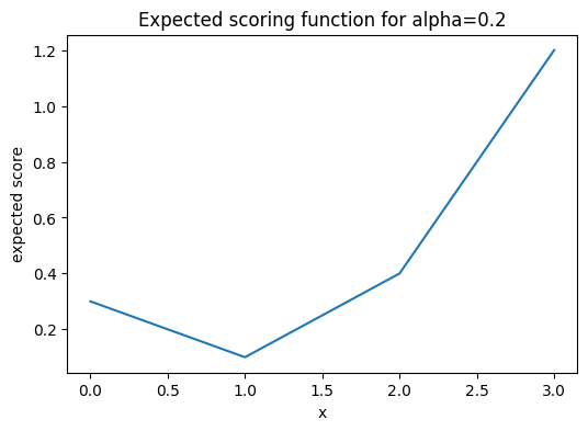
If you wonder about the value 1 for quantiles of level smaller than 50%, the minimisation formulation helps. The following plot shows \mathbb{E}(S_\alpha(x, Y)) for \alpha=0.2 with a clear unique minimum at x=1.
A note for the interested reader: The above empirical distribution is the same as the distribution of a Bernoulli random variable, except that the x-values are shifted, i.e. the Bernoulli random variables are canonically set to 0 and 1 instead of 1 and 2. Furthermore, there is a direct connection between quantiles and classification via the cost-weighted misclassification error, see Fissler, Lorentzen & Mayer (2022).
Empirical Quantiles
From the empirical CDF, it is only a small step to empirical quantiles. But what’s the difference anyway? While we saw the exact quantile of the empirical distribution, q_\alpha(F_n), an empirical or sample quantile estimate the true (population) quantile given a data sample, i.e. \hat{q}_\alpha(\{y_i\}) \approx q_\alpha(F).
As an empirical CDF estimates the CDF of the true underlying (population) distribution, F_n=\hat{F} \approx F, one immediate way to estimate a quantile is:
- Estimate the CDF via the empirical CDF F_n.
- Use the exact quantile in analogy to Eq.(1) as an estimate.
Very importantly, this is just one way to estimate quantiles from a sample. There are many, many more. Here is the outcome of the 20%-quantile of our tiny data sample y_1=1 and y_2=2.
import numpy as np

methods = [
    'inverted_cdf',
    'averaged_inverted_cdf',
    'closest_observation',
    'interpolated_inverted_cdf',
    'hazen',
    'weibull',
    'linear',
    'median_unbiased',
    'normal_unbiased',
    'nearest',
    'lower',
    'higher',
    'midpoint',
]
alpha = 0.2
for m in methods:
    estimate = np.quantile([1, 2], 0.2, method=m)
    print(f"{m:<25} {alpha}-quantile estimate = {estimate}")
inverted_cdf 0.2-quantile estimate = 1
averaged_inverted_cdf 0.2-quantile estimate = 1.0
closest_observation 0.2-quantile estimate = 1
interpolated_inverted_cdf 0.2-quantile estimate = 1.0
hazen 0.2-quantile estimate = 1.0
weibull 0.2-quantile estimate = 1.0
linear 0.2-quantile estimate = 1.2
median_unbiased 0.2-quantile estimate = 1.0
normal_unbiased 0.2-quantile estimate = 1.0
nearest 0.2-quantile estimate = 1
lower 0.2-quantile estimate = 1
higher 0.2-quantile estimate = 2
midpoint 0.2-quantile estimate = 1.5Note that the first 9 methods are the ones discussed in a famous paper of Hyndman & Fan (1996). The default method of both Python’s numpy.quantile and R’s quantile is linear, i.e. number 7 in Hyndman & Fan. Somewhat surprisingly, we observe that this default method is clearly biased in this case and overestimates the true quantile.
For large sample sizes, the differences will get tiny and all methods converge finally to a true quantile, at least for continuous distributions. In order to assess the bias with small sample sizes for each method, I do a simulation. This is where the fun starts😄
For all three selected distributions and for quantile levels 15%, 50% and 85%, I simulate 10000 random samples, each of sample size 10 and calculate the sample quantile. Then I take the mean over all 10000 simulations as well as the 5% and the 95% quantiles as a measure of uncertainty, i.e. 90% confidence intervals. After some coding, this results in the following plot. (I spare you the code at this point. You can find it in the linked notebook at the bottom of this post).
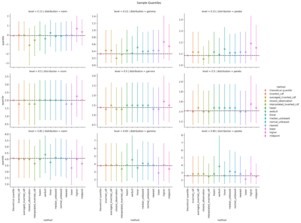
left: Normal distribution; mid: Gamma distribution; right: Pareto distribution
top: 15%-quantile; mid: 50%-quantile; bottom: 85%-quantile
For the 15%-quantile, the default linear method always overestimates, but it does surprisingly well for the 85%-quantile of the Pareto distribution. Overall, I personally would prefer the median unbiased or the Hazen method. Interestingly, the Hazen method is one of the oldest, namely from Hazen (1914), and is the only one that fulfills all proposed properties of Hyndman & Fan, who propose the median unbiased method as default.
Quantile Regression
So far, the interest was in the quantile of a sample or distribution. To go one step further, one might ask for the conditional quantile of a response variable Y given some features or covariates X, q_\alpha(Y|X)=q_\alpha(F_{Y|X}). This is the realm of quantile regression as invented by Koenker & Bassett (1978). To stay within linear models, one simply replaces the squared error of ordinary least squares (OLS) by the pinball loss.
Without going into any more details, I chose the Palmer’s penguin dataset and the body mass in gram as response variable, all the other variables as feature variables. And again, I model the 15%, 50% and 85% quantiles.
import seaborn as sns

df = sns.load_dataset("penguins").dropna()
df| species | island | bill_length_mm | bill_depth_mm | flipper_length_mm | body_mass_g | sex | |
|---|---|---|---|---|---|---|---|
| 0 | Adelie | Torgersen | 39.1 | 18.7 | 181.0 | 3750.0 | Male |
| 1 | Adelie | Torgersen | 39.5 | 17.4 | 186.0 | 3800.0 | Female |
| 2 | Adelie | Torgersen | 40.3 | 18.0 | 195.0 | 3250.0 | Female |
| 4 | Adelie | Torgersen | 36.7 | 19.3 | 193.0 | 3450.0 | Female |
| 5 | Adelie | Torgersen | 39.3 | 20.6 | 190.0 | 3650.0 | Male |
| … | … | … | … | … | … | … | … |
| 338 | Gentoo | Biscoe | 47.2 | 13.7 | 214.0 | 4925.0 | Female |
| 340 | Gentoo | Biscoe | 46.8 | 14.3 | 215.0 | 4850.0 | Female |
| 341 | Gentoo | Biscoe | 50.4 | 15.7 | 222.0 | 5750.0 | Male |
| 342 | Gentoo | Biscoe | 45.2 | 14.8 | 212.0 | 5200.0 | Female |
| 343 | Gentoo | Biscoe | 49.9 | 16.1 | 213.0 | 5400.0 | Male |
from sklearn.base import clone
from sklearn.compose import ColumnTransformer
from sklearn.linear_model import QuantileRegressor
from sklearn.pipeline import Pipeline
from sklearn.preprocessing import OneHotEncoder, SplineTransformer

y = df["body_mass_g"]
X = df.drop(columns="body_mass_g")
qr50 = Pipeline([
    ("column_transformer",
     ColumnTransformer([
         ("ohe", OneHotEncoder(drop="first"), ["species", "island", "sex"]),
         ("spline", SplineTransformer(n_knots=3, degree=2), ["bill_length_mm", "bill_depth_mm", "flipper_length_mm"]),

     ])
    ),
    ("quantile_regressor",
     QuantileRegressor(quantile=0.5, alpha=0, solver="highs")
    )
])
qr15 = clone(qr50)
qr15.set_params(quantile_regressor__quantile=0.15)
qr85 = clone(qr50)
qr85.set_params(quantile_regressor__quantile=0.85)

qr15.fit(X, y)
qr50.fit(X, y)
qr85.fit(X, y)
This code snippet gives the three fitted linear quantile models. That was the easy part. I find it much harder to produce good visualisations.
import polars as pl  # imported and used much earlier in the notebook

df_obs = df.copy()
df_obs["type"] = "observed"
dfs = [pl.from_pandas(df_obs)]
for m, name in [(qr15, "15%-q"), (qr50, "median"), (qr85, "85%-q")]:
    df_pred = df.copy()
    df_pred["type"] = "predicted_" + name
    df_pred["body_mass_g"] = m.predict(X)
    dfs.append(pl.from_pandas(df_pred))
df_pred = pl.concat(dfs).to_pandas()

sns.catplot(df_pred, x="species", y="body_mass_g", hue="type", alpha=0.5)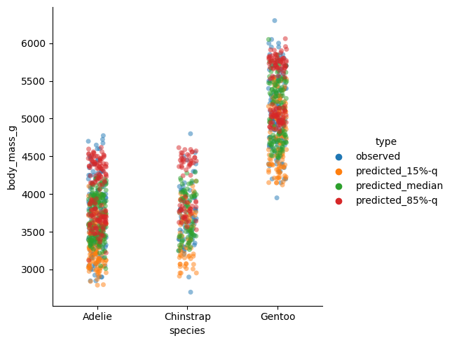
This plot per species seems suspicious. We would expect the 85%-quantile prediction in red to mostly be larger than the median (green), instead we detect several clusters. The reason behind it is the sex of the penguins which also enters the model. To demonstrate this fact, I plot the sex separately and make the species visible by the plot style. This time, I put the flipper length on the x-axis.
sns.relplot(
    df_pred,
    x="flipper_length_mm",
    y="body_mass_g",
    hue="type",
    col="sex",
    style="species",
    alpha=0.5,
)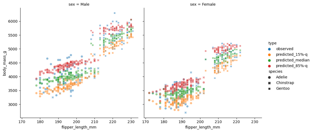
This is a really nice plot:
- One immediately observes the differences in sex on the left and right subplot.
- The two clusters in each subplot can be well explained by the penguin species.
- The 3 quantiles are now vertically in the expected order, 15% quantile in yellow the lowest, 85%-quantile in red the highest, the median in the middle, and some observations beyond those predicted quantiles.
- The models are linear in flipper length with a positive, but slightly different slope per quantile level.
As a final check, let us compute the coverage of each quantile model (in-sample).
[
    np.mean(y <= qr15.predict(X)),
    np.mean(y <= qr50.predict(X)),
    np.mean(y <= qr85.predict(X)),
]
[0.15015015015015015, 0.5225225225225225, 0.8618618618618619]Those numbers are close enough to 15%, 50% and 85%.
As always, the full Python code is available as notebook: https://github.com/lorentzenchr/notebooks/blob/master/blogposts/2023-02-11%20empirical_quantiles.ipynb.
Leave a Reply