My last post was using {hstats}, {kernelshap} and {shapviz} to explain a binary classification random forest. Here, we use the same package combo to improve a Poisson GLM with insights from a boosted trees model.
Insurance pricing data
This time, we work with a synthetic, but quite realistic dataset. It describes 1 Mio insurance policies and their corresponding claim counts. A reference for the data is:
Mayer, M., Meier, D. and Wuthrich, M.V. (2023),
SHAP for Actuaries: Explain any Model.
http://dx.doi.org/10.2139/ssrn.4389797
library(OpenML)
library(lightgbm)
library(splines)
library(ggplot2)
library(patchwork)
library(hstats)
library(kernelshap)
library(shapviz)
#===================================================================
# Load and describe data
#===================================================================
df <- getOMLDataSet(data.id = 45106)$data
dim(df) # 1000000 7
head(df)
# year town driver_age car_weight car_power car_age claim_nb
# 2018 1 51 1760 173 3 0
# 2019 1 41 1760 248 2 0
# 2018 1 25 1240 111 2 0
# 2019 0 40 1010 83 9 0
# 2018 0 43 2180 169 5 0
# 2018 1 45 1170 149 1 1
summary(df)
# Response
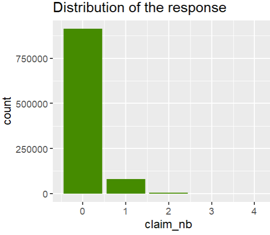
ggplot(df, aes(claim_nb)) +
geom_bar(fill = "chartreuse4") +
ggtitle("Distribution of the response")
# Features
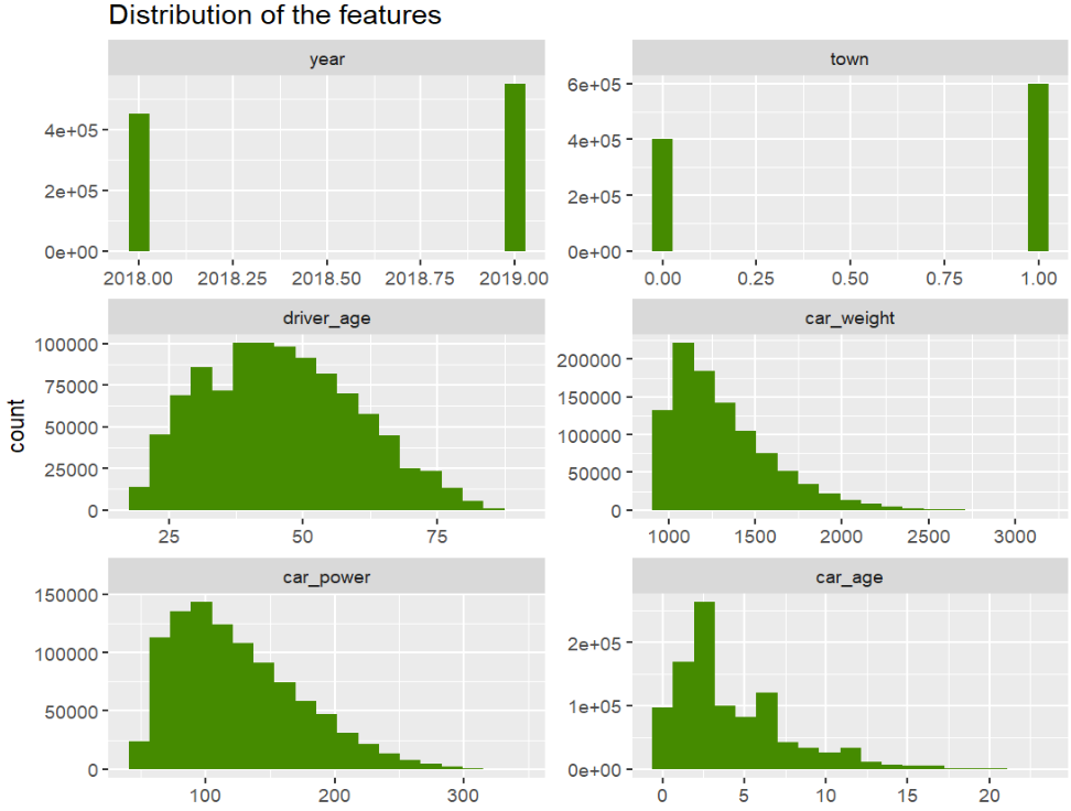
xvars <- c("year", "town", "driver_age", "car_weight", "car_power", "car_age")
df[xvars] |>
stack() |>
ggplot(aes(values)) +
geom_histogram(fill = "chartreuse4", bins = 19) +
facet_wrap(~ind, scales = "free", ncol = 2) +
ggtitle("Distribution of the features")
# car_power and car_weight are correlated 0.68, car_age and driver_age 0.28
df[xvars] |>
cor() |>
round(2)
# year town driver_age car_weight car_power car_age
# year 1 0.00 0.00 0.00 0.00 0.00
# town 0 1.00 -0.16 0.00 0.00 0.00
# driver_age 0 -0.16 1.00 0.09 0.10 0.28
# car_weight 0 0.00 0.09 1.00 0.68 0.00
# car_power 0 0.00 0.10 0.68 1.00 0.09
# car_age 0 0.00 0.28 0.00 0.09 1.00
Modeling
- We fit a naive additive linear GLM and a tuned Boosted Trees model.
- We combine the models and specify their predict function.
# Train/test split
set.seed(8300)
ix <- sample(nrow(df), 0.9 * nrow(df))
train <- df[ix, ]
valid <- df[-ix, ]

# Naive additive linear Poisson regression model
(fit_glm <- glm(claim_nb ~ ., data = train, family = poisson()))

# Boosted trees with LightGBM. The parameters (incl. number of rounds) have been
# by combining early-stopping with random search CV (not shown here)

dtrain <- lgb.Dataset(data.matrix(train[xvars]), label = train$claim_nb)

params <- list(
  learning_rate = 0.05,
  objective = "poisson",
  num_leaves = 7,
  min_data_in_leaf = 50,
  min_sum_hessian_in_leaf = 0.001,
  colsample_bynode = 0.8,
  bagging_fraction = 0.8,
  lambda_l1 = 3,
  lambda_l2 = 5
)

fit_lgb <- lgb.train(params = params, data = dtrain, nrounds = 300)

# {hstats} works for multi-output predictions,
# so we can combine all models to a list, which simplifies the XAI part.
models <- list(GLM = fit_glm, LGB = fit_lgb)

# Custom predictions on response scale
pf <- function(m, X) {
  cbind(
    GLM = predict(m$GLM, X, type = "response"),
    LGB = predict(m$LGB, data.matrix(X[xvars]))
  )
}
pf(models, head(valid, 2))
#       GLM        LGB
# 0.1082285 0.08580529
# 0.1071895 0.09181466

# And on log scale
pf_log <- function(m, X) {
  log(pf(m = m, X = X))
}
pf_log(models, head(valid, 2))
#       GLM       LGB
# -2.223510 -2.455675
# -2.233157 -2.387983 -2.346350
Traditional XAI
Performance
Comparing average Poisson deviance on the validation data shows that the LGB model is clearly better than the naively built GLM, so there is room for improvent!
perf <- average_loss(
  models, X = valid, y = "claim_nb", loss = "poisson", pred_fun = pf
)
perf
#       GLM       LGB
# 0.4362407 0.4331857
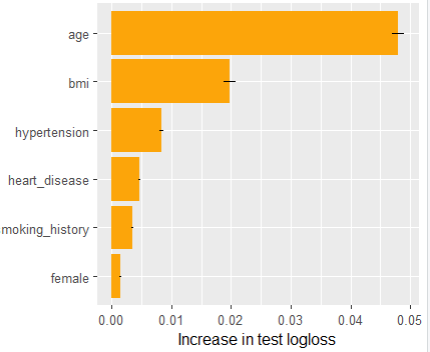
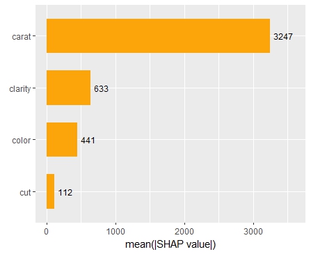
Feature importance
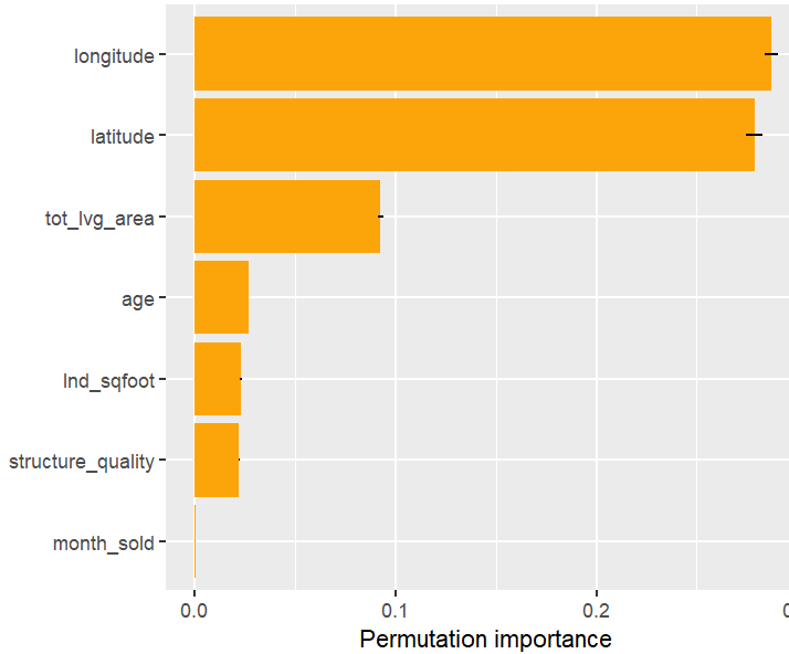
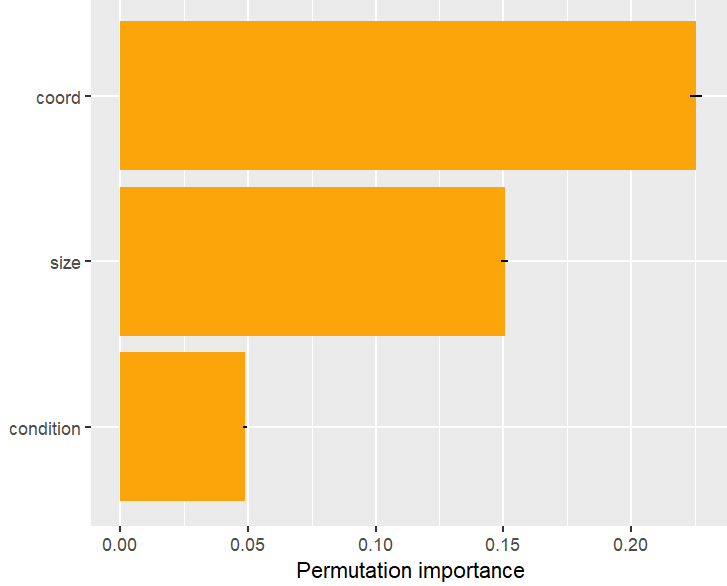
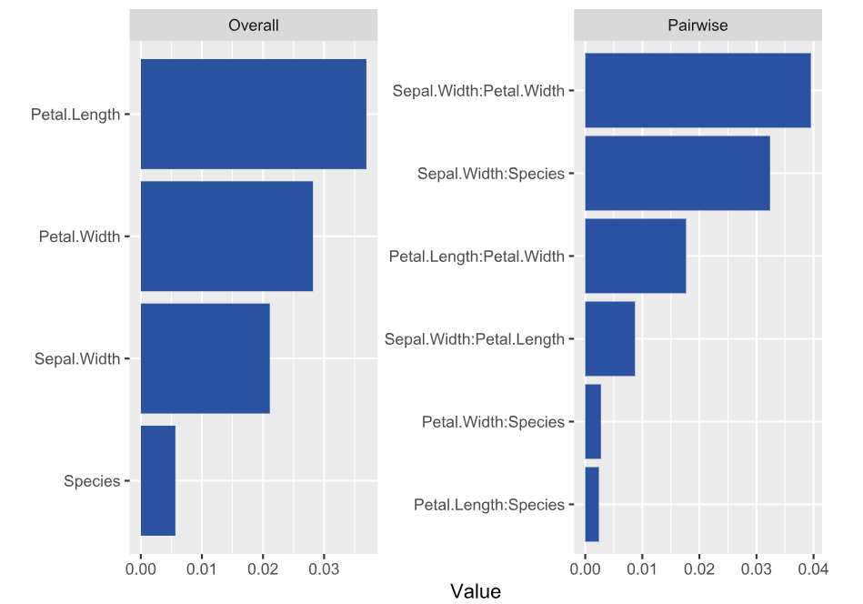
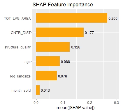
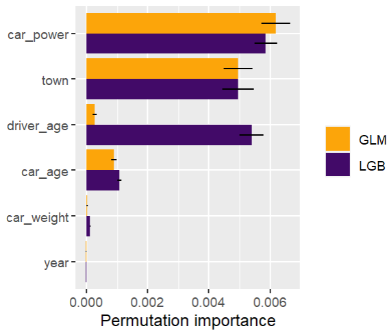
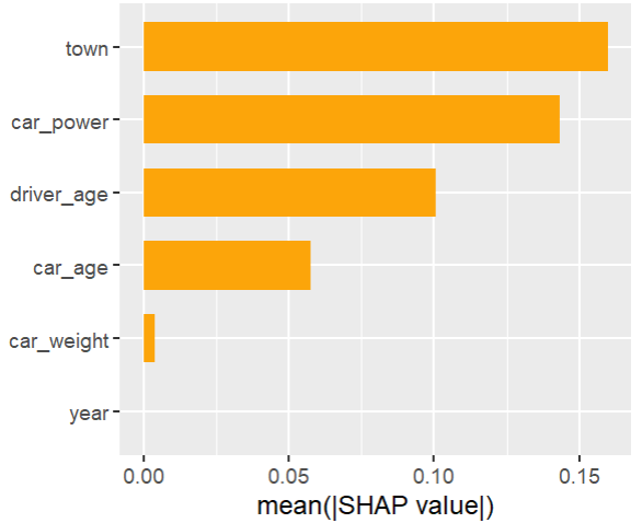
Next, we calculate permutation importance on the validation data with respect to mean Poisson deviance loss. The results make sense, and we note that year and car_weight seem to be negligile.
imp <- perm_importance(
  models, v = xvars, X = valid, y = "claim_nb", loss = "poisson", pred_fun = pf
)
plot(imp)
Main effects
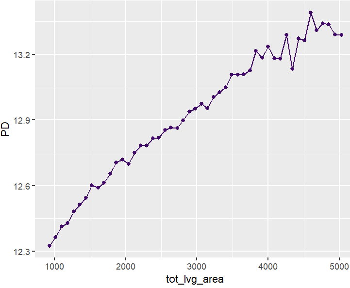
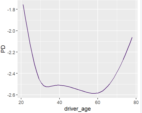
Next, we visualize estimated main effects by partial dependence plots on log link scale. The differences between the models are quite small, with one big exception: Investing more parameters into driver_age via spline will greatly improve the performance and usefulness of the GLM.
partial_dep(models, v = "driver_age", train, pred_fun = pf_log) |>
  plot(show_points = FALSE)

pdp <- function(v) {
  partial_dep(models, v = v, X = train, pred_fun = pf_log) |>
    plot(show_points = FALSE)
}
wrap_plots(lapply(xvars, pdp), guides = "collect") &
  ylim(-2.8, -1.7)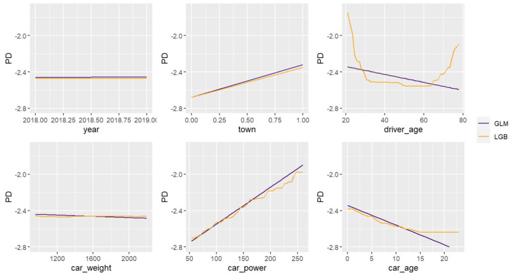
Interaction effects
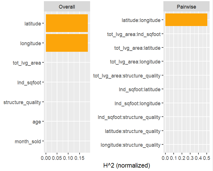
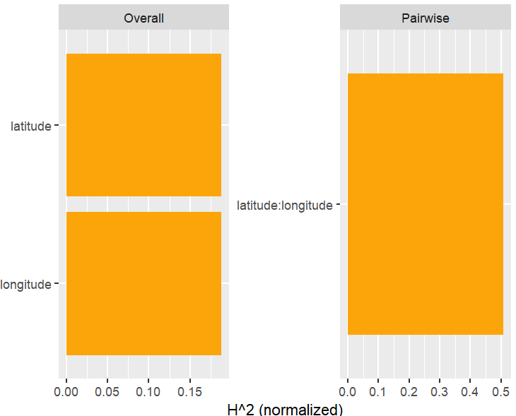
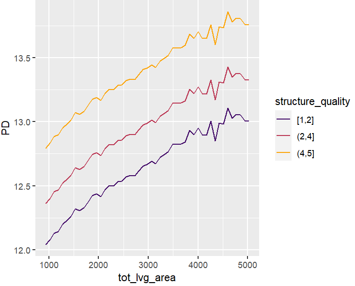
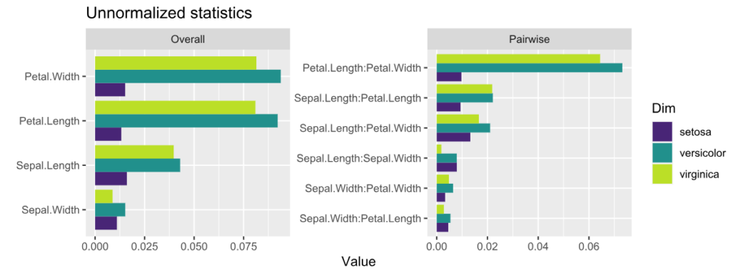
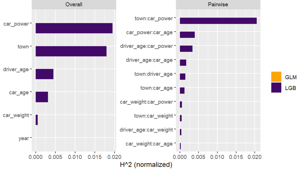
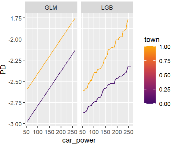
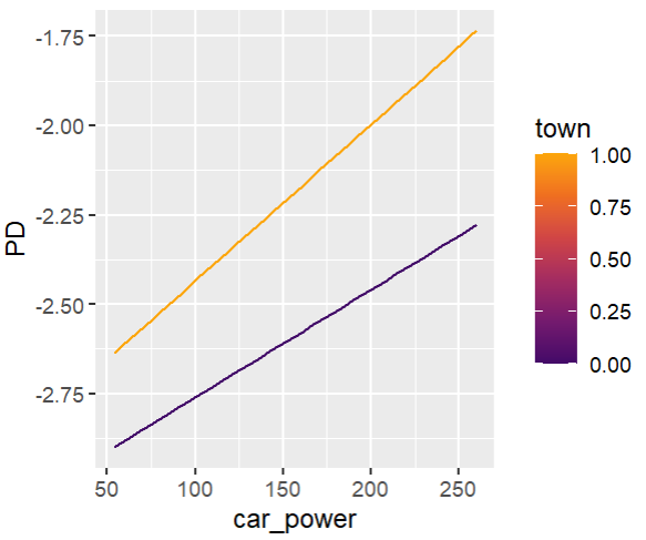
Friedman’s H-squared (per feature and feature pair) and on log link scale shows that – unsurprisingly – our GLM does not contain interactions, and that the strongest relative interaction happens between town and car_power. The stratified PDP visualizes this interaction. Let’s add a corresponding interaction effect to our GLM later.
system.time(  # 5 sec
  H <- hstats(models, v = xvars, X = train, pred_fun = pf_log)
)
H
plot(H)

# Visualize strongest interaction by stratified PDP
partial_dep(models, v = "car_power", X = train, pred_fun = pf_log, BY = "town") |>
  plot(show_points = FALSE)
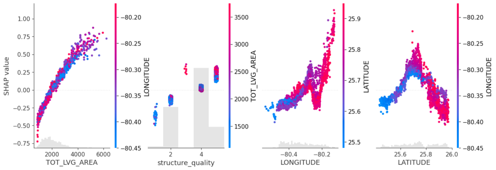
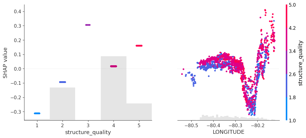
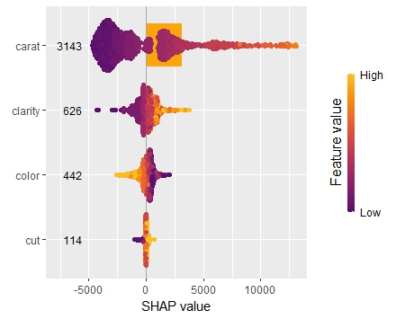
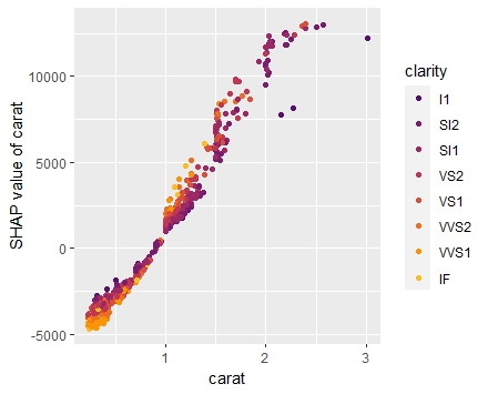
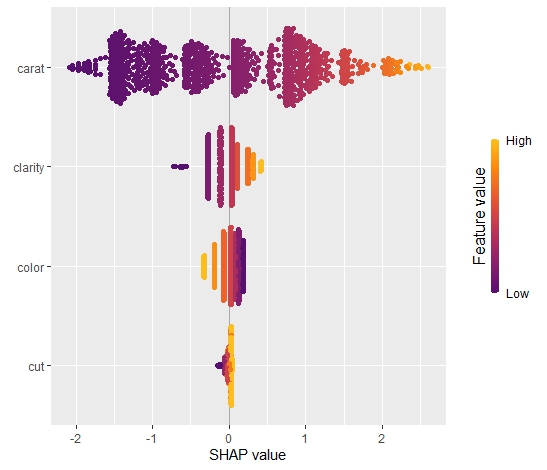
SHAP
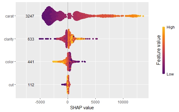
As an elegant alternative to studying feature importance, PDPs and Friedman’s H, we can simply run a SHAP analysis on the LGB model.
set.seed(22)
X_explain <- train[sample(nrow(train), 1000), xvars]

shap_values_lgb <- shapviz(fit_lgb, data.matrix(X_explain))
sv_importance(shap_values_lgb)
sv_dependence(shap_values_lgb, v = xvars) &
  ylim(-0.35, 0.8)
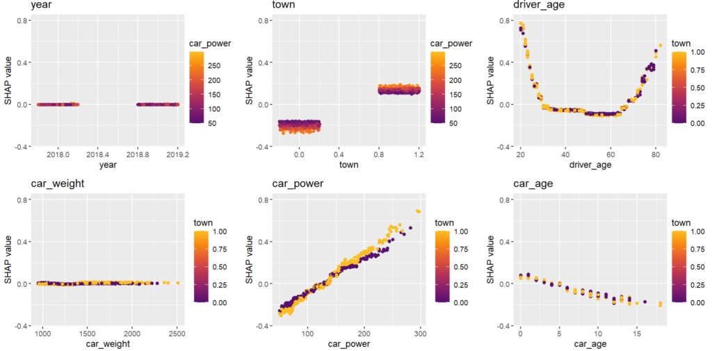
Here, we would come to the same conclusions:
car_weightandyearmight be dropped.- Add a regression spline for
driver_age - Add an interaction between
car_powerandtown.
Pimp the GLM
In the final section, we apply the three insights from above with very good results.
fit_glm2 <- glm(
  claim_nb ~ car_power * town + ns(driver_age, df = 7) + car_age,
  data = train,
  family = poisson()

# Performance now as good as LGB
perf_glm2 <- average_loss(
  fit_glm2, X = valid, y = "claim_nb", loss = "poisson", type = "response"
)
perf_glm2  # 0.432962

# Effects similar as LGB, and smooth
partial_dep(fit_glm2, v = "driver_age", X = train) |>
  plot(show_points = FALSE)

partial_dep(fit_glm2, v = "car_power", X = train, BY = "town") |>
  plot(show_points = FALSE)
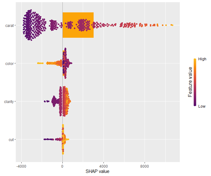
Or even via permutation or kernel SHAP:
set.seed(1)
bg <- train[sample(nrow(train), 200), ]
xvars2 <- setdiff(xvars, c("year", "car_weight"))

system.time(  # 4 sec
  ks_glm2 <- permshap(fit_glm2, X = X_explain[xvars2], bg_X = bg)
)
shap_values_glm2 <- shapviz(ks_glm2)
sv_dependence(shap_values_glm2, v = xvars2) &
  ylim(-0.3, 0.8)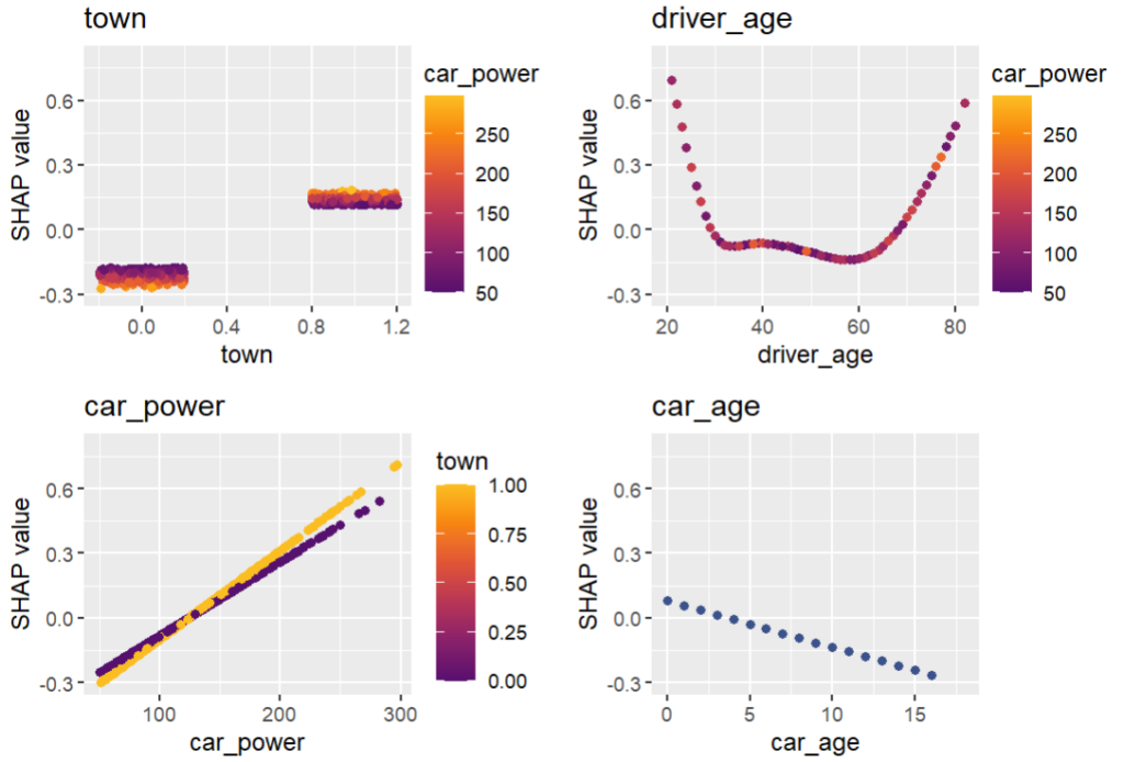
Final words
- Improving naive GLMs with insights from ML + XAI is fun.
- In practice, the gap between GLM and a boosted trees model can’t be closed that easily. (The true model behind our synthetic dataset contains a single interaction, unlike real data/models that typically have much more interactions.)
- {hstats} can work with multiple regression models in parallel. This helps to keep the workflow smooth. Similar for {kernelshap}.
- A SHAP analysis often brings the same qualitative insights as multiple other XAI tools together.