Tabular data has had a comfortable life for years. Gradient boosting showed up, got very good at its job, and then quietly became the default answer to almost everything with rows and columns.
In very recent years, a new player has arrived: the tabular foundation model or prior fitted neural network, and suddenly tabular data is sounding a lot less sleepy…
Very roughly speaking: Such models have been pre-trained on data, where each observation consists of a synthetic dataset (X_train, y_train) with single response y_test corresponding to a single observation x_test. A specialized transformer neural net learns to study (X_train, y_train, x_test) to predict the conditional distribution of y_test as good as possible. Then, a new observation with a new synthetic dataset is generated, and the next iteration is done. The whole process is repeated millions of times. The secret sauce is how to generate the synthetic data to cover the nature of most data sets sufficiently well.
After being pre-trained, ideally, the model can look at your training data (X_train, Y_train) and sees: “hey, this data structure looks familiar, I know how to get predictions for that one”.
The best-known implementation is TabPFN. However in this post, I use tabICLv2 from Inria because it is open source, has a permissive license, and is also extremely strong.
The goal of this blog post is not to bury gradient boosting. It is just to see whether tabular foundation models are a genuine new tool or just a trend that can be ignored.
Comparison with XGBoost on a real dataset
Let’s use a rich dataset with house prices of Miami, originally put together by Prof. Steven Bourassa. It has about 10k observations. The aim is to use a subset of the covariates to predict logarithmic prices.
Load data and build simple XGBoost model
We use a simple XGBoost regressor with default parameters as a strong baseline, using the validation data for early stopping to choose the number of trees.
import numpy as np
import shap
import xgboost as xgb
from sklearn.datasets import fetch_openml
from sklearn.metrics import mean_squared_error
from sklearn.model_selection import train_test_split
# Load data
df = fetch_openml(data_id=43093, as_frame=True)
X, y = df.data, np.log(df.target)
# Data split
x_vars = ["TOT_LVG_AREA", "LND_SQFOOT", "structure_quality", "age", "LONGITUDE", "LATITUDE"]
X_train, X_valid, y_train, y_valid = train_test_split(
X[x_vars], y, test_size=0.2, random_state=30
)
# XGBoost baseline: fit with early stopping
dtrain = xgb.DMatrix(X_train, label=y_train)
dvalid = xgb.DMatrix(X_valid, label=y_valid)
params = {
"learning_rate": 0.2,
"objective": "reg:squarederror",
"max_depth": 5,
}
xgb_model = xgb.train(
params=params,
dtrain=dtrain,
evals=[(dvalid, "valid")],
verbose_eval=20,
early_stopping_rounds=20,
num_boost_round=1000,
)
# Evaluate on validation
xgb_pred = xgb_model.predict(xgb.DMatrix(X_valid))
xgb_mse = mean_squared_error(y_valid, xgb_pred)
print(f"XGBoost validation RMSE: {np.sqrt(xgb_mse):.4}")
# XGBoost validation RMSE: 0.1509
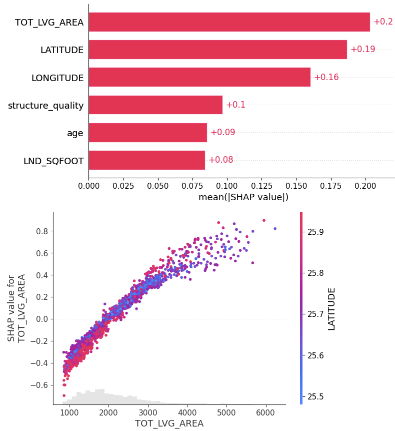
# SHAP analysis
xgb_shap_explainer = shap.Explainer(xgb_model)
xgb_shap_values = xgb_shap_explainer(X_valid)
shap.plots.bar(xgb_shap_values)
shap.plots.scatter(xgb_shap_values[:, "TOT_LVG_AREA"], color=xgb_shap_values)
FIgure A: SHAP analysis for the XGBoost baseline
Now the prior fitted neural net
Note that we have worked in Google Colab to have easy access to GPUs. There, you need to set a Hugging Face access token to download the model weights of the pre-trained model. Many huggs to them for that beautiful hosting job.
from tabicl import TabICLRegressor
tabicl_model = TabICLRegressor(kv_cache=True, random_state=42)
tabicl_model.fit(X_train, y_train) # Only data transformation is fitted, not the model
# Evaluate on validation data
tabicl_pred = tabicl_model.predict(X_valid)
tabicl_mse = mean_squared_error(y_valid, tabicl_pred)
print(f"TabICL validation RMSE: {np.sqrt(tabicl_mse):.4}")
# TabICL validation RMSE: 0.1311
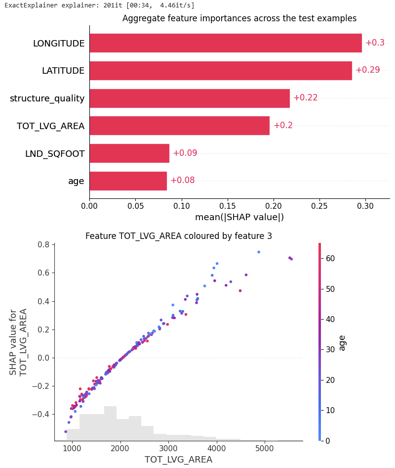
# SHAP analysis
from tabicl.shap import get_shap_values, plot_shap, plot_shap_feature
tabicl_shap_values = get_shap_values(estimator=tabicl_model, X_test=X_valid[:200])
plot_shap(tabicl_shap_values)
plot_shap_feature(tabicl_shap_values, feature="TOT_LVG_AREA")
Figure B: SHAP analysis of the pre-trained model
Comparison
Performance: Without any fine-tuning, the pre-trained model does substantially better than the slightly tuned XGBoost model: RMSE of 0.13 against 0.15. Wow!
Interpretation: TreeSHAP is zillion times faster and more reliable than running an exact permutation SHAP algorithm with a single background row with all values being NA. Still, its better than nothing. But there is room for improvement.
Ease of use: No fine-tuning, just .fit() and .predict(). However, we need some infrastructure (ideally GPU), and access to the model weights. Note that Inria provides tools to fine tune on your own data, which is absolutely insane. We will have a look at that in a later post.
Prediction intervals: Since tabular foundation models predict the full predictive posterior distribution for each observation (actually, a histogram), not only averages as in our example, but also medians or quartile (ranges) and therefore simple prediction intervals can be derived. Also this part I would like to cover later.
Limitations: There are many, e.g., we can’t use too big datasets or the SHAP values are not too realiable.
Just to impressing managers?
Nope. Even I as an absolute boosted tree lover am impressed 🙂
LightSHAP is here – a new, lightweight SHAP implementation for tabular data. While heavily inspired from the famous shap package, it has no dependency on it. LightSHAP simplifies working with dataframes (pandas, polars) and categorical data.
Key Features
Tree Models: TreeSHAP wrappers for XGBoost, LightGBM, and CatBoost via explain_tree()
Model-Agnostic: Permutation SHAP and Kernel SHAP via explain_any()
Visualization: Flexible plots
Highlights of the agnostic explainer:
Exact and sampling versions of permutation SHAP and Kernel SHAP
Sampling versions iterate until convergence, and provide standard errors
Parallel processing via joblib
Supports multi-output models
Supports case weights
Accepts numpy, pandas, and polars input, and categorical features
Some methods of the explanation object:
plot.bar(): Feature importance bar plot
plot.beeswarm(): Summary beeswarm plot
plot.scatter(): Dependence plots
plot.waterfall(): Waterfall plot for individual explanations
importance(): Returns feature importance values
set_X(): Update explanation data, e.g., to replace a numpy array with a DataFrame
set_feature_names(): Set or update feature names
select_output(): Select a specific output for multi-output models
filter(): Subset explanations by condition or indices
…
Usage
Let’s demonstrate the two workhorses explain_tree() and explain_any() with small examples.
Prepare diamonds data
import catboost
import numpy as np
import seaborn as sns
import statsmodels.formula.api as smf

# pip install lightshap
from lightshap import explain_any, explain_tree

# Prepare data
df0 = sns.load_dataset("diamonds")

df = df0.assign(
    log_carat=lambda x: np.log(x.carat),
    log_price=lambda x: np.log(x.price),
)

# Features only
X = df[["log_carat", "clarity", "color", "cut"]]
Fit and explain boosted trees model
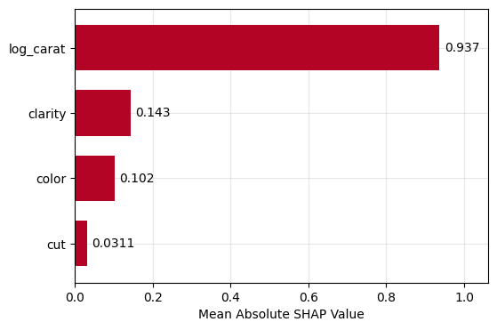
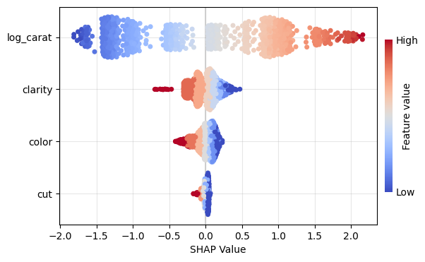
Let’s (naively) build a small CatBoost model and explain ot using a sample of 1000 observations.
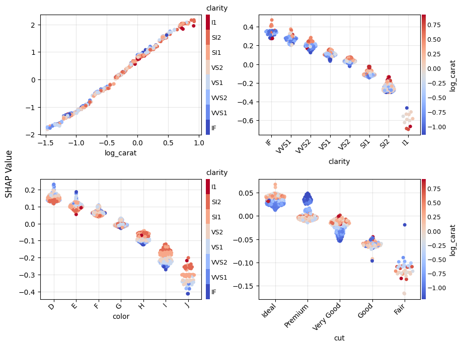
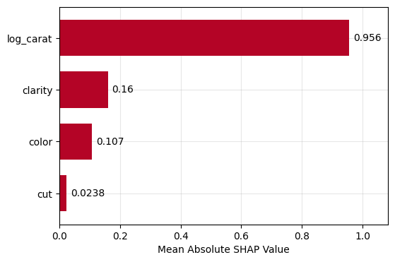
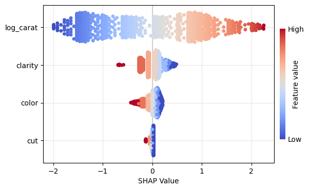
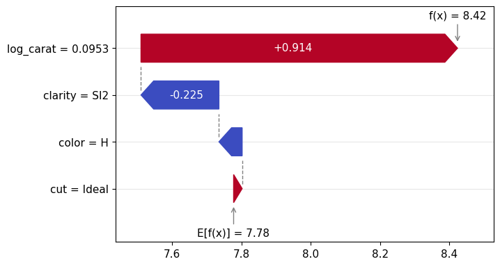
Figure 1: SHAP importance bar plot for the CatBoost modelFigure 2: SHAP beeswarm plot for the CatBoost modelFigure 3: SHAP dependence plots for the CatBoost modelFigure 4: Explaining an individual prediction via SHAP waterfall plot for the CatBoost model
Fit and explain any model
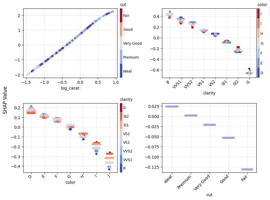
To demonstate the model agnostic SHAP cruncher explain_any(), let’s fit a linear regression model with interactions and natural cubic spline.
lm = smf.ols("log_price ~ cr(log_carat, df=4) + clarity * color + cut", data=df)
lm = lm.fit()

# SHAP analysis - automatically picking exact permutation SHAP
# due to the small number of features
X_explain = X.sample(1000, random_state=0)
lm_explanation = explain_any(lm.predict, X_explain)  # 5s on laptop

lm_explanation.plot.bar()
lm_explanation.plot.beeswarm()
lm_explanation.plot.scatter(sharey=False)
lm_explanation.plot.waterfall(row_id=0)
Figure 5: SHAP importance plot for the linear regressionFigure 6: SHAP beeswarm plot for the linear regressionFigure 7: SHAP dependence plots for the linear regressionFigure 8: SHAP waterfall plot to explain a single prediction of the linear regression
How to contribute?
Test, test, test: The more people are using and testing the current beta version of the package, the better it will get.
Open issues: If you see problems or gaps, please open an issue. Then we will discuss if/who will work on this.
Future plans
In its current early stage, the project is still a “one-man show”. While growing, the aim is to move the project to a bigger organisation, e.g., a university.
SHAP interaction strength for the XGBoost model (single variables reflect SHAP main effect strength).
Our two sister packages are continuously being improved. A brief summary of the latest changes:
shapviz (v0.10.2)
Identical axes, axis titles and color bars are now collected across dependence plots.
Dependence plots have received arguments share_y=FALSE and ylim=NULL for better comparability across subplots.
New visualization for SHAP interaction strenght via sv_interaction(kind="bar"). It shows mean absolute SHAP interaction/main effects, where the interaction values are multiplied by two for symmetry.
kernelshap (v0.9.1)
permshap() now offers a balanced sampling version which iterates until convergence and returns standard errors. It is used by default when the model has more than eight features, or by setting exact=FALSE.
Fixed an error in kernelshap() which made the resulting values slightly off for models with interactions of order three or higher. Now, the exact version returns the same values as exact permutation SHAP and agrees with the exact explainer in Python’s shap package.
Illustrating sampling permutation SHAP
Let’s use a beautiful dataset on medical costs to fit a log-linear Gamma GLM with interactions between all features and smoking, and explain it by SHAP on log prediction (= linear) scale.
Since the model does not contain interactions of order above 2, the SHAP values perfectly reconstruct the estimated model coefficients, see our recent paper on https://arxiv.org/abs/2508.12947 for a proof.
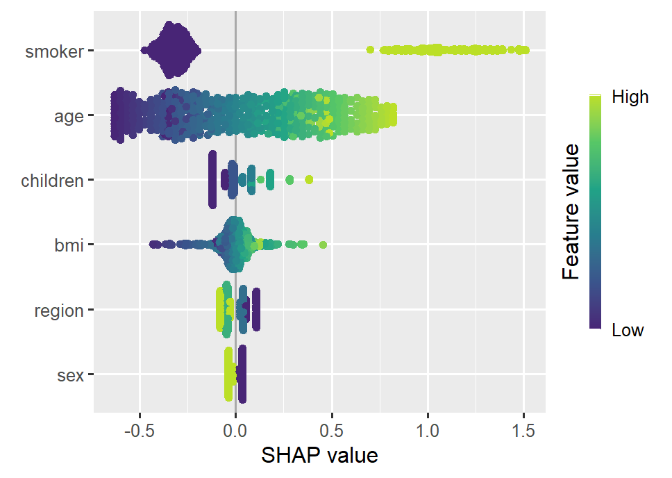
Smoking and age are the most important features. Some strong interactions with smoking are visible.
R
library(xgboost)
library(ggplot2)
library(patchwork)
library(shapviz)
library(kernelshap)
options(shapviz.viridis_args = list(option = "D", begin = 0.1, end = 0.9))
set.seed(1)
# https://github.com/stedy/Machine-Learning-with-R-datasets
df <- read.csv("https://raw.githubusercontent.com/stedy/Machine-Learning-with-R-datasets/refs/heads/master/insurance.csv")
# Gamma GLM with interactions
fit_glm <- glm(charges ~ . * smoker, data = df, family = Gamma(link = "log"))
# Use SHAP to explain
xvars <- c("age", "sex", "bmi", "children", "smoker", "region")
X_explain <- head(df[xvars], 500)
# The new sampling permutation algo (forced with exact = FALSE)
shap_glm <- permshap(fit_glm, X_explain, exact = FALSE, seed = 1) |>
shapviz()
sv_importance(shap_glm, kind = "bee")
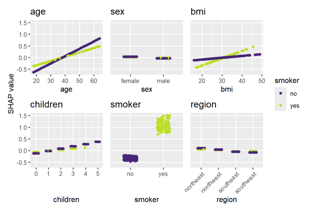
sv_dependence(
shap_glm,
v = xvars,
share_y = TRUE,
color_var = "smoker"
)
SHAP beeswarm plot of the Gamma GLMSHAP dependence plots of the Gamma GLM, using “smoking” on the color scale
Illustrating SHAP interaction strength
As a second example, we sloppily fit an XGBoost model with Gamma deviance loss to illustrate some of the SHAP interaction functionality of {shapviz}. As with the GLM, the SHAP values are being calculated on log scale.
For the sake of brevity, we focus on plots visualizing SHAP interactions. In practice, make sure to use a clean train/test/(x-)validation and tuning approach.
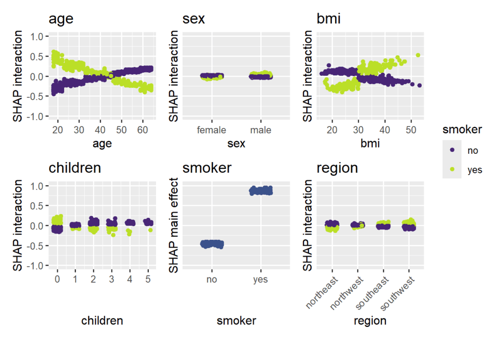
The strongest interaction effects (smoker * age, smoker * bmi) are stronger than most main effects. Not all interactions seem natural.
R
# XGBoost model (sloppily without tuning)
X_num <- data.matrix(df[xvars])
fit_xgb <- xgb.train(
  params = list(objective = "reg:gamma", learning_rate = 0.2),
  data = xgb.DMatrix(X_num, label = df$charges),
  nrounds = 100
)

shap_xgb <- shapviz(fit_xgb, X_pred = X_num, X = df, interactions = TRUE)

# SHAP interaction/main-effect strength
sv_interaction(shap_xgb, kind = "bar", fill = "darkred")

# Study interaction/main-effects of "smoking"
sv_dependence(
  shap_xgb,
  v = xvars,
  color_var = "smoker",
  ylim = c(-1, 1),
  interactions = TRUE
) + # we rotate axis labels of *last* plot, otherwise use &
  guides(x = guide_axis(angle = 45))
SHAP interaction strength for the XGBoost model (single variables reflect SHAP main effect strength). SHAP interaction effects with smoking for the XGBoost model, including the main effect of smoking
Keep an eye on these two packages for further improvements… 🙂
In this post, we show how different use cases require different model diagnostics. In short, we compare (statistical) inference and prediction.
As an example, we use a simple linear model for the Munich rent index dataset, which was kindly provided by the authors of Regression – Models, Methods and Applications 2nd ed. (2021). This dataset contains monthy rents in EUR (rent) for about 3000 apartments in Munich, Germany, from 1999. The apartments have several features such as living area (area) in squared meters, year of construction (yearc), quality of location (location, 0: average, 1: good, 2: top), quality of bath rooms (bath, 0:standard, 1: premium), quality of kitchen (kitchen, 0: standard, 1: premium), indicator for central heating (cheating).
The target variable is Y=\text{rent} and the goal of our model is to predict the mean rent, E[Y] (we omit the conditioning on X for brevity).
Disclaimer: Before presenting the use cases, let me clearly state that I am not in the apartment rent business and everything here is merely for the purpose of demonstrating statistical good practice.
Inference
The first use case is about inference of the effect of the features. Imagine the point of view of an investor who wants to know whether the installation of a central heating is worth it (financially). To lay the ground on which to base a decision, a statistician must have answers to:
What is the effect of the variable cheating on the rent.
Is this effect statistically significant?
Prediction
The second use case is about prediction. This time, we take the point of view of someone looking out for a new apartment to rent. In order to know whether the proposed rent by the landlord is about right or improper (too high), a reference value would be very convenient. One can either ask the neighbors or ask a model to predict the rent of the apartment in question.
Model Fit
Before answering the above questions and doing some key diagnostics, we must load the data and fit a model. We choose a simple linear model and directly model rent.
Notes:
For rent indices as well as house prices, one often log-transforms the target variable before modelling or one uses a log-link and an appropriate loss function (e.g. Gamma deviance).
Our Python version uses GeneralizedLinearRegressor from the package glum. We could as well have chosen other implementations like statsmodels.regression.linear_model.OLS. This way, we have to implement the residual diagnostics ourselves which makes it clear what is plotted.
For brevity, we skip imports and data loading. Our model is then fit by:
Python
R
lm = glum.GeneralizedLinearRegressor(
    alpha=0,
    drop_first=True,  # this is very important if alpha=0
    formula="bs(area, degree=3, df=4) + yearc"
      	" + C(location) + C(bath) + C(kitchen) + C(cheating)"
)
lm.fit(X_train, y_train)
model = lm(
  formula = rent ~ bs(area, degree = 3, df = 4) + yearc + location + bath + kitchen + cheating,
  data = df_train
)
Diagnostics for Inference
The coefficient table will already tell us the effect of the cheating variable. For more involved models like gradient boosted trees or neural nets, one can use partial dependence and shap values to assess the effect of features.
Python
R
lm.coef_table(X_train, y_train)
summary(model)
confint(model)
Variable
coef
se
p_value
ci_lower
ci_upper
intercept
-3682.5
327.0
0.0
-4323
-3041
bs(area, ..)[1]
88.5
31.3
4.6e-03
27
150
bs(area,..)[2]
316.8
24.5
0.0
269
365
bs(area, ..)[3]
547.7
62.8
0.0
425
671
bs(area, ..)[4]
733.7
91.7
1.3e-15
554
913
yearc
1.9
0.2
0.0
1.6
2.3
C(location)[2]
48.2
5.9
4.4e-16
37
60
C(location)[3]
137.9
27.7
6.6e-07
84
192
C(bath)[1]
50.0
16.5
2.4e-03
18
82
C(kitchen)[1]
98.2
18.5
1.1e-07
62
134
C(cheating)[1]
107.8
10.6
0.0
87.0
128.6
We see that ceteris paribus, meaning all else equal, a central heating increases the monthly rent by about 108 EUR. Not the size of the effect of 108 EUR, but the fact that there is an effect of central heating on the rent seems statistically significant: This is indicated by the very low probability, i.e. p-value, for the null-hypothesis of cheating having a coefficient of zero. We also see that the confidence interval with the default confidence level of 95%: [ci_lower, ci_upper] = [87, 129]. This shows the uncertainty of the estimated effect.
For a building with 10 apartments and with an investment horizon of about 10 years, the estimated effect gives roughly a budget of 13000 EUR (range is roughly 10500 to 15500 with 95% confidence).
A good statistician should ask several further questions:
Is the dataset at hand a good representation of the population?
Are there confounders or interaction effects, in particular between cheating and other features?
Are the assumptions for the low p-value and the confidence interval of cheating valid?
Here, we will only address the last question, and even that one only partially. Which assumptions were made? The error term, \epsilon = Y - E[Y], should be homoscedastic and Normal distributed. As the error is not observable (because the true model for E[Y] is unknown), one replaces E[Y] by the model prediction \hat{E}[Y], this gives the residuals, \hat{\epsilon} = Y - \hat{E}[Y] = y - \text{fitted values}, instead. For homoscedasticity, the residuals should look like white (random) noise. Normality, on the other hand, becomes less of a concern with larger data thanks to the central limit theorem. With about 3000 data points, we are far away from small data, but it might still be a good idea to check for normality.
The diagnostic tools to check that are residual and quantile-quatile (QQ) plots.
Python
R
# See notebook for a definition of residual_plot.
import seaborn as sns
fig, axes = plt.subplots(ncols=2, figsize=(4.8 * 2.1, 6.4))
ax = residual_plot(model=lm, X=X_train, y=y_train, ax=axes[0])
sns.kdeplot(
    x=lm.predict(X_train),
    y=residuals(lm, X_train, y_train, kind="studentized"),
    thresh=.02,
    fill=True,
    ax=axes[1],
).set(
    xlabel="fitted",
    ylabel="studentized residuals",
    title="Contour Plot of Residuals",
)
autoplot(model, which = c(1, 2))  # from library ggfortify
# density plot of residuals
ggplot(model, aes(x = .fitted, y = .resid)) + geom_point() +
  geom_density_2d() + geom_density_2d_filled(alpha = 0.5)
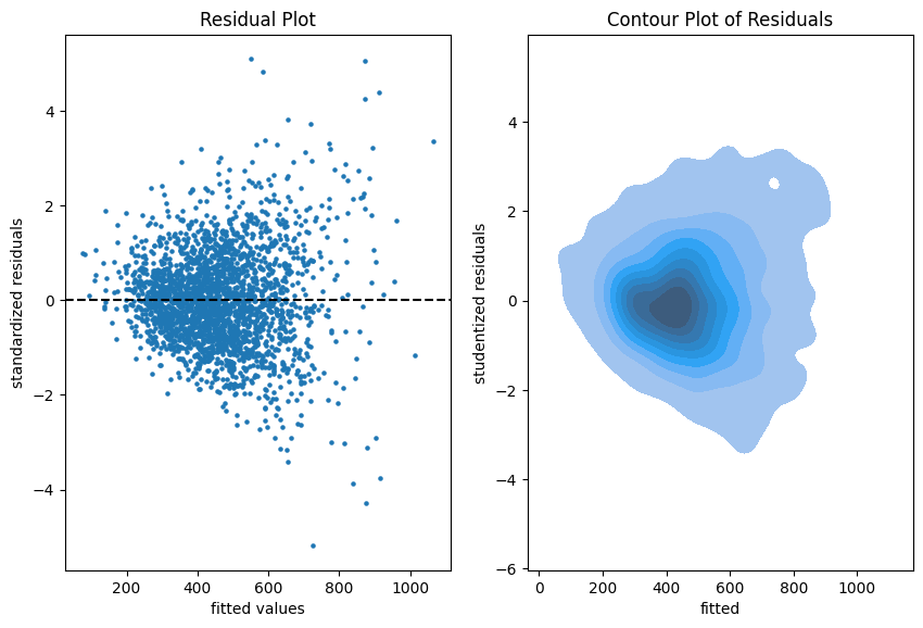
Residual plots on the training data.
The more data points one has the less informative is a scatter plot. Therefore, we put a contour plot on the right.
Visual insights:
There seems to be a larger variability for larger fitted values. This is a hint that the homoscedasticity might be violated.
The residuals seem to be centered around 0. This is a hint that the model is well calibrated (adequate).
Python
R
# See notebook for a definition of qq_plot.
qq_plot(lm, X_train, y_train)
autoplot(model, which = 2)
The QQ-plot shows the quantiles of the theoretical assumed distribution of the residuals on the x-axis and the ordered values of the residuals on the y-axis. In the Python version, we decided to use the studentized residuals because normality of the error implies a student (t) distribution for these residuals.
Concluding remarks:
We might do similar plots on the test sample, but we don’t necessarily need a test sample to answer the inference questions.
It is good practice to plot the residuals vs each of the features as well.
Diagnostics for Prediction
If we are only interested in predictions of the mean rent, \hat{E}[Y], we don’t care much about the probability distribution of Y. We just want to know if the predictions are close enough to the real mean of the rent E[Y]. In a similar argument as for the error term and residuals, we have to accept that E[Y] is not observable (it is the quantity that we want to predict). So we have to fall back to the observations of Y in order to judge if our model is well calibrated, i.e., close the the ideal E[Y].
Very importantly, here we make use of the test sample in all of our diagnostics because we fear the in-sample bias.
We start simple by a look at the unconditional calibration, that is the average (negative) residual \frac{1}{n}\sum(\hat{E}[Y_i]-Y_i).
print(paste("Train set mean residual:", mean(resid(model))))
print(paste("Test set mean residual: ", mean(df_test$rent - predict(model, df_test))))
set
mean bias
count
stderr
p-value
train
-3.2e-12
2465
2.8
1.0
test
2.1
617
5.8
0.72
It is no surprise that bias_mean in the train set is almost zero. This is the balance property of (generalized) linear models (with intercept term). On the test set, however, we detect a small bias of about 2 EUR per apartment on average.
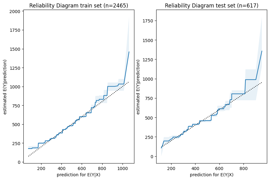
Next, we have a look a reliability diagrams which contain much more information about calibration and bias of a model than the unconditional calibration above. In fact, it assesses auto-calibration, i.e. how well the model uses its own information. An ideal model would lie on the dotted diagonal line.
Python
R
fig, axes = plt.subplots(ncols=2, figsize=(4.8 * 2.1, 6.4))
plot_reliability_diagram(y_obs=y_train, y_pred=lm.predict(X_train), n_bootstrap=100, ax=axes[0])
axes[0].set_title(axes[0].get_title() + f" train set (n={X_train.shape[0]})")
plot_reliability_diagram(y_obs=y_test, y_pred=lm.predict(X_test), n_bootstrap=100, ax=axes[1])
axes[1].set_title(axes[1].get_title() + f" test set (n={X_test.shape[0]})")
iso_train = isoreg(x = model$fitted.values, y = df_train$rent)
iso_test = isoreg(x = predict(model, df_test), y = df_test$rent)
bind_rows(
  tibble(set = "train", x = iso_train$x[iso_train$ord], y = iso_train$yf),
  tibble(set = "test", x = iso_test$x[iso_test$ord], y = iso_test$yf),
) |>
  ggplot(aes(x=x, y=y, color=set)) + geom_line() +
  geom_abline(intercept = 0, slope = 1, linetype="dashed") +
  ggtitle("Reliability Diagram")
Visual insights:
Graphs on train and test set look very similar. The larger uncertainty intervals on the test set stem from the fact that is has a smaller sample size.
The model seems to lie around the diagonal indicating good auto-calibration for the largest part of the range.
Very high predicted values seem to be systematically too low, i.e. the graph is above the diagonal.
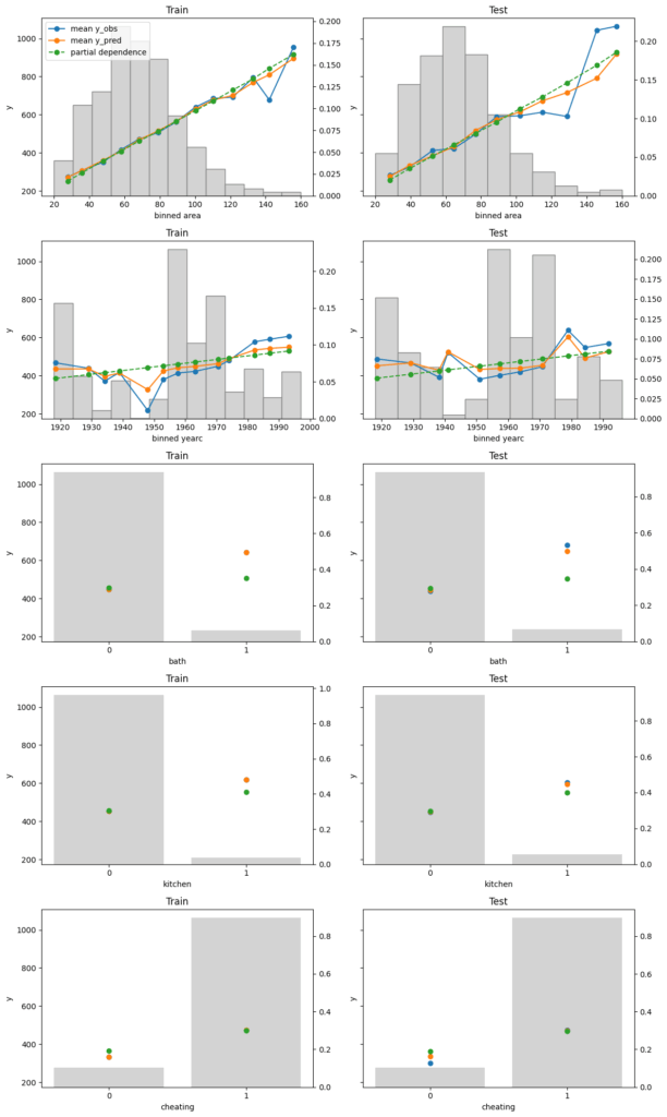
Finally, we assess conditional calibration, i.e. the calibration with respect to the features. Therefore, we plot one of our favorite graphs for each feature. It consists of:
average observed value of Y for each (binned) value of the feature
average predicted value
partial dependence
histogram of the feature (grey, right y-axis)
Python
R
fig, axes = plt.subplots(nrows=5, ncols=2, figsize=(12, 5*4), sharey=True)
for i, col in enumerate(["area", "yearc", "bath", "kitchen", "cheating"]):
    plot_marginal(
        y_obs=y_train,
        y_pred=lm.predict(X_train),
        X=X_train,
        feature_name=col,
        predict_function=lm.predict,
        ax=axes[i][0],
    )
    plot_marginal(
        y_obs=y_test,
        y_pred=lm.predict(X_test),
        X=X_test,
        feature_name=col,
        predict_function=lm.predict,
        ax=axes[i][1],
    )
    axes[i][0].set_title("Train")
    axes[i][1].set_title("Test")
    if i != 0:
        axes[i][0].get_legend().remove()
    axes[i][1].get_legend().remove()
fig.tight_layout()
xvars = c("area", "yearc", "bath", "kitchen", "cheating")
m_train = feature_effects(model, v = xvars, data = df_train, y = df_train$rent)
m_test = feature_effects(model, v = xvars, data = df_test, y = df_test$rent)

c(m_train, m_test) |>
  plot(
    share_y = "rows",
    ncol = 2,
    byrow = FALSE,
    stats = c("y_mean", "pred_mean", "pd"),
    subplot_titles = FALSE,
    # plotly = TRUE,
    title = "Left: Train - Right: Test",
  )
Visual insights:
On the train set, the categorical features seem to have perfect calibration as average observed equals average predicted. This is again a result of the balance property. On the test set, we see a deviation, especially for the categorical level with smaller sample size. This is a good demonstration why plotting on both train and test set is a good idea.
The numerical features area and year of construction seem fine, but a closer look can’t hurt.
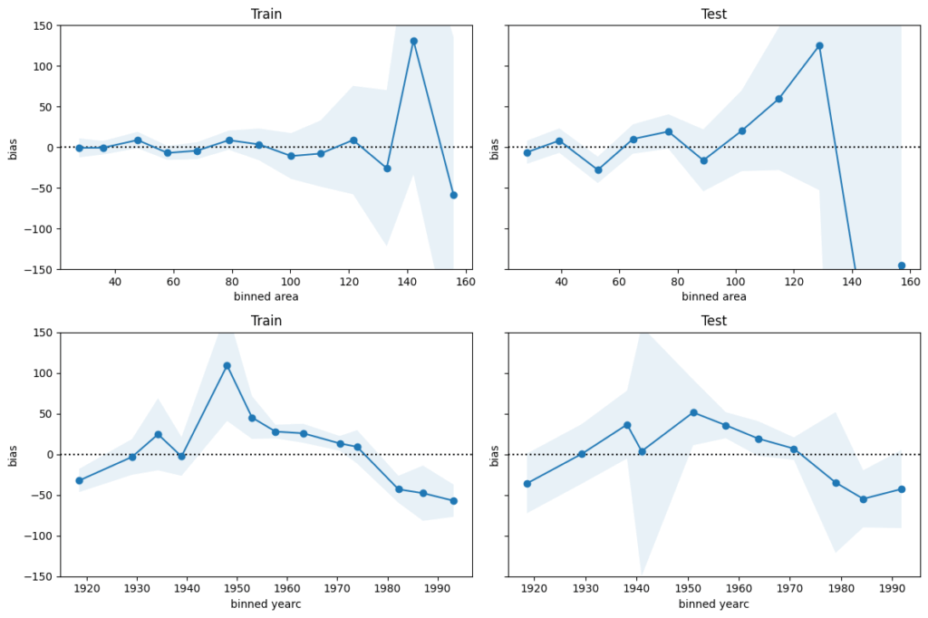
We next perform a bias plot, which is plotting the average difference of predicted minus observed per feature value. The values should be around zero, so we can zoom in on the y-axis. This is very similar to the residual plot, but the information is better condensed for its purpose.
Python
R
fig, axes = plt.subplots(nrows=2, ncols=2, figsize=(12, 2*4), sharey=True)
axes[0,0].set_ylim(-150, 150)
for i, col in enumerate(["area", "yearc"]):
    plot_bias(
        y_obs=y_train,
        y_pred=lm.predict(X_train),
        feature=X_train[col],
        ax=axes[i][0],
    )
    plot_bias(
        y_obs=y_test,
        y_pred=lm.predict(X_test),
        feature=X_test[col],
        ax=axes[i][1],
    )
    axes[i][0].set_title("Train")
    axes[i][1].set_title("Test")
fig.tight_layout()
For large values of area and yearc in the 1940s and 1950s, there are only few observations available. Still, the model might be improved for those regions.
The bias of yearc shows a parabolic curve. The simple linear effect in our model seems too simplistic. A refined model could use splines instead, as for area.
Concluding remarks:
The predictions for area larger than around 120 square meters and for year of construction around the 2nd world war are less reliable.
For all the rest, the bias is smaller than 50 EUR on average. This is therefore a rough estimation of the prediction uncertainty. It should be enough to prevent improperly high (or low) rents (on average).
Edited on 2025-05-01: Multiple improvements by Christian, especially on making Polars neater, DuckDB faster, and the plot easier to read.
From time to time, the following questions pop up:
How to calculate grouped counts and (weighted) means?
What are fast ways to do it in R?
This blog post presents a couple of approaches and then compares their speed with a naive (non-scientific!) benchmark.
Base R
There are many ways to calculate grouped counts and means in base R, e.g., aggregate(), tapply(), by(), split() + lapply(). In my experience, the fastest way is a combination of tabulate() and rowsum().
R
# Make data
set.seed(1)

n <- 1e6

y <- rexp(n)
w <- runif(n)
g <- factor(sample(LETTERS[1:3], n, TRUE))
df <- data.frame(y = y, g = g, w = w)

# Grouped counts
tabulate(g)
# 333469 333569 332962

# Grouped means
rowsum(y, g) / tabulate(g)
      [,1]
# A 1.000869
# B 1.001043
# C 1.000445

# Grouped weighted mean
ws <- rowsum(data.frame(y = y * w, w), g)
ws[, 1L] / ws[, 2L]
# 1.0022749 1.0017816 0.9997058
But: tabulate() ignores missing values. To avoid problems, create an explicit missing level via factor(x, exclude = NULL).
Let’s turn to some other approaches.
dplyr
Not optimized for speed or memory, but the de-facto standard in data processing with R. I love its syntax.
Does not need an introduction. Since 2006 the package for fast data manipulation written in C.
R
library(data.table)

dt <- data.table(df)

# Grouped counts (use keyby for sorted output)
dt[, .N, by = g]
#         g      N
#    <fctr>  <int>
# 1:      C 332962
# 2:      B 333569
# 3:      A 333469

# Grouped means
dt[, mean(y), by = g]

# Grouped weighted means
dt[, sum(w * y) / sum(w), by = g]
dt[, weighted.mean(y, w), by = g]
DuckDB
Extremely powerful query engine / database system written in C++, with initial release in 2019, and R bindings since 2020. Allows larger-than-RAM calculations.
R
library(duckdb)

con <- dbConnect(duckdb())

# only registers: duckdb_register(con, name = "df", df = df)
dbWriteTable(con, name = "df", value = df)

dbGetQuery(con, "SELECT g, COUNT(*) N FROM df GROUP BY g")
dbGetQuery(con, "SELECT g, AVG(y) AS mean FROM df GROUP BY g")
con |>
  dbGetQuery(
  "
  SELECT g, SUM(y * w) / sum(w) as wmean
  FROM df
  GROUP BY g
  "
  )
#   g     wmean
# 1 A 1.0022749
# 2 B 1.0017816
# 3 C 0.9997058
collapse
C/C++-based package for data transformation and statistical computing. {collapse} was initially released on CRAN in 2020. It can do much more than grouped calculations, check it out!
R
library(collapse)

fcount(g)
fnobs(g, g) # Faster and does not need memory, but ignores missing values
fmean(y, g = g)
fmean(y, g = g, w = w)
#         A         B         C
# 1.0022749 1.0017816 0.9997058
Polars
R bindings of the fantastic Polars project that started in 2020. First R release in 2022. Currently under heavy revision.
The current package is not up-to-date with the main project, thus we expect the revised version (available in this branch) to be faster.
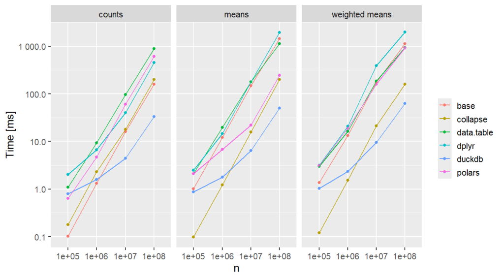
Let’s compare the speed of these approaches for sample sizes up to 10^8 using a Windows system with an Intel i7-13700H CPU.
This is not at all meant as a scientific benchmark!
R
# We run the code in a fresh session
library(tidyverse) # 2.0.0
library(duckdb) # 1.2.1
library(data.table) # 1.16.0
library(collapse) # 2.0.19
library(polars) # 0.22.3

polars_info() # 8 threads
setDTthreads(8)
con <- dbConnect(duckdb(config = list(threads = "8")))

set.seed(1)

N <- 10^(5:8)
m_queries <- 3
results <- vector("list", length(N) * m_queries)

for (i in seq_along(N)) {
  n <- N[i]

  # Create data
  y <- rexp(n)
  w <- runif(n)
  g <- factor(sample(LETTERS, n, TRUE))

  df <- tibble(y = y, g = g, w = w)
  dt <- data.table(df)
  dfp <- as_polars_df(df)
  dbWriteTable(con, name = "df", value = df, overwrite = TRUE)

  # Grouped counts
  results[[1 + (i - 1) * m_queries]] <- bench::mark(
    base = tabulate(g),
    dplyr = dplyr::count(df, g),
    data.table = dt[, .N, by = g],
    polars = dfp$get_column("g")$value_counts(),
    collapse = fcount(g),
    duckdb = dbGetQuery(con, "SELECT g, COUNT(*) N FROM df GROUP BY g"),
    check = FALSE,
    min_iterations = 3,
  ) |>
    bind_cols(n = n, query = "counts")

  results[[2 + (i - 1) * m_queries]] <- bench::mark(
    base = rowsum(y, g) / tabulate(g),
    dplyr = df |> group_by(g) |> summarize(mean(y)),
    data.table = dt[, mean(y), by = g],
    polars = dfp$group_by("g")$agg(pl$col("y")$mean()),
    collapse = fmean(y, g = g),
    duckdb = dbGetQuery(con, "SELECT g, AVG(y) AS mean FROM df GROUP BY g"),
    check = FALSE,
    min_iterations = 3
  ) |>
    bind_cols(n = n, query = "means")

  results[[3 + (i - 1) * m_queries]] <- bench::mark(
    base = {
      ws <- rowsum(data.frame(y = y * w, w), g)
      ws[, 1L] / ws[, 2L]
    },
    dplyr = df |> group_by(g) |> summarize(sum(w * y) / sum(w)),
    data.table = dt[, sum(w * y) / sum(w), by = g],
    polars = (
      dfp
      $group_by("g")
      $agg((pl$col("y") * pl$col("w"))$sum() / pl$col("w")$sum())
    ),
    collapse = fmean(y, g = g, w = w),
    duckdb = dbGetQuery(
      con,
      "SELECT g, SUM(y * w) / sum(w) as wmean FROM df GROUP BY g"
    ),
    check = FALSE,
    min_iterations = 3
  ) |>
    bind_cols(n = n, query = "weighted means")
}

results_df <- bind_rows(results) |>
  group_by(n, query) |>
  mutate(
    time = as.numeric(median) * 1000, # ms
    n = as.factor(n),
    approach = as.character(expression),
    relative = as.numeric(time / min(time))
  ) |>
  ungroup()

ggplot(
  results_df, aes(y = time, x = n, group = approach, color = approach)
) +
  geom_point() +
  geom_line() +
  scale_y_log10(labels = scales::label_number()) +
  facet_wrap("query") +
  labs(x = "n", y = "Time [ms]", color = element_blank()) +
  theme_gray(base_size = 14)
Memory
What about memory? {dplyr}, {data.table}, and rowsum() require a lot of it, as does collapse::fcount(). For the other approaches, almost no memory is required, or profmem can’ t measure it.
Final words
{duckdb} is increadibly fast for large data.
{collapse} is increadibly fast for all sample sizes. In other benchmarks, it is slower because there, the grouping has to be a string rather than a factor.
{polars} looks really cool.
rowsum() and tabulate() provide fast solutions with base R.
In this recent post, we have used Polars and DuckDB to convert a large CSV file to Parquet in steaming mode – and Python.
Different people have contacted me and asked: “and in R?”
Simple answer: We have DuckDB, and we have different Polars bindings. Here, we are using {polars} which is currently being overhauled into {neopandas}.
So let’s not wait any longer!
Run times are on a Windows system with an Intel i7-13700H CPU.
Generate 2.2 GB csv file
We use {data.table} to dump a randomly generated dataset with 100 Mio rows into a csv file.
R
library(data.table)

set.seed(1)

n <- 1e8

df <- data.frame(
  X = sample(letters[1:3], n, TRUE),
  Y = runif(n),
  Z = sample(1:5, n, TRUE)
)

fwrite(df, "data.csv")
DuckDB
Then, we use DuckDB to fire a query to the file and stream the result into Parquet.
Threads and RAM can be set on the fly, which is very convenient. Setting a low memory limit (e.g., 500 MB) will work – try it out!
R
library(duckdb)

con <- dbConnect(duckdb(config = list(threads = "8", memory_limit = "4GB")))

system.time( # 3.5s
  dbSendQuery(
    con,
    "
    COPY (
      SELECT Y, Z
      FROM 'data.csv'
      WHERE X == 'a'
      ORDER BY Y
    ) TO 'data.parquet' (FORMAT parquet, COMPRESSION zstd)
    "
  )
)

# Check
dbGetQuery(con, "SELECT COUNT(*) N FROM 'data.parquet'") # 33329488
dbGetQuery(con, "SELECT * FROM 'data.parquet' LIMIT 5")
#              Y Z
# 1 5.355105e-09 4
# 2 9.080395e-09 5
# 3 2.258457e-08 2
# 4 3.445894e-08 2
# 5 6.891787e-08 1
3.5 seconds – wow! The resulting file looks good. It is 125 MB large.
Conversion from CSV to Parquet in streaming mode? No problem for the two power houses Polars and DuckDB. We can even throw in some data preprocessing steps in-between, like column selection, data filters, or sorts.
Edit: Streaming writing (or “lazy sinking”) of data with Polars was introduced with release 1.25.2 in March 2025, thanks Christian for pointing this out.
pip install polars
pip install duckdb
Run times are on a normal laptop, dedicating 8 threads to the crunching.
Let’s use Polars in Lazy mode to connect to the CSV, apply some data operations, and stream the result into a Parquet file.
Python
# Native API with POLARS_MAX_THREADS = 8
(
    pl.scan_csv("data.csv")
    .filter(pl.col("X") == "a")
    .drop("X")
    .sort(["Y", "Z"])
    .sink_parquet("data.parquet", row_group_size=100_000)  # "zstd" compression
)
# 3.5 s
In case you prefer to write SQL code, you can alternatively use the SQL API of Polars. Curiously, run time is substantially longer:
Python
# Via SQL API (slower!?)
(
    pl.scan_csv("data.csv")
    .sql("SELECT Y, Z FROM self WHERE X == 'a' ORDER BY Y, Z")
    .sink_parquet("data.parquet", row_group_size=100_000)
)

# 6.8 s
In both cases, the result looks as expected, and the resulting Parquet file is about 170 MB large.
Python
pl.scan_parquet("data.parquet").head(5).collect()

# Output
        Y   Z
      f64 i64
3.7796e-8	4
5.0273e-8	5
5.7652e-8	4
8.0578e-8	3
8.1598e-8	4
DuckDB
As an alternative, we use DuckDB. Thread pool size and RAM limit can be set on the fly. Setting a low memory limit (e.g., 500 MB) will lead to longer run times, but it works.
Python
con = duckdb.connect(config={"threads": 8, "memory_limit": "4GB"})

con.sql(
    """
    COPY (
        SELECT Y, Z
        FROM 'data.csv'
        WHERE X == 'a'
        ORDER BY Y, Z
    ) TO 'data.parquet' (FORMAT parquet, COMPRESSION zstd, ROW_GROUP_SIZE 100_000)
    """
)

# 3.9 s
Again, the output looks as expected. The Parquet file is again 170 MB large, thanks to using the same compression (“zstd”) as with Polars..
The functionality is best described by its output:
PythonR
The plots show different types of feature effects relevant in modeling:
Average observed: Descriptive effect (also interesting without model).
Average predicted: Combined effect of all features. Also called “M Plot” (Apley 2020).
Partial dependence: Effect of one feature, keeping other feature values constant (Friedman 2001).
Number of observations or sum of case weights: Feature value distribution.
R only: Accumulated local effects, an alternative to partial dependence (Apley 2020).
Both implementations…
are highly efficient thanks to {Polars} in Python and {collapse} in R, and work on datasets with millions of observations,
support case weights with all their statistics, ideal in insurance applications,
calculate average residuals (not shown in the plots above),
provide standard deviations/errors of average observed and bias,
allow to switch to Plotly for interactive plots, and
are highly customizable (the R package, e.g., allows to collapse rare levels after calculating statistics via the update() method or to sort the features according to main effect importance).
In the spirit of our “Lost In Translation” series, we provide both high-quality Python and R code. We will use the same data and models as in one of our latest posts on how to build strong GLMs via ML + XAI.
Example
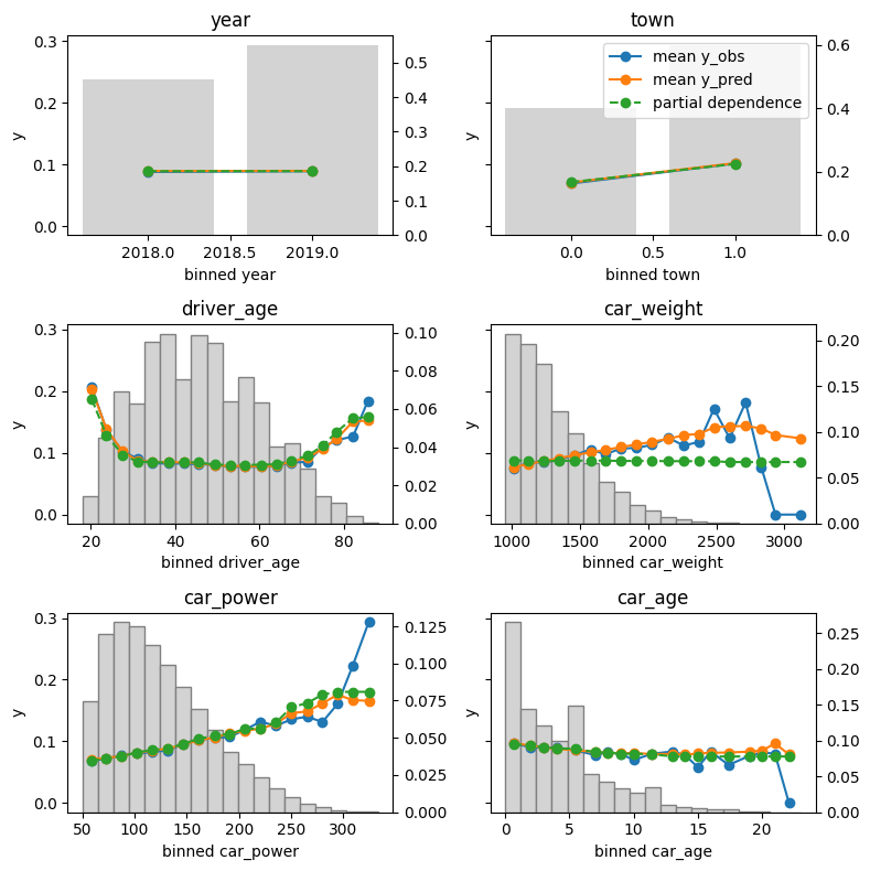
Let’s build a Poisson LightGBM model to explain the claim frequency given six traditional features in a pricing dataset on motor liability claims. 80% of the 1 Mio rows are used for training, the other 20% for evaluation. Hyper-parameters have been slightly tuned (not shown).
Let’s inspect the (main effects) of the model on the test data.
R
Python
library(effectplots)

# 0.3 s
feature_effects(fit, v = xvars, data = X_test, y = test$claim_nb) |>
  plot(share_y = "all")
from model_diagnostics.calibration import plot_marginal

fig, axes = plt.subplots(3, 2, figsize=(8, 8), sharey=True, layout="tight")

# 2.3 s
for i, (feat, ax) in enumerate(zip(X_test.columns, axes.flatten())):
    plot_marginal(
        y_obs=y_test,
        y_pred=model.predict(X_test),
        X=X_test,
        feature_name=feat,
        predict_function=model.predict,
        ax=ax,
    )
    ax.set_title(feat)
    if i != 1:
        ax.legend().remove()
The output can be seen at the beginning of this blog post.
Here some model insights:
Average predictions closely match observed frequencies. No clear bias is visible.
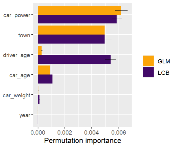
Partial dependence shows that the year and the car weight almost have no impact (regarding their main effects), while the driver_age and car_power effects seem strongest. The shared y axes help to assess these.
Except for car_weight, the partial dependence curve closely follows the average predictions. This means that the model effect seems to really come from the feature on the x axis, and not of some correlated other feature (as, e.g., with car_weight which is actually strongly correlated with car_power).
Final words
Inspecting models has become much relaxed with above functions.
The packages used offer much more functionality. Try them out! Or we will show them in later posts ;).
References
Apley, Daniel W., and Jingyu Zhu. 2020. Visualizing the Effects of Predictor Variables in Black Box Supervised Learning Models. Journal of the Royal Statistical Society Series B: Statistical Methodology, 82 (4): 1059–1086. doi:10.1111/rssb.12377.
Friedman, Jerome H. 2001. Greedy Function Approximation: A Gradient Boosting Machine. Annals of Statistics 29 (5): 1189–1232. doi:10.1214/aos/1013203451.
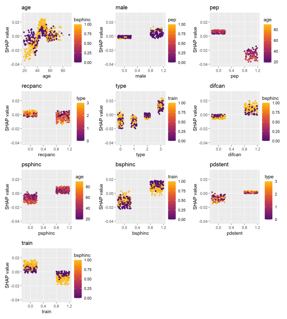
We use a causal forest [1] to model the treatment effect in a randomized controlled clinical trial. Then, we explain this black-box model with usual explainability tools. These will reveal segments where the treatment works better or worse, just like a forest plot, but multivariately.
Data
For illustration, we use patient-level data of a 2-arm trial of rectal indomethacin against placebo to prevent post-ERCP pancreatitis (602 patients) [2]. The dataset is available in the package {medicaldata}.
The data is in fantastic shape, so we don’t need to spend a lot of time with data preparation.
We integer encode factors.
We select meaningful features, basically those shown in the forest plot of [2] (Figure 4) without low-information features and without hospital.
The marginal estimate of the treatment effect is -0.078, i.e., indomethacin reduces the probability of post-ERCP pancreatitis by 7.8 percentage points. Our aim is to develop and interpret a model to see if this value is associated with certain covariates.
library(medicaldata)
suppressPackageStartupMessages(library(dplyr))
library(grf)          #  causal_forest()
library(ggplot2)
library(patchwork)    #  Combine ggplots
library(hstats)       #  Friedman's H, PDP
library(kernelshap)   #  General SHAP
library(shapviz)      #  SHAP plots

W <- as.integer(indo_rct$rx) - 1L      # 0=placebo, 1=treatment
table(W)
#   0   1
# 307 295

Y <- as.numeric(indo_rct$outcome) - 1  # Y=1: post-ERCP pancreatitis (bad)
mean(Y)  # 0.1312292

mean(Y[W == 1]) - mean(Y[W == 0])      # -0.07785568

xvars <- c(
  "age",         # Age in years
  "male",        # Male (1=yes)
  "pep",         # Previous post-ERCP pancreatitis (1=yes)
  "recpanc",     # History of recurrent Pancreatitis (1=yes)
  "type",        # Sphincter of oddi dysfunction type/level (0=no, to 3=type 3)
  "difcan",      # Cannulation of the papilla was difficult (1=yes)
  "psphinc",     # Pancreatic sphincterotomy performed (1=yes)
  "bsphinc",     # Biliary sphincterotomy performed (1=yes)
  "pdstent",     # Pancreatic stent (1=yes)
  "train"        # Trainee involved in stenting (1=yes)
)

X <- indo_rct |>
  mutate_if(is.factor, function(v) as.integer(v) - 1L) |>
  rename(male = gender) |>
  select_at(xvars)

head(X)

# age  male   pep recpanc  type difcan psphinc bsphinc pdstent train
#  26     0     0       1     1      0       0       0       0     1
#  24     1     1       0     0      0       0       1       0     0
#  57     0     0       0     2      0       0       0       0     0
#  29     0     0       0     1      0       0       1       1     1
#  38     0     1       0     1      0       1       1       1     1
#  59     0     0       0     1      1       0       1       1     0

summary(X)

#     age             male             pep            recpanc
# Min.   :19.00   Min.   :0.0000   Min.   :0.0000   Min.   :0.000
# 1st Qu.:35.00   1st Qu.:0.0000   1st Qu.:0.0000   1st Qu.:0.000
# Median :45.00   Median :0.0000   Median :0.0000   Median :0.000
# Mean   :45.27   Mean   :0.2093   Mean   :0.1595   Mean   :0.299
# 3rd Qu.:54.00   3rd Qu.:0.0000   3rd Qu.:0.0000   3rd Qu.:1.000
# Max.   :90.00   Max.   :1.0000   Max.   :1.0000   Max.   :1.000
#      type           difcan          psphinc          bsphinc
# Min.   :0.000   Min.   :0.0000   Min.   :0.0000   Min.   :0.0000
# 1st Qu.:1.000   1st Qu.:0.0000   1st Qu.:0.0000   1st Qu.:0.0000
# Median :2.000   Median :0.0000   Median :1.0000   Median :1.0000
# Mean   :1.743   Mean   :0.2608   Mean   :0.5698   Mean   :0.5714
# 3rd Qu.:2.000   3rd Qu.:1.0000   3rd Qu.:1.0000   3rd Qu.:1.0000
# Max.   :3.000   Max.   :1.0000   Max.   :1.0000   Max.   :1.0000
#    pdstent           train
# Min.   :0.0000   Min.   :0.0000
# 1st Qu.:1.0000   1st Qu.:0.0000
# Median :1.0000   Median :0.0000
# Mean   :0.8239   Mean   :0.4701
# 3rd Qu.:1.0000   3rd Qu.:1.0000
# Max.   :1.0000   Max.   :1.0000
The model
We use the {grf} package to fit a causal forest [1], a tree-ensemble trying to estimate conditional average treatment effects (CATE) E[Y(1) – Y(0) | X = x]. As such, it can be used to study treatment effect inhomogeneity.
In contrast to a typical random forest:
Honest trees are grown: Within trees, part of the data is used for splitting, and the other part for calculating the node values. This anti-overfitting is implemented for all random forests in {grf}.
Splits are selected to produce child nodes with maximally different treatment effects (under some additional constraints).
Note: With about 13%, the complication rate is relatively low. Thus, the treatment effect (measured on absolute scale) can become small for certain segments simply because the complication rate is close to 0. Ideally, we could model relative treatment effects or odds ratios, but I have not found this option in {grf} so far.
fit <- causal_forest(
  X = X,
  Y = Y,
  W = W,
  num.trees = 1000,
  mtry = 4,
  sample.fraction = 0.7,
  seed = 1,
  ci.group.size = 1,
)
Explain the model with “classic” techniques
After looking at tree split importance, we study the effects via partial dependence plots and Friedman’s H. These only require a predict() function and a reference dataset.
Variable importance of the causal forest can be measured by the relative counts each feature had been used to split on (in the first 4 levels). The most important variable is age.
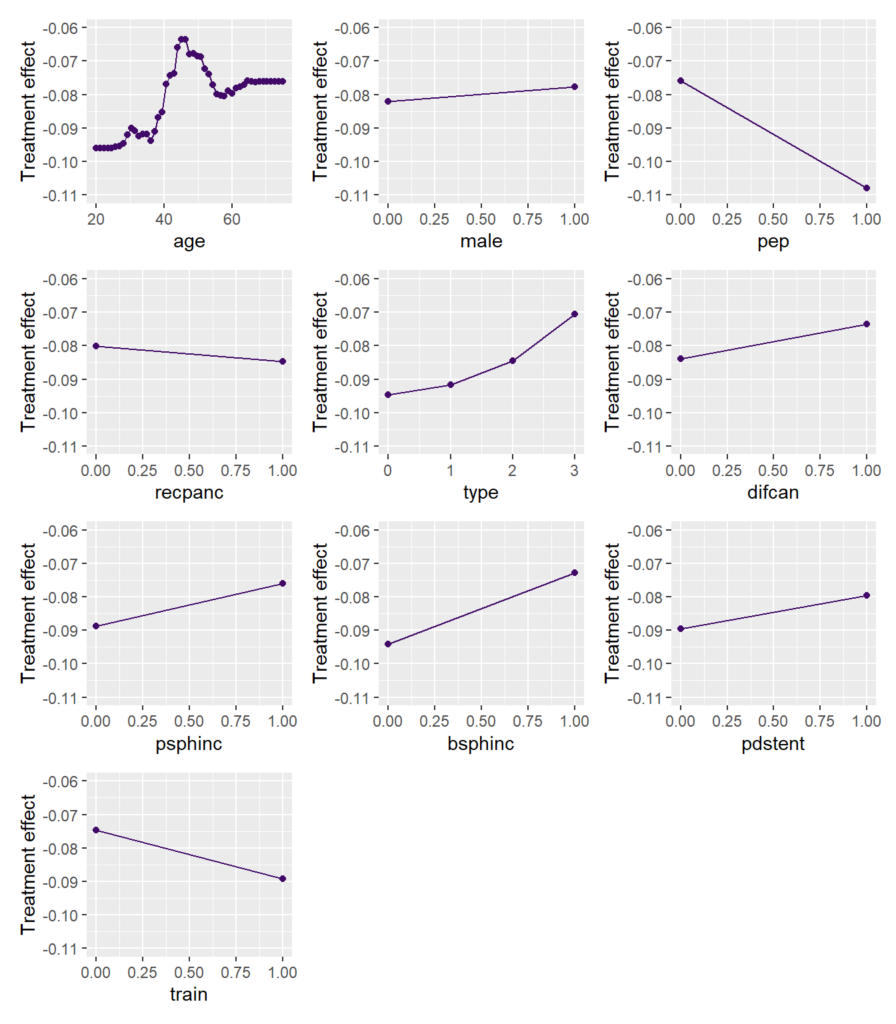
Main effects
To study the main effects on the CATE, we consider partial dependence plots (PDP). Such plot shows how the average prediction depends on the values of a feature, keeping all other feature values constant (can be unnatural.)
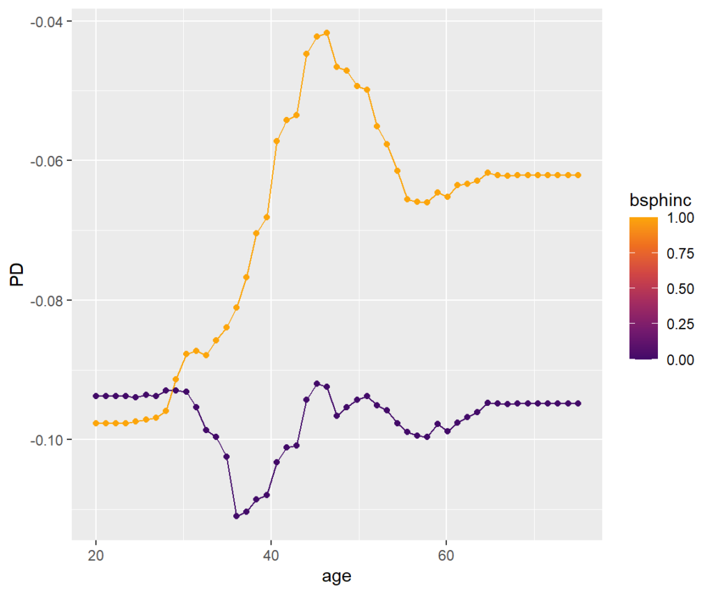
We can see that the treatment effect is strongest for persons up to age 35, then reduces until 45. For older patients, the effect increases again.
Remember: Negative values mean a stronger (positive) treatment effect.
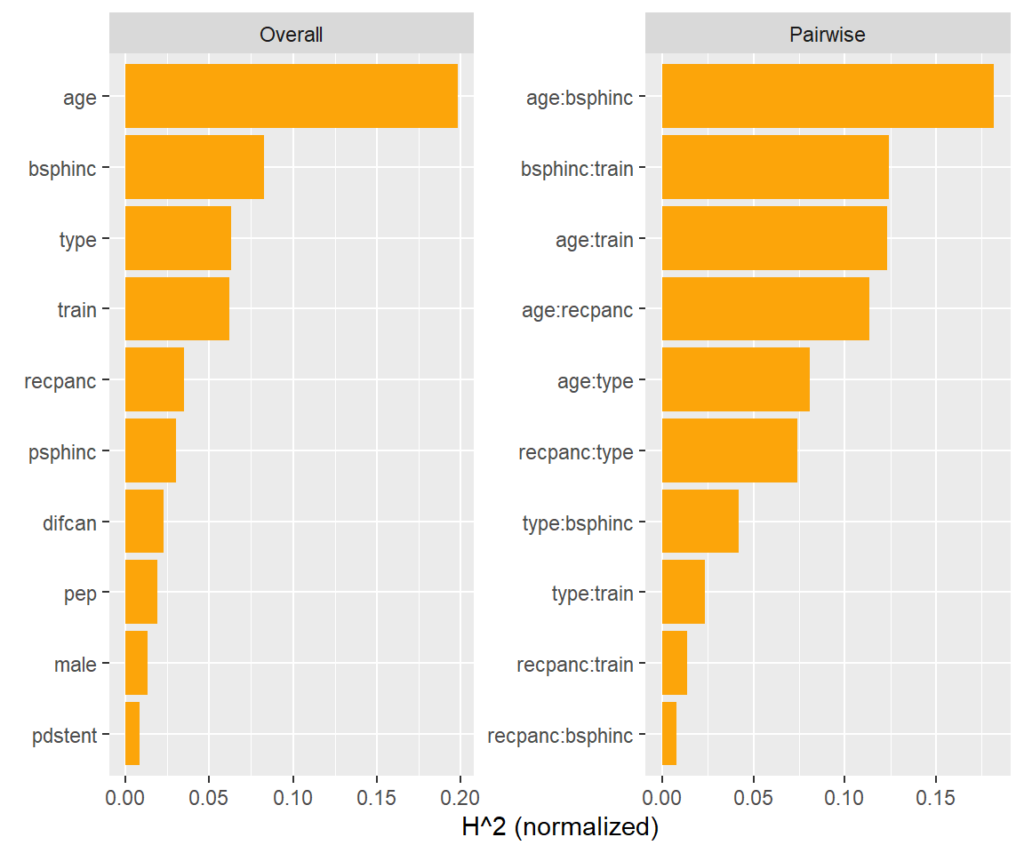
Interaction strength
Between what covariates are there strong interactions?
A model agnostic way to assess pairwise interaction strength is Friedman’s H statistic [3]. It measures the error when approximating the two-dimensional partial dependence function of the two features by their univariate partial dependence functions. A value of zero means there is no interaction. A value of α means that about 100α% of the joint effect (variability) comes from the interaction.
This measure is shown on the right hand side of the plot. More than 15% of the joint effect variability of age and biliary sphincterotomy (bsphinc) comes from their interaction.
Typically, pairwise H-statistics are calculated only for the most important variables or those with high overall interaction strength. Overall interaction strength (left hand side of the plot) can be measured by a version of Friedman’s H. It shows how much of the prediction variability comes from interactions with that feature.
Visualize strong interaction
Interactions can be visualized, e.g., by a stratified PDP. We can see that the treatment effect is associated with age mainly for persons with biliary sphincterotomy.
SHAP Analysis
A “modern” way to explain the model is based on SHAP [4]. It decomposes the (centered) predictions into additive contributions of the covariates.
Because there is no TreeSHAP shipped with {grf}, we use the much slower Kernel SHAP algorithm implemented in {kernelshap} that works for any model.
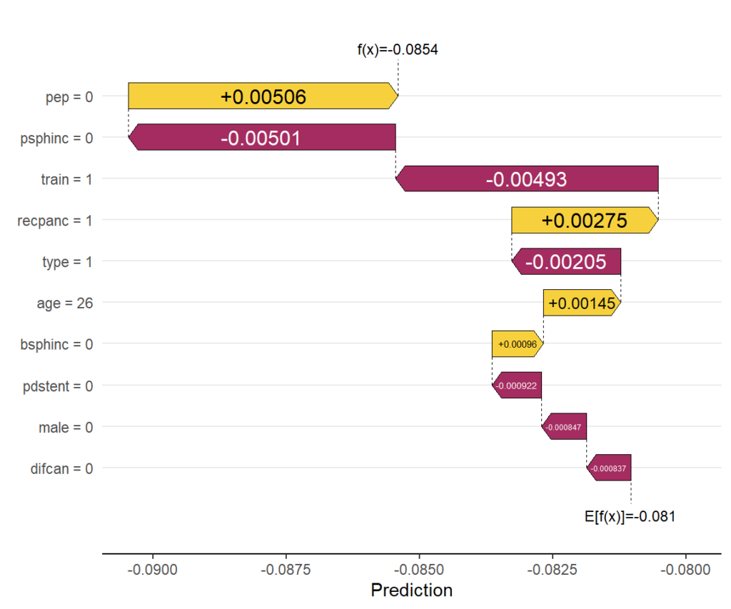
First, we explain the prediction of a single data row, then we decompose many predictions. These decompositions can be analysed by simple descriptive plots to gain insights about the model as a whole.
# Explaining one CATE
kernelshap(fit, X = X[1, ], bg_X = X, pred_fun = pred_fun) |>
  shapviz() |>
  sv_waterfall() +
  xlab("Prediction")

# Explaining all CATEs globally
system.time(  # 13 min
  ks <- kernelshap(fit, X = X, pred_fun = pred_fun)
)
shap_values <- shapviz(ks)

sv_importance(shap_values)
sv_importance(shap_values, kind = "bee")
sv_dependence(shap_values, v = xvars) +
  plot_layout(ncol = 3) &
  ylim(c(-0.04, 0.03))
Explain one CATE
Explaining the CATE corresponding to the feature values of the first patient via waterfall plot.
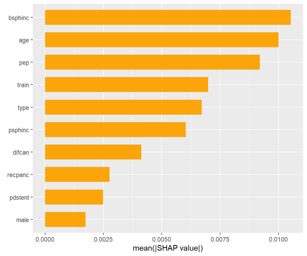
SHAP importance plot
The bars show average absolute SHAP values. For instance, we can say that biliary sphincterotomy impacts the treatment effect on average by more than +- 0.01 (but we don’t see how).
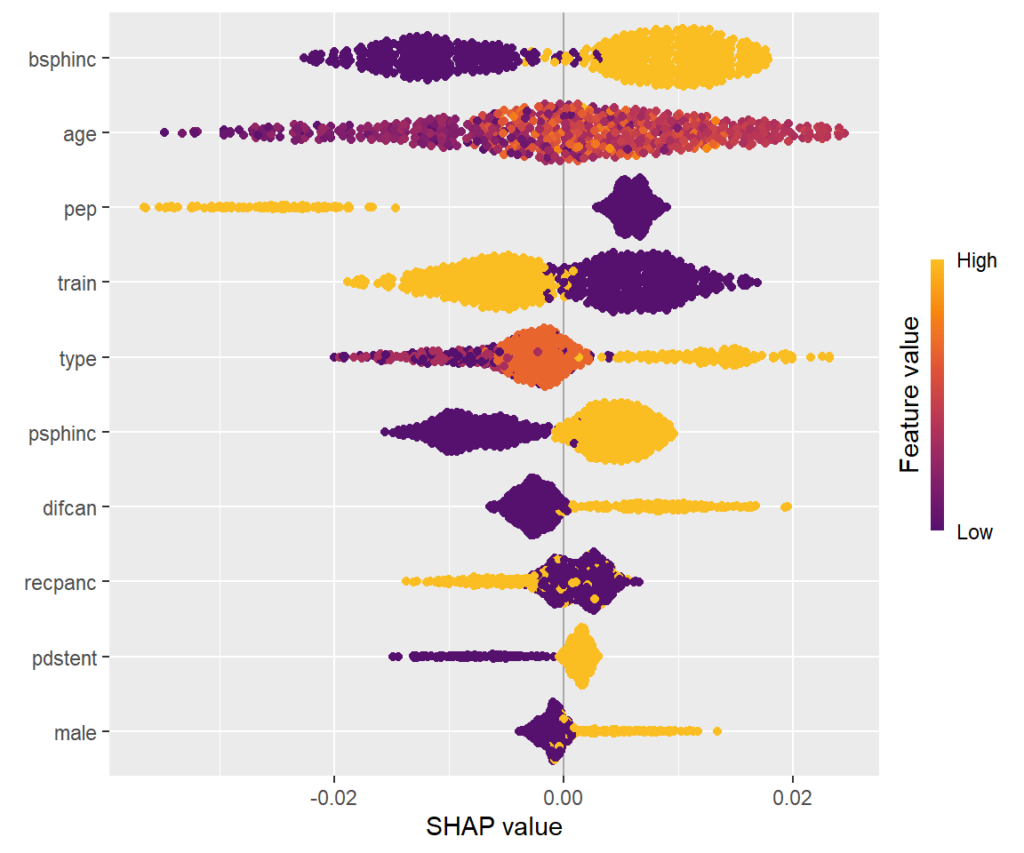
SHAP summary plot
One-dimensional plot of SHAP values with scaled feature values on the color scale, sorted in the same order as the SHAP importance plot. Compared to the SHAP importance barplot, for instance, we can additionally see that biliary sphincterotomy weakens the treatment effect (positive SHAP value).
SHAP dependence plots
Scatterplots of SHAP values against corresponding feature values. Vertical scatter (at given x value) indicates presence of interactions. A candidate of an interacting feature is selected on the color scale. For instance, we see a similar pattern in the age effect on the treatment effect as in the partial dependence plot. Thanks to the color scale, we also see that the age effect depends on biliary sphincterotomy.
Remember that SHAP values are on centered prediction scale. Still, a positive value means a weaker treatment effect.
Wrap-up
{grf} is a fantastic package. You can expect more on it here.
Causal forests are an interesting way to directly model treatment effects.
Standard explainability methods can be used to explain the black-box.
References
Athey, Susan, Julie Tibshirani, and Stefan Wager. “Generalized Random Forests”. Annals of Statistics, 47(2), 2019.
Elmunzer BJ et al. A randomized trial of rectal indomethacin to prevent post-ERCP pancreatitis. N Engl J Med. 2012 Apr 12;366(15):1414-22. doi: 10.1056/NEJMoa1111103.
Friedman, Jerome H., and Bogdan E. Popescu. Predictive Learning via Rule Ensembles. The Annals of Applied Statistics 2, no. 3 (2008): 916-54.
Scott M. Lundberg and Su-In Lee. A Unified Approach to Interpreting Model Predictions. Advances in Neural Information Processing Systems 30 (2017).
{missRanger} is a multivariate imputation algorithm based on random forests, and a fast version of the original missForest algorithm of Stekhoven and Buehlmann (2012). Surprise, surprise: it uses {ranger} to fit random forests. Especially combined with predictive mean matching (PMM), the imputations are often quite realistic.
Out-of-sample application
The newest CRAN release 2.6.0 offers out-of-sample application. This is useful for removing any leakage between train/test data or during cross-validation. Furthermore, it allows to fill missing values in user provided data. By default, it uses the same number of PMM donors as during training, but you can change this by setting pmm.k = nice value.
We distinguish two types of observations to be imputed:
Easy case: Only a single value is missing. Here, we simply apply the corresponding random forest to fill the one missing value.
Hard case: Multiple values are missing. Here, we first fill the values univariately, and then repeatedly apply the corresponding random forests, with the hope that the effect of univariate imputation vanishes. If values of two highly correlated features are missing, then the imputations can be non-sensical. There is no way to mend this.
Example
To illustrate the technique with a simple example, we use the iris data.
1. First, we randomly add 10% missing values. 2. Then, we make a train/test split. 3. Next, we “fit” missRanger() to the training data. 4. Finally, we use its new predict() method to fill the test data.
The results look reasonable, in this case even for the “hard case” row 6 with missing values in two variables. Here, it is probably the strong association with Species that helped to create good values.
The new predict() also works with single row input.
Within only a few years, SHAP (Shapley additive explanations) has emerged as the number 1 way to investigate black-box models. The basic idea is to decompose model predictions into additive contributions of the features in a fair way. Studying decompositions of many predictions allows to derive global properties of the model.
What happens if we apply SHAP algorithms to additive models? Why would this ever make sense?
In the spirit of our “Lost In Translation” series, we provide both high-quality Python and R code.
The models
Let’s build the models using a dataset with three highly correlated covariates and a (deterministic) response.
import numpy as np
import lightgbm as lgb
import shap
from sklearn.preprocessing import PolynomialFeatures
from sklearn.compose import ColumnTransformer
from sklearn.pipeline import Pipeline
from sklearn.linear_model import LinearRegression

#===================================================================
# Make small data
#===================================================================

def make_data(n=100):
    x1 = np.linspace(0.01, 1, n)
    x2 = np.log(x1)
    x3 = x1 > 0.7
    X = np.column_stack((x1, x2, x3))

    y = 1 + 0.2 * x1 + 0.5 * x2 + x3 + np.sin(2 * np.pi * x1)

    return X, y

X, y = make_data()

#===================================================================
# Additive linear model and additive boosted trees
#===================================================================

# Linear model with polynomial terms
poly = PolynomialFeatures(degree=3, include_bias=False)

preprocessor =  ColumnTransformer(
    transformers=[
        ("poly0", poly, [0]),
        ("poly1", poly, [1]),
        ("other", "passthrough", [2]),
    ]
)

model_lm = Pipeline(
    steps=[
        ("preprocessor", preprocessor),
        ("lm", LinearRegression()),
    ]
)
_ = model_lm.fit(X, y)

# Boosted trees with single-split trees
params = dict(
    learning_rate=0.05,
    objective="mse",
    max_depth=1,
    colsample_bynode=0.7,
)

model_lgb = lgb.train(
    params=params,
    train_set=lgb.Dataset(X, label=y),
    num_boost_round=300,
)
SHAP
For both models, we use exact permutation SHAP and exact Kernel SHAP. Furthermore, the linear model is analyzed with “additive SHAP”, and the tree-based model with TreeSHAP.
Do the algorithms provide the same?
R
Python
system.time({  # 1s
  shap_lm <- list(
    add = shapviz(additive_shap(fit_lm, df)),
    kern = kernelshap(fit_lm, X = df[xvars], bg_X = df),
    perm = permshap(fit_lm, X = df[xvars], bg_X = df)
  )

  shap_lgb <- list(
    tree = shapviz(fit_lgb, X),
    kern = kernelshap(fit_lgb, X = X, bg_X = X),
    perm = permshap(fit_lgb, X = X, bg_X = X)
  )
})

# Consistent SHAP values for linear regression
all.equal(shap_lm$add$S, shap_lm$perm$S)
all.equal(shap_lm$kern$S, shap_lm$perm$S)

# Consistent SHAP values for boosted trees
all.equal(shap_lgb$lgb_tree$S, shap_lgb$lgb_perm$S)
all.equal(shap_lgb$lgb_kern$S, shap_lgb$lgb_perm$S)

# Linear coefficient of x3 equals slope of SHAP values
tail(coef(fit_lm), 1)                # 1.112096
diff(range(shap_lm$kern$S[, "x3"]))  # 1.112096

sv_dependence(shap_lm$add, xvars)sv_dependence(shap_lm$add, xvars, color_var = NULL)
shap_lm = {
"add": shap.Explainer(model_lm.predict, masker=X, algorithm="additive")(X),
"perm": shap.Explainer(model_lm.predict, masker=X, algorithm="exact")(X),
"kern": shap.KernelExplainer(model_lm.predict, data=X).shap_values(X),
}
shap_lgb = {
"tree": shap.Explainer(model_lgb)(X),
"perm": shap.Explainer(model_lgb.predict, masker=X, algorithm="exact")(X),
"kern": shap.KernelExplainer(model_lgb.predict, data=X).shap_values(X),
}
# Consistency for additive linear regression
eps = 1e-12
assert np.abs(shap_lm["add"].values - shap_lm["perm"].values).max() < eps
assert np.abs(shap_lm["perm"].values - shap_lm["kern"]).max() < eps
# Consistency for additive boosted trees
assert np.abs(shap_lgb["tree"].values - shap_lgb["perm"].values).max() < eps
assert np.abs(shap_lgb["perm"].values - shap_lgb["kern"]).max() < eps
# Linear effect of last feature in the fitted model
model_lm.named_steps["lm"].coef_[-1] # 1.112096
# Linear effect of last feature derived from SHAP values (ignore the sign)
shap_lm["perm"][:, 2].values.ptp() # 1.112096
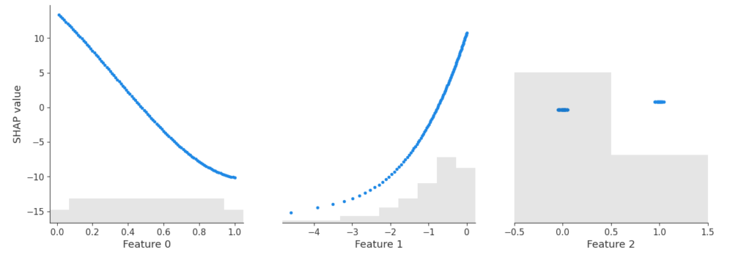
shap.plots.scatter(shap_lm["add"])
SHAP dependence plot of the additive linear model and the additive explainer (Python).
Yes – the three algorithms within model provide the same SHAP values. Furthermore, the SHAP values reconstruct the additive components of the features.
Didactically, this is very helpful when introducing SHAP as a method: Pick a white-box and a black-box model and compare their SHAP dependence plots. For the white-box model, you simply see the additive components, while the dependence plots of the black-box model show scatter due to interactions.
Remark: The exact equivalence between algorithms is lost, when
there are too many features for exact procedures (~10+ features), and/or when
the background data of Kernel/Permutation SHAP does not agree with the training data. This leads to slightly different estimates of the baseline value, which itself influences the calculation of SHAP values.
Final words
SHAP algorithms applied to additive models typically give identical results. Slight differences might occur because sampling versions of the algos are used, or a different baseline value is estimated.
The resulting SHAP values describe the additive components.
Didactically, it helps to see SHAP analyses of white-box and black-box models side by side.
TLDR: The scipy 1.7.0 release introduced Wright’s generalized Bessel function in the Python ecosystem. It is an important ingredient for the density and log-likelihood of Tweedie probabilty distributions. In this last part of the trilogy I’d like to point out why it was important to have this function and share the endeavor of implementing this inconspicuous but highly intractable special function. The fun part is exploiting a free parameter in an integral representation, which can be optimized by curve fitting to the minimal arc length.
This trilogy celebrates the 40th birthday of Tweedie distributions in 2024 and highlights some of their very special properties.
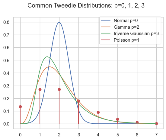
As pointed out in part I and part II, the family of Tweedie distributions is a very special one with outstanding properties. They are central for estimating expectations with GLMs. The probability distributions have mainly positive (non-negative) support and are skewed, e.g. Poisson, Gamma, Inverse Gaussian and compound Poisson-Gamma.
\begin{align*}
Y &\sim \mathrm{Tw}_p(\mu, \phi)
\end{align*}
Probability density of several Tweedie distributions.
Compound Poisson Gamma
A very special domain for the power parameter is between Poisson and Gamma: 1<p<2. This range results in the Compound Poisson distribution which is suitable if you have a random count process and if each count itself has a random amount. A well know example is insurance claims. Typically, there is a random number of insurance claims, and each and every claim has a random amount of claim costs.
\begin{align*}
N &\sim \mathrm{Poisson}(\lambda)\\
X_i &\sim \mathrm{Gamma}(a, b)\\
Y &= \sum_{i=0}^N X_i \sim \mathrm{CompPois}(\lambda, a, b)
\end{align*}
For Poisson count we have \operatorname{E}[N]=\lambda and \operatorname{Var}[N]=\lambda=\operatorname{E}[N], for the Gamma amount \operatorname{E}[X]=\frac{a}{b} and \operatorname{Var}[X]=\frac{a}{b^2}=\frac{1}{a}\operatorname{E}[X]^2. For the compound Poisson-Gamma variable, we obtain
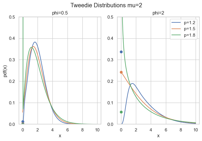
What’s so special here is that there is a point mass at zero, i.e., P(Y=0)=\exp(-\frac{\mu^{2-p}}{\phi(2-p)}) > 0. Hence, it is a suitable distribution for non-negative quantities with some exact zeros.
Probability density for compound Poisson Gamma, point masses at zero are marked as points.
Code
import matplotlib.pyplot as plt
import numpy as np
from scipy.special import wright_bessel


def cpg_pmf(mu, phi, p):
    """Compound Poisson Gamma point mass at zero."""
    return np.exp(-np.power(mu, 2 - p) / (phi * (2 - p)))

def cpg_pdf(x, mu, phi, p):
    """Compound Poisson Gamma pdf."""
    if not (1 < p < 2):
        raise ValueError("1 < p < 2 required")
    theta = np.power(mu, 1 - p) / (1 - p)
    kappa = np.power(mu, 2 - p) / (2 - p)
    alpha = (2 - p) / (1 - p)
    t = ((p - 1) * phi / x)**alpha
    t /= (2 - p) * phi
    a = 1 / x * wright_bessel(-alpha, 0, t)
    return a * np.exp((x * theta - kappa) / phi)

fig, axes = plt.subplots(ncols=2, figsize=[6.4 * 1.25, 4.8])
x = np.linspace(1e-9, 10, 200)
mu = 2
for p in [1.2, 1.5, 1.8]:
    for i, phi in enumerate([0.5, 2]):
        axes[i].plot(x, cpg_pdf(x=x, mu=mu, phi=phi, p=p), label=f"{p=}")
        axes[i].scatter(0, cpg_pmf(mu=mu, phi=phi, p=p))
        axes[i].set_ylim(0, 0.5)
        axes[i].set_title(f"{phi=}")
        if i > 0:
            axes[i].legend()
        else:
            axes[i].set_ylabel("pdf(x)")
        axes[i].set_xlabel("x")
fig.suptitle("Tweedie Distributions mu=2")
The rest of this post is about how to compute the density for this parameter range. The easy part is \exp\left(\frac{y\theta - \kappa(\theta)}{\phi}\right) which can be directly implemented. The real obstacle is the term c(y, \phi) which is given by
This depends on Wright’s (generalized Bessel) function\Phi(a, b, z) as introduced in a 1933 paper by E. Wright.
Wright’s Generalized Bessel Function
According to DLMF 10.46, the function is defined as
\begin{equation*}
\Phi(a, b, z) = \sum_{k=0}^{\infty} \frac{z^k}{k!\Gamma(ak+b)}, \quad a > -1, b \in R, z \in C
\end{equation*}
which converges everywhere because it is an entire function. We will focus on the positive real axis z=x\geq 0 and the range a\geq 0, b\geq 0 (note that a=-\alpha \in (0,\infty) for 1<p<2). For the compound Poisson-Gamma, we even have b=0.
Implementation of such a function as done in scipy.stats.wright_bessel, even for the restricted parameter range, poses tremendous challenges. The first one is that it has three parameters which is quite a lot. Then the series representation above, for instance, can always be used, but depending on the parameters, it will require a huge amount of terms, particularly for large x. As each term involves the Gamma function, this becomes expensive very fast. One ends up using different representations and strategies for different parameter regions:
Small x: Taylor series according to definition
Small a: Taylor series in a=0
Large x: Asymptotic series due to Wright (1935)
Large a: Taylor series according to definition for a few terms around the approximate maximum term k_{max} due to Dunn & Smyth (2005)
General: Integral represantation due to Luchko (2008)
Dunn & Smyth investigated several evaluation strategies for the simpler Tweedie density which amounts to Wright’s functions with b=0, see Dunn & Smyth (2005). Luchko (2008) lists most of the above strategies for the full Wright’s function.
Note that Dunn & Smyth (2008) provide another strategy to evaluate the Tweedie distribution function by means of the inverse Fourier transform. This does not involve Wright’s function, but also encounters complicated numerical integration of oscillatory functions.
The Integral Representation
This brings us deep into complex analysis: We start with Hankel’s contour integral representation of the reciprocal Gamma function.
with the Hankel path Ha^- from negative infinity (A) just below the real axis, counter-clockwise with radius \epsilon>0 around the origin and just above the real axis back to minus infinity (D).
Hankel contour Ha– in the complex plane.
In principle, one is free to choose any such path with the same start (A) and end point (D) as long as one does not cross the negative real axis. One usually lets the AB and CD be infinitesimal close to the negative real line. Very importantly, the radius \epsilon>0 is a free parameter! That is real magic🪄
By interchanging sum and integral and using the series of the exponential, Wright’s function becomes
Now, one needs to do the tedious work and split the integral into the 3 path sections AB, BC, CD. Putting AB and CD together gives an integral over K, the circle BC gives an integral over P:
\begin{align*}
\Phi(a, b, x) &= \frac{1}{\pi} \int_{\epsilon}^\infty K(a, b, x, r) \; dr
\\
 &+ \frac{\epsilon^{1-b}}{\pi} \int_0^\pi P(\epsilon, a, b, x, \varphi) \; d\varphi
\\
K(a, b, x, r) &= r^{-b}\exp(-r + x  r^{-a} \cos(\pi a))
\\
&\quad \sin(x \cdot r^{-a} \sin(\pi a) + \pi b)
\\
P(\epsilon, a, b, x, \varphi) &= \exp(\epsilon \cos(\varphi) + x  \epsilon^{-a}\cos(a \varphi))
\\
&\quad \cos(\epsilon \sin(\varphi) - x \cdot \epsilon^{-a} \sin(a \varphi) + (1-b) \varphi)
\end{align*}
What remains is to carry out the numerical integration, also known as quadrature. While this is an interesting topic in its own, let’s move to the magic part.
Arc Length Minimization
If you have come so far and say, wow, puh, uff, crazy, 🤯😱 Just keep on a little bit because here comes the real fun part🤞
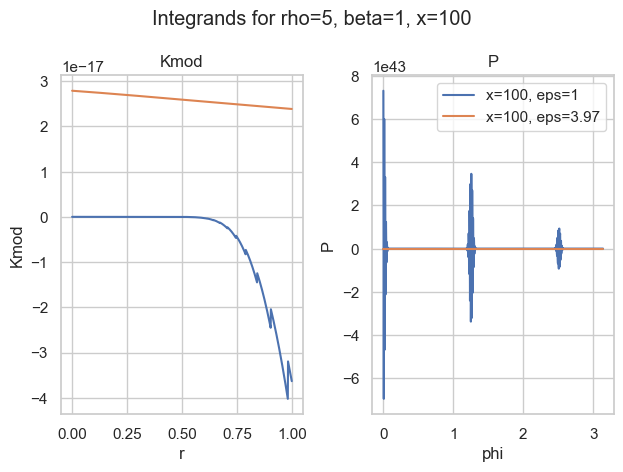
It turns out that most of the time, the integral over P is the most difficult. The worst behaviour an integrand can have is widely oscillatory. Here is one of my favorite examples:
Integrands for a=5, b=1, x=100 and two choices of epsilon.
With the naive choice of \epsilon=1, both integrands (blue) are—well—crazy. There is basically no chance the most sophisticated quadrature rule will work. And then look at the other choice of \epsilon\approx 4. Both curves seem well behaved (for P, we would need a closer look).
So the idea is to find a good choice of \epsilon to make P well behaved. Well behaved here means most boring, if possible a straight line. What makes a straight line unique? In flat space, it is the shortest path between two points. Therefore, well behaved integrands have minimal arc length. That is what we want to minimize.
The arc lengthS from x=a to x=b of a 1-dimensional function f is given by
\begin{equation*}
S = \int_a^b \sqrt{1 + f^\prime(x)^2} \; dx
\end{equation*}
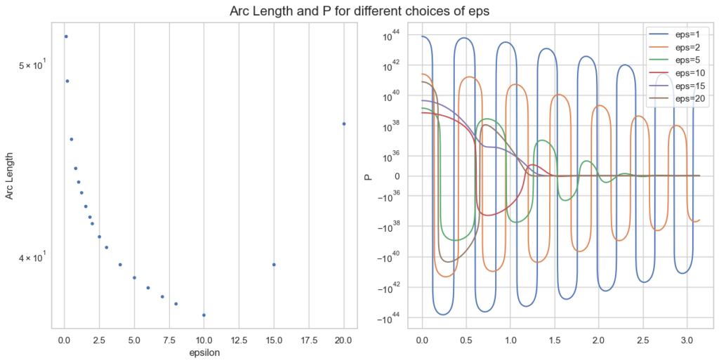
Instead of f=P, we only take the oscillatory part of P and approximate the arc length as f(\varphi)=f(\varphi) = \epsilon \sin(\varphi) - x \epsilon^{-\rho} \sin(\rho \varphi) + (1-\beta) \varphi. For a single parameter point a, b, z this looks like
Arc length and integrand P for different epsilon, given a=0.1, b=5, x=100.
Note the logarithmic y-scale for the right plot of P. The optimal \epsilon=10 is plotted in red and behaves clearly better than smaller values of \epsilon.
What remains to be done for an actual implementation is
Calculate minimal \epsilon for a large grid of values a, b, x.
Choose a function with some parameters.
Curve fitting (so again optimisation): Fit this function to the minimal \epsilon of the grid via minimising least squares.
Implement some quadrature rules and use this choice of \epsilon in the hope that it intra- and extrapolates well.
This strategy turns out to work well in practice and is implemented in scipy. As the parameter space of 3 variables is huge, the integral representation breaks down in certain areas, e.g. huge values of \epsilon where the integrands just overflow numerically (in 64-bit floating point precision). But we have our other evaluation strategies for that.
Conclusion
An extensive notebook for Wright’s function, with all implementation strategies can be found here.
After an adventurous journey, we arrived at one implementation strategy of Wright’s generalised Bessel function, namely the integral representation. The path went deep into complex analysis and contour integration, then further to the arc length of a function and finally curve fitting via optimisation. I am really astonished how connected all those different areas of mathematics can be.
Wright’s function is the missing piece to compute full likelihoods and probability functions of the Tweedie distribution family and is now available in the Python ecosystem via scipy.
We are at the very end of this Tweedie trilogy. I hope it has been entertaining and it has become clear why Tweedie deserves to be celebrated.
Further references:
Delong, Ł., Lindholm, M. & Wüthrich, M.V. “Making Tweedie’s compound Poisson model more accessible”. Eur. Actuar. J.11, 185–226 (2021). https://doi.org/10.1007/s13385-021-00264-3
Wright E.M. 1933. “On the coefficients of power series having essential singularities”. J. London Math. Soc. 8: 71–79. https://doi.org/10.1112/jlms/s1-8.1.71
Wright, E. M. 1935, “The asymptotic expansion of the generalized Bessel”, function. Proc. London Math. Soc. (2) 38, pp. 257–270. https://doi.org/10.1112/plms/s2-38.1.257
Dunn, P.K., Smyth, G.K. “Series evaluation of Tweedie exponential dispersion model densities”. Stat Comput 15, 267–280 (2005). https://doi.org/10.1007/s11222-005-4070-y
Dunn, P.K., Smyth, G.K. “Evaluation of Tweedie exponential dispersion model densities by Fourier inversion”. Stat Comput 18, 73–86 (2008). https://doi.org/10.1007/s11222-007-9039-6
Luchko, Y. F. (2008), “Algorithms for Evaluation of the Wright Function for the Real Arguments’ Values”, Fractional Calculus and Applied Analysis 11(1). https://eudml.org/doc/11309 Note a slight misprint in the integrand P.
With its newest release 1.1.0, the Python package model-diagnostics got the concept of a plotting backend. Before this release, all plots were constructed with matplotlib. This is still the default. But additionally, the user can now select plotly, if it is installed.
There are 2 ways to specify the plotting backend explicitly
Setting the plotting backend via global configuation
from model_diagnostics import set_config

set_config(plot_backend="plotly")
Setting the plotting backend via a context manager
from model_diagnostics import config_context
from model_diagnostics.calibration import plot_bias

with config_context(plot_backend="plotly"):
    plot_bias(...)
The context manager has precedence over the global setting. Here is an example of an interactive reliability diagram backed by plotly:
import numpy as np
from model_diagnostics.calibration import plot_reliability_diagram
from model_diagnostics import set_config
set_config(plot_backend="plotly")
x = np.linspace(0, 2 * np.pi, 100)
y_obs = np.cos(x)
# A poor linear interpolation through extrema as predictions.
y_pred = np.interp(x, [0, np.pi, 2 * np.pi], [1, -1, 1])
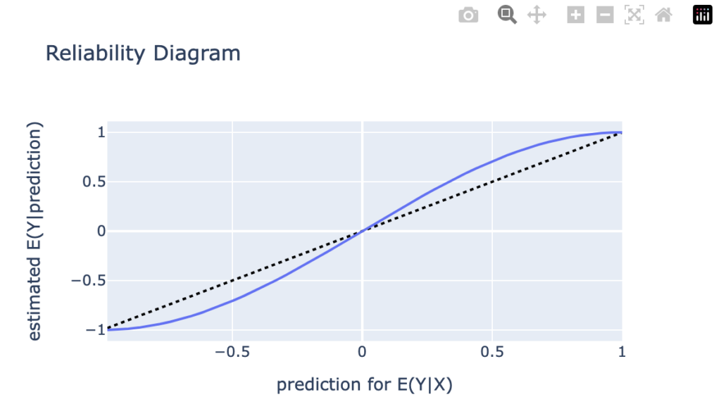
ax = plot_reliability_diagram(y_obs=y_obs, y_pred=y_pred)
If you wonder why this graph is not interactive despite promised to be, here is why: While this graph renders nicely in a juper lab notebook, for instance, this website is built with wordpress and I was simply unable to figure out a way to get the html of the graph rendered properly—without wordpress crashing. I you know a way, please contact me.
import numpy as np
import pandas as pd
import matplotlib.pyplot as plt
import seaborn as sns
import shap
from sklearn.datasets import fetch_openml
from sklearn.inspection import PartialDependenceDisplay
from sklearn.metrics import mean_poisson_deviance
from sklearn.dummy import DummyRegressor
from lightgbm import LGBMRegressor
# We need preview version of glum that adds formulaic API
# !pip install git+https://github.com/Quantco/glum@glum-v3#egg=glum
from glum import GeneralizedLinearRegressor
# Load data
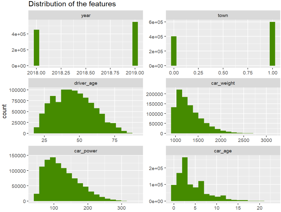
df = fetch_openml(data_id=45106, parser="pandas").frame
df.head()
# Continuous features
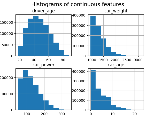
df.hist(["driver_age", "car_weight", "car_power", "car_age"])
_ = plt.suptitle("Histograms of continuous features", fontsize=15)
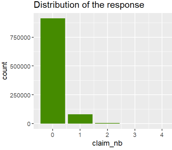
# Response and discrete features
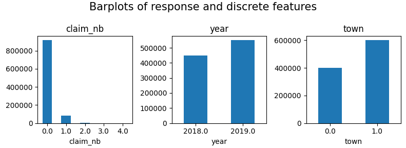
fig, axes = plt.subplots(figsize=(8, 3), ncols=3)
for v, ax in zip(["claim_nb", "year", "town"], axes):
df[v].value_counts(sort=False).sort_index().plot(kind="bar", ax=ax, rot=0, title=v)
plt.suptitle("Barplots of response and discrete features", fontsize=15)
plt.tight_layout()
plt.show()
# Rank correlations
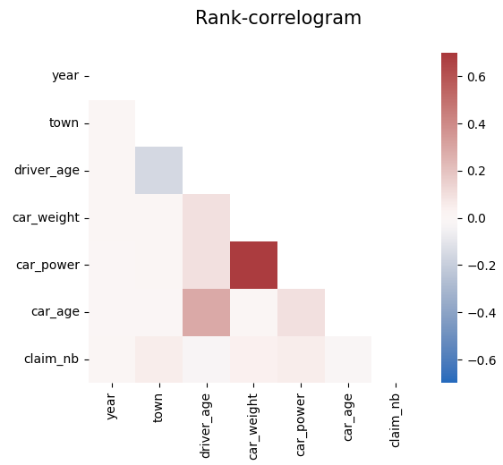
corr = df.corr("spearman")
mask = np.triu(np.ones_like(corr, dtype=bool))
plt.suptitle("Rank-correlogram", fontsize=15)
_ = sns.heatmap(
corr, mask=mask, vmin=-0.7, vmax=0.7, center=0, cmap="vlag", square=True
)
Modeling
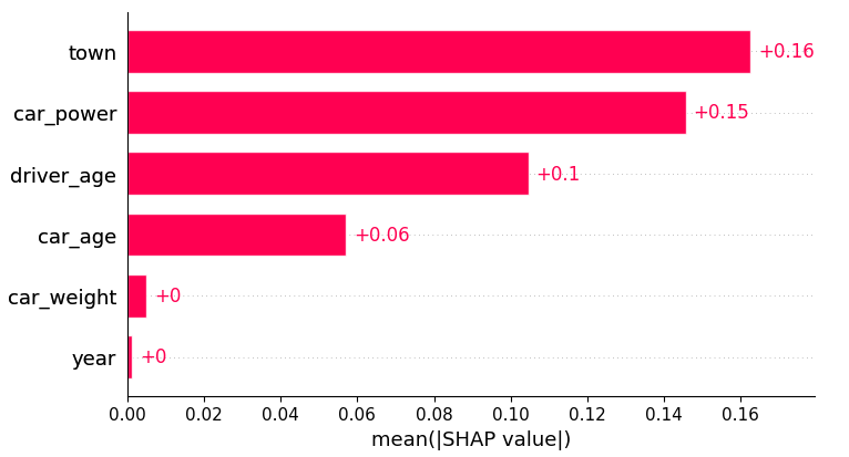
We fit a tuned Boosted Trees model to model log(E(claim count)) via Poisson deviance loss.
And perform a SHAP analysis to derive insights.
from sklearn.model_selection import train_test_split
X_train, X_test, y_train, y_test = train_test_split(
df.drop("claim_nb", axis=1), df["claim_nb"], test_size=0.1, random_state=30
)
# Tuning step not shown. Number of boosting rounds found via early stopping on CV performance
params = dict(
learning_rate=0.05,
objective="poisson",
num_leaves=7,
min_child_samples=50,
min_child_weight=0.001,
colsample_bynode=0.8,
subsample=0.8,
reg_alpha=3,
reg_lambda=5,
verbose=-1,
)
model_lgb = LGBMRegressor(n_estimators=360, **params)
model_lgb.fit(X_train, y_train)
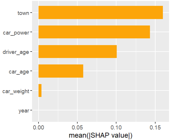
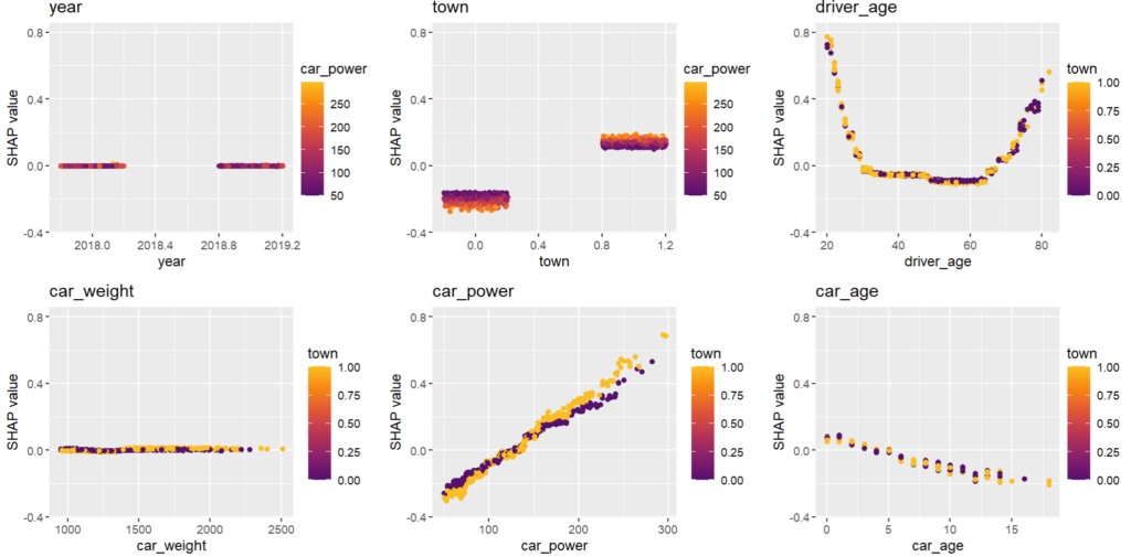
# SHAP analysis
X_explain = X_train.sample(n=2000, random_state=937)
explainer = shap.Explainer(model_lgb)
shap_val = explainer(X_explain)
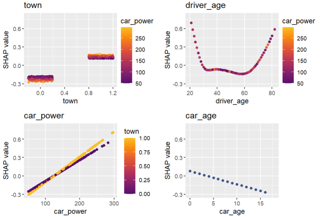
plt.suptitle("SHAP importance", fontsize=15)
shap.plots.bar(shap_val)
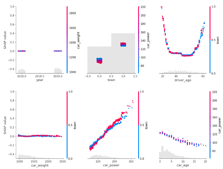
for s in [shap_val[:, 0:3], shap_val[:, 3:]]:
shap.plots.scatter(s, color=shap_val, ymin=-0.5, ymax=1)
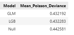
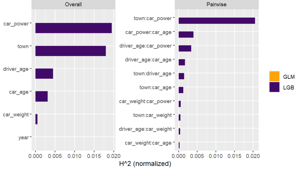
Here, we would come to the conclusions:
car_weight and year might be dropped, depending on the specify aim of the model.
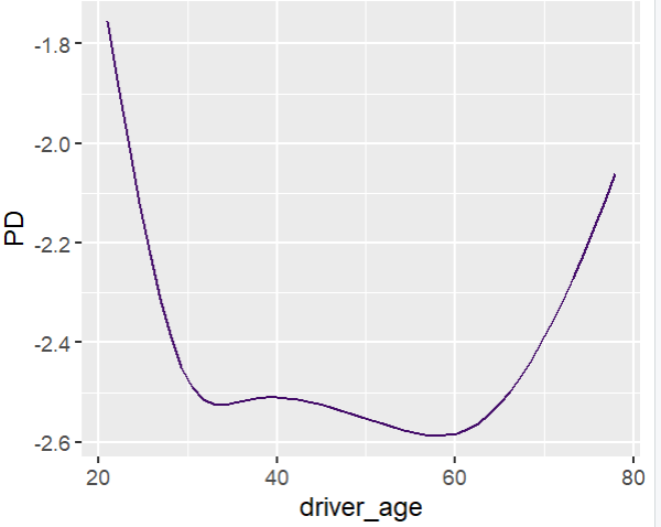
Add a regression spline for driver_age.
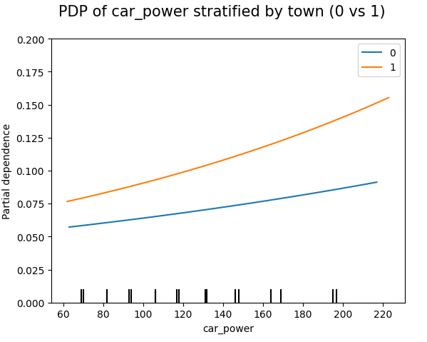
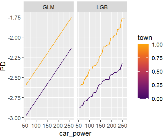
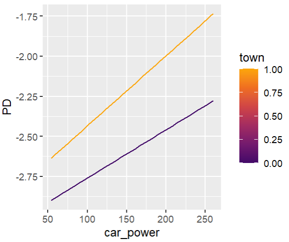
Add an interaction between car_power and town.
Build strong GLM
Let’s build a GLM with these insights. Two important things:
Glum is an extremely powerful GLM implementation that was inspired by a pull request of our Christian Lorentzen.
In the upcoming version 3.0, it adds a formula API based of formulaic, a very performant formula parser. This gives a very easy way to add interaction effects, regression splines, dummy encodings etc.
model_glm = GeneralizedLinearRegressor(
family="poisson",
l1_ratio=1.0,
alpha=1e-10,
formula="car_power * C(town) + bs(driver_age, 7) + car_age",
)
model_glm.fit(X_train, y=y_train) # 1 second on old laptop
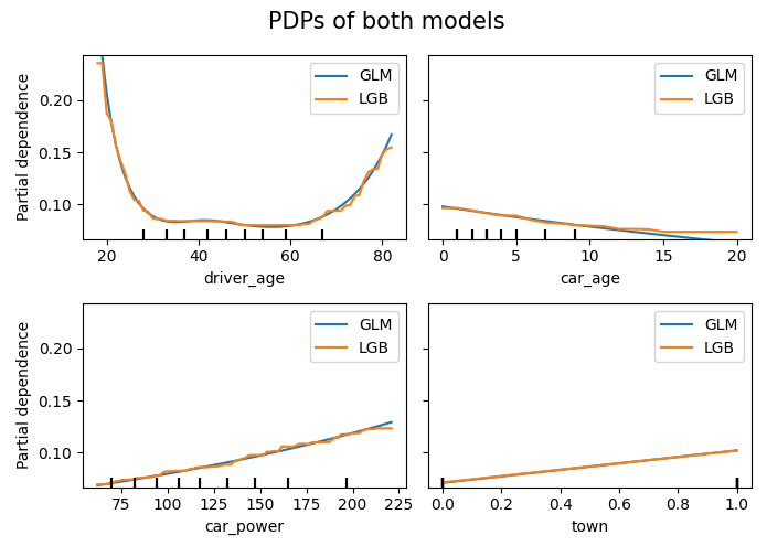
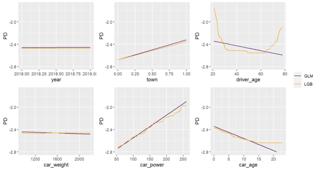
# PDPs of both models
fig, ax = plt.subplots(2, 2, figsize=(7, 5))
cols = ("tab:blue", "tab:orange")
for color, name, model in zip(cols, ("GLM", "LGB"), (model_glm, model_lgb)):
disp = PartialDependenceDisplay.from_estimator(
model,
features=["driver_age", "car_age", "car_power", "town"],
X=X_explain,
ax=ax if name == "GLM" else disp.axes_,
line_kw={"label": name, "color": color},
)
fig.suptitle("PDPs of both models", fontsize=15)
fig.tight_layout()
# Stratified PDP of car_power
for color, town in zip(("tab:blue", "tab:orange"), (0, 1)):
mask = X_explain.town == town
disp = PartialDependenceDisplay.from_estimator(
model_glm,
features=["car_power"],
X=X_explain[mask],
ax=None if town == 0 else disp.axes_,
line_kw={"label": town, "color": color},
)
plt.suptitle("PDP of car_power stratified by town (0 vs 1)", fontsize=15)
_ = plt.ylim(0, 0.2)
In this relatively simple situation, the mean Poisson deviance of our models are very simlar now:
model_dummy = DummyRegressor().fit(X_train, y=y_train)
deviance_null = mean_poisson_deviance(y_test, model_dummy.predict(X_test))

dev_imp = []
for name, model in zip(("GLM", "LGB", "Null"), (model_glm, model_lgb, model_dummy)):
    dev_imp.append((name, mean_poisson_deviance(y_test, model.predict(X_test))))
pd.DataFrame(dev_imp, columns=["Model", "Mean_Poisson_Deviance"])
Final words
Glum is an extremely powerful GLM implementation – we have only scratched its surface. You can expect more blogposts on Glum…
Having a formula interface is especially useful for adding interactions. Fingers crossed that the upcoming version 3.0 will soon be released.
Building GLMs via ML + XAI is so smooth, especially when you work with large data. For small data, you need to be careful to not add hidden overfitting to the model.
My last post was using {hstats}, {kernelshap} and {shapviz} to explain a binary classification random forest. Here, we use the same package combo to improve a Poisson GLM with insights from a boosted trees model.
Insurance pricing data
This time, we work with a synthetic, but quite realistic dataset. It describes 1 Mio insurance policies and their corresponding claim counts. A reference for the data is:
Mayer, M., Meier, D. and Wuthrich, M.V. (2023), SHAP for Actuaries: Explain any Model. http://dx.doi.org/10.2139/ssrn.4389797
We fit a naive additive linear GLM and a tuned Boosted Trees model.
We combine the models and specify their predict function.
# Train/test split
set.seed(8300)
ix <- sample(nrow(df), 0.9 * nrow(df))
train <- df[ix, ]
valid <- df[-ix, ]

# Naive additive linear Poisson regression model
(fit_glm <- glm(claim_nb ~ ., data = train, family = poisson()))

# Boosted trees with LightGBM. The parameters (incl. number of rounds) have been
# by combining early-stopping with random search CV (not shown here)

dtrain <- lgb.Dataset(data.matrix(train[xvars]), label = train$claim_nb)

params <- list(
  learning_rate = 0.05,
  objective = "poisson",
  num_leaves = 7,
  min_data_in_leaf = 50,
  min_sum_hessian_in_leaf = 0.001,
  colsample_bynode = 0.8,
  bagging_fraction = 0.8,
  lambda_l1 = 3,
  lambda_l2 = 5
)

fit_lgb <- lgb.train(params = params, data = dtrain, nrounds = 300)

# {hstats} works for multi-output predictions,
# so we can combine all models to a list, which simplifies the XAI part.
models <- list(GLM = fit_glm, LGB = fit_lgb)

# Custom predictions on response scale
pf <- function(m, X) {
  cbind(
    GLM = predict(m$GLM, X, type = "response"),
    LGB = predict(m$LGB, data.matrix(X[xvars]))
  )
}
pf(models, head(valid, 2))
#       GLM        LGB
# 0.1082285 0.08580529
# 0.1071895 0.09181466

# And on log scale
pf_log <- function(m, X) {
  log(pf(m = m, X = X))
}
pf_log(models, head(valid, 2))
#       GLM       LGB
# -2.223510 -2.455675
# -2.233157 -2.387983 -2.346350
Traditional XAI
Performance
Comparing average Poisson deviance on the validation data shows that the LGB model is clearly better than the naively built GLM, so there is room for improvent!
perf <- average_loss(
  models, X = valid, y = "claim_nb", loss = "poisson", pred_fun = pf
)
perf
#       GLM       LGB
# 0.4362407 0.4331857
Feature importance
Next, we calculate permutation importance on the validation data with respect to mean Poisson deviance loss. The results make sense, and we note that year and car_weight seem to be negligile.
imp <- perm_importance(
  models, v = xvars, X = valid, y = "claim_nb", loss = "poisson", pred_fun = pf
)
plot(imp)
Main effects
Next, we visualize estimated main effects by partial dependence plots on log link scale. The differences between the models are quite small, with one big exception: Investing more parameters into driver_age via spline will greatly improve the performance and usefulness of the GLM.
Friedman’s H-squared (per feature and feature pair) and on log link scale shows that – unsurprisingly – our GLM does not contain interactions, and that the strongest relative interaction happens between town and car_power. The stratified PDP visualizes this interaction. Let’s add a corresponding interaction effect to our GLM later.
system.time(  # 5 sec
  H <- hstats(models, v = xvars, X = train, pred_fun = pf_log)
)
H
plot(H)

# Visualize strongest interaction by stratified PDP
partial_dep(models, v = "car_power", X = train, pred_fun = pf_log, BY = "town") |>
  plot(show_points = FALSE)
SHAP
As an elegant alternative to studying feature importance, PDPs and Friedman’s H, we can simply run a SHAP analysis on the LGB model.
In the final section, we apply the three insights from above with very good results.
fit_glm2 <- glm(
  claim_nb ~ car_power * town + ns(driver_age, df = 7) + car_age,
  data = train,
  family = poisson()

# Performance now as good as LGB
perf_glm2 <- average_loss(
  fit_glm2, X = valid, y = "claim_nb", loss = "poisson", type = "response"
)
perf_glm2  # 0.432962

# Effects similar as LGB, and smooth
partial_dep(fit_glm2, v = "driver_age", X = train) |>
  plot(show_points = FALSE)

partial_dep(fit_glm2, v = "car_power", X = train, BY = "town") |>
  plot(show_points = FALSE)
Improving naive GLMs with insights from ML + XAI is fun.
In practice, the gap between GLM and a boosted trees model can’t be closed that easily. (The true model behind our synthetic dataset contains a single interaction, unlike real data/models that typically have much more interactions.)
{hstats} can work with multiple regression models in parallel. This helps to keep the workflow smooth. Similar for {kernelshap}.
A SHAP analysis often brings the same qualitative insights as multiple other XAI tools together.