LightSHAP is here – a new, lightweight SHAP implementation for tabular data. While heavily inspired from the famous shap package, it has no dependency on it. LightSHAP simplifies working with dataframes (pandas, polars) and categorical data.
Key Features
Tree Models: TreeSHAP wrappers for XGBoost, LightGBM, and CatBoost via explain_tree()
Model-Agnostic: Permutation SHAP and Kernel SHAP via explain_any()
Visualization: Flexible plots
Highlights of the agnostic explainer:
Exact and sampling versions of permutation SHAP and Kernel SHAP
Sampling versions iterate until convergence, and provide standard errors
Parallel processing via joblib
Supports multi-output models
Supports case weights
Accepts numpy, pandas, and polars input, and categorical features
Some methods of the explanation object:
plot.bar(): Feature importance bar plot
plot.beeswarm(): Summary beeswarm plot
plot.scatter(): Dependence plots
plot.waterfall(): Waterfall plot for individual explanations
importance(): Returns feature importance values
set_X(): Update explanation data, e.g., to replace a numpy array with a DataFrame
set_feature_names(): Set or update feature names
select_output(): Select a specific output for multi-output models
filter(): Subset explanations by condition or indices
…
Usage
Let’s demonstrate the two workhorses explain_tree() and explain_any() with small examples.
Prepare diamonds data
import catboost
import numpy as np
import seaborn as sns
import statsmodels.formula.api as smf

# pip install lightshap
from lightshap import explain_any, explain_tree

# Prepare data
df0 = sns.load_dataset("diamonds")

df = df0.assign(
    log_carat=lambda x: np.log(x.carat),
    log_price=lambda x: np.log(x.price),
)

# Features only
X = df[["log_carat", "clarity", "color", "cut"]]
Fit and explain boosted trees model
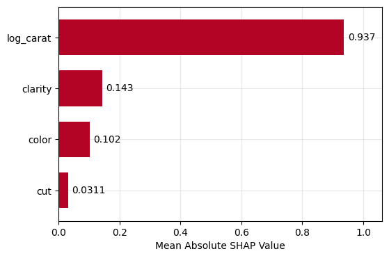
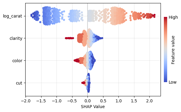
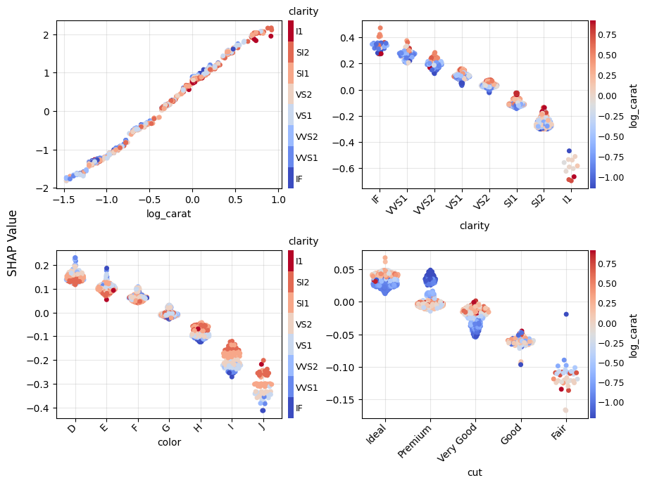
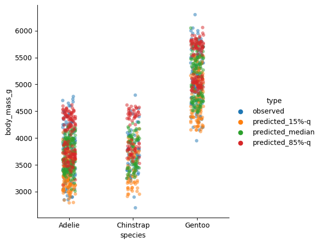
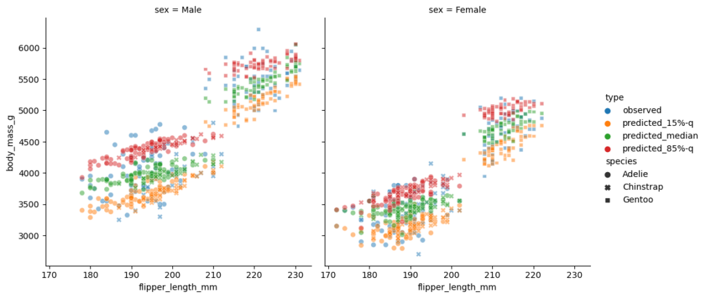
Let’s (naively) build a small CatBoost model and explain ot using a sample of 1000 observations.
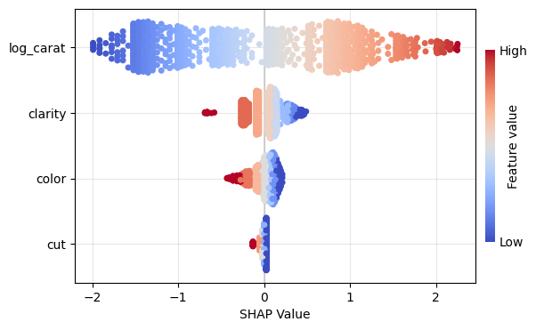
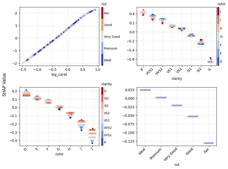
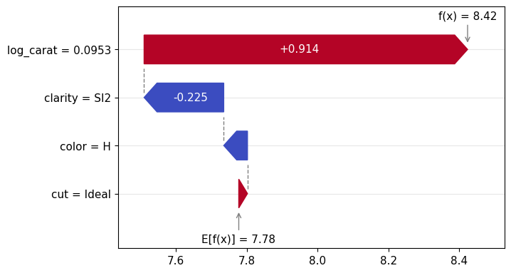
Figure 1: SHAP importance bar plot for the CatBoost modelFigure 2: SHAP beeswarm plot for the CatBoost modelFigure 3: SHAP dependence plots for the CatBoost modelFigure 4: Explaining an individual prediction via SHAP waterfall plot for the CatBoost model
Fit and explain any model
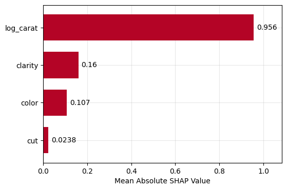
To demonstate the model agnostic SHAP cruncher explain_any(), let’s fit a linear regression model with interactions and natural cubic spline.
lm = smf.ols("log_price ~ cr(log_carat, df=4) + clarity * color + cut", data=df)
lm = lm.fit()

# SHAP analysis - automatically picking exact permutation SHAP
# due to the small number of features
X_explain = X.sample(1000, random_state=0)
lm_explanation = explain_any(lm.predict, X_explain)  # 5s on laptop

lm_explanation.plot.bar()
lm_explanation.plot.beeswarm()
lm_explanation.plot.scatter(sharey=False)
lm_explanation.plot.waterfall(row_id=0)
Figure 5: SHAP importance plot for the linear regressionFigure 6: SHAP beeswarm plot for the linear regressionFigure 7: SHAP dependence plots for the linear regressionFigure 8: SHAP waterfall plot to explain a single prediction of the linear regression
How to contribute?
Test, test, test: The more people are using and testing the current beta version of the package, the better it will get.
Open issues: If you see problems or gaps, please open an issue. Then we will discuss if/who will work on this.
Future plans
In its current early stage, the project is still a “one-man show”. While growing, the aim is to move the project to a bigger organisation, e.g., a university.
In 2021, I wrote a blog post about Swiss mortality and it turned out to be among the most read posts I have written so far. Four years later, I think it’s time for an update with the following improvements:
4 years more observations, in particular after Covid-19
As 4 years ago, I caution against any misinterpretation: I show only crude death rates (CDR) which do not take into account any demographic shift like changing distributions of age.
The first figure shows the CDR per year for several countries, Switzerland (CHE) among them. We fetch the data from the internet, pick some countries of interest, filter on combined gender only (pl.col("Sex") == pl.lit("b") with “b” for both), aggregate and plot. Thanks to this blog post , I was able to integrate the altair/vega-light charts created in Python directly into this wordpress text. The difference is that I exported the altair charts as html and directly copy&pasted it into this text as html block because the html also contains the data to be plotted (as opposed to the default json output).
from datetime import datetime
import polars as pl
import altair as alt

# https://altair-viz.github.io/user_guide/large_datasets.html
alt.data_transformers.enable("vegafusion")

df_original = pl.read_csv(
    "https://www.mortality.org/File/GetDocument/Public/STMF/Outputs/stmf.csv",
    skip_rows=2,
    # Help polars a bit:
    schema_overrides={
        "D65_74": pl.Float64,
        "D75_84": pl.Float64,
        "D85p": pl.Float64,
        "DTotal": pl.Float64,
    },
)

df_mortality = df_original.filter(
    # Select country of interest and only "both" sexes.
    # Note: Germany "DEUTNP" and "USA" have short time series.
    pl.col("CountryCode").is_in(["CAN", "CHE", "FRATNP", "GBRTENW", "SWE"]),
    pl.col("Sex") == pl.lit("b"),
).with_columns(
    # Change to ISO-3166-1 ALPHA-3 codes
    CountryCode=pl.col("CountryCode").replace(
        {"FRATNP": "FRA", "GBRTENW": "England & Wales"},
    ),
    # Create population pro rata temporis (exposure) to ease aggregation
    Population=pl.col("DTotal") / pl.col("RTotal"),
).with_columns(
    # We think that the data uses ISO 8601 week dates and we set the weekday
    # to 1, i.e., Monday.
    Date=(
        pl.col("Year").cast(pl.String)
        + "-W" + pl.col("Week").cast(pl.String).str.zfill(2)
        + "-1"
    ).str.to_date(format="%G-W%V-%u")
)

chart = (
    alt.Chart(
        df_mortality.filter(pl.col("Year") <= 2024)
        # The Covid-19 peaks in 2020 are better seen on weekly resolution.
        .group_by("Year", "CountryCode")
        .agg(pl.col("Population").sum(), pl.col("DTotal").sum())
        .with_columns(
            CDR=pl.col("DTotal") / pl.col("Population"),
        )
    )
    .mark_line(tooltip=True)
    .encode(
        x="Year:T",
        y=alt.Y("CDR:Q", scale=alt.Scale(zero=False)),
        color="CountryCode:N",
    )
    .properties(
        title="Crude Death Rate per Year",
        width=400,  # default 300
    )
    .interactive()
)
# chart.save("crude_death_rate.html")
chart
Crude death rate (CDR) for Canada (CAN), Switzerland (CHE), England & Wales, France (FRA) and Sweden (SWE). Data as of 05.07.2025.
Note that the y-axis does not start at zero. Nevertheless, we see values between 0.007 and 0.0105. The big spike that we observed in the beginning of 2021 in the old post is now flattened. In 2021 all those countries showed a CDR of over 0.01, now most are below 0.09 in 2020. This shows that the data as of February 2021 was incomplete as I mentioned. Now we have the complete picture and it looks better—fortunately!
This time, I also add a chart with weekly CDRs to demonstrate the seasonality effects.
chart = (
    alt.Chart(
        df_mortality.filter(
            pl.col("CountryCode") <= pl.lit("CHE"),
            # Last 12 years
            pl.col("Year") > pl.col("Year").max() - 12,
        ).with_columns(
            CDR=pl.col("DTotal") / pl.col("Population"),
        )
    )
    .mark_line(tooltip=True)
    .encode(
        x="Date:T",
        y=alt.Y("CDR:Q", scale=alt.Scale(zero=True)),
    )
    .properties(
        title="Crude Death Rate per Week for Switzerland",
        width=400,  # default 300
    )
    .interactive()
)
# chart.save("crude_death_rate_per_week.html")
chart
Weekly crude death rate (CDR) of Switzerland
This shows a very regular seasonal pattern with a peak in every winter.
As last time, we also collect data the deaths and population of Switzerland for more than the past 100 years. Thanks to the good Swiss government institutes that make that possible. Again, the CDR of both data sources agree within less than 1% relative error.
Have a look at the notebook linked below to see the code for this chart.
Crude death rate (CDR) for Switzerland from 1901 to 2023
Note again that the left y-axis does not start at zero, but the right y-axis does. One can see several interesting facts:
The Swiss population is and always was growing for the last 120 years—with the only exception around 1976.
The Spanish flu between 1918 and 1920 caused by far the largest peak in mortality in the last 120 years.
Covid-19 caused a significant increase of mortality in 2020-2022 that seems now gone (should have added the year 2024 in the last chart, but have a look at the first one).
The second world war is not visible in the mortality of Switzerland.
Overall, the mortality is decreasing, but this decrease seems to have flattened in the last decade.
In this post, we show how different use cases require different model diagnostics. In short, we compare (statistical) inference and prediction.
As an example, we use a simple linear model for the Munich rent index dataset, which was kindly provided by the authors of Regression – Models, Methods and Applications 2nd ed. (2021). This dataset contains monthy rents in EUR (rent) for about 3000 apartments in Munich, Germany, from 1999. The apartments have several features such as living area (area) in squared meters, year of construction (yearc), quality of location (location, 0: average, 1: good, 2: top), quality of bath rooms (bath, 0:standard, 1: premium), quality of kitchen (kitchen, 0: standard, 1: premium), indicator for central heating (cheating).
The target variable is Y=\text{rent} and the goal of our model is to predict the mean rent, E[Y] (we omit the conditioning on X for brevity).
Disclaimer: Before presenting the use cases, let me clearly state that I am not in the apartment rent business and everything here is merely for the purpose of demonstrating statistical good practice.
Inference
The first use case is about inference of the effect of the features. Imagine the point of view of an investor who wants to know whether the installation of a central heating is worth it (financially). To lay the ground on which to base a decision, a statistician must have answers to:
What is the effect of the variable cheating on the rent.
Is this effect statistically significant?
Prediction
The second use case is about prediction. This time, we take the point of view of someone looking out for a new apartment to rent. In order to know whether the proposed rent by the landlord is about right or improper (too high), a reference value would be very convenient. One can either ask the neighbors or ask a model to predict the rent of the apartment in question.
Model Fit
Before answering the above questions and doing some key diagnostics, we must load the data and fit a model. We choose a simple linear model and directly model rent.
Notes:
For rent indices as well as house prices, one often log-transforms the target variable before modelling or one uses a log-link and an appropriate loss function (e.g. Gamma deviance).
Our Python version uses GeneralizedLinearRegressor from the package glum. We could as well have chosen other implementations like statsmodels.regression.linear_model.OLS. This way, we have to implement the residual diagnostics ourselves which makes it clear what is plotted.
For brevity, we skip imports and data loading. Our model is then fit by:
Python
R
lm = glum.GeneralizedLinearRegressor(
    alpha=0,
    drop_first=True,  # this is very important if alpha=0
    formula="bs(area, degree=3, df=4) + yearc"
      	" + C(location) + C(bath) + C(kitchen) + C(cheating)"
)
lm.fit(X_train, y_train)
model = lm(
  formula = rent ~ bs(area, degree = 3, df = 4) + yearc + location + bath + kitchen + cheating,
  data = df_train
)
Diagnostics for Inference
The coefficient table will already tell us the effect of the cheating variable. For more involved models like gradient boosted trees or neural nets, one can use partial dependence and shap values to assess the effect of features.
Python
R
lm.coef_table(X_train, y_train)
summary(model)
confint(model)
Variable
coef
se
p_value
ci_lower
ci_upper
intercept
-3682.5
327.0
0.0
-4323
-3041
bs(area, ..)[1]
88.5
31.3
4.6e-03
27
150
bs(area,..)[2]
316.8
24.5
0.0
269
365
bs(area, ..)[3]
547.7
62.8
0.0
425
671
bs(area, ..)[4]
733.7
91.7
1.3e-15
554
913
yearc
1.9
0.2
0.0
1.6
2.3
C(location)[2]
48.2
5.9
4.4e-16
37
60
C(location)[3]
137.9
27.7
6.6e-07
84
192
C(bath)[1]
50.0
16.5
2.4e-03
18
82
C(kitchen)[1]
98.2
18.5
1.1e-07
62
134
C(cheating)[1]
107.8
10.6
0.0
87.0
128.6
We see that ceteris paribus, meaning all else equal, a central heating increases the monthly rent by about 108 EUR. Not the size of the effect of 108 EUR, but the fact that there is an effect of central heating on the rent seems statistically significant: This is indicated by the very low probability, i.e. p-value, for the null-hypothesis of cheating having a coefficient of zero. We also see that the confidence interval with the default confidence level of 95%: [ci_lower, ci_upper] = [87, 129]. This shows the uncertainty of the estimated effect.
For a building with 10 apartments and with an investment horizon of about 10 years, the estimated effect gives roughly a budget of 13000 EUR (range is roughly 10500 to 15500 with 95% confidence).
A good statistician should ask several further questions:
Is the dataset at hand a good representation of the population?
Are there confounders or interaction effects, in particular between cheating and other features?
Are the assumptions for the low p-value and the confidence interval of cheating valid?
Here, we will only address the last question, and even that one only partially. Which assumptions were made? The error term, \epsilon = Y - E[Y], should be homoscedastic and Normal distributed. As the error is not observable (because the true model for E[Y] is unknown), one replaces E[Y] by the model prediction \hat{E}[Y], this gives the residuals, \hat{\epsilon} = Y - \hat{E}[Y] = y - \text{fitted values}, instead. For homoscedasticity, the residuals should look like white (random) noise. Normality, on the other hand, becomes less of a concern with larger data thanks to the central limit theorem. With about 3000 data points, we are far away from small data, but it might still be a good idea to check for normality.
The diagnostic tools to check that are residual and quantile-quatile (QQ) plots.
Python
R
# See notebook for a definition of residual_plot.
import seaborn as sns
fig, axes = plt.subplots(ncols=2, figsize=(4.8 * 2.1, 6.4))
ax = residual_plot(model=lm, X=X_train, y=y_train, ax=axes[0])
sns.kdeplot(
    x=lm.predict(X_train),
    y=residuals(lm, X_train, y_train, kind="studentized"),
    thresh=.02,
    fill=True,
    ax=axes[1],
).set(
    xlabel="fitted",
    ylabel="studentized residuals",
    title="Contour Plot of Residuals",
)
autoplot(model, which = c(1, 2))  # from library ggfortify
# density plot of residuals
ggplot(model, aes(x = .fitted, y = .resid)) + geom_point() +
  geom_density_2d() + geom_density_2d_filled(alpha = 0.5)
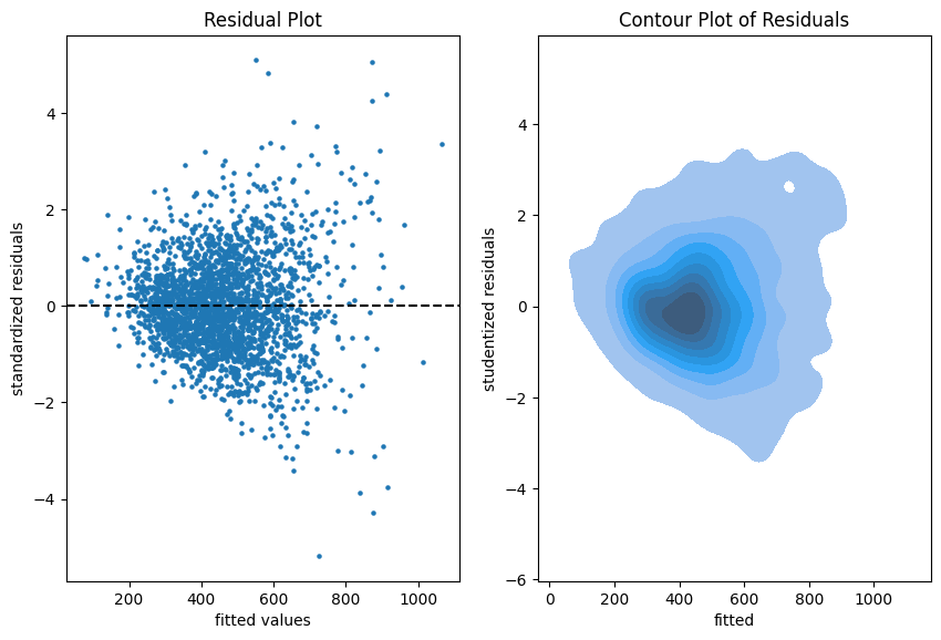
Residual plots on the training data.
The more data points one has the less informative is a scatter plot. Therefore, we put a contour plot on the right.
Visual insights:
There seems to be a larger variability for larger fitted values. This is a hint that the homoscedasticity might be violated.
The residuals seem to be centered around 0. This is a hint that the model is well calibrated (adequate).
Python
R
# See notebook for a definition of qq_plot.
qq_plot(lm, X_train, y_train)
autoplot(model, which = 2)
The QQ-plot shows the quantiles of the theoretical assumed distribution of the residuals on the x-axis and the ordered values of the residuals on the y-axis. In the Python version, we decided to use the studentized residuals because normality of the error implies a student (t) distribution for these residuals.
Concluding remarks:
We might do similar plots on the test sample, but we don’t necessarily need a test sample to answer the inference questions.
It is good practice to plot the residuals vs each of the features as well.
Diagnostics for Prediction
If we are only interested in predictions of the mean rent, \hat{E}[Y], we don’t care much about the probability distribution of Y. We just want to know if the predictions are close enough to the real mean of the rent E[Y]. In a similar argument as for the error term and residuals, we have to accept that E[Y] is not observable (it is the quantity that we want to predict). So we have to fall back to the observations of Y in order to judge if our model is well calibrated, i.e., close the the ideal E[Y].
Very importantly, here we make use of the test sample in all of our diagnostics because we fear the in-sample bias.
We start simple by a look at the unconditional calibration, that is the average (negative) residual \frac{1}{n}\sum(\hat{E}[Y_i]-Y_i).
print(paste("Train set mean residual:", mean(resid(model))))
print(paste("Test set mean residual: ", mean(df_test$rent - predict(model, df_test))))
set
mean bias
count
stderr
p-value
train
-3.2e-12
2465
2.8
1.0
test
2.1
617
5.8
0.72
It is no surprise that bias_mean in the train set is almost zero. This is the balance property of (generalized) linear models (with intercept term). On the test set, however, we detect a small bias of about 2 EUR per apartment on average.
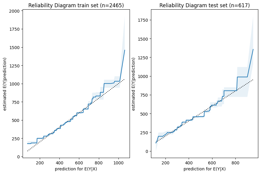
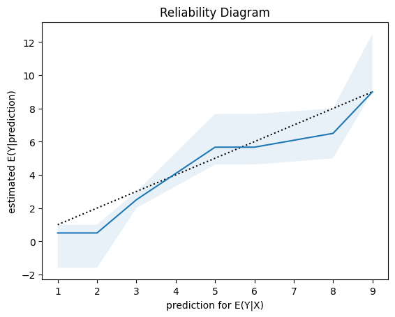
Next, we have a look a reliability diagrams which contain much more information about calibration and bias of a model than the unconditional calibration above. In fact, it assesses auto-calibration, i.e. how well the model uses its own information. An ideal model would lie on the dotted diagonal line.
Python
R
fig, axes = plt.subplots(ncols=2, figsize=(4.8 * 2.1, 6.4))
plot_reliability_diagram(y_obs=y_train, y_pred=lm.predict(X_train), n_bootstrap=100, ax=axes[0])
axes[0].set_title(axes[0].get_title() + f" train set (n={X_train.shape[0]})")
plot_reliability_diagram(y_obs=y_test, y_pred=lm.predict(X_test), n_bootstrap=100, ax=axes[1])
axes[1].set_title(axes[1].get_title() + f" test set (n={X_test.shape[0]})")
iso_train = isoreg(x = model$fitted.values, y = df_train$rent)
iso_test = isoreg(x = predict(model, df_test), y = df_test$rent)
bind_rows(
  tibble(set = "train", x = iso_train$x[iso_train$ord], y = iso_train$yf),
  tibble(set = "test", x = iso_test$x[iso_test$ord], y = iso_test$yf),
) |>
  ggplot(aes(x=x, y=y, color=set)) + geom_line() +
  geom_abline(intercept = 0, slope = 1, linetype="dashed") +
  ggtitle("Reliability Diagram")
Visual insights:
Graphs on train and test set look very similar. The larger uncertainty intervals on the test set stem from the fact that is has a smaller sample size.
The model seems to lie around the diagonal indicating good auto-calibration for the largest part of the range.
Very high predicted values seem to be systematically too low, i.e. the graph is above the diagonal.
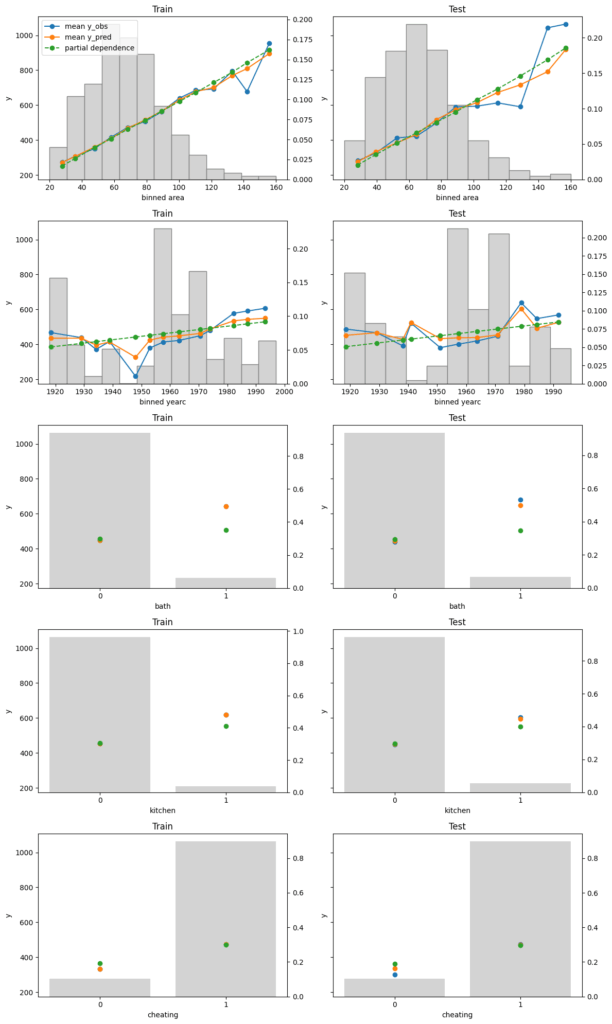
Finally, we assess conditional calibration, i.e. the calibration with respect to the features. Therefore, we plot one of our favorite graphs for each feature. It consists of:
average observed value of Y for each (binned) value of the feature
average predicted value
partial dependence
histogram of the feature (grey, right y-axis)
Python
R
fig, axes = plt.subplots(nrows=5, ncols=2, figsize=(12, 5*4), sharey=True)
for i, col in enumerate(["area", "yearc", "bath", "kitchen", "cheating"]):
    plot_marginal(
        y_obs=y_train,
        y_pred=lm.predict(X_train),
        X=X_train,
        feature_name=col,
        predict_function=lm.predict,
        ax=axes[i][0],
    )
    plot_marginal(
        y_obs=y_test,
        y_pred=lm.predict(X_test),
        X=X_test,
        feature_name=col,
        predict_function=lm.predict,
        ax=axes[i][1],
    )
    axes[i][0].set_title("Train")
    axes[i][1].set_title("Test")
    if i != 0:
        axes[i][0].get_legend().remove()
    axes[i][1].get_legend().remove()
fig.tight_layout()
xvars = c("area", "yearc", "bath", "kitchen", "cheating")
m_train = feature_effects(model, v = xvars, data = df_train, y = df_train$rent)
m_test = feature_effects(model, v = xvars, data = df_test, y = df_test$rent)

c(m_train, m_test) |>
  plot(
    share_y = "rows",
    ncol = 2,
    byrow = FALSE,
    stats = c("y_mean", "pred_mean", "pd"),
    subplot_titles = FALSE,
    # plotly = TRUE,
    title = "Left: Train - Right: Test",
  )
Visual insights:
On the train set, the categorical features seem to have perfect calibration as average observed equals average predicted. This is again a result of the balance property. On the test set, we see a deviation, especially for the categorical level with smaller sample size. This is a good demonstration why plotting on both train and test set is a good idea.
The numerical features area and year of construction seem fine, but a closer look can’t hurt.
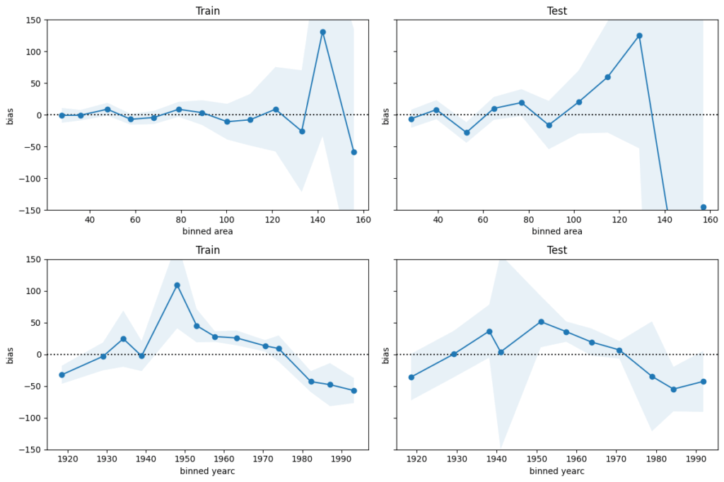
We next perform a bias plot, which is plotting the average difference of predicted minus observed per feature value. The values should be around zero, so we can zoom in on the y-axis. This is very similar to the residual plot, but the information is better condensed for its purpose.
Python
R
fig, axes = plt.subplots(nrows=2, ncols=2, figsize=(12, 2*4), sharey=True)
axes[0,0].set_ylim(-150, 150)
for i, col in enumerate(["area", "yearc"]):
    plot_bias(
        y_obs=y_train,
        y_pred=lm.predict(X_train),
        feature=X_train[col],
        ax=axes[i][0],
    )
    plot_bias(
        y_obs=y_test,
        y_pred=lm.predict(X_test),
        feature=X_test[col],
        ax=axes[i][1],
    )
    axes[i][0].set_title("Train")
    axes[i][1].set_title("Test")
fig.tight_layout()
For large values of area and yearc in the 1940s and 1950s, there are only few observations available. Still, the model might be improved for those regions.
The bias of yearc shows a parabolic curve. The simple linear effect in our model seems too simplistic. A refined model could use splines instead, as for area.
Concluding remarks:
The predictions for area larger than around 120 square meters and for year of construction around the 2nd world war are less reliable.
For all the rest, the bias is smaller than 50 EUR on average. This is therefore a rough estimation of the prediction uncertainty. It should be enough to prevent improperly high (or low) rents (on average).
Conversion from CSV to Parquet in streaming mode? No problem for the two power houses Polars and DuckDB. We can even throw in some data preprocessing steps in-between, like column selection, data filters, or sorts.
Edit: Streaming writing (or “lazy sinking”) of data with Polars was introduced with release 1.25.2 in March 2025, thanks Christian for pointing this out.
pip install polars
pip install duckdb
Run times are on a normal laptop, dedicating 8 threads to the crunching.
Let’s use Polars in Lazy mode to connect to the CSV, apply some data operations, and stream the result into a Parquet file.
Python
# Native API with POLARS_MAX_THREADS = 8
(
    pl.scan_csv("data.csv")
    .filter(pl.col("X") == "a")
    .drop("X")
    .sort(["Y", "Z"])
    .sink_parquet("data.parquet", row_group_size=100_000)  # "zstd" compression
)
# 3.5 s
In case you prefer to write SQL code, you can alternatively use the SQL API of Polars. Curiously, run time is substantially longer:
Python
# Via SQL API (slower!?)
(
    pl.scan_csv("data.csv")
    .sql("SELECT Y, Z FROM self WHERE X == 'a' ORDER BY Y, Z")
    .sink_parquet("data.parquet", row_group_size=100_000)
)

# 6.8 s
In both cases, the result looks as expected, and the resulting Parquet file is about 170 MB large.
Python
pl.scan_parquet("data.parquet").head(5).collect()

# Output
        Y   Z
      f64 i64
3.7796e-8	4
5.0273e-8	5
5.7652e-8	4
8.0578e-8	3
8.1598e-8	4
DuckDB
As an alternative, we use DuckDB. Thread pool size and RAM limit can be set on the fly. Setting a low memory limit (e.g., 500 MB) will lead to longer run times, but it works.
Python
con = duckdb.connect(config={"threads": 8, "memory_limit": "4GB"})

con.sql(
    """
    COPY (
        SELECT Y, Z
        FROM 'data.csv'
        WHERE X == 'a'
        ORDER BY Y, Z
    ) TO 'data.parquet' (FORMAT parquet, COMPRESSION zstd, ROW_GROUP_SIZE 100_000)
    """
)

# 3.9 s
Again, the output looks as expected. The Parquet file is again 170 MB large, thanks to using the same compression (“zstd”) as with Polars..
The functionality is best described by its output:
PythonR
The plots show different types of feature effects relevant in modeling:
Average observed: Descriptive effect (also interesting without model).
Average predicted: Combined effect of all features. Also called “M Plot” (Apley 2020).
Partial dependence: Effect of one feature, keeping other feature values constant (Friedman 2001).
Number of observations or sum of case weights: Feature value distribution.
R only: Accumulated local effects, an alternative to partial dependence (Apley 2020).
Both implementations…
are highly efficient thanks to {Polars} in Python and {collapse} in R, and work on datasets with millions of observations,
support case weights with all their statistics, ideal in insurance applications,
calculate average residuals (not shown in the plots above),
provide standard deviations/errors of average observed and bias,
allow to switch to Plotly for interactive plots, and
are highly customizable (the R package, e.g., allows to collapse rare levels after calculating statistics via the update() method or to sort the features according to main effect importance).
In the spirit of our “Lost In Translation” series, we provide both high-quality Python and R code. We will use the same data and models as in one of our latest posts on how to build strong GLMs via ML + XAI.
Example
Let’s build a Poisson LightGBM model to explain the claim frequency given six traditional features in a pricing dataset on motor liability claims. 80% of the 1 Mio rows are used for training, the other 20% for evaluation. Hyper-parameters have been slightly tuned (not shown).
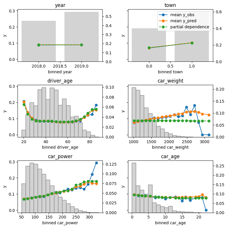
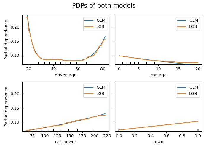
Let’s inspect the (main effects) of the model on the test data.
R
Python
library(effectplots)

# 0.3 s
feature_effects(fit, v = xvars, data = X_test, y = test$claim_nb) |>
  plot(share_y = "all")
from model_diagnostics.calibration import plot_marginal

fig, axes = plt.subplots(3, 2, figsize=(8, 8), sharey=True, layout="tight")

# 2.3 s
for i, (feat, ax) in enumerate(zip(X_test.columns, axes.flatten())):
    plot_marginal(
        y_obs=y_test,
        y_pred=model.predict(X_test),
        X=X_test,
        feature_name=feat,
        predict_function=model.predict,
        ax=ax,
    )
    ax.set_title(feat)
    if i != 1:
        ax.legend().remove()
The output can be seen at the beginning of this blog post.
Here some model insights:
Average predictions closely match observed frequencies. No clear bias is visible.
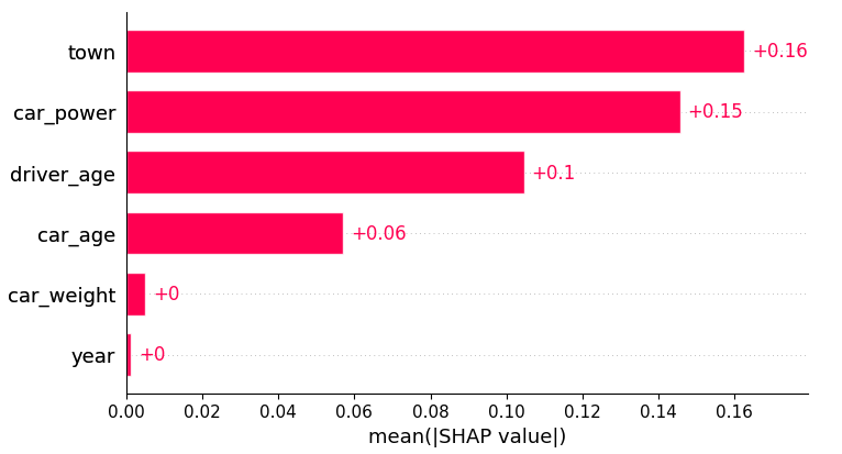
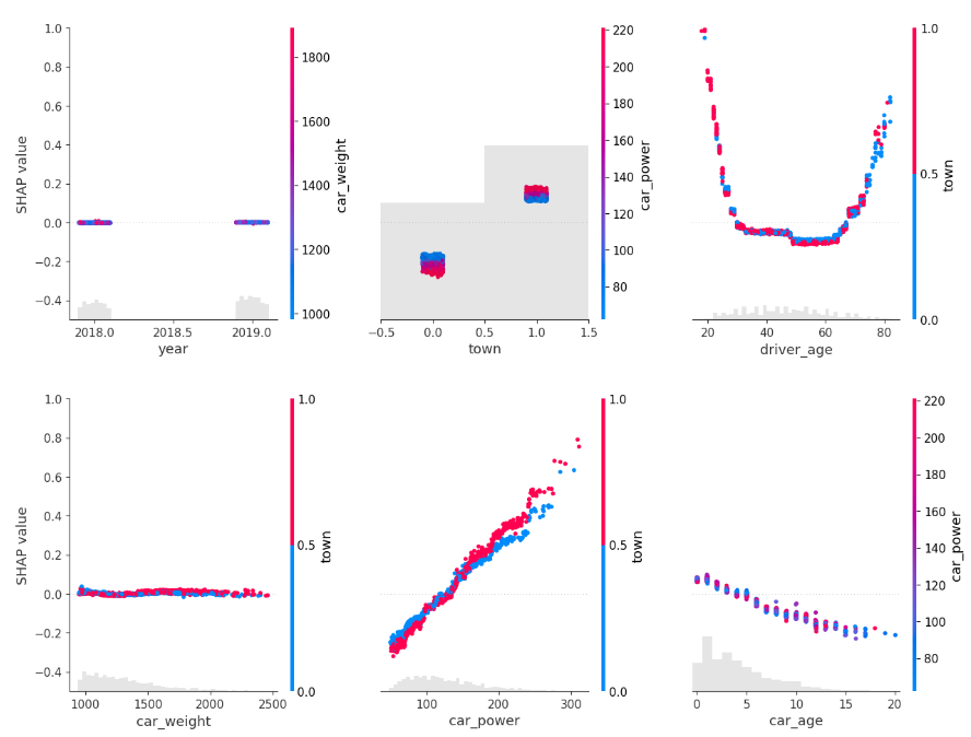
Partial dependence shows that the year and the car weight almost have no impact (regarding their main effects), while the driver_age and car_power effects seem strongest. The shared y axes help to assess these.
Except for car_weight, the partial dependence curve closely follows the average predictions. This means that the model effect seems to really come from the feature on the x axis, and not of some correlated other feature (as, e.g., with car_weight which is actually strongly correlated with car_power).
Final words
Inspecting models has become much relaxed with above functions.
The packages used offer much more functionality. Try them out! Or we will show them in later posts ;).
References
Apley, Daniel W., and Jingyu Zhu. 2020. Visualizing the Effects of Predictor Variables in Black Box Supervised Learning Models. Journal of the Royal Statistical Society Series B: Statistical Methodology, 82 (4): 1059–1086. doi:10.1111/rssb.12377.
Friedman, Jerome H. 2001. Greedy Function Approximation: A Gradient Boosting Machine. Annals of Statistics 29 (5): 1189–1232. doi:10.1214/aos/1013203451.
Within only a few years, SHAP (Shapley additive explanations) has emerged as the number 1 way to investigate black-box models. The basic idea is to decompose model predictions into additive contributions of the features in a fair way. Studying decompositions of many predictions allows to derive global properties of the model.
What happens if we apply SHAP algorithms to additive models? Why would this ever make sense?
In the spirit of our “Lost In Translation” series, we provide both high-quality Python and R code.
The models
Let’s build the models using a dataset with three highly correlated covariates and a (deterministic) response.
import numpy as np
import lightgbm as lgb
import shap
from sklearn.preprocessing import PolynomialFeatures
from sklearn.compose import ColumnTransformer
from sklearn.pipeline import Pipeline
from sklearn.linear_model import LinearRegression

#===================================================================
# Make small data
#===================================================================

def make_data(n=100):
    x1 = np.linspace(0.01, 1, n)
    x2 = np.log(x1)
    x3 = x1 > 0.7
    X = np.column_stack((x1, x2, x3))

    y = 1 + 0.2 * x1 + 0.5 * x2 + x3 + np.sin(2 * np.pi * x1)

    return X, y

X, y = make_data()

#===================================================================
# Additive linear model and additive boosted trees
#===================================================================

# Linear model with polynomial terms
poly = PolynomialFeatures(degree=3, include_bias=False)

preprocessor =  ColumnTransformer(
    transformers=[
        ("poly0", poly, [0]),
        ("poly1", poly, [1]),
        ("other", "passthrough", [2]),
    ]
)

model_lm = Pipeline(
    steps=[
        ("preprocessor", preprocessor),
        ("lm", LinearRegression()),
    ]
)
_ = model_lm.fit(X, y)

# Boosted trees with single-split trees
params = dict(
    learning_rate=0.05,
    objective="mse",
    max_depth=1,
    colsample_bynode=0.7,
)

model_lgb = lgb.train(
    params=params,
    train_set=lgb.Dataset(X, label=y),
    num_boost_round=300,
)
SHAP
For both models, we use exact permutation SHAP and exact Kernel SHAP. Furthermore, the linear model is analyzed with “additive SHAP”, and the tree-based model with TreeSHAP.
Do the algorithms provide the same?
R
Python
system.time({  # 1s
  shap_lm <- list(
    add = shapviz(additive_shap(fit_lm, df)),
    kern = kernelshap(fit_lm, X = df[xvars], bg_X = df),
    perm = permshap(fit_lm, X = df[xvars], bg_X = df)
  )

  shap_lgb <- list(
    tree = shapviz(fit_lgb, X),
    kern = kernelshap(fit_lgb, X = X, bg_X = X),
    perm = permshap(fit_lgb, X = X, bg_X = X)
  )
})

# Consistent SHAP values for linear regression
all.equal(shap_lm$add$S, shap_lm$perm$S)
all.equal(shap_lm$kern$S, shap_lm$perm$S)

# Consistent SHAP values for boosted trees
all.equal(shap_lgb$lgb_tree$S, shap_lgb$lgb_perm$S)
all.equal(shap_lgb$lgb_kern$S, shap_lgb$lgb_perm$S)

# Linear coefficient of x3 equals slope of SHAP values
tail(coef(fit_lm), 1)                # 1.112096
diff(range(shap_lm$kern$S[, "x3"]))  # 1.112096

sv_dependence(shap_lm$add, xvars)sv_dependence(shap_lm$add, xvars, color_var = NULL)
shap_lm = {
"add": shap.Explainer(model_lm.predict, masker=X, algorithm="additive")(X),
"perm": shap.Explainer(model_lm.predict, masker=X, algorithm="exact")(X),
"kern": shap.KernelExplainer(model_lm.predict, data=X).shap_values(X),
}
shap_lgb = {
"tree": shap.Explainer(model_lgb)(X),
"perm": shap.Explainer(model_lgb.predict, masker=X, algorithm="exact")(X),
"kern": shap.KernelExplainer(model_lgb.predict, data=X).shap_values(X),
}
# Consistency for additive linear regression
eps = 1e-12
assert np.abs(shap_lm["add"].values - shap_lm["perm"].values).max() < eps
assert np.abs(shap_lm["perm"].values - shap_lm["kern"]).max() < eps
# Consistency for additive boosted trees
assert np.abs(shap_lgb["tree"].values - shap_lgb["perm"].values).max() < eps
assert np.abs(shap_lgb["perm"].values - shap_lgb["kern"]).max() < eps
# Linear effect of last feature in the fitted model
model_lm.named_steps["lm"].coef_[-1] # 1.112096
# Linear effect of last feature derived from SHAP values (ignore the sign)
shap_lm["perm"][:, 2].values.ptp() # 1.112096
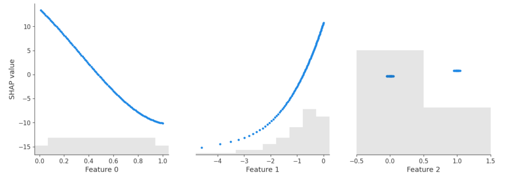
shap.plots.scatter(shap_lm["add"])
SHAP dependence plot of the additive linear model and the additive explainer (Python).
Yes – the three algorithms within model provide the same SHAP values. Furthermore, the SHAP values reconstruct the additive components of the features.
Didactically, this is very helpful when introducing SHAP as a method: Pick a white-box and a black-box model and compare their SHAP dependence plots. For the white-box model, you simply see the additive components, while the dependence plots of the black-box model show scatter due to interactions.
Remark: The exact equivalence between algorithms is lost, when
there are too many features for exact procedures (~10+ features), and/or when
the background data of Kernel/Permutation SHAP does not agree with the training data. This leads to slightly different estimates of the baseline value, which itself influences the calculation of SHAP values.
Final words
SHAP algorithms applied to additive models typically give identical results. Slight differences might occur because sampling versions of the algos are used, or a different baseline value is estimated.
The resulting SHAP values describe the additive components.
Didactically, it helps to see SHAP analyses of white-box and black-box models side by side.
TLDR: The scipy 1.7.0 release introduced Wright’s generalized Bessel function in the Python ecosystem. It is an important ingredient for the density and log-likelihood of Tweedie probabilty distributions. In this last part of the trilogy I’d like to point out why it was important to have this function and share the endeavor of implementing this inconspicuous but highly intractable special function. The fun part is exploiting a free parameter in an integral representation, which can be optimized by curve fitting to the minimal arc length.
This trilogy celebrates the 40th birthday of Tweedie distributions in 2024 and highlights some of their very special properties.
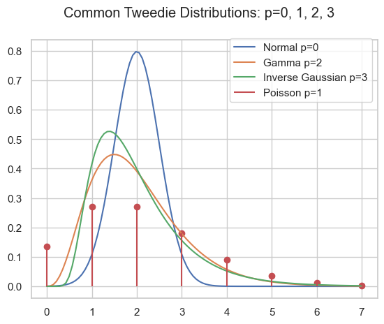
As pointed out in part I and part II, the family of Tweedie distributions is a very special one with outstanding properties. They are central for estimating expectations with GLMs. The probability distributions have mainly positive (non-negative) support and are skewed, e.g. Poisson, Gamma, Inverse Gaussian and compound Poisson-Gamma.
\begin{align*}
Y &\sim \mathrm{Tw}_p(\mu, \phi)
\end{align*}
Probability density of several Tweedie distributions.
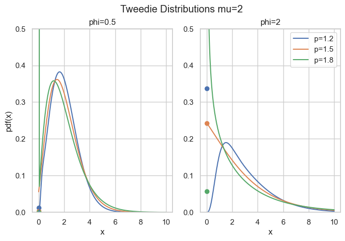
Compound Poisson Gamma
A very special domain for the power parameter is between Poisson and Gamma: 1<p<2. This range results in the Compound Poisson distribution which is suitable if you have a random count process and if each count itself has a random amount. A well know example is insurance claims. Typically, there is a random number of insurance claims, and each and every claim has a random amount of claim costs.
\begin{align*}
N &\sim \mathrm{Poisson}(\lambda)\\
X_i &\sim \mathrm{Gamma}(a, b)\\
Y &= \sum_{i=0}^N X_i \sim \mathrm{CompPois}(\lambda, a, b)
\end{align*}
For Poisson count we have \operatorname{E}[N]=\lambda and \operatorname{Var}[N]=\lambda=\operatorname{E}[N], for the Gamma amount \operatorname{E}[X]=\frac{a}{b} and \operatorname{Var}[X]=\frac{a}{b^2}=\frac{1}{a}\operatorname{E}[X]^2. For the compound Poisson-Gamma variable, we obtain
What’s so special here is that there is a point mass at zero, i.e., P(Y=0)=\exp(-\frac{\mu^{2-p}}{\phi(2-p)}) > 0. Hence, it is a suitable distribution for non-negative quantities with some exact zeros.
Probability density for compound Poisson Gamma, point masses at zero are marked as points.
Code
import matplotlib.pyplot as plt
import numpy as np
from scipy.special import wright_bessel


def cpg_pmf(mu, phi, p):
    """Compound Poisson Gamma point mass at zero."""
    return np.exp(-np.power(mu, 2 - p) / (phi * (2 - p)))

def cpg_pdf(x, mu, phi, p):
    """Compound Poisson Gamma pdf."""
    if not (1 < p < 2):
        raise ValueError("1 < p < 2 required")
    theta = np.power(mu, 1 - p) / (1 - p)
    kappa = np.power(mu, 2 - p) / (2 - p)
    alpha = (2 - p) / (1 - p)
    t = ((p - 1) * phi / x)**alpha
    t /= (2 - p) * phi
    a = 1 / x * wright_bessel(-alpha, 0, t)
    return a * np.exp((x * theta - kappa) / phi)

fig, axes = plt.subplots(ncols=2, figsize=[6.4 * 1.25, 4.8])
x = np.linspace(1e-9, 10, 200)
mu = 2
for p in [1.2, 1.5, 1.8]:
    for i, phi in enumerate([0.5, 2]):
        axes[i].plot(x, cpg_pdf(x=x, mu=mu, phi=phi, p=p), label=f"{p=}")
        axes[i].scatter(0, cpg_pmf(mu=mu, phi=phi, p=p))
        axes[i].set_ylim(0, 0.5)
        axes[i].set_title(f"{phi=}")
        if i > 0:
            axes[i].legend()
        else:
            axes[i].set_ylabel("pdf(x)")
        axes[i].set_xlabel("x")
fig.suptitle("Tweedie Distributions mu=2")
The rest of this post is about how to compute the density for this parameter range. The easy part is \exp\left(\frac{y\theta - \kappa(\theta)}{\phi}\right) which can be directly implemented. The real obstacle is the term c(y, \phi) which is given by
This depends on Wright’s (generalized Bessel) function\Phi(a, b, z) as introduced in a 1933 paper by E. Wright.
Wright’s Generalized Bessel Function
According to DLMF 10.46, the function is defined as
\begin{equation*}
\Phi(a, b, z) = \sum_{k=0}^{\infty} \frac{z^k}{k!\Gamma(ak+b)}, \quad a > -1, b \in R, z \in C
\end{equation*}
which converges everywhere because it is an entire function. We will focus on the positive real axis z=x\geq 0 and the range a\geq 0, b\geq 0 (note that a=-\alpha \in (0,\infty) for 1<p<2). For the compound Poisson-Gamma, we even have b=0.
Implementation of such a function as done in scipy.stats.wright_bessel, even for the restricted parameter range, poses tremendous challenges. The first one is that it has three parameters which is quite a lot. Then the series representation above, for instance, can always be used, but depending on the parameters, it will require a huge amount of terms, particularly for large x. As each term involves the Gamma function, this becomes expensive very fast. One ends up using different representations and strategies for different parameter regions:
Small x: Taylor series according to definition
Small a: Taylor series in a=0
Large x: Asymptotic series due to Wright (1935)
Large a: Taylor series according to definition for a few terms around the approximate maximum term k_{max} due to Dunn & Smyth (2005)
General: Integral represantation due to Luchko (2008)
Dunn & Smyth investigated several evaluation strategies for the simpler Tweedie density which amounts to Wright’s functions with b=0, see Dunn & Smyth (2005). Luchko (2008) lists most of the above strategies for the full Wright’s function.
Note that Dunn & Smyth (2008) provide another strategy to evaluate the Tweedie distribution function by means of the inverse Fourier transform. This does not involve Wright’s function, but also encounters complicated numerical integration of oscillatory functions.
The Integral Representation
This brings us deep into complex analysis: We start with Hankel’s contour integral representation of the reciprocal Gamma function.
with the Hankel path Ha^- from negative infinity (A) just below the real axis, counter-clockwise with radius \epsilon>0 around the origin and just above the real axis back to minus infinity (D).
Hankel contour Ha– in the complex plane.
In principle, one is free to choose any such path with the same start (A) and end point (D) as long as one does not cross the negative real axis. One usually lets the AB and CD be infinitesimal close to the negative real line. Very importantly, the radius \epsilon>0 is a free parameter! That is real magic🪄
By interchanging sum and integral and using the series of the exponential, Wright’s function becomes
Now, one needs to do the tedious work and split the integral into the 3 path sections AB, BC, CD. Putting AB and CD together gives an integral over K, the circle BC gives an integral over P:
\begin{align*}
\Phi(a, b, x) &= \frac{1}{\pi} \int_{\epsilon}^\infty K(a, b, x, r) \; dr
\\
 &+ \frac{\epsilon^{1-b}}{\pi} \int_0^\pi P(\epsilon, a, b, x, \varphi) \; d\varphi
\\
K(a, b, x, r) &= r^{-b}\exp(-r + x  r^{-a} \cos(\pi a))
\\
&\quad \sin(x \cdot r^{-a} \sin(\pi a) + \pi b)
\\
P(\epsilon, a, b, x, \varphi) &= \exp(\epsilon \cos(\varphi) + x  \epsilon^{-a}\cos(a \varphi))
\\
&\quad \cos(\epsilon \sin(\varphi) - x \cdot \epsilon^{-a} \sin(a \varphi) + (1-b) \varphi)
\end{align*}
What remains is to carry out the numerical integration, also known as quadrature. While this is an interesting topic in its own, let’s move to the magic part.
Arc Length Minimization
If you have come so far and say, wow, puh, uff, crazy, 🤯😱 Just keep on a little bit because here comes the real fun part🤞
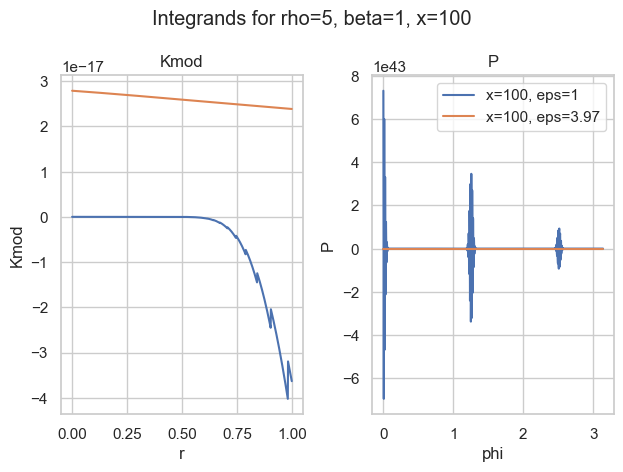
It turns out that most of the time, the integral over P is the most difficult. The worst behaviour an integrand can have is widely oscillatory. Here is one of my favorite examples:
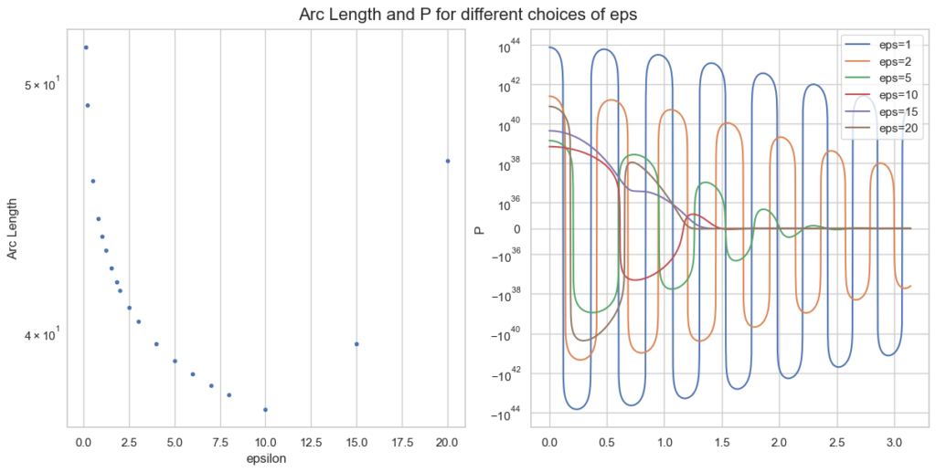
Integrands for a=5, b=1, x=100 and two choices of epsilon.
With the naive choice of \epsilon=1, both integrands (blue) are—well—crazy. There is basically no chance the most sophisticated quadrature rule will work. And then look at the other choice of \epsilon\approx 4. Both curves seem well behaved (for P, we would need a closer look).
So the idea is to find a good choice of \epsilon to make P well behaved. Well behaved here means most boring, if possible a straight line. What makes a straight line unique? In flat space, it is the shortest path between two points. Therefore, well behaved integrands have minimal arc length. That is what we want to minimize.
The arc lengthS from x=a to x=b of a 1-dimensional function f is given by
\begin{equation*}
S = \int_a^b \sqrt{1 + f^\prime(x)^2} \; dx
\end{equation*}
Instead of f=P, we only take the oscillatory part of P and approximate the arc length as f(\varphi)=f(\varphi) = \epsilon \sin(\varphi) - x \epsilon^{-\rho} \sin(\rho \varphi) + (1-\beta) \varphi. For a single parameter point a, b, z this looks like
Arc length and integrand P for different epsilon, given a=0.1, b=5, x=100.
Note the logarithmic y-scale for the right plot of P. The optimal \epsilon=10 is plotted in red and behaves clearly better than smaller values of \epsilon.
What remains to be done for an actual implementation is
Calculate minimal \epsilon for a large grid of values a, b, x.
Choose a function with some parameters.
Curve fitting (so again optimisation): Fit this function to the minimal \epsilon of the grid via minimising least squares.
Implement some quadrature rules and use this choice of \epsilon in the hope that it intra- and extrapolates well.
This strategy turns out to work well in practice and is implemented in scipy. As the parameter space of 3 variables is huge, the integral representation breaks down in certain areas, e.g. huge values of \epsilon where the integrands just overflow numerically (in 64-bit floating point precision). But we have our other evaluation strategies for that.
Conclusion
An extensive notebook for Wright’s function, with all implementation strategies can be found here.
After an adventurous journey, we arrived at one implementation strategy of Wright’s generalised Bessel function, namely the integral representation. The path went deep into complex analysis and contour integration, then further to the arc length of a function and finally curve fitting via optimisation. I am really astonished how connected all those different areas of mathematics can be.
Wright’s function is the missing piece to compute full likelihoods and probability functions of the Tweedie distribution family and is now available in the Python ecosystem via scipy.
We are at the very end of this Tweedie trilogy. I hope it has been entertaining and it has become clear why Tweedie deserves to be celebrated.
Further references:
Delong, Ł., Lindholm, M. & Wüthrich, M.V. “Making Tweedie’s compound Poisson model more accessible”. Eur. Actuar. J.11, 185–226 (2021). https://doi.org/10.1007/s13385-021-00264-3
Wright E.M. 1933. “On the coefficients of power series having essential singularities”. J. London Math. Soc. 8: 71–79. https://doi.org/10.1112/jlms/s1-8.1.71
Wright, E. M. 1935, “The asymptotic expansion of the generalized Bessel”, function. Proc. London Math. Soc. (2) 38, pp. 257–270. https://doi.org/10.1112/plms/s2-38.1.257
Dunn, P.K., Smyth, G.K. “Series evaluation of Tweedie exponential dispersion model densities”. Stat Comput 15, 267–280 (2005). https://doi.org/10.1007/s11222-005-4070-y
Dunn, P.K., Smyth, G.K. “Evaluation of Tweedie exponential dispersion model densities by Fourier inversion”. Stat Comput 18, 73–86 (2008). https://doi.org/10.1007/s11222-007-9039-6
Luchko, Y. F. (2008), “Algorithms for Evaluation of the Wright Function for the Real Arguments’ Values”, Fractional Calculus and Applied Analysis 11(1). https://eudml.org/doc/11309 Note a slight misprint in the integrand P.
TLDR: This second part of the trilogy will have a deeper look at offsets and sample weights of a GLM. Their non-equivalence stems from the mean-variance relationship. This time, we not only have a Poisson frequency but also a Gamma severity model.
This trilogy celebrates the 40th birthday of Tweedie distributions in 2024 and highlights some of their very special properties.
In the part I, we have already introduced the mean-variance relation of a Tweedie random variable Y\sim Tw_p(\mu, \phi) with Tweedie power p, mean \mu and dispersion parameter \phi:
This variance function directly impacts the estimation of GLMs. Assume the task is to estimate the expectation of a random variableY_i\sim Tw_p(\mu_i, \phi/w_i), given observations of the target y_i and of explanatories variables, aka features, x_i\in R^k. A GLM then assumes a link functiong(\mu_i) = \sum_{j=1}^k x_{ij}\beta_jwith coefficients \beta to be estimated via an optimization procedure, of which the first order condition, also called score equation, reads
This shows that the higher the Tweedie power p, entering via v(\mu) only, the less weight is given to deviations of large values. In other words, higher Tweedie powers result in GLMs that are less and less sensitive to what happens at large (expected) values.
This is also reflected in the deviance loss function. They can be derived from the negative log-likelihood and are given by
These are the only strictly consistent scoring functions for the expectation (up to one multiplicative and one additive constant) that are homogeneous functions (of degree 2-p), see, e.g., Fissler et al (2022). The Poisson deviance (p=1), for example, has a degree of homogeneity of 1 and the same unit as the target variable. The Gamma deviance (p=2), on the other side, is zero-homogeneous and is completely agnostic to the scale of its arguments. This is another way of stating the above: the higher the Tweedie power the less it cares about large values.
It is also connected to the fact that Tweedie distributions are the only distributions from the exponential dispersion family that are closed under scale transformations:
When estimating counts with a Poisson GLM, there is often an exposure measure like time under consideration or underlying number of things (insurance policies, trees in a forest, radioactive atoms). One then often finds two different, but equivalent formulations of a Poisson GLM with log-link.
Sample weights: Model frequency y=\frac{N}{w} and fit with sample weights w to estimate \operatorname{E}[y] = \mu_y = \exp(x \beta).
Offsets: Model counts N, but account for the exposure w via an offset as \operatorname{E}[N]=\mu_N = \exp(x \beta + \log(w)) = w \mu_y.
Note that each way models a different target, so we had to use subscripts to distinguish the mean parameters \mu.
In this special case of a Poisson GLM with (canonical) log-link, both models are equivalent and will result in the exact same parameters \beta. You can plug it into the score equation to convince yourself.
Tweedie GLM
Very importantly, this simple equivalence of GLM fomulations with offsets and with sample weights does only hold for the Poisson GLM with log-link. It does not hold for any other Tweedie parameter or even other distributions from the exponential dispersion family.
One can show that a Tweedie GLM with log-link and offset (additive in link space) \log(u) on target y with weights w is equivalent to the same Tweedie GLM but with target \frac{y}{u} and weights w u^{2-p}.
So one can construct an equivalence between unweighted with offsets and weighted without offsets by setting u = \sqrt[2-p]{w}. But note that this does not work for a Gamma GLM which as p=2.
Example
We continue with the same dataset and model as in part I and show this (non-) equivalence with the offsets.
from glum import GeneralizedLinearRegressor
import pandas as pd

# ... quite some code ... here we abbreviate.
# Model frequency with weights (but without offsets)
y_freq = df["ClaimNb"] / df["Exposure"]
w_freq = df["Exposure"]
X = df[x_vars]
glm_params = {
    "alpha": 0,
    "drop_first": True,
    "gradient_tol": 1e-8,
}
glm_freq = GeneralizedLinearRegressor(
    family="poisson", **glm_params
).fit(X, y_freq, sample_weight=w_freq)

# Model counts N = w * freq with offsets (but without weights)
N = w_freq * y_freq
glm_offset_freq = GeneralizedLinearRegressor(
    family="poisson", **glm_params
).fit(X, N, offset=np.log(w_freq))

print(
    f"intercept freq{'':<8}= {glm_freq.intercept_}\n"
    f"intercept freq offset = {glm_offset_freq.intercept_}"
)
# intercept freq        = -3.756437676421677
# intercept freq offset = -3.7564376764216725

np.max(np.abs(glm_freq.coef_ - glm_offset_freq.coef_)) < 1e-13
# True
As next, we model the severity Y = \frac{loss}{N} with claim counts N as weights. As is standard, we use a Gamma GLM with log-link (which is not canonical this time).
# Model severity with weights (but without offsets)
y_sev = (df["ClaimAmount"] / df["ClaimNb"])
w_sev = df["ClaimNb"].fillna(0)
X = df[x_vars]
# Filter out zero count (w_sev==0) rows
w_gt_0 = w_sev > 0
y_sev = y_sev[w_gt_0]
X_sev = X[w_gt_0]
w_sev = w_sev[w_gt_0]

glm_sev = GeneralizedLinearRegressor(
    family="gamma", **glm_params
).fit(X_sev, y_sev, sample_weight=w_sev)

# Note that the target is claim amount = w * sev.
claim_amount = w_sev * y_sev
glm_offset_sev = GeneralizedLinearRegressor(
    family="gamma", **glm_params
).fit(X_sev, claim_amount, offset=np.log(w_sev))

print(
    f"intercept sev{'':<8}= {glm_sev.intercept_}\n"
    f"intercept sev offset = {glm_offset_sev.intercept_}"
)
# intercept sev        = 7.287909799461992
# intercept sev offset = 7.236827150674156

np.max(np.abs(glm_sev.coef_ - glm_offset_sev.coef_))
# 0.2119162919285421
The deviations might seem small, but they are there and add up:
print(
    "Total predicted claim amounts with weights "
    f"{np.sum(w_sev * glm_sev.predict(X_sev)):_.2f}"
)
print(
    "Total predicted claim amounts offset       "
    f"{np.sum(glm_offset_sev.predict(X_sev, offset=np.log(w_sev))):_.2f}"
)
# Total predicted claim amounts with weights 49_309_687.30
# Total predicted claim amounts offset       48_769_342.47
Here, it becomes evident that the two models are quite different.
TLDR: In this first part of the Tweedie Trilogy, we will take a look at what happens to a GLM if we aggregate the data by a group-by operation. A frequency model for insurance pricing will serve as an example.
This trilogy celebrates the 40th birthday of Tweedie distributions in 2024 and highlights some of their very special properties.
Tweedie distributions and Generalised Linear Models (GLM) have an intertwined relationship. While GLMs are, in my view, one of the best reference models for estimating expectations, Tweedie distributions lie at the heart of expectation estimation. In fact, basically all applied GLMs in practice use Tweedie distributions with three notable exceptions: the binomial, the multinomial and the negative binomial distribution.
Mean-Variance Relation
“An index which distinguishes between some important exponential families” is the original publication title of Maurice Charles Kenneth Tweedie in 1984—but note that Shaul K. Bar-Lev and Peter Enis published around the same time; as their 1986 paper was received November 1983, the distribution could also be named Bar-Lev & Enis distribution.1 This index is meanwhile called the Tweedie power parameter p. Recall that distributions of the exponential dispersion family always fulfil a mean-variance relationship. Its even a way to define them. For the Tweedie distribution, denoted Tw_p(\mu, \phi), the relation reads
In non-life insurance pricing, most claims happen somewhat randomly, typically the occurrence as well as the size. Take the theft of your bike or a water damage of your basement due to flooding as an example. Pricing actuaries usually want to predict the expected loss E[Y|X] given some features X of a policy. The set of features could contain the purchasing price of your bike or the proximity of your house to a river.
Instead of directly modelling the expected loss per exposure w, e.g. the time duration of the insurance contract, the most used approach is the famous frequency-severity split:
For simplicity, the conditioning on X is suppressed, it would occur in every expectation. The first part \operatorname{E}\left[\frac{N}{w}\right]is the (expected) frequency, i.e. the number of claims per exposure (time). The second term \operatorname{E}\left[\left.\frac{Y}{N}\right| N\right] is the (expected) severity, i.e. the average claim size (per claim) given a fixed number of claims. Here, we focus on the frequency part.
Convolution and Aggregation Invariance
This property might first seem very theoretical, but it may be one of the most important properties for the estimation of expectations E[Y|X] with GLMs. It is in fact a property valid for the whole exponential dispersion family: The weighted mean of i.i.d. random variables has (almost) the same distribution!
\begin{align*}
Y &=\sum_i^n \frac{w_i Y_i}{w_+} \sim \mathrm{Tw}_p(\mu, \phi/w_+) \,.
\end{align*}
It is obvious that the mean of Yis again \mu. But is is remarkable that it has the same distribution with the same power parameter, only the 2nd argument with the dispersion parameter differs. But the dispersion parameter cancels out in GLM estimations. In fact, we will show that two GLMs, one on aggregated data, give identical results. Another way of saying the same in statistical terms is that (weighted) averages are the sufficient statistic for the expectation within the exponential dispersion family.
This is quite an essential property for data aggregation. It means that one can aggregate rows with identical features and still do an analysis (of the conditional expectation) without loss of information.
The weighted average above can be written a bit more intuitive. For instance, a frequency Y_i=\frac{N_i}{w_i} has weighted average Y=\frac{\sum_i N_i}{\sum_i w_i}.
Poisson Distribution
When modelling counts, the Poisson distribution is by far the easiest distribution one can think of. It only has a single parameter, is a member of the Tweedie family, and fulfils the mean-variance relation
In particular, p=1. While the distribution is strictly speaking only for counts, i.e. N takes on non-negative integer values, Poisson regression also works for any non-negative response variable like N/w \in \mathrm{R}.
In the next week, part II of this trilogy will follow. There, we will meet some more of its quite remarkable properties.
Further references:
Tweedie M.C.K. 1984. “An index which distinguishes between some important exponential families”. Statistics: Applications and New Directions. Proceedings of the Indian Statistical Institute Golden Jubilee International Conference, Indian Statistical Institute, Cal- cutta, pp. 579–604.
Bar-Lev, S.K., Enis, P. Reproducibility in the one-parameter exponential family. Metrika32, 391–394 (1985). https://doi.org/10.1007/BF01897827
Shaul K. Bar-Lev. Peter Enis. “Reproducibility and Natural Exponential Families with Power Variance Functions.” Ann. Statist. 14 (4) 1507 – 1522, December, 1986. https://doi.org/10.1214/aos/1176350173
A great thanks to Prof. Mario Wüthrich for pointing out the references of Bar-Lev and Enis. ↩︎
import numpy as np
import pandas as pd
import matplotlib.pyplot as plt
import seaborn as sns
import shap
from sklearn.datasets import fetch_openml
from sklearn.inspection import PartialDependenceDisplay
from sklearn.metrics import mean_poisson_deviance
from sklearn.dummy import DummyRegressor
from lightgbm import LGBMRegressor
# We need preview version of glum that adds formulaic API
# !pip install git+https://github.com/Quantco/glum@glum-v3#egg=glum
from glum import GeneralizedLinearRegressor
# Load data
df = fetch_openml(data_id=45106, parser="pandas").frame
df.head()
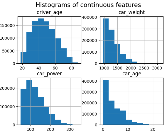
# Continuous features
df.hist(["driver_age", "car_weight", "car_power", "car_age"])
_ = plt.suptitle("Histograms of continuous features", fontsize=15)
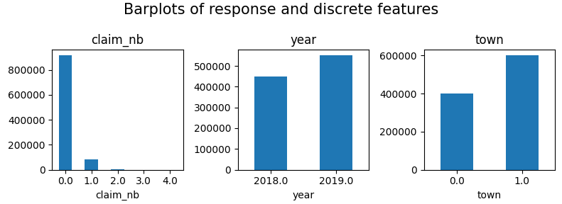
# Response and discrete features
fig, axes = plt.subplots(figsize=(8, 3), ncols=3)
for v, ax in zip(["claim_nb", "year", "town"], axes):
df[v].value_counts(sort=False).sort_index().plot(kind="bar", ax=ax, rot=0, title=v)
plt.suptitle("Barplots of response and discrete features", fontsize=15)
plt.tight_layout()
plt.show()
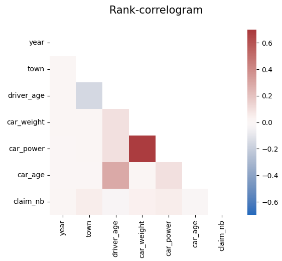
# Rank correlations
corr = df.corr("spearman")
mask = np.triu(np.ones_like(corr, dtype=bool))
plt.suptitle("Rank-correlogram", fontsize=15)
_ = sns.heatmap(
corr, mask=mask, vmin=-0.7, vmax=0.7, center=0, cmap="vlag", square=True
)
Modeling
We fit a tuned Boosted Trees model to model log(E(claim count)) via Poisson deviance loss.
And perform a SHAP analysis to derive insights.
from sklearn.model_selection import train_test_split

X_train, X_test, y_train, y_test = train_test_split(
    df.drop("claim_nb", axis=1), df["claim_nb"], test_size=0.1, random_state=30
)

# Tuning step not shown. Number of boosting rounds found via early stopping on CV performance
params = dict(
    learning_rate=0.05,
    objective="poisson",
    num_leaves=7,
    min_child_samples=50,
    min_child_weight=0.001,
    colsample_bynode=0.8,
    subsample=0.8,
    reg_alpha=3,
    reg_lambda=5,
    verbose=-1,
)

model_lgb = LGBMRegressor(n_estimators=360, **params)
model_lgb.fit(X_train, y_train)

# SHAP analysis
X_explain = X_train.sample(n=2000, random_state=937)
explainer = shap.Explainer(model_lgb)
shap_val = explainer(X_explain)

plt.suptitle("SHAP importance", fontsize=15)
shap.plots.bar(shap_val)

for s in [shap_val[:, 0:3], shap_val[:, 3:]]:
    shap.plots.scatter(s, color=shap_val, ymin=-0.5, ymax=1)
Here, we would come to the conclusions:
car_weight and year might be dropped, depending on the specify aim of the model.
Add a regression spline for driver_age.
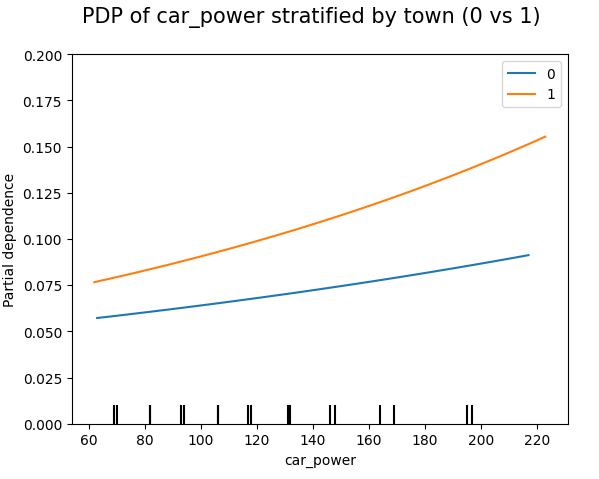
Add an interaction between car_power and town.
Build strong GLM
Let’s build a GLM with these insights. Two important things:
Glum is an extremely powerful GLM implementation that was inspired by a pull request of our Christian Lorentzen.
In the upcoming version 3.0, it adds a formula API based of formulaic, a very performant formula parser. This gives a very easy way to add interaction effects, regression splines, dummy encodings etc.
model_glm = GeneralizedLinearRegressor(
    family="poisson",
    l1_ratio=1.0,
    alpha=1e-10,
    formula="car_power * C(town) + bs(driver_age, 7) + car_age",
)
model_glm.fit(X_train, y=y_train)  # 1 second on old laptop

# PDPs of both models
fig, ax = plt.subplots(2, 2, figsize=(7, 5))
cols = ("tab:blue", "tab:orange")
for color, name, model in zip(cols, ("GLM", "LGB"), (model_glm, model_lgb)):
    disp = PartialDependenceDisplay.from_estimator(
        model,
        features=["driver_age", "car_age", "car_power", "town"],
        X=X_explain,
        ax=ax if name == "GLM" else disp.axes_,
        line_kw={"label": name, "color": color},
    )
fig.suptitle("PDPs of both models", fontsize=15)
fig.tight_layout()

# Stratified PDP of car_power
for color, town in zip(("tab:blue", "tab:orange"), (0, 1)):
    mask = X_explain.town == town
    disp = PartialDependenceDisplay.from_estimator(
        model_glm,
        features=["car_power"],
        X=X_explain[mask],
        ax=None if town == 0 else disp.axes_,
        line_kw={"label": town, "color": color},
    )
plt.suptitle("PDP of car_power stratified by town (0 vs 1)", fontsize=15)
_ = plt.ylim(0, 0.2)
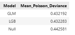
In this relatively simple situation, the mean Poisson deviance of our models are very simlar now:
model_dummy = DummyRegressor().fit(X_train, y=y_train)
deviance_null = mean_poisson_deviance(y_test, model_dummy.predict(X_test))

dev_imp = []
for name, model in zip(("GLM", "LGB", "Null"), (model_glm, model_lgb, model_dummy)):
    dev_imp.append((name, mean_poisson_deviance(y_test, model.predict(X_test))))
pd.DataFrame(dev_imp, columns=["Model", "Mean_Poisson_Deviance"])
Final words
Glum is an extremely powerful GLM implementation – we have only scratched its surface. You can expect more blogposts on Glum…
Having a formula interface is especially useful for adding interactions. Fingers crossed that the upcoming version 3.0 will soon be released.
Building GLMs via ML + XAI is so smooth, especially when you work with large data. For small data, you need to be careful to not add hidden overfitting to the model.
In this post, I’d like to tell the story of my journey into the open source world of Python with a focus on scikit-learn. My hope is that it encourages others to start or to keep contributing and have endurance for bigger picture changes.
Back in 2015/2016, I was working as a non-life pricing actuary. The standard vendor desktop applications we used for generalized linear models (GLM) had problems of system discontinuities, manual error prone steps and the lack of modern machine learning capabilities (not even out-of-sample model comparison).
Python was then on the rise for data science. Numpy, scipy and pandas had laid the foundations, then came deep learning alias neural net frameworks leading to tensorflow and pytorch. XGBoost was also a game changer visible in Kaggle competition leaderboards. All those projects came as open source with thriving communities and possibilities to contribute.
While the R base package always comes with splendid dataframes (I guess they invented it) and battle proven GLMs out of the box, the Python site for GLMs was not that well developed. So I started with GLMs in statsmodels and generalized linear mixed models (a.k.a. hierarchical or multilevel models) in pymc (then called pymc3). My first open source contributions in the Python world were small issues in statsmodels and a little later the bug report pymc#2640 about memory alignment issues which was caused by joblib#563.
To my great surprise the famous machine learning library scikit-learn did not have GLMs, only penalized linear models and logistic regression, but no Poisson or Gamma GLMs which are essential in non-life insurance pricing. Fortunately, I was not the first one to notice this lack. There was already an open issue scikit-learn#5975 with many people asking for this feature. Just nobody had contributed a pull request (PR) yet.
That’s when I said to myself: It should not fail just because no one implements it. I really like open source and gained some programming experience during my PhD in particle physics, mainly C++. Eventually, I boldly (because I was still a newbie) opened the PR scikit-learn#9405 in summer 2017.
Becoming a scikit-learn core developer
This PR turned out to be essential for the development of GLMs and for becoming a scikit-learn core developer. I dare say that I almost got crazy trying to convince the core developers that GLMs are really that useful for supervised machine learning and that GLMs should land in scikit-learn. In retrospective, this was the hardest part and it took me almost 2 years of patience and repeating my arguments, some examples comments are given below:
comment example 1
“I can only repeat myself: I’d prefer to have this functionality in scikit-learn for several reasons (your review, opinion and ideas, very official/trustworthy library, more efficient maintainance, effort to release this pr as its own library, …). To be more explicit for the moment: If it takes longer than the end of 2019 (+-), I’ll consider to release it as separate library.”link
comment example 2
“I see it a bit different. Scikit-Learn like R glm and glmnet is trusted world-wide and can be used in many companies, whereas it might be difficult to get any of the existing GLM libraries on pypi (h2o excluded) into production (no offense intended). That being said, I’d like to return the question and ask you: What exactly has to be fulfilled in order for a GLM PR to be merged into scikit-learn? Once that is clarified, I’ll think about starting a collaboration for this.”link
comment example 3
…
guidance – maintenance As a GLM user on a fairly regular basis, I’d be happy to help as good as I can. Feel free to reach out to me. As to maintenance, I think a unified framework would even lower the burden. I can also imagine to give some support for maintenance.
miscellaneous
…
For GBMs to rely on the same loss and link functions would make sense …
…
further steps Besides further commits to this PR, let me know how I can help you best.
As I wanted to demonstrate the full utility of GLMs, this PR had become much too large for review and inclusion: +4000 lines of code with several solvers, penalty matrices, 3 examples, a lot of documentation and good test coverage (and a lot of things I would do differently today).
The conclusion was to carve out a minimal GLM implementation using the L-BFGS solver of scipy. This way, I met Roman Yurchak with whom it was a pleasure to work with. It took a little 🇨🇭Swiss chocolate🍫 incentive to finally get scikit-learn#14300 (still +2900 loc) reviewed and merged in spring 2020. Almost 3 years after opening my original PR, it was released in scikit-learn version 0.23!
I guess it was mainly this work and perseverance around GLMs that catched the attention of the core developers and that motivated them to vote for me: In summer 2020, I was invited to become a scikit-learn core developer and gladly accepted.
Summary as core developer
Further directions
My work on GLMs was easily extensible to other estimators in the form of loss functions. Again, to my surprise, loss functions, a core element for supervised learning, were re-implemented again and again within scikit-learn. So, based on Roman’s idea in #15123, I started a project to unify them, and by unifying also extending several tree estimator classes with poisson and gamma losses (and making existing ones more stable and faster).
As loss functions are such important core components, they have basically 2 major requirements: be numerically stable and fast. That’s why I went with Cython (preferred way for fast code in scikit-learn) in scikit-learn#20567 and guess which loop it closed? Again, I met segfault errors caused by joblib#563. This time, it motivated another core developer to quite an investment in fixing it in joblib#1254.
Another story branch is the dedicated GLM Python library glum. The authors took my original way too long GLM PR as a starting point and developed one of the most feature rich and fastest GLM implementations out there. This is almost like a dream come true.
A summary of my contributions over those 3 intensive years as scikit-learn core developer are best given in several categories.
Pull requests
A summary of my contributions in terms of code may be:
Unified loss module, unified naming of losses, poisson and gamma losses for GLMs and decision tree based models
LinearModelLoss and NewtonSolver (newton-cholesky) for GLMs like LogisticRegression and PoissonRegressor as well as further solver improvements
QuantileRegressor (linear quantile regression) and quantile/pinball loss for HistGradientBoostingRegressor (HGBT). BTW, linear quantile regression is much harder than GLM solvers!
SplineTransformer
Interaction constraints and feature subsampling for HGBT
From the release notes and the github PRs (where one would miss a few) a more details list of important PRs
Keep in mind that review(er)s are by far the scarcest resource of scikit-learn.
I also like to mention PR#25753 which changed to government to be more inclusive, in particular with voting rights.
Lessons learned
Just before the end, a few critical words must be allowed.
Scikit-learn is focused a lot on stability. For some items of my wish list to land in scikit-learn, it would have again taken years. This time, I decided to release my own library model-diagnostics and I enjoy the freedom to use cutting edge components like polars.
As part-time statistician, I consider certain design choices like classifiers’ predict implicitly using a 50% threshold instead of returning a predicted probability (what predict_proba does) a bit poor. Hard to change!!! At least, PR#26120 might improve that to some extent.
I ponder a lot on the pipeline concept. At first, it was like an eye-opener for me to think of feature preprocessing as part of the estimator. The scikit-learn API is build around the pipeline design with fit, transform and predict. But the current trend of modern model classes like gradient boosted trees (XGBoost, LightGBM, HGBT) don’t need a preprocessing pipeline anymore, e.g., they can natively deal with categorical features and missing values. But it is hard to pass the information which feature to treat as categorical through a pipeline, see scikit-learn#18894.
It is still a very painful experience to specify design matrices of linear models, in particular interaction terms, see scikit-learn#15263, #19533 and #25412. Doing that in a pipline with a ColumnTransformer is just very complicated and prohibits a lot of optimizations (mostly for categoricals)—which is one of the reasons glum is faster.
One of the greatest rewards of this journey was that I learned a lot, about Python, machine learning, rigorous reviews, CI/CD, open source communities, endurance. But even more so, I had the pleasure to meet and work with some kind, brilliant and gifted people like Roman Yurchak, Alexandre Gramfort, Olivier Grisel, Thomas Fan, Nicolas Hug, Adrin Jalali and many more. I am really grateful to be a part of something bigger than its parts.
🚀Version 1.0.0 of the new Python package for model-diagnostics was just released on PyPI. If you use (machine learning or statistical or other) models to predict a mean, median, quantile or expectile, this library offers tools to assess the calibration of your models and to compare and decompose predictive model performance scores.🚀
By the way, I really never wanted to write a plotting library. But it turned out that arranging results until they are ready to be visualised amounts to quite a large part of the source code. I hope this was worth the effort. Your feedback is very welcome, either here in the comments or as feature request or bug report under https://github.com/lorentzenchr/model-diagnostics/issues.
For a jump start, I recommend to go directly to the two examples:
This is the next article in our series “Lost in Translation between R and Python”. The aim of this series is to provide high-quality R and Python code to achieve some non-trivial tasks. If you are to learn R, check out the R tab below. Similarly, if you are to learn Python, the Python tab will be your friend.
This post is heavily based on the new {shapviz} vignette.
Setting
Besides other features, a model with geographic components contains features like
latitude and longitude,
postal code, and/or
other features that depend on location, e.g., distance to next restaurant.
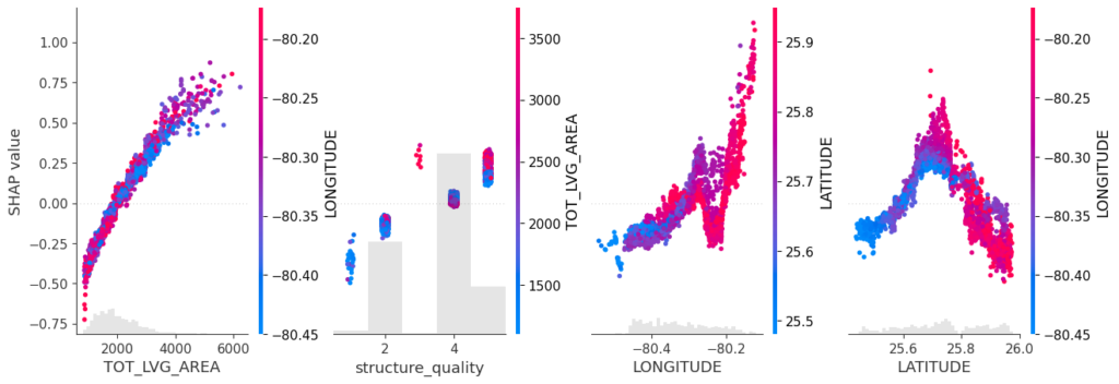
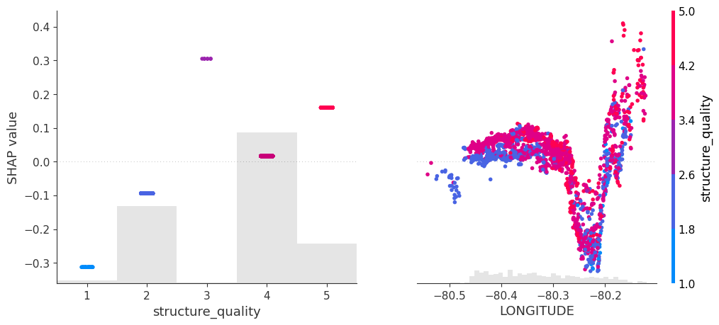
Like any feature, the effect of a single geographic feature can be described using SHAP dependence plots. However, studying the effect of latitude (or any other location dependent feature) alone is often not very illuminating – simply due to strong interaction effects and correlations with other geographic features.
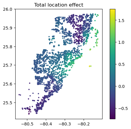
That’s where the additivity of SHAP values comes into play: The sum of SHAP values of all geographic components represent the total geographic effect, and this sum can be visualized as a heatmap or 3D scatterplot against latitude/longitude (or any other geographic representation).
A first example
For illustration, we will use a beautiful house price dataset containing information on about 14’000 houses sold in 2016 in Miami-Dade County. Some of the columns are as follows:
SALE_PRC: Sale price in USD: Its logarithm will be our model response.
LATITUDE, LONGITUDE: Coordinates
CNTR_DIST: Distance to central business district
OCEAN_DIST: Distance (ft) to the ocean
RAIL_DIST: Distance (ft) to the next railway track
HWY_DIST: Distance (ft) to next highway
TOT_LVG_AREA: Living area in square feet
LND_SQFOOT: Land area in square feet
structure_quality: Measure of building quality (1: worst to 5: best)
age: Age of the building in years
(Italic features are geographic components.) For more background on this dataset, see Mayer et al [2].
We will fit an XGBoost model to explain log(price) as a function of lat/long, size, and quality/age.
R
Python
devtools::install_github("ModelOriented/shapviz", dependencies = TRUE)
library(xgboost)
library(ggplot2)
library(shapviz)  # Needs development version 0.9.0 from github

head(miami)

x_coord <- c("LATITUDE", "LONGITUDE")
x_nongeo <- c("TOT_LVG_AREA", "LND_SQFOOT", "structure_quality", "age")
x <- c(x_coord, x_nongeo)

# Train/valid split
set.seed(1)
ix <- sample(nrow(miami), 0.8 * nrow(miami))
X_train <- data.matrix(miami[ix, x])
X_valid <- data.matrix(miami[-ix, x])
y_train <- log(miami$SALE_PRC[ix])
y_valid <- log(miami$SALE_PRC[-ix])

# Fit XGBoost model with early stopping
dtrain <- xgb.DMatrix(X_train, label = y_train)
dvalid <- xgb.DMatrix(X_valid, label = y_valid)

params <- list(learning_rate = 0.2, objective = "reg:squarederror", max_depth = 5)

fit <- xgb.train(
  params = params,
  data = dtrain,
  watchlist = list(valid = dvalid),
  early_stopping_rounds = 20,
  nrounds = 1000,
  callbacks = list(cb.print.evaluation(period = 100))
)
%load_ext lab_black

import numpy as np
import matplotlib.pyplot as plt
from sklearn.datasets import fetch_openml

df = fetch_openml(data_id=43093, as_frame=True)
X, y = df.data, np.log(df.target)
X.head()

# Data split and model
from sklearn.model_selection import train_test_split
import xgboost as xgb

x_coord = ["LONGITUDE", "LATITUDE"]
x_nongeo = ["TOT_LVG_AREA", "LND_SQFOOT", "structure_quality", "age"]
x = x_coord + x_nongeo

X_train, X_valid, y_train, y_valid = train_test_split(
    X[x], y, test_size=0.2, random_state=30
)

# Fit XGBoost model with early stopping
dtrain = xgb.DMatrix(X_train, label=y_train)
dvalid = xgb.DMatrix(X_valid, label=y_valid)

params = dict(learning_rate=0.2, objective="reg:squarederror", max_depth=5)

fit = xgb.train(
    params=params,
    dtrain=dtrain,
    evals=[(dvalid, "valid")],
    verbose_eval=100,
    early_stopping_rounds=20,
    num_boost_round=1000,
)
SHAP dependence plots
Let’s first study selected SHAP dependence plots, evaluated on the validation dataset with around 2800 observations. Note that we could as well use the training data for this purpose, but it is a bit large.
Sum of SHAP values on color scale against coordinates (Python output).
The last plot gives a good impression on price levels, but note:
Since we have modeled logarithmic prices, the effects are on relative scale (0.1 means about 10% above average).
Due to interaction effects with non-geographic components, the location effects might depend on features like living area. This is not visible in above plot. We will modify the model now to improve this aspect.
Two modifications
We will now change above model in two ways, not unlike the model in Mayer et al [2].
We will use additional geographic features like distance to railway track or to the ocean.
We will use interaction constraints to allow only interactions between geographic features.
The second step leads to a model that is additive in each non-geographic component and also additive in the combined location effect. According to the technical report of Mayer [1], SHAP dependence plots of additive components in a boosted trees model are shifted versions of corresponding partial dependence plots (evaluated at observed values). This allows a “Ceteris Paribus” interpretation of SHAP dependence plots of corresponding components.
R
Python
# Extend the feature set
more_geo <- c("CNTR_DIST", "OCEAN_DIST", "RAIL_DIST", "HWY_DIST")
x2 <- c(x, more_geo)

X_train2 <- data.matrix(miami[ix, x2])
X_valid2 <- data.matrix(miami[-ix, x2])

dtrain2 <- xgb.DMatrix(X_train2, label = y_train)
dvalid2 <- xgb.DMatrix(X_valid2, label = y_valid)

# Build interaction constraint vector
ic <- c(
  list(which(x2 %in% c(x_coord, more_geo)) - 1),
  as.list(which(x2 %in% x_nongeo) - 1)
)

# Modify parameters
params$interaction_constraints <- ic

fit2 <- xgb.train(
  params = params,
  data = dtrain2,
  watchlist = list(valid = dvalid2),
  early_stopping_rounds = 20,
  nrounds = 1000,
  callbacks = list(cb.print.evaluation(period = 100))
)

# SHAP analysis
sv2 <- shapviz(fit2, X_pred = X_valid2)

# Two selected features: Thanks to additivity, structure_quality can be read as
# Ceteris Paribus
sv_dependence(sv2, v = c("structure_quality", "LONGITUDE"), alpha = 0.2)

# Total geographic effect (Ceteris Paribus thanks to additivity)
sv_dependence2D(sv2, x = "LONGITUDE", y = "LATITUDE", add_vars = more_geo) +
  coord_equal()
# Extend the feature set
more_geo = ["CNTR_DIST", "OCEAN_DIST", "RAIL_DIST", "HWY_DIST"]
x2 = x + more_geo

X_train2, X_valid2 = train_test_split(X[x2], test_size=0.2, random_state=30)

dtrain2 = xgb.DMatrix(X_train2, label=y_train)
dvalid2 = xgb.DMatrix(X_valid2, label=y_valid)

# Build interaction constraint vector
ic = [x_coord + more_geo, *[[z] for z in x_nongeo]]

# Modify parameters
params["interaction_constraints"] = ic

fit2 = xgb.train(
    params=params,
    dtrain=dtrain2,
    evals=[(dvalid2, "valid")],
    verbose_eval=100,
    early_stopping_rounds=20,
    num_boost_round=1000,
)

# SHAP analysis
xgb_explainer2 = shap.Explainer(fit2)
shap_values2 = xgb_explainer2(X_valid2)

v = ["structure_quality", "LONGITUDE"]
shap.plots.scatter(shap_values2[:, v], color=shap_values2[:, v])

# Total location effect
shap_coord2 = shap_values2[:, x_coord]
c = shap_values2[:, x_coord + more_geo].values.sum(axis=1)
plt.scatter(*list(shap_coord2.data.T), c=c, s=4)
ax = plt.gca()
ax.set_aspect("equal", adjustable="box")
plt.colorbar()
plt.title("Total location effect")
plt.show()
SHAP dependence plots of an additive feature (structure quality, no vertical scatter per unique feature value) and one of the geographic features (Python output).Sum of all geographic features (color) against coordinates. There are no interactions to non-geographic features, so the effect can be read Ceteris Paribus (Python output).
Again, the resulting total geographic effect looks reasonable.
Wrap-Up
SHAP values of all geographic components in a model can be summed up and plotted on the color scale against coordinates (or some other geographic representation). This gives a lightning fast impression of the location effects.
Interaction constraints between geographic and non-geographic features lead to Ceteris Paribus interpretation of total geographic effects.
Mayer, Michael, Steven C. Bourassa, Martin Hoesli, and Donato Flavio Scognamiglio. 2022. “Machine Learning Applications to Land and Structure Valuation.” Journal of Risk and Financial Management.
Applied statistics is dominated by the ubiquitous mean. For a change, this post is dedicated to quantiles. I will give my best to provide a good mix of theory and practical examples.
While the mean describes only the central tendency of a distribution or random sample, quantiles are able to describe the whole distribution. They appear in box-plots, in childrens’ weight-for-age curves, in salary survey results, in risk measures like the value-at-risk in the EU-wide solvency II framework for insurance companies, in quality control and in many more fields.
Often, one talks about quantiles, but rarely defines them. In what fallows, I borrow from Gneiting (2011).
Definition 1: Quantile
Given a cumulative probability distribution (CDF) F(x)=\mathbb{P}(X\leq x), the quantile at level \alpha \in (0,1) (ɑ-quantile for short), q_\alpha(F), is defined as
The inequalities of this definition are called coverage conditions. It is very important to note that quantiles are potentially set valued. Another way to write this set is as an interval:
For q_\alpha^-, we recover the usual quantile definition as the generalized inverse of F. But this is only one possible value. I will discuss examples of quantile intervals later on.
To get acquainted a bit more, let’s plot the cumulative distribution function and the quantile function for some continuous distributions: Normal, Gamma and Pareto distribution. The parametrisation is such that all have mean 2, Normal and Gamma have variance 4, and Pareto has an infinite variance. For those continuous and strictly increasing distributions, all quantiles are unique, and therefore simplify to the inverse CDF q_\alpha^- in the above equations. Note that those three distributions have very different tail behaviour: The density of the Normal distribution has the famously fast decrease \propto e^{-x^2}, the Gamma density has an exponentially decreasing tail \propto e^{-x} and the Pareto density has a fat tail, i.e. an inverse power \propto \frac{1}{x^\alpha}.
CDF (top) and quantile function (bottom) of several distributions: Normal N(\mu=2, \sigma^2=2)(left), Gamma Ga(\alpha=2, \beta=\frac{1}{2}) (middle) and Pareto Pa(\alpha=2)(right).
There are at least two more equivalent ways to define quantiles. They will help us later to get a better visualisations.
Definition 2: Quantile as minimiser
Given a probability distribution F, the ɑ-quantile q_\alpha(F) is defined as any minimiser of the expected scoring function S
The scoring function or loss function S can be generalized to S_\alpha(x, y) = (\mathbb{1}_{x\geq y} – \alpha)(g(x) – g(y)) for any increasing function g, but the above version in definition 2 is by far the simplest one and coincides with the pinball loss used in quantile regression.
This definition is super useful because it provides a tool to assess whether a given value really is a quantile. A plot will suffice.
Having a definition in terms of a convex optimisation problem, there is another definition in terms of the first order condition of optimality. For continuous, strictly increasing distributions, this would be equivalent to setting the first derivative to zero. For our non-smooth scoring function with potentially set-valued solution, this gets more complicated, e.g. subdifferential or subgradients replacing derivatives. In the end, it amounts to a sign change of the expectation of the so called identification function V(x, y)=\mathbf{1}_{x\geq y}-\alpha.
Empirical Distribution
The empirical distribution provides an excellent example. Given a sample of n observations y_1, \ldots, y_n, the empirical distribution is given by F_n(x)=\frac{1}{n}\sum_{i=1}^n \mathbf{1}_{x\geq y_i}. Let us start simple and take two observations y_1=1 and y_2=2. Plugging in this distribution in the definition 1 of quantiles gives the exact quantiles of this 2-point empirical CDF:
Here we encounter the interval [1, 2] for \alpha=\frac{1}{2}. Again, I plot both the (empirical) CDF F_n and the quantiles.
Empirical distribution function and exact quantiles of observations y=1 and y=2.
In the left plot, the big dots unambiguously mark the values at x=1 and x=2. For the quantiles in the right plot, the vertical line at probability 0.5 really means that all those values between 1 and 2 are possible 0.5-quantiles, also known as median.
If you wonder about the value 1 for quantiles of level smaller than 50%, the minimisation formulation helps. The following plot shows \mathbb{E}(S_\alpha(x, Y)) for \alpha=0.2 with a clear unique minimum at x=1.
Expected scoring function (pinball loss) for \alpha=0.2 for the empirical CDF with observations 1 and 2.
A note for the interested reader: The above empirical distribution is the same as the distribution of a Bernoulli random variable, except that the x-values are shifted, i.e. the Bernoulli random variables are canonically set to 0 and 1 instead of 1 and 2. Furthermore, there is a direct connection between quantiles and classification via the cost-weighted misclassification error, see Fissler, Lorentzen & Mayer (2022).
Empirical Quantiles
From the empirical CDF, it is only a small step to empirical quantiles. But what’s the difference anyway? While we saw the exact quantile of the empirical distribution, q_\alpha(F_n), an empirical or sample quantile estimate the true (population) quantile given a data sample, i.e. \hat{q}_\alpha(\{y_i\}) \approx q_\alpha(F).
As an empirical CDF estimates the CDF of the true underlying (population) distribution, F_n=\hat{F} \approx F, one immediate way to estimate a quantile is:
Estimate the CDF via the empirical CDF F_n.
Use the exact quantile in analogy to Eq.(1) as an estimate.
Very importantly, this is just one way to estimate quantiles from a sample. There are many, many more. Here is the outcome of the 20%-quantile of our tiny data sample y_1=1 and y_2=2.
import numpy as np

methods = [
    'inverted_cdf',
    'averaged_inverted_cdf',
    'closest_observation',
    'interpolated_inverted_cdf',
    'hazen',
    'weibull',
    'linear',
    'median_unbiased',
    'normal_unbiased',
    'nearest',
    'lower',
    'higher',
    'midpoint',
]
alpha = 0.2
for m in methods:
    estimate = np.quantile([1, 2], 0.2, method=m)
    print(f"{m:<25} {alpha}-quantile estimate = {estimate}")
Note that the first 9 methods are the ones discussed in a famous paper of Hyndman & Fan (1996). The default method of both Python’s numpy.quantile and R’s quantile is linear, i.e. number 7 in Hyndman & Fan. Somewhat surprisingly, we observe that this default method is clearly biased in this case and overestimates the true quantile.
For large sample sizes, the differences will get tiny and all methods converge finally to a true quantile, at least for continuous distributions. In order to assess the bias with small sample sizes for each method, I do a simulation. This is where the fun starts😄
For all three selected distributions and for quantile levels 15%, 50% and 85%, I simulate 10000 random samples, each of sample size 10 and calculate the sample quantile. Then I take the mean over all 10000 simulations as well as the 5% and the 95% quantiles as a measure of uncertainty, i.e. 90% confidence intervals. After some coding, this results in the following plot. (I spare you the code at this point. You can find it in the linked notebook at the bottom of this post).
Small sample bias (n=10) of different empirical quantile estimation methods (x-axis and color) based on 10000 simulations. Dots are the mean values, error bars cover a 90% confidence interval. The dotted horizontal line is the theoretical quantile value. left: Normal distribution; mid: Gamma distribution; right: Pareto distribution top: 15%-quantile; mid: 50%-quantile; bottom: 85%-quantile
For the 15%-quantile, the default linear method always overestimates, but it does surprisingly well for the 85%-quantile of the Pareto distribution. Overall, I personally would prefer the median unbiased or the Hazen method. Interestingly, the Hazen method is one of the oldest, namely from Hazen (1914), and is the only one that fulfills all proposed properties of Hyndman & Fan, who propose the median unbiased method as default.
Quantile Regression
So far, the interest was in the quantile of a sample or distribution. To go one step further, one might ask for the conditional quantile of a response variable Y given some features or covariates X, q_\alpha(Y|X)=q_\alpha(F_{Y|X}). This is the realm of quantile regression as invented by Koenker & Bassett (1978). To stay within linear models, one simply replaces the squared error of ordinary least squares (OLS) by the pinball loss.
Without going into any more details, I chose the Palmer’s penguin dataset and the body mass in gram as response variable, all the other variables as feature variables. And again, I model the 15%, 50% and 85% quantiles.
import seaborn as sns

df = sns.load_dataset("penguins").dropna()
df
species
island
bill_length_mm
bill_depth_mm
flipper_length_mm
body_mass_g
sex
0
Adelie
Torgersen
39.1
18.7
181.0
3750.0
Male
1
Adelie
Torgersen
39.5
17.4
186.0
3800.0
Female
2
Adelie
Torgersen
40.3
18.0
195.0
3250.0
Female
4
Adelie
Torgersen
36.7
19.3
193.0
3450.0
Female
5
Adelie
Torgersen
39.3
20.6
190.0
3650.0
Male
…
…
…
…
…
…
…
…
338
Gentoo
Biscoe
47.2
13.7
214.0
4925.0
Female
340
Gentoo
Biscoe
46.8
14.3
215.0
4850.0
Female
341
Gentoo
Biscoe
50.4
15.7
222.0
5750.0
Male
342
Gentoo
Biscoe
45.2
14.8
212.0
5200.0
Female
343
Gentoo
Biscoe
49.9
16.1
213.0
5400.0
Male
from sklearn.base import clone
from sklearn.compose import ColumnTransformer
from sklearn.linear_model import QuantileRegressor
from sklearn.pipeline import Pipeline
from sklearn.preprocessing import OneHotEncoder, SplineTransformer

y = df["body_mass_g"]
X = df.drop(columns="body_mass_g")
qr50 = Pipeline([
    ("column_transformer",
     ColumnTransformer([
         ("ohe", OneHotEncoder(drop="first"), ["species", "island", "sex"]),
         ("spline", SplineTransformer(n_knots=3, degree=2), ["bill_length_mm", "bill_depth_mm", "flipper_length_mm"]),

     ])
    ),
    ("quantile_regressor",
     QuantileRegressor(quantile=0.5, alpha=0, solver="highs")
    )
])
qr15 = clone(qr50)
qr15.set_params(quantile_regressor__quantile=0.15)
qr85 = clone(qr50)
qr85.set_params(quantile_regressor__quantile=0.85)

qr15.fit(X, y)
qr50.fit(X, y)
qr85.fit(X, y)
This code snippet gives the three fitted linear quantile models. That was the easy part. I find it much harder to produce good visualisations.
import polars as pl  # imported and used much earlier in the notebook

df_obs = df.copy()
df_obs["type"] = "observed"
dfs = [pl.from_pandas(df_obs)]
for m, name in [(qr15, "15%-q"), (qr50, "median"), (qr85, "85%-q")]:
    df_pred = df.copy()
    df_pred["type"] = "predicted_" + name
    df_pred["body_mass_g"] = m.predict(X)
    dfs.append(pl.from_pandas(df_pred))
df_pred = pl.concat(dfs).to_pandas()

sns.catplot(df_pred, x="species", y="body_mass_g", hue="type", alpha=0.5)
Quantile regression estimates and observed values for species (x-axis).
This plot per species seems suspicious. We would expect the 85%-quantile prediction in red to mostly be larger than the median (green), instead we detect several clusters. The reason behind it is the sex of the penguins which also enters the model. To demonstrate this fact, I plot the sex separately and make the species visible by the plot style. This time, I put the flipper length on the x-axis.
Quantile regression estimates and observed values vs flipper length (x-axis). Left: male; right: female
This is a really nice plot:
One immediately observes the differences in sex on the left and right subplot.
The two clusters in each subplot can be well explained by the penguin species.
The 3 quantiles are now vertically in the expected order, 15% quantile in yellow the lowest, 85%-quantile in red the highest, the median in the middle, and some observations beyond those predicted quantiles.
The models are linear in flipper length with a positive, but slightly different slope per quantile level.
As a final check, let us compute the coverage of each quantile model (in-sample).
This post shows how filling histograms can be done in very different ways thereby connecting very different areas: from gradient boosted trees to SQL queries to one-hot encoding. Let’s jump into it!
2nd order Taylor expansion of the loss which amounts to using gradients and hessians.
One histogram per feature: bin the feature and fill the histogram with the gradients and hessians.
The filling of the histograms is often the bottleneck when fitting GBTs. While filling a single histogram is very fast, this operation is executed many times: for each boosting round, for each tree split and for each feature. This is the reason why GBT implementations have dedicated routines for it. We look into this operation from different angles.
For the coming (I)Python code snippets to work (# %% indicates a new notebook cell), we need the following imports.
import duckdb                    # v0.5.1
import matplotlib.pyplot as plt  # v.3.6.1
from matplotlib.ticker import MultipleLocator
import numpy as np               # v1.23.4
import pandas as pd              # v1.5.0
import pyarrow as pa             # v9.0.0
import tabmat                    # v3.1.2

from sklearn.ensemble._hist_gradient_boosting.histogram import (
    _build_histogram_root,
)                                # v1.1.2
from sklearn.ensemble._hist_gradient_boosting.common import (
  HISTOGRAM_DTYPE
)
Naive Histogram Visualisation
As a starter, we create a small table with two columns: bin index and value of the hessian.
A histogram then sums up all the hessian values belonging to the same bin. The result looks like the following.
Above table visualised as histogram
Dedicated Method
We simulate filling the histogram of a single feature. Therefore, we draw 1,000,000 random variables for gradients and hessians as well as the bin indices.
import duckdb
import pyarrow as pa
import numpy as np
import tabmat

from sklearn.ensemble._hist_gradient_boosting.histogram import (
    _build_histogram_root,
)
from sklearn.ensemble._hist_gradient_boosting.common import HISTOGRAM_DTYPE


rng = np.random.default_rng(42)
n_obs = 1000_000
n_bins = 256
binned_feature = rng.integers(0, n_bins, size=n_obs, dtype=np.uint8)
gradients = rng.normal(size=n_obs).astype(np.float32)
hessians = rng.lognormal(size=n_obs).astype(np.float32)
Now we use the dedicated (and private!) and single-threaded method _build_histogram_root from sckit-learn to fill a histogram.
This executes in around 1.4 ms. This is quite fast. But again, imagine 100 boosting rounds with 10 tree splits on average and 100 features. This means this is done around 100,000 times and would therefore take roughly 2 minutes.
Someone familiar with SQL and database queries might immediately see how this task can be formulated as SQL group-by-aggregate query. To demonstrate it on our simulated data, we use DuckDB as well as Apache Arrow (the file format as well as the Python library pyarrow). You can read more about DuckDB in our post DuckDB: Quacking SQL.
# %%
con = duckdb.connect()
arrow_table = pa.Table.from_pydict(
    {
        "bin": binned_feature,
        "gradients": gradients,
        "hessians": hessians,
})
# Read data once to make timing fairer
arrow_result = con.execute("SELECT * FROM arrow_table")

# %%
%%time
arrow_result = con.execute("""
SELECT
    bin as bin,
    SUM(gradients) as sum_gradients,
    SUM(hessians) as sum_hessians,
    COUNT() as count
FROM arrow_table
GROUP BY bin
""").arrow()
# Wall time: 6.52 ms
On my laptop, this takes about 6.5 ms and, upon sorting, gives the same results:
The fact that DuckDB is faster than Arrow on this task might have to do with the large invested effort on parallelised group-by operations, see their post Parallel Grouped Aggregation in DuckDB for more infos.
One-Hot encoded Matrix Multiplication
I think it is very interesting that filling histograms can be written as a matrix multiplication! The trick is to view the feature as a categorical feature and use its one-hot encoded matrix representation. This blows up memory, of course. Note that one-hot encoding is usually met with generalized linear models (GLM) in order to incorporate nominal categorical feature variables with no internal ordering in the design matrix.
For our demonstration, we use a numpy index trick to construct the one-hot encoded matrix employing the fact that the binned feature already contains the right indices.
This is way slower, but, somehow surprisingly, produces the same result.
The one-hot encoded matrix is very sparse, with only one non-zero value per column, i.e. only one out of 256 (number of bins) values is non-zero. This structure can be exploited to reduce both CPU time as well as memory consumption, with the help of the package tabmat that was built to accelerate GLMs. Unfortunately, tabmat only provides a matrix-vector multiplication (and the sandwich product, of course), but no matrix-matrix multiplication. So we have to do a little extra work.
While the timing of this approach is quite good, the construction of a CategoricalMatrix requires more time than the matrix-vector multiplication.
Conclusion
In the end, the special (Cython) routine of scikit-learn ist the fastest of our tested methods for filling histograms. The other GBT libraries have their own even more specialised routines which might be a reason for even faster fit times. What we learned in this post is that this seemingly simple task plays a very crucial part in modern GBTs and can be accomplished by very different approaches. These different approaches uncover connections of algorithms of quite different domains.