In this post, we show how different use cases require different model diagnostics. In short, we compare (statistical) inference and prediction.
As an example, we use a simple linear model for the Munich rent index dataset, which was kindly provided by the authors of Regression – Models, Methods and Applications 2nd ed. (2021). This dataset contains monthy rents in EUR (rent) for about 3000 apartments in Munich, Germany, from 1999. The apartments have several features such as living area (area) in squared meters, year of construction (yearc), quality of location (location, 0: average, 1: good, 2: top), quality of bath rooms (bath, 0:standard, 1: premium), quality of kitchen (kitchen, 0: standard, 1: premium), indicator for central heating (cheating).
The target variable is Y=\text{rent}E[Y]
Disclaimer: Before presenting the use cases, let me clearly state that I am not in the apartment rent business and everything here is merely for the purpose of demonstrating statistical good practice.
Inference
The first use case is about inference of the effect of the features. Imagine the point of view of an investor who wants to know whether the installation of a central heating is worth it (financially). To lay the ground on which to base a decision, a statistician must have answers to:
- What is the effect of the variable
cheatingon the rent. - Is this effect statistically significant?
Prediction
The second use case is about prediction. This time, we take the point of view of someone looking out for a new apartment to rent. In order to know whether the proposed rent by the landlord is about right or improper (too high), a reference value would be very convenient. One can either ask the neighbors or ask a model to predict the rent of the apartment in question.
Model Fit
Before answering the above questions and doing some key diagnostics, we must load the data and fit a model. We choose a simple linear model and directly model rent.
Notes:
- For rent indices as well as house prices, one often log-transforms the target variable before modelling or one uses a log-link and an appropriate loss function (e.g. Gamma deviance).
- Our Python version uses
GeneralizedLinearRegressorfrom the package glum. We could as well have chosen other implementations like statsmodels.regression.linear_model.OLS. This way, we have to implement the residual diagnostics ourselves which makes it clear what is plotted.
For brevity, we skip imports and data loading. Our model is then fit by:
lm = glum.GeneralizedLinearRegressor(
    alpha=0,
    drop_first=True,  # this is very important if alpha=0
    formula="bs(area, degree=3, df=4) + yearc"
      	" + C(location) + C(bath) + C(kitchen) + C(cheating)"
)
lm.fit(X_train, y_train)
model = lm( formula = rent ~ bs(area, degree = 3, df = 4) + yearc + location + bath + kitchen + cheating, data = df_train )
Diagnostics for Inference
The coefficient table will already tell us the effect of the cheating variable. For more involved models like gradient boosted trees or neural nets, one can use partial dependence and shap values to assess the effect of features.
lm.coef_table(X_train, y_train)
summary(model)
confint(model)
| Variable | coef | se | p_value | ci_lower | ci_upper |
|---|---|---|---|---|---|
| intercept | -3682.5 | 327.0 | 0.0 | -4323 | -3041 |
| bs(area, ..)[1] | 88.5 | 31.3 | 4.6e-03 | 27 | 150 |
| bs(area,..)[2] | 316.8 | 24.5 | 0.0 | 269 | 365 |
| bs(area, ..)[3] | 547.7 | 62.8 | 0.0 | 425 | 671 |
| bs(area, ..)[4] | 733.7 | 91.7 | 1.3e-15 | 554 | 913 |
| yearc | 1.9 | 0.2 | 0.0 | 1.6 | 2.3 |
| C(location)[2] | 48.2 | 5.9 | 4.4e-16 | 37 | 60 |
| C(location)[3] | 137.9 | 27.7 | 6.6e-07 | 84 | 192 |
| C(bath)[1] | 50.0 | 16.5 | 2.4e-03 | 18 | 82 |
| C(kitchen)[1] | 98.2 | 18.5 | 1.1e-07 | 62 | 134 |
| C(cheating)[1] | 107.8 | 10.6 | 0.0 | 87.0 | 128.6 |
We see that ceteris paribus, meaning all else equal, a central heating increases the monthly rent by about 108 EUR. Not the size of the effect of 108 EUR, but the fact that there is an effect of central heating on the rent seems statistically significant:
This is indicated by the very low probability, i.e. p-value, for the null-hypothesis of cheating having a coefficient of zero.
We also see that the confidence interval with the default confidence level of 95%: [ci_lower, ci_upper] = [87, 129].
This shows the uncertainty of the estimated effect.
For a building with 10 apartments and with an investment horizon of about 10 years, the estimated effect gives roughly a budget of 13000 EUR (range is roughly 10500 to 15500 with 95% confidence).
A good statistician should ask several further questions:
- Is the dataset at hand a good representation of the population?
- Are there confounders or interaction effects, in particular between
cheatingand other features? - Are the assumptions for the low p-value and the confidence interval of
cheatingvalid?
Here, we will only address the last question, and even that one only partially. Which assumptions were made? The error term, \epsilon = Y - E[Y]E[Y]E[Y]\hat{E}[Y]\hat{\epsilon} = Y - \hat{E}[Y] = y - \text{fitted values}
The diagnostic tools to check that are residual and quantile-quatile (QQ) plots.
# See notebook for a definition of residual_plot.
import seaborn as sns
fig, axes = plt.subplots(ncols=2, figsize=(4.8 * 2.1, 6.4))
ax = residual_plot(model=lm, X=X_train, y=y_train, ax=axes[0])
sns.kdeplot(
    x=lm.predict(X_train),
    y=residuals(lm, X_train, y_train, kind="studentized"),
    thresh=.02,
    fill=True,
    ax=axes[1],
).set(
    xlabel="fitted",
    ylabel="studentized residuals",
    title="Contour Plot of Residuals",
)
autoplot(model, which = c(1, 2)) # from library ggfortify # density plot of residuals ggplot(model, aes(x = .fitted, y = .resid)) + geom_point() + geom_density_2d() + geom_density_2d_filled(alpha = 0.5)
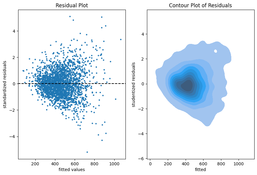
The more data points one has the less informative is a scatter plot. Therefore, we put a contour plot on the right.
Visual insights:
- There seems to be a larger variability for larger fitted values. This is a hint that the homoscedasticity might be violated.
- The residuals seem to be centered around 0. This is a hint that the model is well calibrated (adequate).
# See notebook for a definition of qq_plot.
qq_plot(lm, X_train, y_train)
autoplot(model, which = 2)

The QQ-plot shows the quantiles of the theoretical assumed distribution of the residuals on the x-axis and the ordered values of the residuals on the y-axis. In the Python version, we decided to use the studentized residuals because normality of the error implies a student (t) distribution for these residuals.
Concluding remarks:
- We might do similar plots on the test sample, but we don’t necessarily need a test sample to answer the inference questions.
- It is good practice to plot the residuals vs each of the features as well.
Diagnostics for Prediction
If we are only interested in predictions of the mean rent, \hat{E}[Y]YE[Y]E[Y]YE[Y]
Very importantly, here we make use of the test sample in all of our diagnostics because we fear the in-sample bias.
We start simple by a look at the unconditional calibration, that is the average (negative) residual \frac{1}{n}\sum(\hat{E}[Y_i]-Y_i)
compute_bias(
    y_obs=np.concatenate([y_train, y_test]),
    y_pred=lm.predict(pd.concat([X_train, X_test])),
    feature=np.array(["train"] * X_train.shape[0] + ["test"] * X_test.shape[0]),
)
print(paste("Train set mean residual:", mean(resid(model))))
print(paste("Test set mean residual: ", mean(df_test$rent - predict(model, df_test))))| set | mean bias | count | stderr | p-value |
|---|---|---|---|---|
| train | -3.2e-12 | 2465 | 2.8 | 1.0 |
| test | 2.1 | 617 | 5.8 | 0.72 |
It is no surprise that bias_mean in the train set is almost zero.
This is the balance property of (generalized) linear models (with intercept term). On the test set, however, we detect a small bias of about 2 EUR per apartment on average.
Next, we have a look a reliability diagrams which contain much more information about calibration and bias of a model than the unconditional calibration above. In fact, it assesses auto-calibration, i.e. how well the model uses its own information.
An ideal model would lie on the dotted diagonal line.
fig, axes = plt.subplots(ncols=2, figsize=(4.8 * 2.1, 6.4))
plot_reliability_diagram(y_obs=y_train, y_pred=lm.predict(X_train), n_bootstrap=100, ax=axes[0])
axes[0].set_title(axes[0].get_title() + f" train set (n={X_train.shape[0]})")
plot_reliability_diagram(y_obs=y_test, y_pred=lm.predict(X_test), n_bootstrap=100, ax=axes[1])
axes[1].set_title(axes[1].get_title() + f" test set (n={X_test.shape[0]})")
iso_train = isoreg(x = model$fitted.values, y = df_train$rent)
iso_test = isoreg(x = predict(model, df_test), y = df_test$rent)
bind_rows(
tibble(set = "train", x = iso_train$x[iso_train$ord], y = iso_train$yf),
tibble(set = "test", x = iso_test$x[iso_test$ord], y = iso_test$yf),
) |>
ggplot(aes(x=x, y=y, color=set)) + geom_line() +
geom_abline(intercept = 0, slope = 1, linetype="dashed") +
ggtitle("Reliability Diagram")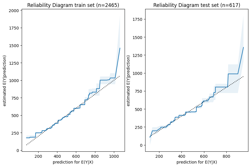
Visual insights:
- Graphs on train and test set look very similar.
The larger uncertainty intervals on the test set stem from the fact that is has a smaller sample size. - The model seems to lie around the diagonal indicating good auto-calibration for the largest part of the range.
- Very high predicted values seem to be systematically too low, i.e. the graph is above the diagonal.
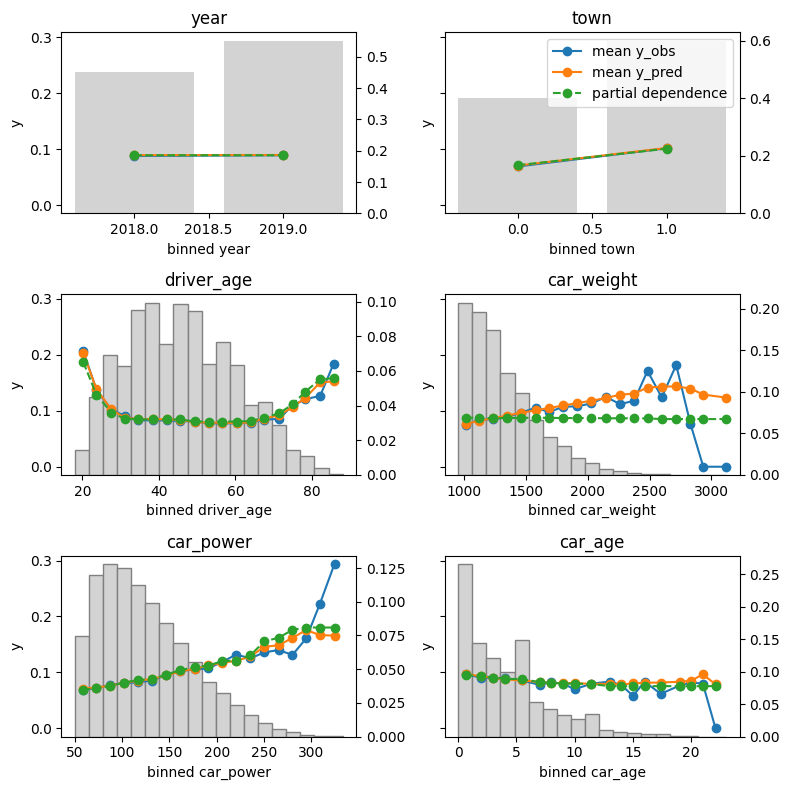
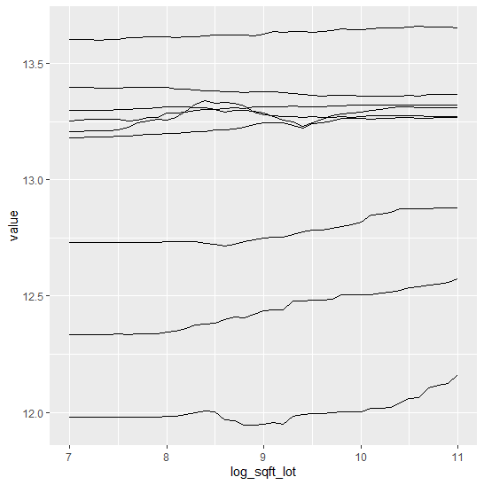
Finally, we assess conditional calibration, i.e. the calibration with respect to the features. Therefore, we plot one of our favorite graphs for each feature. It consists of:
- average observed value of
Y - average predicted value
- partial dependence
- histogram of the feature (grey, right y-axis)
fig, axes = plt.subplots(nrows=5, ncols=2, figsize=(12, 5*4), sharey=True)
for i, col in enumerate(["area", "yearc", "bath", "kitchen", "cheating"]):
    plot_marginal(
        y_obs=y_train,
        y_pred=lm.predict(X_train),
        X=X_train,
        feature_name=col,
        predict_function=lm.predict,
        ax=axes[i][0],
    )
    plot_marginal(
        y_obs=y_test,
        y_pred=lm.predict(X_test),
        X=X_test,
        feature_name=col,
        predict_function=lm.predict,
        ax=axes[i][1],
    )
    axes[i][0].set_title("Train")
    axes[i][1].set_title("Test")
    if i != 0:
        axes[i][0].get_legend().remove()
    axes[i][1].get_legend().remove()
fig.tight_layout()
xvars = c("area", "yearc", "bath", "kitchen", "cheating")
m_train = feature_effects(model, v = xvars, data = df_train, y = df_train$rent)
m_test = feature_effects(model, v = xvars, data = df_test, y = df_test$rent)
c(m_train, m_test) |>
plot(
share_y = "rows",
ncol = 2,
byrow = FALSE,
stats = c("y_mean", "pred_mean", "pd"),
subplot_titles = FALSE,
# plotly = TRUE,
title = "Left: Train - Right: Test",
)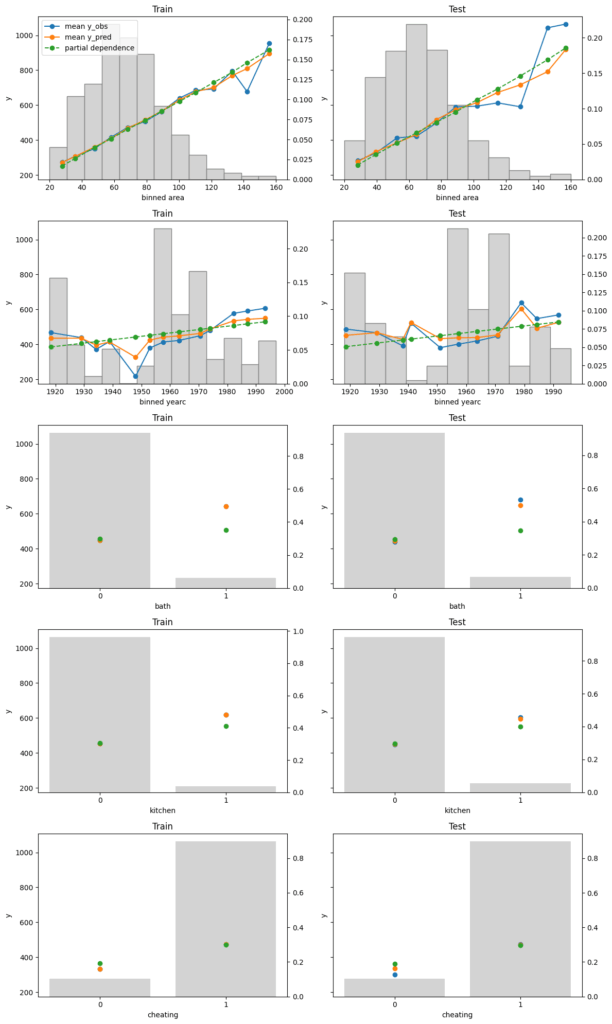
Visual insights:
- On the train set, the categorical features seem to have perfect calibration as average observed equals average predicted. This is again a result of the balance property. On the test set, we see a deviation, especially for the categorical level with smaller sample size. This is a good demonstration why plotting on both train and test set is a good idea.
- The numerical features area and year of construction seem fine, but a closer look can’t hurt.
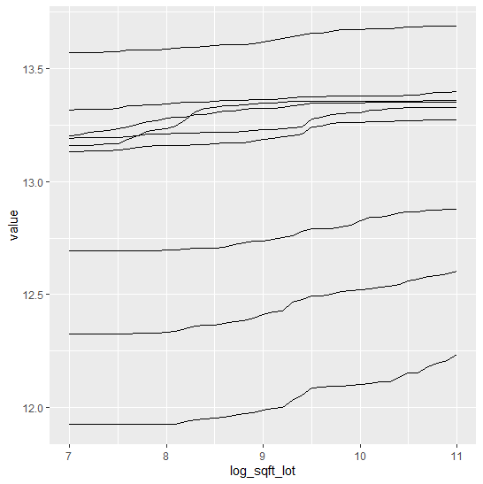
We next perform a bias plot, which is plotting the average difference of predicted minus observed per feature value. The values should be around zero, so we can zoom in on the y-axis.
This is very similar to the residual plot, but the information is better condensed for its purpose.
fig, axes = plt.subplots(nrows=2, ncols=2, figsize=(12, 2*4), sharey=True)
axes[0,0].set_ylim(-150, 150)
for i, col in enumerate(["area", "yearc"]):
    plot_bias(
        y_obs=y_train,
        y_pred=lm.predict(X_train),
        feature=X_train[col],
        ax=axes[i][0],
    )
    plot_bias(
        y_obs=y_test,
        y_pred=lm.predict(X_test),
        feature=X_test[col],
        ax=axes[i][1],
    )
    axes[i][0].set_title("Train")
    axes[i][1].set_title("Test")
fig.tight_layout()
c(m_train[c("area", "yearc")], m_test[c("area", "yearc")]) |>
plot(
ylim = c(-150, 150),
ncol = 2,
byrow = FALSE,
stats = "resid_mean",
subplot_titles = FALSE,
title = "Left: Train - Right: Test",
# plotly = TRUE,
interval = "ci"
)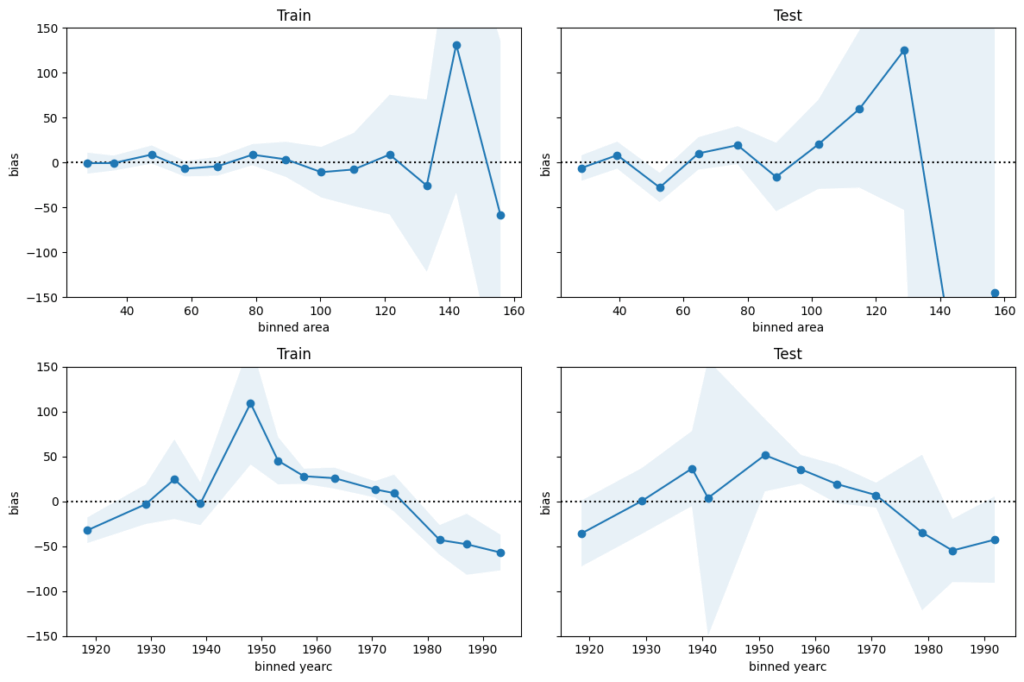
Visual insights:
- For large values of
areaandyearcin the 1940s and 1950s, there are only few observations available. Still, the model might be improved for those regions. - The bias of
yearcshows a parabolic curve. The simple linear effect in our model seems too simplistic. A refined model could use splines instead, as forarea.
Concluding remarks:
- The predictions for
arealarger than around 120 square meters and for year of construction around the 2nd world war are less reliable. - For all the rest, the bias is smaller than 50 EUR on average.
This is therefore a rough estimation of the prediction uncertainty.
It should be enough to prevent improperly high (or low) rents (on average).
The full Python and R code is available under: