Lost in Translation between R and Python 1
This is the first article in our series “Lost in Translation between R and Python”. The aim of this series is to provide high-quality R and Python 3 code to achieve some non-trivial tasks. If you are to learn R, check out the R tab below. Similarly, if you are to learn Python, the Python tab will be your friend.
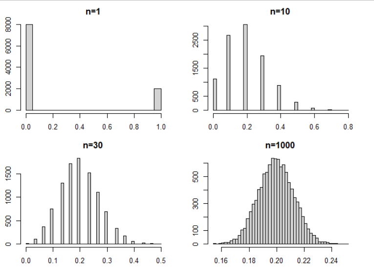
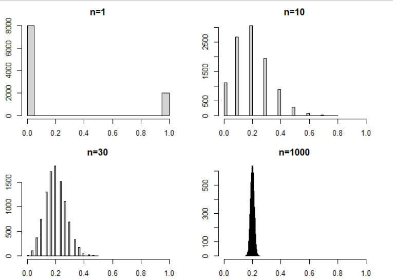
Let’s start with a little bit of statistics – it wont be the last time, friends: Illustrating the Central Limit Theorem (CLT).
Take a sample of a random variable X with finite variance. The CLT says: No matter how “unnormally” distributed X is, its sample mean will be approximately normally distributed, at least if the sample size is not too small. This classic result is the basis to construct simple confidence intervals and hypothesis tests for the (true) mean of X, check out Wikipedia for a lot of additional information.
The code below illustrates this famous statistical result by simulation, using a very asymmetrically distributed X, namely X = 1 with probability 0.2 and X=0 otherwise. X could represent the result of asking a randomly picked person whether he smokes. Conducting such a poll, the mean of the collected sample of such results would be a statistical estimate of the proportion of people smoking.
Curiously, by a tiny modification, the same code will also illustrate another key result in statistics – the Law of Large Numbers: For growing sample size, the distribution of the sample mean of X contracts to the expectation E(X).
# Fix seed, set constants
set.seed(2006)
sample_sizes <- c(1, 10, 30, 1000)
nsims <- 10000

# Helper function: Mean of one sample of X
one_mean <- function(n, p = c(0.8, 0.2)) {
  mean(sample(0:1, n, replace = TRUE, prob = p))
}
# one_mean(10)

# Simulate and plot
par(mfrow = c(2, 2), mai = rep(0.4, 4))

for (n in sample_sizes) {
  means <- replicate(nsims, one_mean(n))
  hist(means, breaks = "FD",
       # xlim = 0:1, # uncomment for LLN
       main = sprintf("n=%i", n))
}
import numpy as np
import matplotlib.pyplot as plt
%matplotlib inline
# Fix seed, set constants
np.random.seed(100)
sample_sizes = [1, 10, 30, 1000]
nsims = 10_000
# Helper function: Mean of one sample
def one_mean(n, p=0.2):
return np.random.binomial(1, p, n).mean()
# Simulate and plot
fig, axes = plt.subplots(2, 2, figsize=(8, 8))
for i, n in enumerate(sample_sizes):
means = [one_mean(n) for ell in range(nsims)]
ax = axes[i // 2, i % 2]
ax.hist(means, 50)
ax.title.set_text(f'$n = {n}$')
ax.set_xlabel('mean')
# ax.set_xlim(0, 1) # uncomment for LLN
fig.tight_layout()Result: The Central Limit Theorem
Result: The Law of Large Number
See also the python notebook https://github.com/lorentzenchr/notebooks/blob/master/blogposts/2021-01-07 Illustrating The Central Limit Theorem.ipynb and for many great posts on R, http://www.R-bloggers.com.
Leave a Reply