SHAP is the predominant way to interpret black-box ML models, especially for tree-based models with the blazingly fast TreeSHAP algorithm.
For general models, two slower SHAP algorithms exist:
- Permutation SHAP (Štrumbelj and Kononenko, 2010)
- Kernel SHAP (Lundberg and Lee, 2017)
Kernel SHAP was introduced in [2] as an approximation to permutation SHAP.
The 0.4.0 CRAN release of our {kernelshap} package now contains an exact permutation SHAP algorithm for up to 14 features, and thus it becomes easy to make experiments between the two approaches.
Some initial statements about permutation SHAP and Kernel SHAP
- Exact permutation SHAP and exact Kernel SHAP have the same computational complexity.
- Technically, exact Kernel SHAP is still an approximation of exact permutation SHAP, so you should prefer the latter.
- Kernel SHAP assumes feature independence. Since features are never independent in practice: does this mean we should never use Kernel SHAP?
- Kernel SHAP can be calculated almost exactly for any number of features, while permutation SHAP approximations get more and more inprecise when the number of features gets too large.
Simulation 1
We will first work with the iris data because it has extremely strong correlations between features. To see the impact of having models with and without interactions, we work with a random forest model of increasing tree depth. Depth 1 means no interactions, depth 2 means pairwise interactions etc.
library(kernelshap)
library(ranger)

differences <- numeric(4)

set.seed(1)

for (depth in 1:4) {
  fit <- ranger(
    Sepal.Length ~ .,
    mtry = 3,
    data = iris,
    max.depth = depth
  )
  ps <- permshap(fit, iris[2:5], bg_X = iris)
  ks <- kernelshap(fit, iris[2:5], bg_X = iris)
  differences[depth] <- mean(abs(ks$S - ps$S))
}

differences  # for tree depth 1, 2, 3, 4
# 5.053249e-17 9.046443e-17 2.387905e-04 4.403375e-04

# SHAP values of first two rows with tree depth 4
ps
#      Sepal.Width Petal.Length Petal.Width      Species
# [1,]  0.11377616   -0.7130647  -0.1956012 -0.004437022
# [2,] -0.06852539   -0.7596562  -0.2259017 -0.006575266

ks
#      Sepal.Width Petal.Length Petal.Width      Species
# [1,]  0.11463191   -0.7125194  -0.1951810 -0.006258208
# [2,] -0.06828866 -0.7597391 -0.2259833 -0.006647530- Up to pairwise interactions (tree depth 2), the mean absolute difference between the two (150 x 4) SHAP matrices is 0.
- Even for interactions of order three or higher, the differences are small. This is unexpected – in the end all iris features are strongly correlated!
Simulation 2
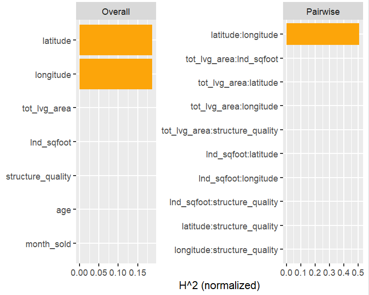
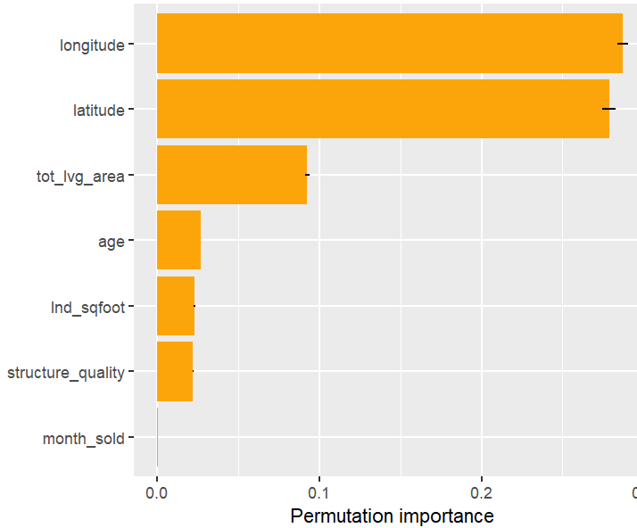
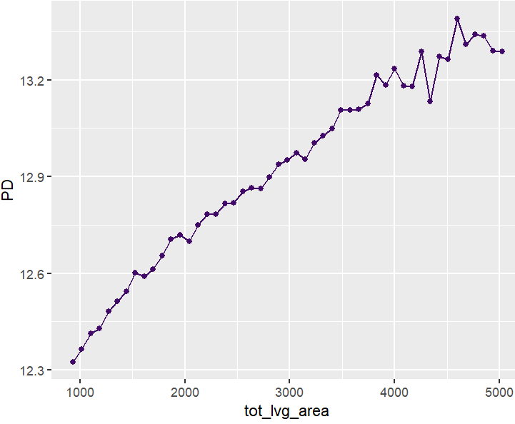
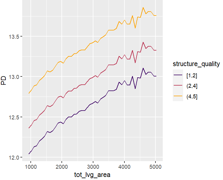
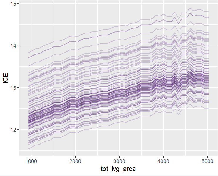
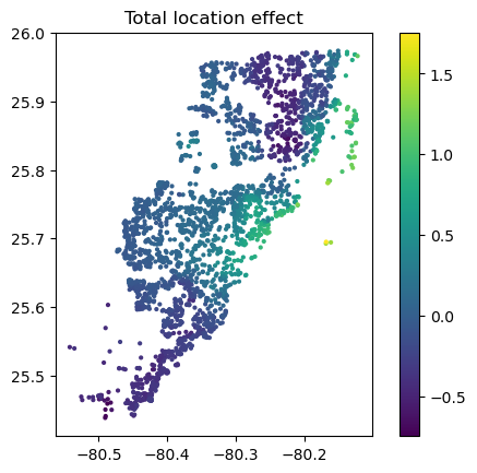
Let’s now use a different data set with more features: miami house price data. As modeling technique, we use XGBoost where we would normally use TreeSHAP. Also here, we increase tree depth from 1 to 3 for increasing interaction depth.
library(xgboost)
library(shapviz)
colnames(miami) <- tolower(colnames(miami))
miami$log_ocean <- log(miami$ocean_dist)
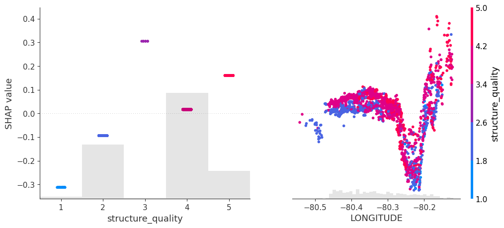
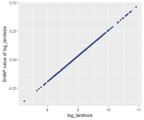
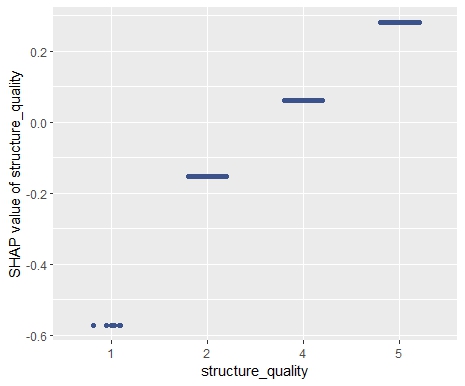
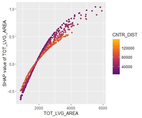
x <- c("log_ocean", "tot_lvg_area", "lnd_sqfoot", "structure_quality", "age", "month_sold")
# Train/valid split
set.seed(1)
ix <- sample(nrow(miami), 0.8 * nrow(miami))
y_train <- log(miami$sale_prc[ix])
y_valid <- log(miami$sale_prc[-ix])
X_train <- data.matrix(miami[ix, x])
X_valid <- data.matrix(miami[-ix, x])
dtrain <- xgb.DMatrix(X_train, label = y_train)
dvalid <- xgb.DMatrix(X_valid, label = y_valid)
# Fit via early stopping (depth 1 to 3)
differences <- numeric(3)
for (i in 1:3) {
fit <- xgb.train(
params = list(learning_rate = 0.15, objective = "reg:squarederror", max_depth = i),
data = dtrain,
watchlist = list(valid = dvalid),
early_stopping_rounds = 20,
nrounds = 1000,
callbacks = list(cb.print.evaluation(period = 100))
)
ps <- permshap(fit, X = head(X_valid, 500), bg_X = head(X_valid, 500))
ks <- kernelshap(fit, X = head(X_valid, 500), bg_X = head(X_valid, 500))
differences[i] <- mean(abs(ks$S - ps$S))
}
differences # for tree depth 1, 2, 3
# 2.904010e-09 5.158383e-09 6.586577e-04
# SHAP values of top two rows for tree depth 3
ps
# log_ocean tot_lvg_area lnd_sqfoot structure_quality age month_sold
# 0.2224359 0.04941044 0.1266136 0.1360166 0.01036866 0.005557032
# 0.3674484 0.01045079 0.1192187 0.1180312 0.01426247 0.005465283
ks
# log_ocean tot_lvg_area lnd_sqfoot structure_quality age month_sold
# 0.2245202 0.049520308 0.1266020 0.1349770 0.01142703 0.003355770
# 0.3697167 0.009575195 0.1198201 0.1168738 0.01544061 0.003450425Again the same picture as with iris: Essentially no differences for interactions up to order two, and only small differences with interactions of higher order.
Wrap-Up
- Use
kernelshap::permshap()to crunch exact permutation SHAP values for models with not too many features. - In real-world applications, exact Kernel SHAP and exact permutation SHAP start to differ (slightly) with models containing interactions of order three or higher.
- Since Kernel SHAP can be calculated almost exactly also for many features, it remains an excellent way to crunch SHAP values for arbitrary models.
What is your experience?
The R code is here.