Lost in Translation between R and Python 5
Hello regression world
This is the next article in our series “Lost in Translation between R and Python”. The aim of this series is to provide high-quality R and Python 3 code to achieve some non-trivial tasks. If you are to learn R, check out the R tab below. Similarly, if you are to learn Python, the Python tab will be your friend.
The last two included a deep dive into historic mortality rates as well as studying a beautiful regression formula.
Diamonds data
One of the most used datasets to teach regression is the diamonds dataset. It describes 54’000 diamonds by
- their
price, - the four “C” variables (
carat,color,cut,clarity), - as well as by perspective measurements
table,depth,x,y, andz.
The dataset is readily available, e.g. in
- R package
ggplot2, - Python package
plotnine, - and the fantastic OpenML database.
Question: How many times did you use diamonds data to compare regression techniques like random forests and gradient boosting?
Answer: Probably a lot!
The curious fact
We recently stumbled over a curious fact regarding that dataset. 26% of the diamonds are duplicates regarding price and the four “C” variables. Within duplicates, the perspective variables table, depth, x, y, and z would differ as if a diamond had been measured from different angles.
In order to illustrate the issue, let us add the two auxilary variables
id: group id of diamonds with identical price and four “C”, andid_size: number of rows in that id
to the dataset and consider a couple of examples. You can view both R and Python code – but the specific output will differ because language specific naming of group ids.
library(tidyverse)

# We add group id and its size
dia <- diamonds %>%
  group_by(carat, cut, clarity, color, price) %>%
  mutate(id = cur_group_id(),
         id_size = n()) %>%
  ungroup() %>%
  arrange(id)

# Proportion of duplicates
1 - max(dia$id) / nrow(dia)  # 0.26

# Some examples
dia %>%
  filter(id_size > 1) %>%
  head(10)

# Most frequent
dia %>%
  arrange(-id_size) %>%
  head(.$id_size[1])

# A random large diamond appearing multiple times
dia %>%
  filter(id_size > 3) %>%
  arrange(-carat) %>%
  head(.$id_size[1])
import numpy as np
import pandas as pd
from plotnine.data import diamonds
# Variable groups
cat_vars = ["cut", "color", "clarity"]
xvars = cat_vars + ["carat"]
all_vars = xvars + ["price"]
print("Shape: ", diamonds.shape)
# Add id and id_size
df = diamonds.copy()
df["id"] = df.groupby(all_vars).ngroup()
df["id_size"] = df.groupby(all_vars)["price"].transform(len)
df.sort_values("id", inplace=True)
print(f'Proportion of dupes: {1 - df["id"].max() / df.shape[0]:.0%}')
print("Random examples")
print(df[df.id_size > 1].head(10))
print("Most frequent")
print(df.sort_values(["id_size", "id"]).tail(13))
print("A random large diamond appearing multiple times")
df[df.id_size > 3].sort_values("carat").tail(6)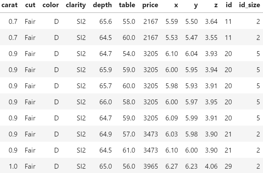
price (Python output).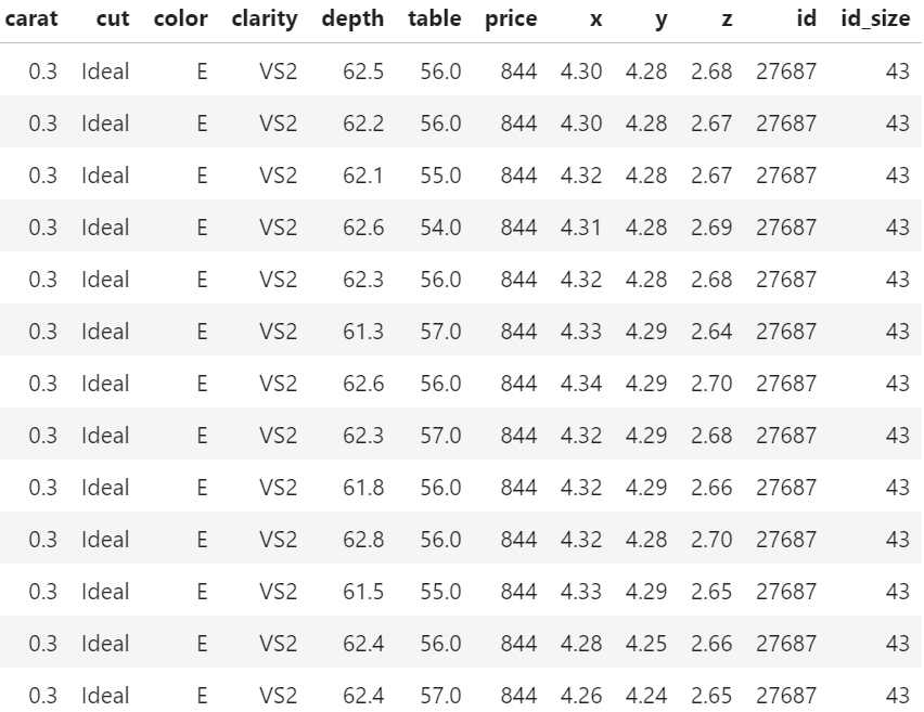
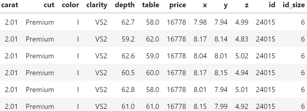
Of course, having the same id does not necessarily mean that the rows really describe the same diamond. price and the four “C”s could coincide purely by chance. Nevertheless: there are exactly six diamonds of 2.01 carat and a price of 16,778 USD in the dataset. And they all have the same color, cut and clarity. This cannot be coincidence!
Why would this be problematic?
In the presence of grouped data, standard validation techniques tend to reward overfitting.
This becomes immediately clear having in mind the 2.01 carat diamond from Table 3. Standard cross-validation (CV) uses random or stratified sampling and would scatter the six rows of that diamond across multiple CV folds. Highly flexible algorithms like random forests or nearest-neighbour regression could exploit this by memorizing the price of this diamond in-fold and do very well out-of-fold. As a consequence, the stated CV performance would be too good and the choice of the modeling technique and its hyperparameters suboptimal.
With grouped data, a good approach is often to randomly sample the whole group instead of single rows. Using such grouped splitting ensures that all rows in the same group would end up in the same fold, removing the above described tendency to overfit.
Note 1. In our case of duplicates, a simple alternative to grouped splitting would be to remove the duplicates altogether. However, the occurrence of duplicates is just one of many situations where grouped or clustered samples appear in reality.
Note 2. The same considerations not only apply to cross-validation but also to simple train/validation/test splits.
Evaluation
What does this mean regarding our diamonds dataset? Using five-fold CV, we will estimate the true root-mean-squared error (RMSE) of a random forest predicting log price by the four “C”. We run this experiment twice: one time, we create the folds by random splitting and the other time by grouped splitting. How heavily will the results from random splitting be biased?
library(ranger)
library(splitTools) # one of our packages on CRAN

set.seed(8325)

# We model log(price)
dia <- dia %>%
  mutate(y = log(price))

# Helper function: calculate rmse
rmse <- function(obs, pred) {
  sqrt(mean((obs - pred)^2))
}

# Helper function: fit model on one fold and evaluate
fit_on_fold <- function(fold, data) {
  fit <- ranger(y ~ carat + cut + color + clarity, data = data[fold, ])
  rmse(data$y[-fold], predict(fit, data[-fold, ])$pred)
}

# 5-fold CV for different split types
cross_validate <- function(type, data) {
  folds <- create_folds(data$id, k = 5, type = type)
  mean(sapply(folds, fit_on_fold, data = dia))
}

# Apply and plot
(results <- sapply(c("basic", "grouped"), cross_validate, data = dia))
barplot(results, col = "orange", ylab = "RMSE by 5-fold CV")
from sklearn.ensemble import RandomForestRegressor
from sklearn.model_selection import cross_val_score, GroupKFold, KFold
from sklearn.metrics import make_scorer, mean_squared_error
import seaborn as sns
rmse = make_scorer(mean_squared_error, squared=False)
# Prepare y, X
df = df.sample(frac=1, random_state=6345)
y = np.log(df.price)
X = df[xvars].copy()
# Correctly ordered integer encoding
X[cat_vars] = X[cat_vars].apply(lambda x: x.cat.codes)
# Cross-validation
results = {}
rf = RandomForestRegressor(n_estimators=500, max_features="sqrt",
min_samples_leaf=5, n_jobs=-1)
for nm, strategy in zip(("basic", "grouped"), (KFold, GroupKFold)):
results[nm] = cross_val_score(
rf, X, y, cv=strategy(), scoring=rmse, groups=df.id
).mean()
print(results)
res = pd.DataFrame(results.items())
sns.barplot(x=0, y=1, data=res);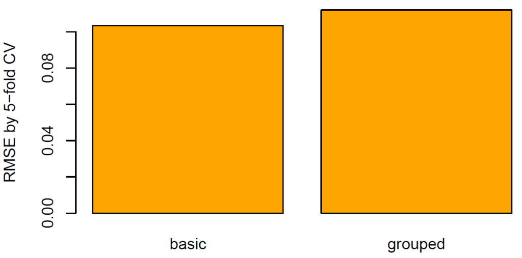
The RMSE (11%) of grouped CV is 8%-10% higher than of random CV (10%). The standard technique therefore seems to be considerably biased.
Final remarks
- The diamonds dataset is not only a brilliant example to demonstrate regression techniques but also a great way to show the importance of a clean validation strategy (in this case: grouped splitting).
- Blind or automatic ML would most probably fail to detect non-trivial data structures like in this case and therefore use inappropriate validation strategies. The resulting model would be somewhere between suboptimal and dangerous. Just that nobody would know it!
- The first step towards a good model validation strategy is data understanding. This is a mix of knowing the data source, how the data was generated, the meaning of columns and rows, descriptive statistics etc.
The Python notebook and R code can be found at: