Lost in Translation between R and Python 10
This is the next article in our series “Lost in Translation between R and Python”. The aim of this series is to provide high-quality R and Python code to achieve some non-trivial tasks. If you are to learn R, check out the R tab below. Similarly, if you are to learn Python, the Python tab will be your friend.
This post is heavily based on the new {shapviz} vignette.
Setting
Besides other features, a model with geographic components contains features like
- latitude and longitude,
- postal code, and/or
- other features that depend on location, e.g., distance to next restaurant.
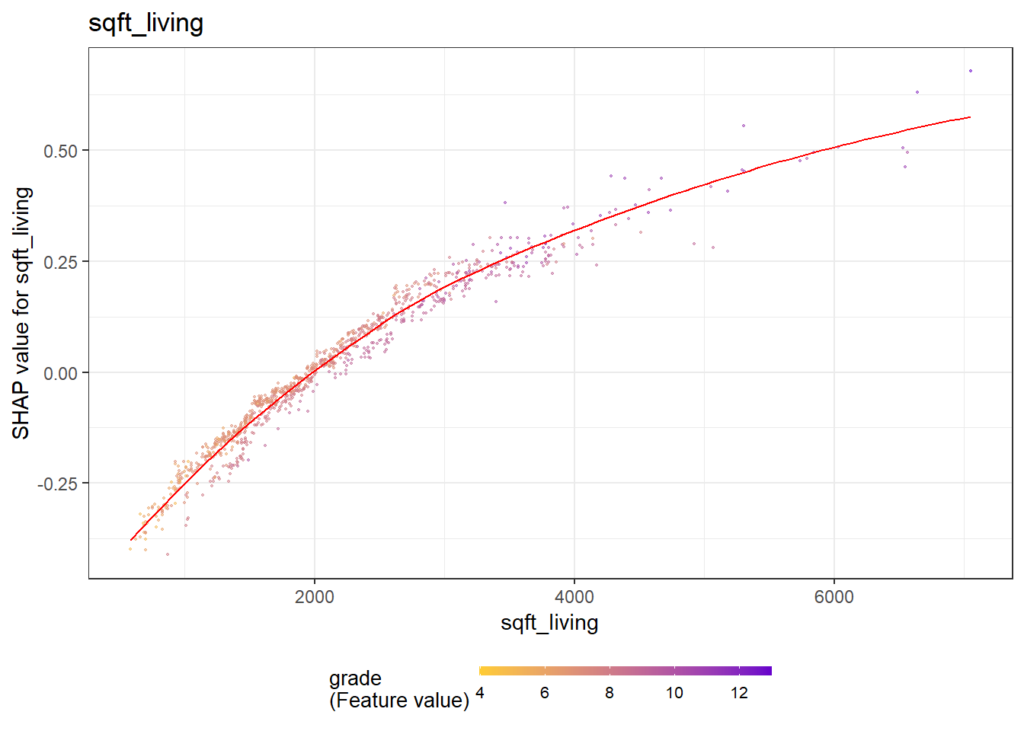
Like any feature, the effect of a single geographic feature can be described using SHAP dependence plots. However, studying the effect of latitude (or any other location dependent feature) alone is often not very illuminating – simply due to strong interaction effects and correlations with other geographic features.
That’s where the additivity of SHAP values comes into play: The sum of SHAP values of all geographic components represent the total geographic effect, and this sum can be visualized as a heatmap or 3D scatterplot against latitude/longitude (or any other geographic representation).
A first example
For illustration, we will use a beautiful house price dataset containing information on about 14’000 houses sold in 2016 in Miami-Dade County. Some of the columns are as follows:
- SALE_PRC: Sale price in USD: Its logarithm will be our model response.
- LATITUDE, LONGITUDE: Coordinates
- CNTR_DIST: Distance to central business district
- OCEAN_DIST: Distance (ft) to the ocean
- RAIL_DIST: Distance (ft) to the next railway track
- HWY_DIST: Distance (ft) to next highway
- TOT_LVG_AREA: Living area in square feet
- LND_SQFOOT: Land area in square feet
- structure_quality: Measure of building quality (1: worst to 5: best)
- age: Age of the building in years
(Italic features are geographic components.) For more background on this dataset, see Mayer et al [2].
We will fit an XGBoost model to explain log(price) as a function of lat/long, size, and quality/age.
devtools::install_github("ModelOriented/shapviz", dependencies = TRUE)
library(xgboost)
library(ggplot2)
library(shapviz)  # Needs development version 0.9.0 from github

head(miami)

x_coord <- c("LATITUDE", "LONGITUDE")
x_nongeo <- c("TOT_LVG_AREA", "LND_SQFOOT", "structure_quality", "age")
x <- c(x_coord, x_nongeo)

# Train/valid split
set.seed(1)
ix <- sample(nrow(miami), 0.8 * nrow(miami))
X_train <- data.matrix(miami[ix, x])
X_valid <- data.matrix(miami[-ix, x])
y_train <- log(miami$SALE_PRC[ix])
y_valid <- log(miami$SALE_PRC[-ix])

# Fit XGBoost model with early stopping
dtrain <- xgb.DMatrix(X_train, label = y_train)
dvalid <- xgb.DMatrix(X_valid, label = y_valid)

params <- list(learning_rate = 0.2, objective = "reg:squarederror", max_depth = 5)

fit <- xgb.train(
  params = params,
  data = dtrain,
  watchlist = list(valid = dvalid),
  early_stopping_rounds = 20,
  nrounds = 1000,
  callbacks = list(cb.print.evaluation(period = 100))
)
%load_ext lab_black
import numpy as np
import matplotlib.pyplot as plt
from sklearn.datasets import fetch_openml
df = fetch_openml(data_id=43093, as_frame=True)
X, y = df.data, np.log(df.target)
X.head()
# Data split and model
from sklearn.model_selection import train_test_split
import xgboost as xgb
x_coord = ["LONGITUDE", "LATITUDE"]
x_nongeo = ["TOT_LVG_AREA", "LND_SQFOOT", "structure_quality", "age"]
x = x_coord + x_nongeo
X_train, X_valid, y_train, y_valid = train_test_split(
X[x], y, test_size=0.2, random_state=30
)
# Fit XGBoost model with early stopping
dtrain = xgb.DMatrix(X_train, label=y_train)
dvalid = xgb.DMatrix(X_valid, label=y_valid)
params = dict(learning_rate=0.2, objective="reg:squarederror", max_depth=5)
fit = xgb.train(
params=params,
dtrain=dtrain,
evals=[(dvalid, "valid")],
verbose_eval=100,
early_stopping_rounds=20,
num_boost_round=1000,
)
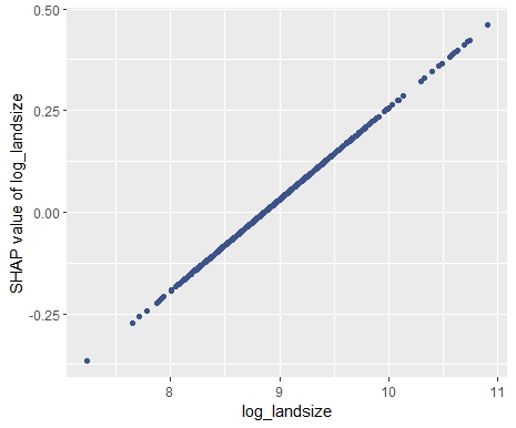
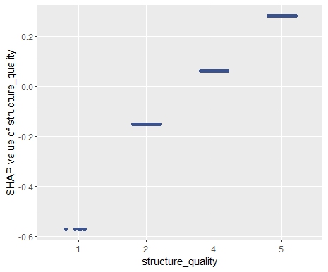
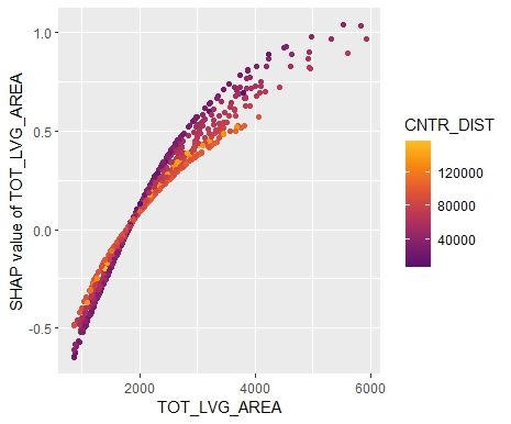
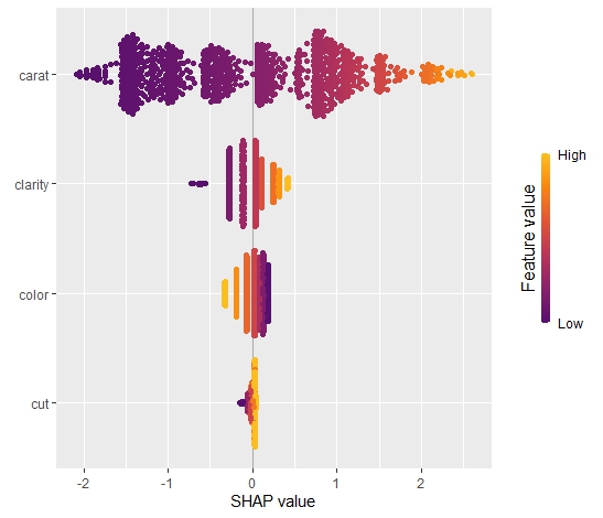
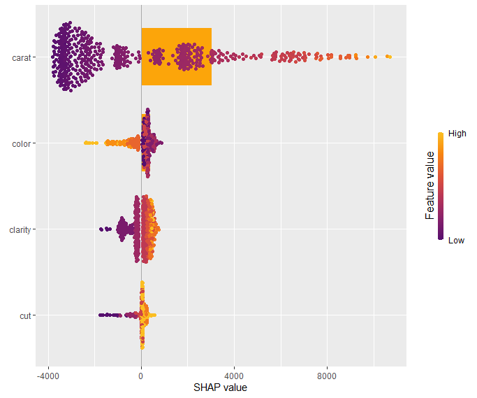
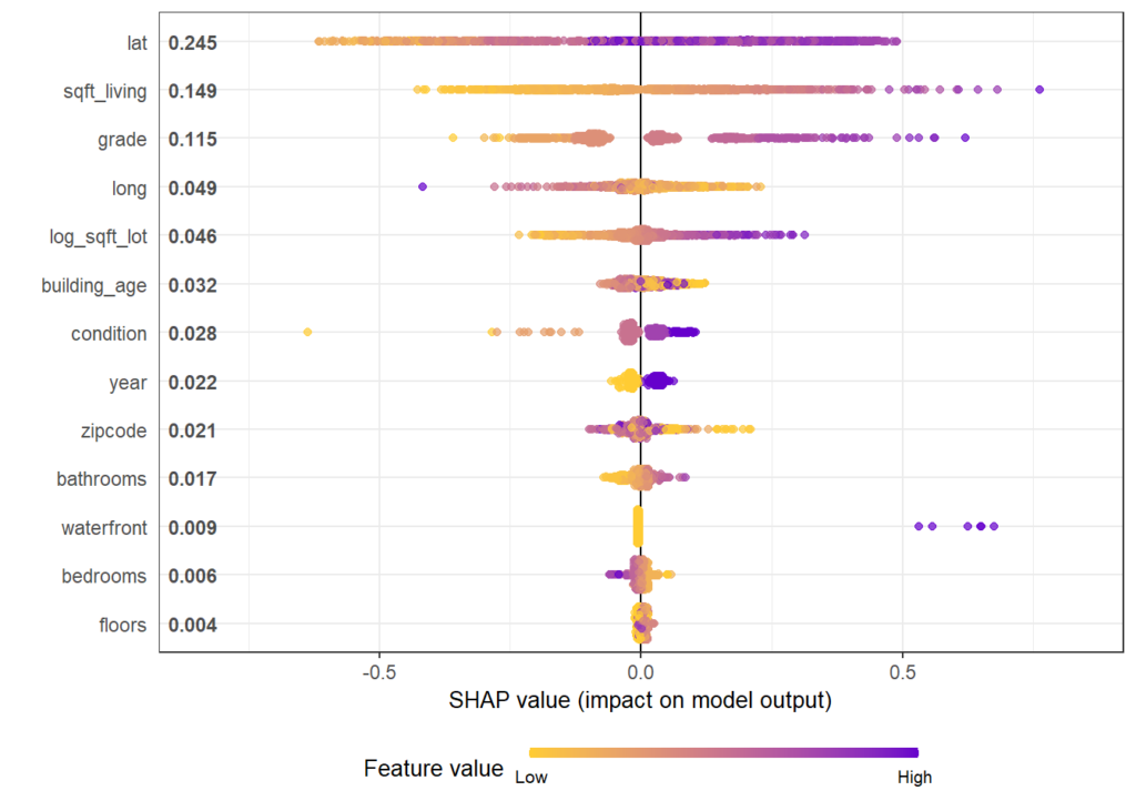
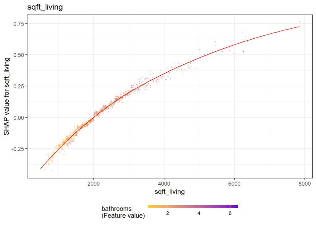
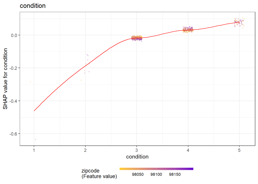
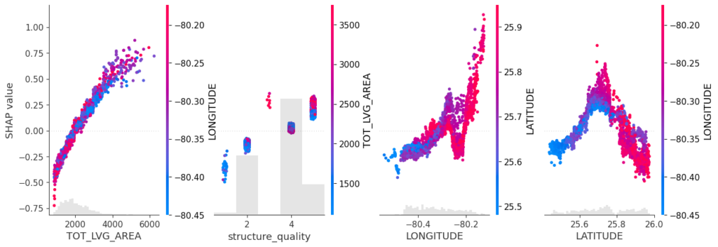
SHAP dependence plots
Let’s first study selected SHAP dependence plots, evaluated on the validation dataset with around 2800 observations. Note that we could as well use the training data for this purpose, but it is a bit large.
sv <- shapviz(fit, X_pred = X_valid)
sv_dependence(
  sv,
  v = c("TOT_LVG_AREA", "structure_quality", "LONGITUDE", "LATITUDE"),
  alpha = 0.2
)
import shap xgb_explainer = shap.Explainer(fit) shap_values = xgb_explainer(X_valid) v = ["TOT_LVG_AREA", "structure_quality", "LONGITUDE", "LATITUDE"] shap.plots.scatter(shap_values[:, v], color=shap_values[:, v])
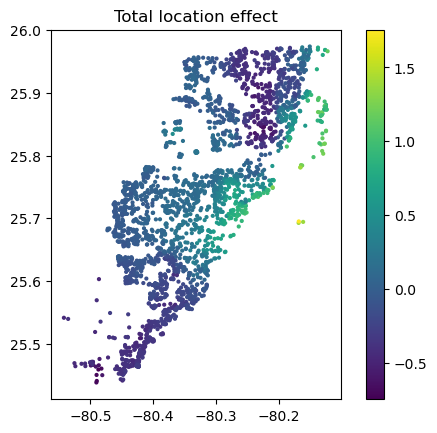
Total coordindate effect
And now the two-dimensional plot of the sum of SHAP values:
sv_dependence2D(sv, x = "LONGITUDE", y = "LATITUDE") +
  coord_equal()
shap_coord = shap_values[:, x_coord]
plt.scatter(*list(shap_coord.data.T), c=shap_coord.values.sum(axis=1), s=4)
ax = plt.gca()
ax.set_aspect("equal", adjustable="box")
plt.colorbar()
plt.title("Total location effect")
plt.show()
The last plot gives a good impression on price levels, but note:
- Since we have modeled logarithmic prices, the effects are on relative scale (0.1 means about 10% above average).
- Due to interaction effects with non-geographic components, the location effects might depend on features like living area. This is not visible in above plot. We will modify the model now to improve this aspect.
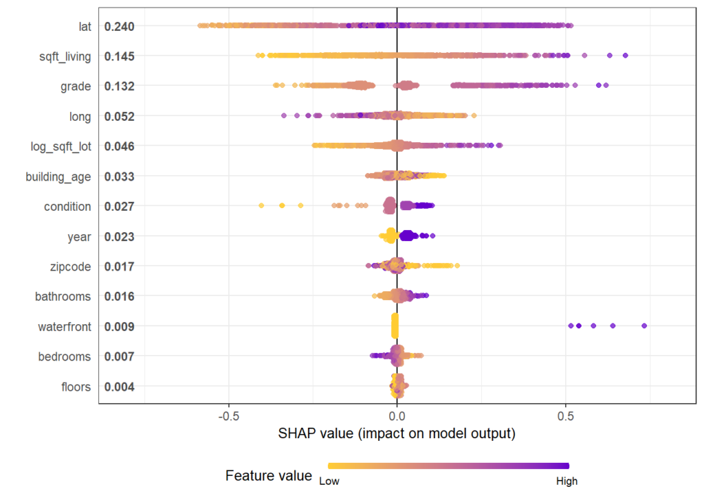
Two modifications
We will now change above model in two ways, not unlike the model in Mayer et al [2].
- We will use additional geographic features like distance to railway track or to the ocean.
- We will use interaction constraints to allow only interactions between geographic features.
The second step leads to a model that is additive in each non-geographic component and also additive in the combined location effect. According to the technical report of Mayer [1], SHAP dependence plots of additive components in a boosted trees model are shifted versions of corresponding partial dependence plots (evaluated at observed values). This allows a “Ceteris Paribus” interpretation of SHAP dependence plots of corresponding components.
# Extend the feature set
more_geo <- c("CNTR_DIST", "OCEAN_DIST", "RAIL_DIST", "HWY_DIST")
x2 <- c(x, more_geo)

X_train2 <- data.matrix(miami[ix, x2])
X_valid2 <- data.matrix(miami[-ix, x2])

dtrain2 <- xgb.DMatrix(X_train2, label = y_train)
dvalid2 <- xgb.DMatrix(X_valid2, label = y_valid)

# Build interaction constraint vector
ic <- c(
  list(which(x2 %in% c(x_coord, more_geo)) - 1),
  as.list(which(x2 %in% x_nongeo) - 1)
)

# Modify parameters
params$interaction_constraints <- ic

fit2 <- xgb.train(
  params = params,
  data = dtrain2,
  watchlist = list(valid = dvalid2),
  early_stopping_rounds = 20,
  nrounds = 1000,
  callbacks = list(cb.print.evaluation(period = 100))
)

# SHAP analysis
sv2 <- shapviz(fit2, X_pred = X_valid2)

# Two selected features: Thanks to additivity, structure_quality can be read as
# Ceteris Paribus
sv_dependence(sv2, v = c("structure_quality", "LONGITUDE"), alpha = 0.2)

# Total geographic effect (Ceteris Paribus thanks to additivity)
sv_dependence2D(sv2, x = "LONGITUDE", y = "LATITUDE", add_vars = more_geo) +
  coord_equal()
# Extend the feature set
more_geo = ["CNTR_DIST", "OCEAN_DIST", "RAIL_DIST", "HWY_DIST"]
x2 = x + more_geo
X_train2, X_valid2 = train_test_split(X[x2], test_size=0.2, random_state=30)
dtrain2 = xgb.DMatrix(X_train2, label=y_train)
dvalid2 = xgb.DMatrix(X_valid2, label=y_valid)
# Build interaction constraint vector
ic = [x_coord + more_geo, *[[z] for z in x_nongeo]]
# Modify parameters
params["interaction_constraints"] = ic
fit2 = xgb.train(
params=params,
dtrain=dtrain2,
evals=[(dvalid2, "valid")],
verbose_eval=100,
early_stopping_rounds=20,
num_boost_round=1000,
)
# SHAP analysis
xgb_explainer2 = shap.Explainer(fit2)
shap_values2 = xgb_explainer2(X_valid2)
v = ["structure_quality", "LONGITUDE"]
shap.plots.scatter(shap_values2[:, v], color=shap_values2[:, v])
# Total location effect
shap_coord2 = shap_values2[:, x_coord]
c = shap_values2[:, x_coord + more_geo].values.sum(axis=1)
plt.scatter(*list(shap_coord2.data.T), c=c, s=4)
ax = plt.gca()
ax.set_aspect("equal", adjustable="box")
plt.colorbar()
plt.title("Total location effect")
plt.show()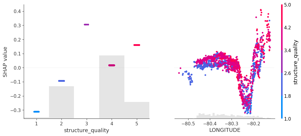
Again, the resulting total geographic effect looks reasonable.
Wrap-Up
- SHAP values of all geographic components in a model can be summed up and plotted on the color scale against coordinates (or some other geographic representation). This gives a lightning fast impression of the location effects.
- Interaction constraints between geographic and non-geographic features lead to Ceteris Paribus interpretation of total geographic effects.
The Python and R notebooks can be found here:
References
- Mayer, Michael. 2022. “SHAP for Additively Modeled Features in a Boosted Trees Model.” https://arxiv.org/abs/2207.14490.
- Mayer, Michael, Steven C. Bourassa, Martin Hoesli, and Donato Flavio Scognamiglio. 2022. “Machine Learning Applications to Land and Structure Valuation.” Journal of Risk and Financial Management.