Tag: R

R programming language

  • Swiss Mortality

    Lost in Translation between R and Python 3

    Hello again!

    This is the third article in our series “Lost in Translation between R and Python”. The aim of this series is to provide high-quality R and Python 3 code to achieve some non-trivial tasks. If you are to learn R, check out the R tab below. Similarly, if you are to learn Python, the Python tab will be your friend.

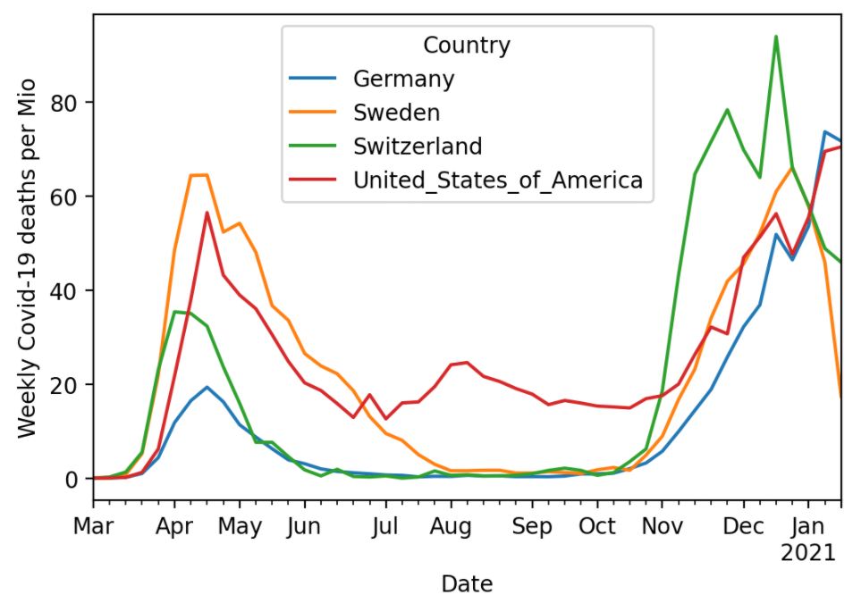
    Post 2: https://lorentzen.ch/index.php/2021/01/26/covid-19-deaths-per-mio/

    Before diving into the data analysis, I would like to share with you that writing this text brought back some memories from my first year as an actuary. Indeed, I started in life insurance and soon switched to non-life. While investigating mortality may be seen as a dry matter, it reveals some interesting statistical problems which have to be properly addressed before drawing conclusions.

    Similar to Post 2, we use a publicly available data, this time from the Human Mortality Database and from the Federal Statistical Office of Switzerland, in order to calculate crude death rates, i.e. number of deaths per person alive per year. This time, we look at a longer time periode of 20 and over 100 years and take all causes of death into account. We caution against any misinterpretation: We show only crude death rates (CDR) which do not take into account any demographic shifts like changing distributions of age or effects from measures taken against COVID-19.

    Let us start with producing the first figure. We fetch the data from the internet, pick some countries of interest, focus on males and females combined only, aggregate and plot. The Python version uses the visualization library altair, which can generate interactive charts. Unfortunately, we can only show a static version in the blog post. If someone knows how to render Vega-Light charts in wordpress, I’d be very interested in a secure solution.

    library(tidyverse)
    library(lubridate)
    
    # Fetch data
    df_original = read_csv(
      "https://www.mortality.org/Public/STMF/Outputs/stmf.csv",
      skip = 2
    )
    
    # 1. Select countries of interest and only "both" sexes
    # Note: Germany "DEUTNP" and "USA" have short time series
    # 2. Change to ISO-3166-1 ALPHA-3 codes
    # 3.Create population pro rata temporis (exposure) to ease aggregation
    df_mortality <- df_original %>% 
      filter(CountryCode %in% c("CAN", "CHE", "FRATNP", "GBRTENW", "SWE"),
             Sex == "b") %>% 
      mutate(CountryCode = recode(CountryCode, "FRATNP" = "FRA",
                                  "GBRTENW" = "England & Wales"),
             population = DTotal / RTotal,
             Year = ymd(Year, truncated = 2))
    
    # Data aggregation per year and country
    df <- df_mortality %>%
      group_by(Year, CountryCode) %>% 
      summarise(CDR = sum(DTotal) / sum(population), 
                .groups = "drop")
    
    ggplot(df, aes(x = Year, y = CDR, color = CountryCode)) +
      geom_line(size = 1) +
      ylab("Crude Death Rate per Year") +
      theme(legend.position = c(0.2, 0.8))
    import pandas as pd
    import altair as alt
    
    
    # Fetch data
    df_mortality = pd.read_csv(
        "https://www.mortality.org/Public/STMF/Outputs/stmf.csv",
        skiprows=2,
    )
    
    # Select countdf_mortalityf interest and only "both" sexes
    # Note: Germany "DEUTNP" and "USA" have short time series
    df_mortality = df_mortality[
        df_mortality["CountryCode"].isin(["CAN", "CHE", "FRATNP", "GBRTENW", "SWE"])
        & (df_mortality["Sex"] == "b")
    ].copy()
    
    # Change to ISO-3166-1 ALPHA-3 codes
    df_mortality["CountryCode"].replace(
        {"FRATNP": "FRA", "GBRTENW": "England & Wales"}, inplace=True
    )
    
    # Create population pro rata temporis (exposure) to ease aggregation
    df_mortality = df_mortality.assign(
        population=lambda df: df["DTotal"] / df["RTotal"]
    )
    
    # Data aggregation per year and country
    df_mortality = (
        df_mortality.groupby(["Year", "CountryCode"])[["population", "DTotal"]]
        .sum()
        .assign(CDR=lambda x: x["DTotal"] / x["population"])
        # .filter(items=["CDR"])  # make df even smaller
        .reset_index()
        .assign(Year=lambda x: pd.to_datetime(x["Year"], format="%Y"))
    )
    
    chart = (
        alt.Chart(df_mortality)
        .mark_line()
        .encode(
            x="Year:T",
            y=alt.Y("CDR:Q", scale=alt.Scale(zero=False)),
            color="CountryCode:N",
        )
        .properties(title="Crude Death Rate per Year")
        .interactive()
    )
    # chart.save("crude_death_rate.html")
    chart
    Crude death rate (CDR) for Canada (CAN), Switzerland (CHE), England & Wales, France (FRA) and Sweden (SWE). Data as of 07.02.2021.

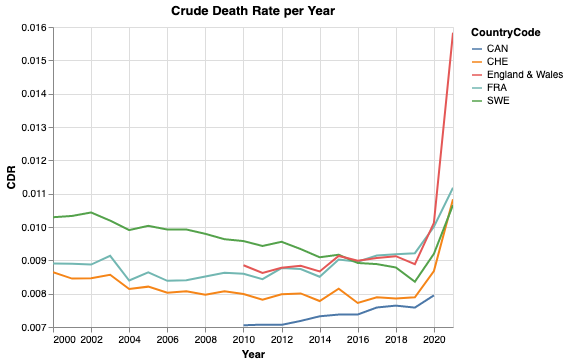
    Note that the y-axis does not start at zero. Nevertheless, we see values between 0.007 and 0.014, which is twice as large. While 2020 shows a clear raise in mortality, for some countries more dramatic than for others, the values of 2021 are still preliminary. For 2021, the data is still incomplete and the yearly CDR is based on a small observation period and hence on a smaller population pro rata temporis. On top, there might be effects from seasonality. To sum up, it means that there is a larger uncertainty for 2021 than for previous whole years.

    For Switzerland, it is also possible to collect data for over 100 years. As the code for data fetching and preparation becomes a bit lengthy, we won’t bother you with it. You can find it in the notebooks linked below. Note that we added the value of 2020 from the figure above. This seems legit as the CDR of both data sources agree within less than 1% relative error.

    Crude death rate (CDR) for Switzerland from 1901 to 2020.

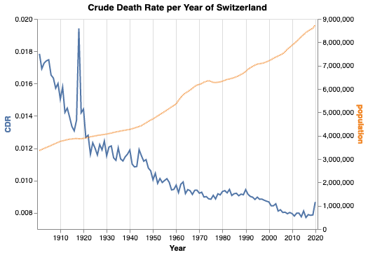
    Again, note that the left y-axis does not start at zero, but the right y-axis does. One can see several interesting facts:

    • The Swiss population is and always was growing for the last 120 years—with the only exception around 1976.
    • The Spanish flu between 1918 and 1920 caused by far the largest peak in mortality in the last 120 years.
    • The second world war is not visible in the mortality in Switzerland.
    • Overall, the mortality is decreasing.

    The Python notebook and R code can be found at:

  • Covid-19 Deaths per Mio

    Lost in Translation between R and Python 2

    Hello again!

    This is the next article in our series “Lost in Translation between R and Python”. The aim of this series is to provide high-quality R and Python 3 code to achieve some non-trivial tasks. If you are to learn R, check out the R tab below. Similarly, if you are to learn Python, the Python tab will be your friend.

    Post 1: https://lorentzen.ch/index.php/2021/01/07/illustrating-the-central-limit-theorem/

    In Post 2, we use a publicly available data of the European Centre for Disease Prevention and Control to calculate Covid-19 deaths per Mio persons over time and across countries . We will use slim Python and R codes to

    • fetch the data directly from the internet,
    • prepare and restructure it for plotting and
    • plot a curve per selected country.

    Note that different countries use different definitions of whom to count as Covid-19 death and these definitions might also have changed over time. So be careful with comparisons!

    library(tidyverse)
    
    # Source and countries
    link <- "https://opendata.ecdc.europa.eu/covid19/casedistribution/csv"
    countries <- c("Switzerland", "United_States_of_America", 
                   "Germany", "Sweden")
    
    # Import
    df0 <- read_csv(link)
    
    # Data prep
    df <- df0 %>%
      mutate(Date = lubridate::dmy(dateRep),
             Deaths = deaths_weekly / (popData2019 / 1e6))  %>%
      rename(Country = countriesAndTerritories) %>%
      filter(Date >= "2020-03-01",
             Country %in% countries)
    
    # Plot
    ggplot(df, aes(x = Date, y = Deaths, color = Country)) +
      geom_line(size = 1) +
      ylab("Weekly deaths per Mio") +
      theme(legend.position = c(0.2, 0.85))
    import pandas as pd
    
    # Source and countries
    url = "https://opendata.ecdc.europa.eu/covid19/casedistribution/csv"
    countries = ["Switzerland", "United_States_of_America", 
                 "Germany", "Sweden"]
    
    # Fetch data
    df0 = pd.read_csv(url)
    # df0.head()
    
    # Prepare data
    df = df0.assign(
        Date=lambda x: pd.to_datetime(x["dateRep"], format="%d/%m/%Y"),
        Deaths=lambda x: x["deaths_weekly"] / x["popData2019"] * 1e6,
    ).rename(columns={"countriesAndTerritories": "Country"})
    df = df.loc[
        (df["Country"].isin(countries)) & (df["Date"] >= "2020-03-01"),
        ["Country", "Date", "Deaths"],
    ]
    df = df.pivot(index="Date", columns="Country")
    df = df.droplevel(0, axis=1)
    
    # Plot
    ax = df.plot()
    ax.set_ylabel('Weekly Covid-19 deaths per Mio');

    Weekly Covid-19 deaths per Mio inhabitants as per January 26, 2021 (Python output).

    The code can be found on https://github.com/mayer79/covid with some other analyses regarding viruses.

  • Illustrating The Central Limit Theorem

    Lost in Translation between R and Python 1

    This is the first article in our series “Lost in Translation between R and Python”. The aim of this series is to provide high-quality R and Python 3 code to achieve some non-trivial tasks. If you are to learn R, check out the R tab below. Similarly, if you are to learn Python, the Python tab will be your friend.

    Let’s start with a little bit of statistics – it wont be the last time, friends: Illustrating the Central Limit Theorem (CLT).

    Take a sample of a random variable X with finite variance. The CLT says: No matter how “unnormally” distributed X is, its sample mean will be approximately normally distributed, at least if the sample size is not too small. This classic result is the basis to construct simple confidence intervals and hypothesis tests for the (true) mean of X, check out Wikipedia for a lot of additional information.

    The code below illustrates this famous statistical result by simulation, using a very asymmetrically distributed X, namely X = 1 with probability 0.2 and X=0 otherwise. X could represent the result of asking a randomly picked person whether he smokes. Conducting such a poll, the mean of the collected sample of such results would be a statistical estimate of the proportion of people smoking.

    Curiously, by a tiny modification, the same code will also illustrate another key result in statistics – the Law of Large Numbers: For growing sample size, the distribution of the sample mean of X contracts to the expectation E(X).

    # Fix seed, set constants
    set.seed(2006)
    sample_sizes <- c(1, 10, 30, 1000)
    nsims <- 10000
    
    # Helper function: Mean of one sample of X
    one_mean <- function(n, p = c(0.8, 0.2)) {
      mean(sample(0:1, n, replace = TRUE, prob = p))
    }
    # one_mean(10)
    
    # Simulate and plot
    par(mfrow = c(2, 2), mai = rep(0.4, 4))
    
    for (n in sample_sizes) {
      means <- replicate(nsims, one_mean(n))
      hist(means, breaks = "FD", 
           # xlim = 0:1, # uncomment for LLN
           main = sprintf("n=%i", n))
    }
    import numpy as np
    import matplotlib.pyplot as plt
    %matplotlib inline
    
    # Fix seed, set constants
    np.random.seed(100)
    sample_sizes = [1, 10, 30, 1000]
    nsims = 10_000
    
    # Helper function: Mean of one sample
    def one_mean(n, p=0.2):
        return np.random.binomial(1, p, n).mean()
    
    # Simulate and plot
    fig, axes = plt.subplots(2, 2, figsize=(8, 8))
    
    for i, n in enumerate(sample_sizes):
        means = [one_mean(n) for ell in range(nsims)]
        ax = axes[i // 2, i % 2]
        ax.hist(means, 50)
        ax.title.set_text(f'$n = {n}$')
        ax.set_xlabel('mean')
        # ax.set_xlim(0, 1)  # uncomment for LLN
    fig.tight_layout()

    Result: The Central Limit Theorem

    The larger the samples, the closer the histogram of the simulated means resembles a symmetric bell shaped curve (R-Output for illustration).

    Result: The Law of Large Number

    Fixing the x-scale illustrates – for free(!) – the Law of Large Numbers: The distribution of the mean contracts more and more to the expectation 0.2 (R-Output for illustration).

    See also the python notebook https://github.com/lorentzenchr/notebooks/blob/master/blogposts/2021-01-07 Illustrating The Central Limit Theorem.ipynb and for many great posts on R,  http://www.R-bloggers.com.