There are different R packages devoted to model agnostic interpretability, DALEX and iml being among the best known. In 2019, I added flashlight
for a couple of reasons:
- Its explainers work with case weights.
- Multiple explainers can be combined to a multi-explainer.
- Stratified calculation is possible.
Since almost all plots in flashlight are constructed with ggplot, it is super easy to turn them into interactive plotly objects: just add a simple ggplotly() to the end of the call.
However… it is not straightforward to show interactive plots in a blog! Thus, we show only screenshots of the resulting plots here and refer to the complete HTML report here: https://mayer79.github.io/flashlight_plotly/flashlight_plotly.html
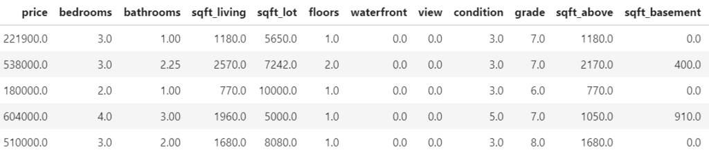
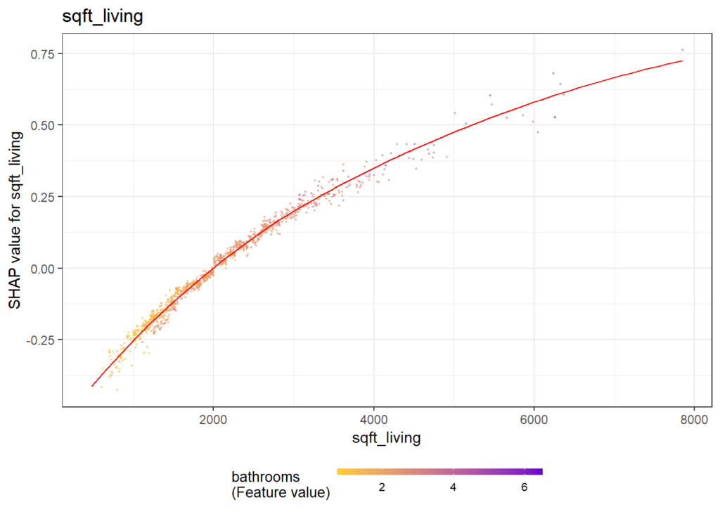
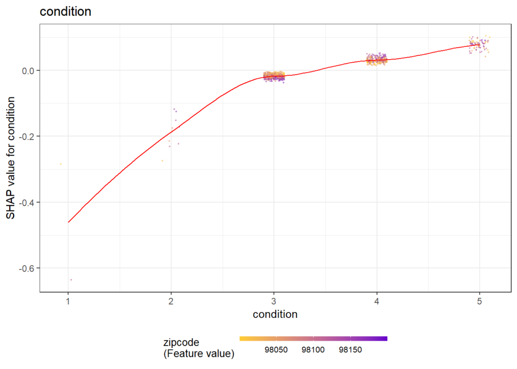
We will use a sweet dataset with more than 20’000 houses to model house prices by a set of derived features such as the logarithmic living area. The location will be represented by the postal code.
Data preparation
We first load the data and prepare some of the columns for modeling. Furthermore, we specify the set of features and the response.
library(dplyr)
library(flashlight)
library(plotly)
library(ranger)
library(lme4)
library(moderndive)
library(splitTools)
library(MetricsWeighted)

set.seed(4933)

data("house_prices")

prep <- house_prices %>%
  mutate(
    log_price = log(price),
    log_sqft_living = log(sqft_living),
    log_sqft_lot = log(sqft_lot),
    log_sqft_basement = log1p(sqft_basement),
    year = as.numeric(format(date, '%Y')),
    age = year - yr_built
  )

x <- c(
  "year", "age", "log_sqft_living", "log_sqft_lot",
  "bedrooms", "bathrooms", "log_sqft_basement",
  "condition", "waterfront", "zipcode"
)

y <- "log_price"

head(prep[c(y, x)])

## # A tibble: 6 x 11
##   log_price  year   age log_sqft_living log_sqft_lot bedrooms bathrooms
##       <dbl> <dbl> <dbl>           <dbl>        <dbl>    <int>     <dbl>
## 1      12.3  2014    59            7.07         8.64        3      1
## 2      13.2  2014    63            7.85         8.89        3      2.25
## 3      12.1  2015    82            6.65         9.21        2      1
## 4      13.3  2014    49            7.58         8.52        4      3
## 5      13.1  2015    28            7.43         9.00        3      2
## 6      14.0  2014    13            8.60        11.5         4      4.5
## # ... with 4 more variables: log_sqft_basement <dbl>, condition <fct>,
## #   waterfront <lgl>, zipcode <fct>
Train / test split
Then, we split the dataset into 80% training and 20% test rows, stratified on the (binned) response log_price.
idx <- partition(prep[[y]], c(train = 0.8, test = 0.2), type = "stratified")

train <- prep[idx$train, ]
test <- prep[idx$test, ]
Models
We fit two models:
- A linear mixed model with random postal code effect.
- A random forest with 500 trees.
# Mixed-effects model
fit_lmer <- lmer(
  update(reformulate(x, "log_price"), . ~ . - zipcode + (1 | zipcode)),
  data = train
)

# Random forest
fit_rf <- ranger(
  reformulate(x, "log_price"),
  always.split.variables = "zipcode",
  data = train
)
cat("R-squared OOB:", fit_rf$r.squared)
## R-squared OOB: 0.8463311
Model inspection
Now, we are ready to inspect our two models regarding performance, variable importance, and effects.
Set up explainers
First, we pack all model dependent information into flashlights (the explainer objects) and combine them to a multiflashlight. As evaluation dataset, we pass the test data. This ensures that interpretability tools using the response (e.g., performance measures and permutation importance) are not being biased by overfitting.
fl_lmer <- flashlight(model = fit_lmer, label = "LMER")
fl_rf <- flashlight(
  model = fit_rf,
  label = "RF",
  predict_function = function(mod, X) predict(mod, X)$predictions
)
fls <- multiflashlight(
  list(fl_lmer, fl_rf),
  y = "log_price",
  data = test,
  metrics = list(RMSE = rmse, `R-squared` = r_squared)
)
Model performance
Let’s evaluate model RMSE and R-squared on the hold-out dataset. Here, the mixed-effects model performs a tiny little bit better than the random forest:
(light_performance(fls) %>%
  plot(fill = "darkred") +
    labs(title = "Model performance", x = element_blank())) %>%
  ggplotly()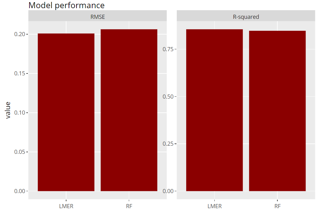
Permutation importance
Next, we inspect the variable strength based on permutation importance. It shows by how much the RMSE is being increased when shuffling a variable before prediction. The results are quite similar between the two models.
(light_importance(fls, v = x) %>%
    plot(fill = "darkred") +
    labs(title = "Permutation importance", y = "Drop in RMSE")) %>%
  ggplotly()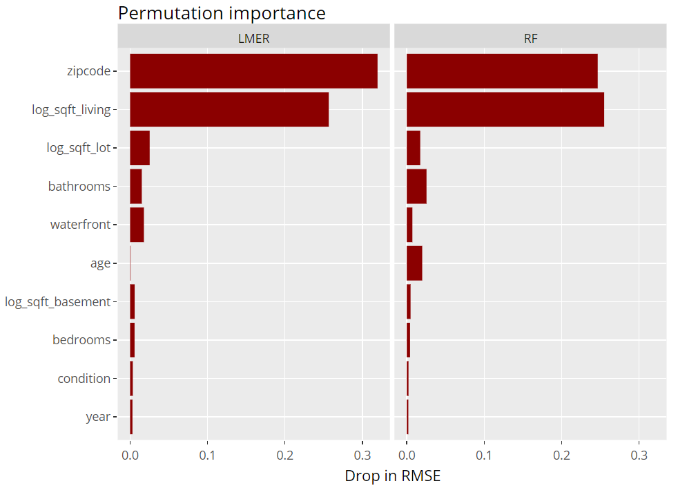
ICE plot
To get an impression of the effect of the living area, we select 200 observations and profile their predictions with increasing (log) living area, keeping everything else fixed (Ceteris Paribus). These ICE (individual conditional expectation) plots are vertically centered in order to highlight potential interaction effects. If all curves coincide, there are no interaction effects and we can say that the effect of the feature is modelled in an additive way (no surprise for the additive linear mixed-effects model).
(light_ice(fls, v = "log_sqft_living", n_max = 200, center = "middle") %>%
    plot(alpha = 0.05, color = "darkred") +
    labs(title = "Centered ICE plot", y = "log_price (shifted)")) %>%
  ggplotly()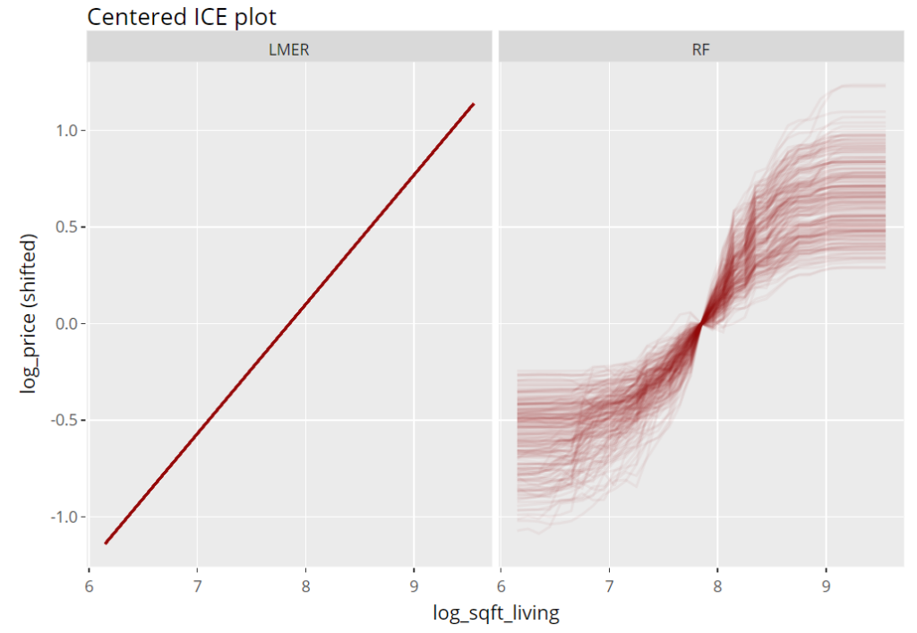
Partial dependence plots
Averaging many uncentered ICE curves provides the famous partial dependence plot, introduced in Friedman’s seminal paper on gradient boosting machines (2001).
(light_profile(fls, v = "log_sqft_living", n_bins = 21) %>%
    plot(rotate_x = FALSE) +
    labs(title = "Partial dependence plot", y = y) +
    scale_colour_viridis_d(begin = 0.2, end = 0.8)) %>%
  ggplotly()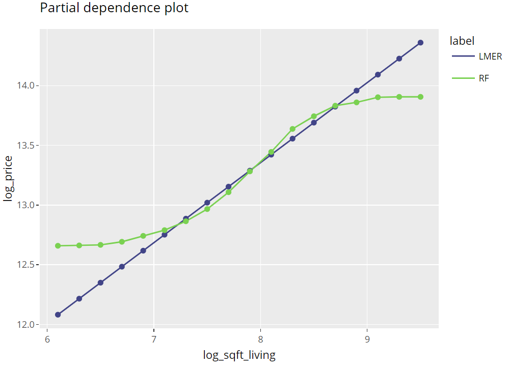
Multiple effects visualized together
The last figure extends the partial dependence plot with three additional curves, all evaluated on the hold-out dataset:
- Average observed values
- Average predictions
- ALE plot (“accumulated local effects”, an alternative to partial dependence plots with relaxed Ceteris Paribus assumption)
(light_effects(fls, v = "log_sqft_living", n_bins = 21) %>%
    plot(use = "all")  +
    labs(title = "Different effect estimates", y = y) +
    scale_colour_viridis_d(begin = 0.2, end = 0.8)) %>%
  ggplotly()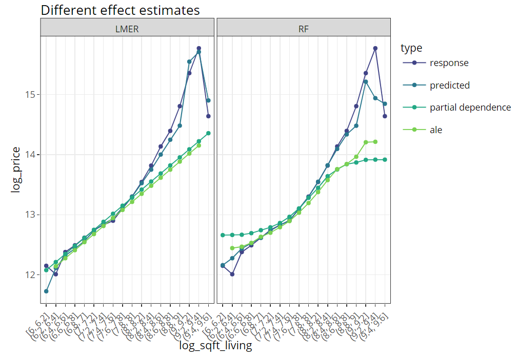
Conclusion
Combining flashlight with plotly works well and provides nice, interactive plots. Using rmarkdown, an analysis like this look quite neat if shipped as an HTML like this one here: https://mayer79.github.io/flashlight_plotly/flashlight_plotly.html
The rmarkdown script can be found here on github.