Category: Programming

  • Let the flashlight shine with plotly

    There are different R packages devoted to model agnostic interpretability, DALEX and iml being among the best known. In 2019, I added flashlight 

    logo.png

    for a couple of reasons:

    1. Its explainers work with case weights.
    2. Multiple explainers can be combined to a multi-explainer.
    3. Stratified calculation is possible.

    Since almost all plots in flashlight are constructed with ggplot, it is super easy to turn them into interactive plotly objects: just add a simple ggplotly() to the end of the call.

    However… it is not straightforward to show interactive plots in a blog! Thus, we show only screenshots of the resulting plots here and refer to the complete HTML report here: https://mayer79.github.io/flashlight_plotly/flashlight_plotly.html

    We will use a sweet dataset with more than 20’000 houses to model house prices by a set of derived features such as the logarithmic living area. The location will be represented by the postal code.

    Data preparation

    We first load the data and prepare some of the columns for modeling. Furthermore, we specify the set of features and the response.

    library(dplyr)
    library(flashlight)
    library(plotly)
    library(ranger)
    library(lme4)
    library(moderndive)
    library(splitTools)
    library(MetricsWeighted)
    
    set.seed(4933)
    
    data("house_prices")
    
    prep <- house_prices %>% 
      mutate(
        log_price = log(price),
        log_sqft_living = log(sqft_living),
        log_sqft_lot = log(sqft_lot),
        log_sqft_basement = log1p(sqft_basement),
        year = as.numeric(format(date, '%Y')),
        age = year - yr_built
      )
    
    x <- c(
      "year", "age", "log_sqft_living", "log_sqft_lot", 
      "bedrooms", "bathrooms", "log_sqft_basement", 
      "condition", "waterfront", "zipcode"
    )
    
    y <- "log_price"
    
    head(prep[c(y, x)])
    
    ## # A tibble: 6 x 11
    ##   log_price  year   age log_sqft_living log_sqft_lot bedrooms bathrooms
    ##       <dbl> <dbl> <dbl>           <dbl>        <dbl>    <int>     <dbl>
    ## 1      12.3  2014    59            7.07         8.64        3      1   
    ## 2      13.2  2014    63            7.85         8.89        3      2.25
    ## 3      12.1  2015    82            6.65         9.21        2      1   
    ## 4      13.3  2014    49            7.58         8.52        4      3   
    ## 5      13.1  2015    28            7.43         9.00        3      2   
    ## 6      14.0  2014    13            8.60        11.5         4      4.5 
    ## # ... with 4 more variables: log_sqft_basement <dbl>, condition <fct>,
    ## #   waterfront <lgl>, zipcode <fct>

    Train / test split

    Then, we split the dataset into 80% training and 20% test rows, stratified on the (binned) response log_price.

    idx <- partition(prep[[y]], c(train = 0.8, test = 0.2), type = "stratified")
    
    train <- prep[idx$train, ]
    test <- prep[idx$test, ]

    Models

    We fit two models:

    1. A linear mixed model with random postal code effect.
    2. A random forest with 500 trees.
    # Mixed-effects model
    fit_lmer <- lmer(
      update(reformulate(x, "log_price"), . ~ . - zipcode + (1 | zipcode)),
      data = train
    )
    
    # Random forest
    fit_rf <- ranger(
      reformulate(x, "log_price"),
      always.split.variables = "zipcode",
      data = train
    )
    cat("R-squared OOB:", fit_rf$r.squared)
    ## R-squared OOB: 0.8463311

    Model inspection

    Now, we are ready to inspect our two models regarding performance, variable importance, and effects.

    Set up explainers

    First, we pack all model dependent information into flashlights (the explainer objects) and combine them to a multiflashlight. As evaluation dataset, we pass the test data. This ensures that interpretability tools using the response (e.g., performance measures and permutation importance) are not being biased by overfitting.

    fl_lmer <- flashlight(model = fit_lmer, label = "LMER")
    fl_rf <- flashlight(
      model = fit_rf,
      label = "RF",
      predict_function = function(mod, X) predict(mod, X)$predictions
    )
    fls <- multiflashlight(
      list(fl_lmer, fl_rf),
      y = "log_price",
      data = test,
      metrics = list(RMSE = rmse, `R-squared` = r_squared)
    )

    Model performance

    Let’s evaluate model RMSE and R-squared on the hold-out dataset. Here, the mixed-effects model performs a tiny little bit better than the random forest:

    (light_performance(fls) %>%
      plot(fill = "darkred") +
        labs(title = "Model performance", x = element_blank())) %>%
      ggplotly()
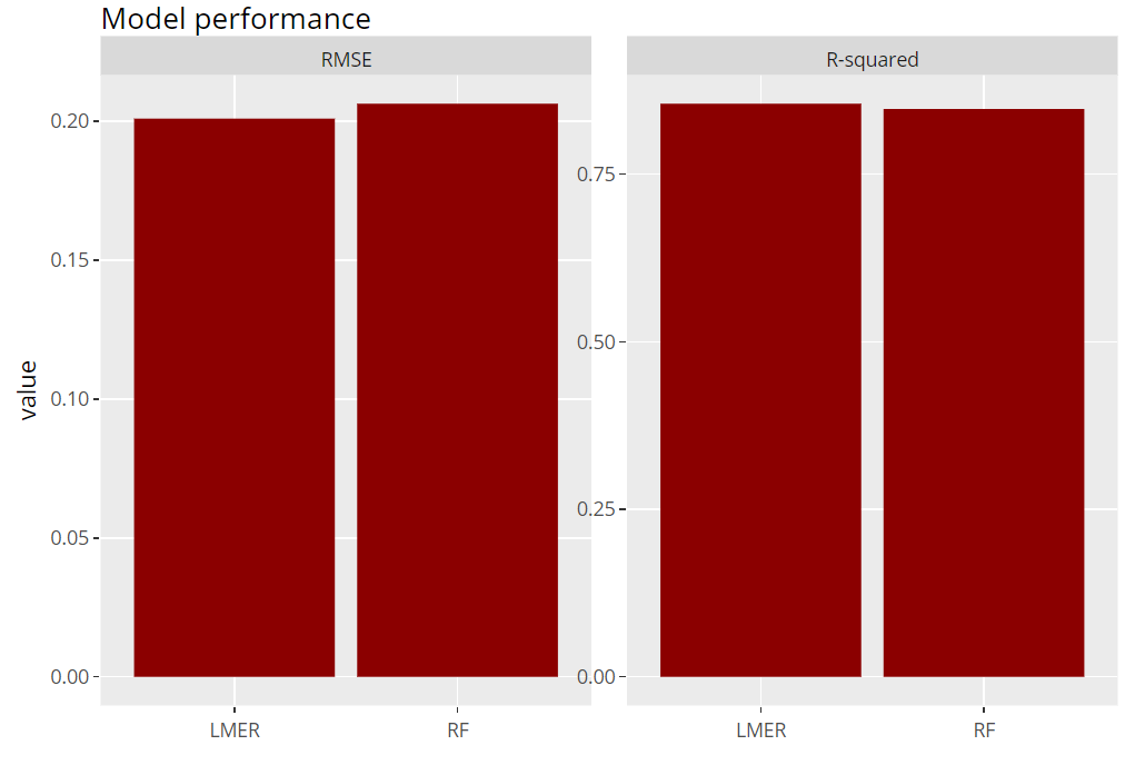
    Model performance (png)

    Permutation importance

    Next, we inspect the variable strength based on permutation importance. It shows by how much the RMSE is being increased when shuffling a variable before prediction. The results are quite similar between the two models.

    (light_importance(fls, v = x) %>%
        plot(fill = "darkred") +
        labs(title = "Permutation importance", y = "Drop in RMSE")) %>%
      ggplotly()
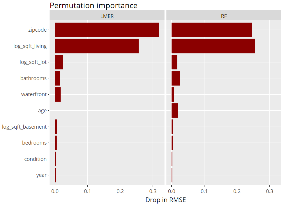
    Variable importance (png)

    ICE plot

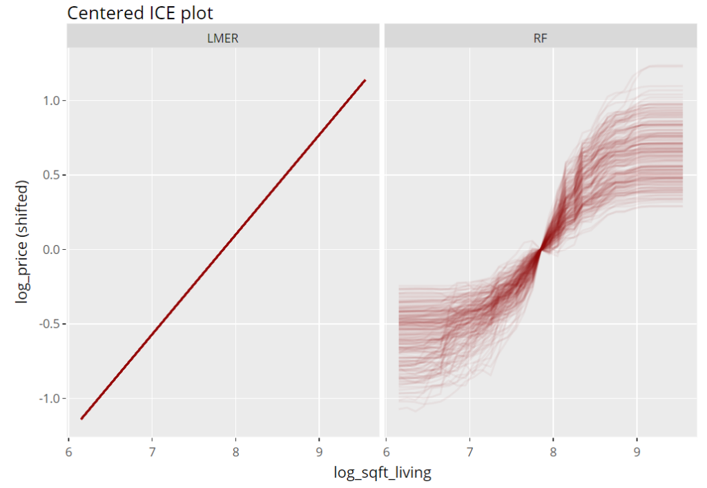
    To get an impression of the effect of the living area, we select 200 observations and profile their predictions with increasing (log) living area, keeping everything else fixed (Ceteris Paribus). These ICE (individual conditional expectation) plots are vertically centered in order to highlight potential interaction effects. If all curves coincide, there are no interaction effects and we can say that the effect of the feature is modelled in an additive way (no surprise for the additive linear mixed-effects model).

    (light_ice(fls, v = "log_sqft_living", n_max = 200, center = "middle") %>%
        plot(alpha = 0.05, color = "darkred") +
        labs(title = "Centered ICE plot", y = "log_price (shifted)")) %>%
      ggplotly()
    Partial dependence plots

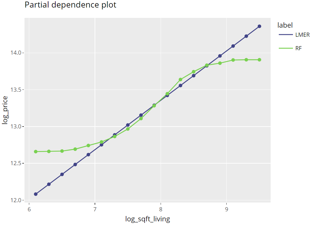
    Averaging many uncentered ICE curves provides the famous partial dependence plot, introduced in Friedman’s seminal paper on gradient boosting machines (2001).

    (light_profile(fls, v = "log_sqft_living", n_bins = 21) %>%
        plot(rotate_x = FALSE) +
        labs(title = "Partial dependence plot", y = y) +
        scale_colour_viridis_d(begin = 0.2, end = 0.8)) %>%
      ggplotly()
    Partial dependence plots (png)

    Multiple effects visualized together

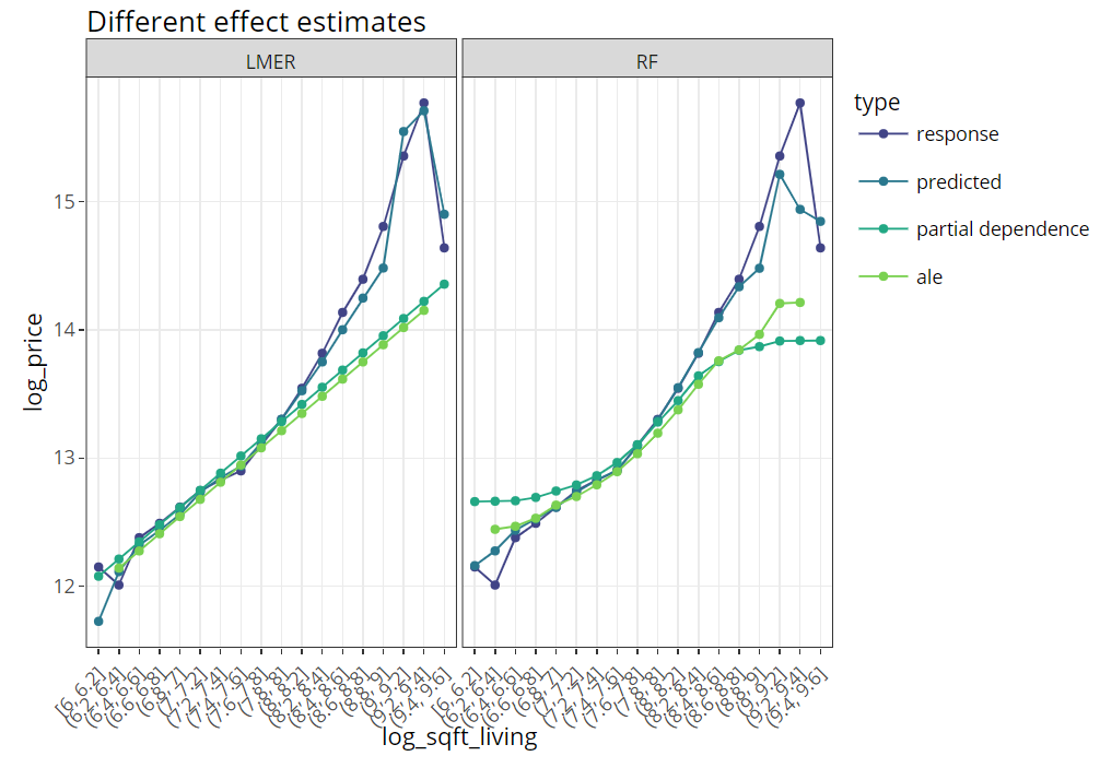
    The last figure extends the partial dependence plot with three additional curves, all evaluated on the hold-out dataset:

    • Average observed values
    • Average predictions
    • ALE plot (“accumulated local effects”, an alternative to partial dependence plots with relaxed Ceteris Paribus assumption)
    (light_effects(fls, v = "log_sqft_living", n_bins = 21) %>%
        plot(use = "all")  +
        labs(title = "Different effect estimates", y = y) +
        scale_colour_viridis_d(begin = 0.2, end = 0.8)) %>%
      ggplotly()
    Multiple effects together (png)

    Conclusion

    Combining flashlight with plotly works well and provides nice, interactive plots. Using rmarkdown, an analysis like this look quite neat if shipped as an HTML like this one here: https://mayer79.github.io/flashlight_plotly/flashlight_plotly.html

    The rmarkdown script can be found here on github.
  • DuckDB: Quacking SQL

    Lost in Translation between R and Python 8

    This is the next article in our series “Lost in Translation between R and Python”. The aim of this series is to provide high-quality R and Python 3 code to achieve some non-trivial tasks. If you are to learn R, check out the R tab below. Similarly, if you are to learn Python, the Python tab will be your friend.

    DuckDB

    DuckDB is a fantastic in-process SQL database management system written completely in C++. Check its official documentation and other blogposts like this to get a feeling of its superpowers. It is getting better and better!

    Some of the highlights:

    • Easy installation in R and Python, made possible via language bindings.
    • Multiprocessing and fast.
    • Allows to work with data bigger than RAM.
    • Can fire SQL queries on R and Pandas tables.
    • Can fire SQL queries on (multiple!) csv and/or Parquet files.
    • Quacks Apache Arrow.

    Installation

    DuckDB is super easy to install:

    • R: install.packages("duckdb")
    • Python: pip install duckdb

    Additional packages required to run the code of this post are indicated in the code.

    A first query

    Let’s start by loading a dataset, initializing DuckDB and running a simple query.

    The dataset we use here contains information on over 20,000 sold houses in Kings County. Along with the sale price, different features describe the size and location of the properties. The dataset is available on OpenML.org with ID 42092.

    library(OpenML)
    library(duckdb)
    library(tidyverse)
    
    # Load data
    df <- getOMLDataSet(data.id = 42092)$data
    
    # Initialize duckdb, register df and materialize first query
    con = dbConnect(duckdb())
    duckdb_register(con, name = "df", df = df)
    con %>% 
      dbSendQuery("SELECT * FROM df limit 5") %>% 
      dbFetch()
    import duckdb
    import pandas as pd
    from sklearn.datasets import fetch_openml
    
    # Load data
    df = fetch_openml(data_id=42092, as_frame=True)["frame"]
    
    # Initialize duckdb, register df and fire first query
    # If out-of-RAM: duckdb.connect("py.duckdb", config={"temp_directory": "a_directory"})
    con = duckdb.connect()
    con.register("df", df)
    con.execute("SELECT * FROM df limit 5").fetchdf()
    Result of first query (from R)

    Average price per grade

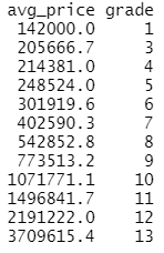
    If you like SQL, then you can do your data preprocessing and simple analyses with DuckDB. Here, we calculate the average house price per online grade (the higher the grade, the better the house).

    query <- 
      "
      SELECT AVG(price) avg_price, grade 
      FROM df 
      GROUP BY grade
      ORDER BY grade
      "
    avg <- con %>% 
      dbSendQuery(query) %>% 
      dbFetch()
    
    avg
    
    # Average price per grade
    query = """
      SELECT AVG(price) avg_price, grade 
      FROM df 
      GROUP BY grade
      ORDER BY grade
      """
    avg = con.execute(query).fetchdf()
    avg
    R output

    Highlight: queries to files

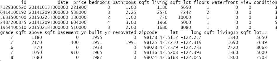
    The last query will be applied directly to files on disk. To demonstrate this fantastic feature, we first save “df” as a parquet file and “avg” as a csv file.

    write_parquet(df, "housing.parquet")
    write.csv(avg, "housing_avg.csv", row.names = FALSE)
    
    # Save df and avg to different file types
    df.to_parquet("housing.parquet")  # pyarrow=7
    avg.to_csv("housing_avg.csv", index=False)

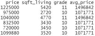
    Let’s load some columns of “housing.parquet” data, but only rows with grades having an average price of one million USD. Agreed, that query does not make too much sense but I hope you get the idea…😃

    # "Complex" query
    query2 <- "
      SELECT price, sqft_living, A.grade, avg_price
      FROM 'housing.parquet' A
      LEFT JOIN 'housing_avg.csv' B
      ON A.grade = B.grade
      WHERE B.avg_price > 1000000
      "
    
    expensive_grades <- con %>% 
      dbSendQuery(query2) %>% 
      dbFetch()
    
    head(expensive_grades)
    
    # dbDisconnect(con)
    # Complex query
    query2 = """
      SELECT price, sqft_living, A.grade, avg_price
      FROM 'housing.parquet' A
      LEFT JOIN 'housing_avg.csv' B
      ON A.grade = B.grade
      WHERE B.avg_price > 1000000
      """
    expensive_grades = con.execute(query2).fetchdf()
    expensive_grades
    
    # con.close()
    R output

    Last words

    • DuckDB is cool!
    • If you have strong SQL skills but do not know R or Python so well, this is a great way to get used to those programming languages.
    • If you are unfamiliar to SQL but like R and/or Python, you can use DuckDB for a while and end up being an SQL addict.
    • If your analysis involves combining many large files during preprocessing, then you can try the trick shown in the last example of this post.

    The Python notebook and R code can be found at:

  • Avoid loops in R! Really?

    It must have been around the year 2000, when I wrote my first snipped of SPLUS/R code. One thing I’ve learned back then:

    Loops are slow. Replace them with

    1. vectorized calculations or
    2. if vectorization is not possible, use sapply() et al.

    Since then, the R core team and the community has invested tons of time to improve R and also to make it faster. There are things like RCPP and parallel computing to speed up loops.

    But what still relatively few R users know: loops are not that slow anymore. We want to demonstrate this using two examples.

    Example 1: sqrt()

    We use three ways to calculate the square root of a vector of random numbers:

    1. Vectorized calculation. This will be the way to go because it is internally optimized in C.
    2. A loop. This must be super slow for large vectors.
    3. vapply() (as safe alternative to sapply).

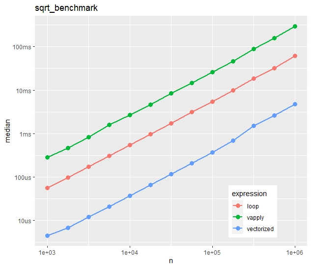
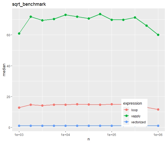
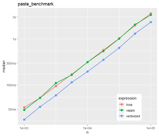
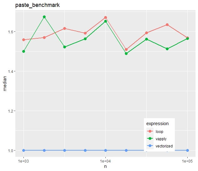
    The three approaches are then compared via bench::mark() regarding their speed for different numbers n of vector lengths. The results are then compared first regarding absolute median times, and secondly (using an independent run), on a relative scale (1 is the vectorized approach).

    library(tidyverse)
    library(bench)
    
    # Calculate square root for each element in loop
    sqrt_loop <- function(x) {
      out <- numeric(length(x))
      for (i in seq_along(x)) {
        out[i] <- sqrt(x[i])
      }
      out
    }
    
    # Example
    sqrt_loop(1:4) # 1.000000 1.414214 1.732051 2.000000
    
    # Compare its performance with two alternatives
    sqrt_benchmark <- function(n) {
      x <- rexp(n)
      mark(
        vectorized = sqrt(x),
        loop = sqrt_loop(x),
        vapply = vapply(x, sqrt, FUN.VALUE = 0.0),
        # relative = TRUE
      )
    }
    
    # Combine results of multiple benchmarks and plot results
    multiple_benchmarks <- function(one_bench, N) {
      res <- vector("list", length(N))
      for (i in seq_along(N)) {
        res[[i]] <- one_bench(N[i]) %>% 
          mutate(n = N[i], expression = names(expression))
      }
      
      ggplot(bind_rows(res), aes(n, median, color = expression)) +
        geom_point(size = 3) +
        geom_line(size = 1) +
        scale_x_log10() +
        ggtitle(deparse1(substitute(one_bench))) +
        theme(legend.position = c(0.8, 0.15))
    }
    
    # Apply simulation
    multiple_benchmarks(sqrt_benchmark, N = 10^seq(3, 6, 0.25))

    Absolute timings

    Absolute median times on the “sqrt()” task

    Relative timings (using a second run)

    Relative median times of a separate run on the “sqrt()” task

    We see:

    • Run times increase quite linearly with vector size.
    • Vectorization is more than ten times faster than the naive loop.
    • Most strikingly, vapply() is much slower than the naive loop. Would you have thought this?

    Example 2: paste()

    For the second example, we use a less simple function, namely

    paste(“Number”, prettyNum(x, digits = 5))

    What will our three approaches (vectorized, naive loop, vapply) show on this task?

    pretty_paste <- function(x) {
      paste("Number", prettyNum(x, digits = 5))
    }
    
    # Example
    pretty_paste(pi) # "Number 3.1416"
    
    # Again, call pretty_paste() for each element in a loop
    paste_loop <- function(x) {
      out <- character(length(x))
      for (i in seq_along(x)) {
        out[i] <- pretty_paste(x[i])
      }
      out
    }
    
    # Compare its performance with two alternatives
    paste_benchmark <- function(n) {
      x <- rexp(n)
      mark(
        vectorized = pretty_paste(x),
        loop = paste_loop(x),
        vapply = vapply(x, pretty_paste, FUN.VALUE = ""),
        # relative = TRUE
      )
    }
    
    multiple_benchmarks(paste_benchmark, N = 10^seq(3, 5, 0.25))

    Absolute timings

    Absolute median times on the “paste()” task

    Relative timings (using a second run)

    Relative median times of a separate run on the “paste()” task
    • In contrast to the first example, vapply() is now as fast as the naive loop.
    • The time advantage of the vectorized approach is much less impressive. The loop takes in median only 50% longer.

    Conclusion

    1. Vectorization is fast and easy to read. If available, use this. No surprise.
    2. If you use vapply/sapply/lapply, do it for the style, not for the speed. In some cases, the loop will be faster. And, depending on the situation and the audience, a loop might actually be even easier to read.

    The code can be found on github.

    The runs have been made on a Windows 11 system with a four core Intel(R) Core(TM) i7-8650U CPU @ 1.90GHz processor.