In a recent post, I introduced the initial version of the “shapviz” package. Its motto: do one thing, but do it well: visualize SHAP values.
The initial community feedback was very positive, and a couple of things have been improved in version 0.2.0. Here the main changes:
- “shapviz” now works with tree-based models of the
h2opackage in R. - Additionally, it wraps the
shaprpackage, which implements an improved version of Kernel SHAP taking into account feature dependence. - A simple interface to collapse SHAP values of dummy variables was added.
- The default importance plot is now a bar plot, instead of the (slower) beeswarm plot. In later releases, the latter might be moved to a separate function
sv_summary()for consistency with other packages. - Importance plot and dependence plot now work neatly with
ggplotly(). The other plot types cannot be translated withggplotly()because they use geoms from outside ggplot. At least I do not know how to do this…
Example
Let’s build an H2O gradient boosted trees model to explain diamond prices. Then, we explain the model with our “shapviz” package. Note that H2O itself also offers some SHAP plots. “shapviz” is directly applied to the fitted H2O model. This means you don’t have to write a single superfluous line of code.
library(shapviz)
library(tidyverse)
library(h2o)

h2o.init()

set.seed(1)

# Get rid of that darn ordinals
ord <- c("clarity", "cut", "color")
diamonds[, ord] <- lapply(diamonds[, ord], factor, ordered = FALSE)

# Minimally tuned GBM with 260 trees, determined by early-stopping with CV
dia_h2o <- as.h2o(diamonds)
fit <- h2o.gbm(
  c("carat", "clarity", "color", "cut"),
  y = "price",
  training_frame = dia_h2o,
  nfolds = 5,
  learn_rate = 0.05,
  max_depth = 4,
  ntrees = 10000,
  stopping_rounds = 10,
  score_each_iteration = TRUE
)
fit

# SHAP analysis on about 2000 diamonds
X_small <- diamonds %>%
  filter(carat <= 2.5) %>%
  sample_n(2000) %>%
  as.h2o()

shp <- shapviz(fit, X_pred = X_small)

sv_importance(shp, show_numbers = TRUE)
sv_importance(shp, show_numbers = TRUE, kind = "bee")
sv_dependence(shp, "color", "auto", alpha = 0.5)
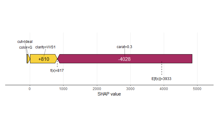
sv_force(shp, row_id = 1)
sv_waterfall(shp, row_id = 1)
Summary and importance plots
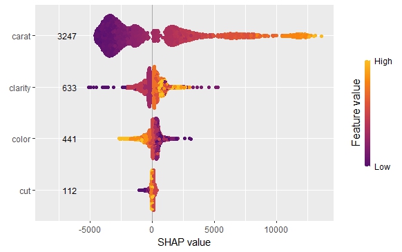
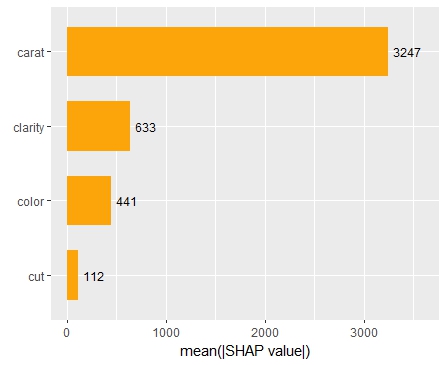
The SHAP importance and SHAP summary plots clearly show that carat is the most important variable. On average, it impacts the prediction by 3247 USD. The effect of “cut” is much smaller. Its impact on the predictions, on average, is plus or minus 112 USD.
SHAP dependence plot
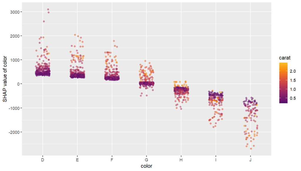
The SHAP dependence plot shows the effect of “color” on the prediction: The better the color (close to “D”), the higher the price. Using a correlation based heuristic, the plot selected carat on the color scale to show that the color effect is hightly influenced by carat in the sense that the impact of color increases with larger diamond weight. This clearly makes sense!
Waterfall and force plot
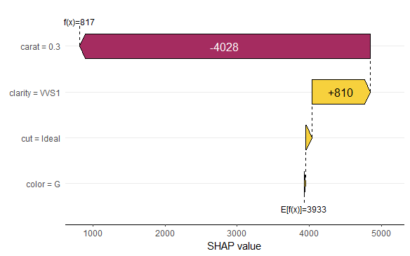
Finally, the waterfall and force plots show how a single prediction is decomposed into contributions from each feature. While this does not tell much about the model itself, it might be helpful to explain what SHAP values are and to debug strange predictions.
Short wrap-up
- Combining “shapviz” and H2O is fun. Okay, that one was subjective :-).
- Good visualization of ML models is extremely helpful and reassuring.
The complete R script can be found here.
Leave a Reply