Hello ML world
Recently, together with Yang Liu, we have been investing some time to extend the R package SHAPforxgboost. This package is designed to make beautiful SHAP plots for XGBoost models, using the native treeshap implementation shipped with XGBoost.
Some of the new features of SHAPforxgboost
- Added support for LightGBM models, using the native treeshap implementation for LightGBM. So don’t get tricked by the package name “SHAPforxgboost” :-).
- The function
shap.plot.dependence() has received the option to select the heuristically strongest interacting feature on the color scale, see last section for details. shap.plot.dependence() now allows jitter and alpha transparency.- The new function
shap.importance() returns SHAP importances without plotting them. - Added vignette with basic workflow to CRAN.
- Added logo:

An interesting alternative to calculate and plot SHAP values for different tree-based models is the treeshap package by Szymon Maksymiuk et al. Keep an eye on this one – it is actively being developed!
What is SHAP?
A couple of years ago, the concept of Shapely values from game theory from the 1950ies was discovered e.g. by Scott Lundberg as an interesting approach to explain predictions of ML models.
The basic idea is to decompose a prediction in a fair way into additive contributions of features. Repeating the process for many predictions provides a brilliant way to investigate the model as a whole.
The main resource on the topic is Scott Lundberg’s site. Besides this, I’d recomment to go through these two fantastic blog posts, even if you already know what SHAP values are:
- https://towardsdatascience.com/explain-your-model-with-the-shap-values-bc36aac4de3d
- https://meichenlu.com/2018-11-10-SHAP-explainable-machine-learning/
Illustration
As an example, we will try to model log house prices of 20’000 sold houses in Kings County. The dataset is available e.g. on OpenML.org under ID 42092.

Fetch and prepare data
We start by downloading the data and preparing it for modelling.
library(farff)
library(OpenML)
library(dplyr)
library(xgboost)
library(ggplot2)
library(SHAPforxgboost)

# Load King Country house prices dataset on OpenML
# ID 42092, https://www.openml.org/d/42092
df <- getOMLDataSet(data.id = 42092)$data
head(df)

# Prepare
df <- df %>%
  mutate(
    log_price = log(price),
    log_sqft_lot = log(sqft_lot),
    year = as.numeric(substr(date, 1, 4)),
    building_age = year - yr_built,
    zipcode = as.integer(as.character(zipcode))
  )

# Define response and features
y <- "log_price"
x <- c("grade", "year", "building_age", "sqft_living",
       "log_sqft_lot", "bedrooms", "bathrooms", "floors", "zipcode",
       "lat", "long", "condition", "waterfront")

# random split
set.seed(83454)
ix <- sample(nrow(df), 0.8 * nrow(df))
Fit XGBoost model
Next, we fit a manually tuned XGBoost model to the data.
dtrain <- xgb.DMatrix(data.matrix(df[ix, x]),
                      label = df[ix, y])
dvalid <- xgb.DMatrix(data.matrix(df[-ix, x]),
                      label = df[-ix, y])

params <- list(
  objective = "reg:squarederror",
  learning_rate = 0.05,
  subsample = 0.9,
  colsample_bynode = 1,
  reg_lambda = 2,
  max_depth = 5
)

fit_xgb <- xgb.train(
  params,
  data = dtrain,
  watchlist = list(valid = dvalid),
  early_stopping_rounds = 20,
  print_every_n = 100,
  nrounds = 10000 # early stopping
)
The resulting model consists of about 600 trees and reaches a validation RMSE of 0.16. This means that about 2/3 of the predictions are within 16% of the observed price, using the empirical rule.
Compact SHAP analysis
ML models are rarely of any use without interpreting its results, so let’s use SHAP to peak into the model.
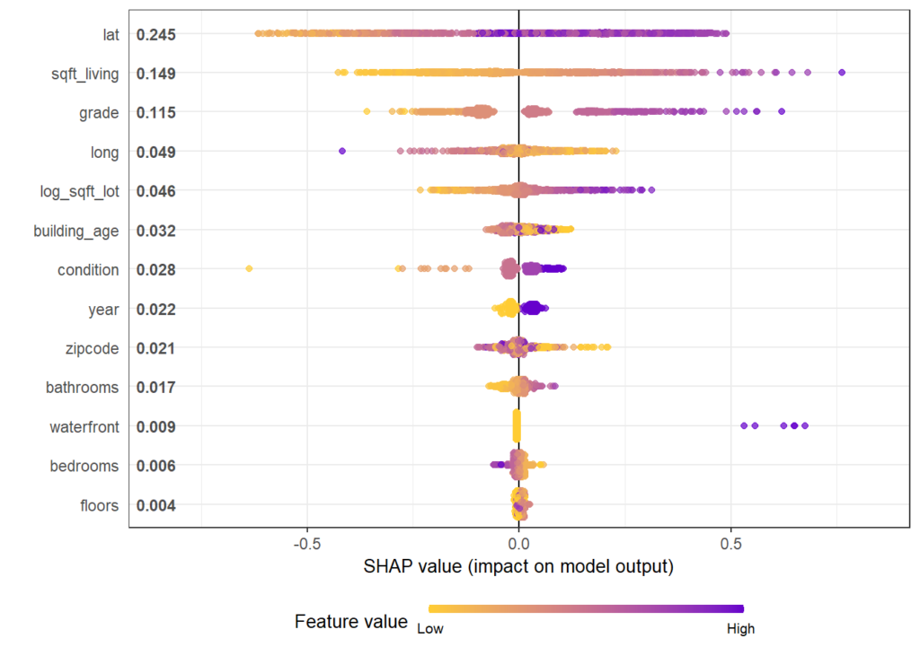
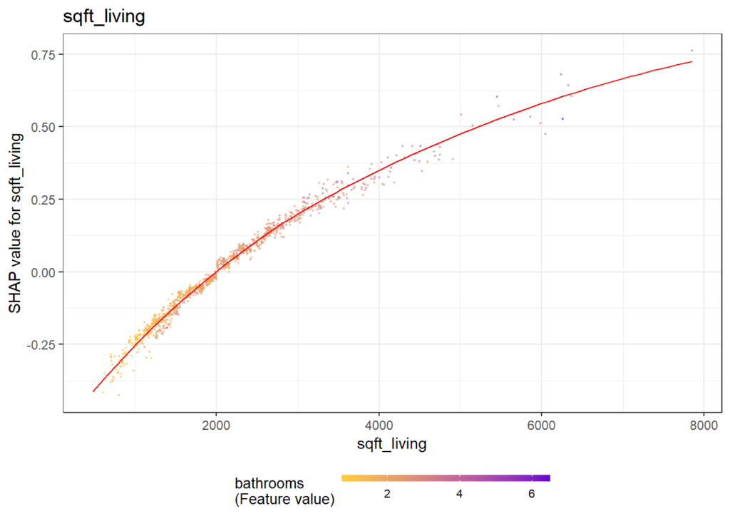
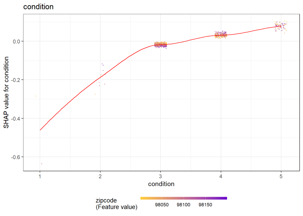
The analysis includes a first plot with SHAP importances. Then, with decreasing importance, dependence plots are shown to get an impression on the effects of each feature.
# Step 1: Select some observations
X <- data.matrix(df[sample(nrow(df), 1000), x])

# Step 2: Crunch SHAP values
shap <- shap.prep(fit_xgb, X_train = X)

# Step 3: SHAP importance
shap.plot.summary(shap)

# Step 4: Loop over dependence plots in decreasing importance
for (v in shap.importance(shap, names_only = TRUE)) {
  p <- shap.plot.dependence(shap, v, color_feature = "auto",
                            alpha = 0.5, jitter_width = 0.1) +
    ggtitle(v)
  print(p)
}
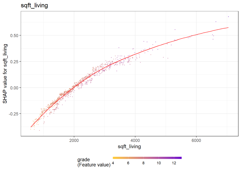
Some of the plots are shown below. The code actually produces all plots, see the corresponding html output on github.
Same workflow for LightGBM
Let’s try out the SHAPforxgboost package with LightGBM.
Note: LightGBM Version 3.2.1 on CRAN is not working properly under Windows. This will be fixed in the next release of LightGBM. As a temporary solution, you need to build it from the current master branch.
library(lightgbm)

dtrain <- lgb.Dataset(data.matrix(df[ix, x]),
                      label = df[ix, y])
dvalid <- lgb.Dataset(data.matrix(df[-ix, x]),
                      label = df[-ix, y])

params <- list(
  objective = "regression",
  learning_rate = 0.05,
  subsample = 0.9,
  reg_lambda = 2,
  num_leaves = 15
)

fit_lgb <- lgb.train(
  params,
  data = dtrain,
  valids = list(valid = dvalid),
  early_stopping_rounds = 20,
  eval_freq = 100,
  eval = "rmse",
  nrounds = 10000
)
Early stopping on the validation data selects about 900 trees as being optimal and results in a validation RMSE of also 0.16.
SHAP analysis
We use exactly the same short snippet to analyze the model by SHAP.
X <- data.matrix(df[sample(nrow(df), 1000), x])
shap <- shap.prep(fit_lgb, X_train = X)
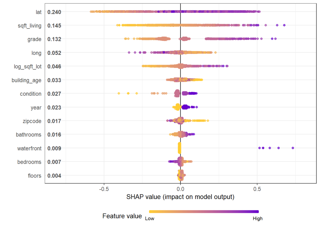
shap.plot.summary(shap)

for (v in shap.importance(shap, names_only = TRUE)) {
  p <- shap.plot.dependence(shap, v, color_feature = "auto",
                            alpha = 0.5, jitter_width = 0.1) +
    ggtitle(v)
  print(p)
}
Again, we only show some of the output and refer to the html of the corresponding rmarkdown. Overall, the model seems to be very similar to the one obtained by XGBoost.
How does the dependence plot selects the color variable?
By default, Scott’s shap package for Python uses a statistical heuristic to colorize the points in the dependence plot by the variable with possibly strongest interaction. The heuristic used by SHAPforxgboost is slightly different and directly uses conditional variances. More specifically, the variable X on the x-axis as well as each other feature Z_k is binned into categories. Then, for each Z_k, the conditional variance across binned X and Z_k is calculated. The Z_k with the highest conditional variance is selected as the color variable.
Note that the heuristic does not depend on “shap interaction values” in order to save time (and because these would not be available for LightGBM).
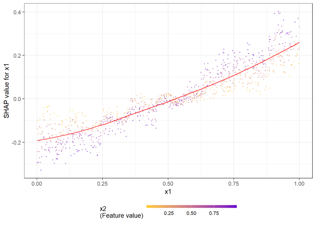
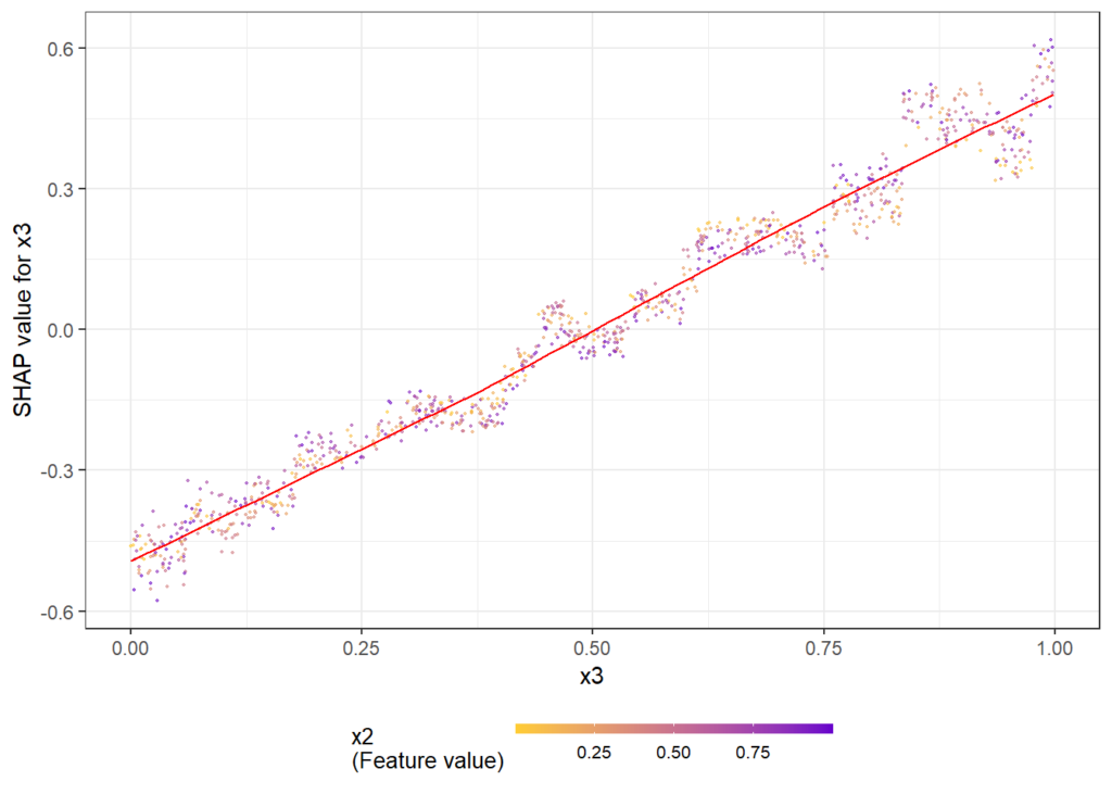
The following simple example shows how/that it is working. First, a dataset is created and a model with three features and strong interaction between x1 and x2 is being fitted. Then, we look at the dependence plots to see if it is consistent with the model/data situation.
n <- 1000

set.seed(334)

df <- data.frame(
  x1 = runif(n),
  x2 = runif(n),
  x3 = runif(n)
  ) %>%
  mutate(
    y = x1 * x2 + x3 + runif(n)
  )
x <- c("x1", "x2", "x3")
dtrain <- lgb.Dataset(data.matrix(df[, x]),
                      label = df[, "y"])

params <- list(
  objective = "regression",
  learning_rate = 0.05,
  subsample = 0.9,
  reg_lambda = 2,
  num_leaves = 15
)

fit_lgb <- lgb.train(
  params,
  data = dtrain,
  eval = "rmse",
  nrounds = 100
)

shap <- shap.prep(fit_lgb, X_train = data.matrix(df[, x]))
shap.plot.summary(shap)

shap.plot.dependence(shap, "x1", color_feature = "auto")
shap.plot.dependence(shap, "x2", color_feature = "auto")
shap.plot.dependence(shap, "x3", color_feature = "auto")
Here the dependence plots for x1 and x3.
The full R script and rmarkdown file of this post can be found on github.
Leave a Reply