We use a causal forest [1] to model the treatment effect in a randomized controlled clinical trial. Then, we explain this black-box model with usual explainability tools. These will reveal segments where the treatment works better or worse, just like a forest plot, but multivariately.
Data
For illustration, we use patient-level data of a 2-arm trial of rectal indomethacin against placebo to prevent post-ERCP pancreatitis (602 patients) [2]. The dataset is available in the package {medicaldata}.
The data is in fantastic shape, so we don’t need to spend a lot of time with data preparation.
- We integer encode factors.
- We select meaningful features, basically those shown in the forest plot of [2] (Figure 4) without low-information features and without hospital.
The marginal estimate of the treatment effect is -0.078, i.e., indomethacin reduces the probability of post-ERCP pancreatitis by 7.8 percentage points. Our aim is to develop and interpret a model to see if this value is associated with certain covariates.
library(medicaldata)
suppressPackageStartupMessages(library(dplyr))
library(grf)          #  causal_forest()
library(ggplot2)
library(patchwork)    #  Combine ggplots
library(hstats)       #  Friedman's H, PDP
library(kernelshap)   #  General SHAP
library(shapviz)      #  SHAP plots

W <- as.integer(indo_rct$rx) - 1L      # 0=placebo, 1=treatment
table(W)
#   0   1
# 307 295

Y <- as.numeric(indo_rct$outcome) - 1  # Y=1: post-ERCP pancreatitis (bad)
mean(Y)  # 0.1312292

mean(Y[W == 1]) - mean(Y[W == 0])      # -0.07785568

xvars <- c(
  "age",         # Age in years
  "male",        # Male (1=yes)
  "pep",         # Previous post-ERCP pancreatitis (1=yes)
  "recpanc",     # History of recurrent Pancreatitis (1=yes)
  "type",        # Sphincter of oddi dysfunction type/level (0=no, to 3=type 3)
  "difcan",      # Cannulation of the papilla was difficult (1=yes)
  "psphinc",     # Pancreatic sphincterotomy performed (1=yes)
  "bsphinc",     # Biliary sphincterotomy performed (1=yes)
  "pdstent",     # Pancreatic stent (1=yes)
  "train"        # Trainee involved in stenting (1=yes)
)

X <- indo_rct |>
  mutate_if(is.factor, function(v) as.integer(v) - 1L) |>
  rename(male = gender) |>
  select_at(xvars)

head(X)

# age  male   pep recpanc  type difcan psphinc bsphinc pdstent train
#  26     0     0       1     1      0       0       0       0     1
#  24     1     1       0     0      0       0       1       0     0
#  57     0     0       0     2      0       0       0       0     0
#  29     0     0       0     1      0       0       1       1     1
#  38     0     1       0     1      0       1       1       1     1
#  59     0     0       0     1      1       0       1       1     0

summary(X)

#     age             male             pep            recpanc
# Min.   :19.00   Min.   :0.0000   Min.   :0.0000   Min.   :0.000
# 1st Qu.:35.00   1st Qu.:0.0000   1st Qu.:0.0000   1st Qu.:0.000
# Median :45.00   Median :0.0000   Median :0.0000   Median :0.000
# Mean   :45.27   Mean   :0.2093   Mean   :0.1595   Mean   :0.299
# 3rd Qu.:54.00   3rd Qu.:0.0000   3rd Qu.:0.0000   3rd Qu.:1.000
# Max.   :90.00   Max.   :1.0000   Max.   :1.0000   Max.   :1.000
#      type           difcan          psphinc          bsphinc
# Min.   :0.000   Min.   :0.0000   Min.   :0.0000   Min.   :0.0000
# 1st Qu.:1.000   1st Qu.:0.0000   1st Qu.:0.0000   1st Qu.:0.0000
# Median :2.000   Median :0.0000   Median :1.0000   Median :1.0000
# Mean   :1.743   Mean   :0.2608   Mean   :0.5698   Mean   :0.5714
# 3rd Qu.:2.000   3rd Qu.:1.0000   3rd Qu.:1.0000   3rd Qu.:1.0000
# Max.   :3.000   Max.   :1.0000   Max.   :1.0000   Max.   :1.0000
#    pdstent           train
# Min.   :0.0000   Min.   :0.0000
# 1st Qu.:1.0000   1st Qu.:0.0000
# Median :1.0000   Median :0.0000
# Mean   :0.8239   Mean   :0.4701
# 3rd Qu.:1.0000   3rd Qu.:1.0000
# Max.   :1.0000   Max.   :1.0000
The model
We use the {grf} package to fit a causal forest [1], a tree-ensemble trying to estimate conditional average treatment effects (CATE) E[Y(1) – Y(0) | X = x]. As such, it can be used to study treatment effect inhomogeneity.
In contrast to a typical random forest:
- Honest trees are grown: Within trees, part of the data is used for splitting, and the other part for calculating the node values. This anti-overfitting is implemented for all random forests in {grf}.
- Splits are selected to produce child nodes with maximally different treatment effects (under some additional constraints).
Note: With about 13%, the complication rate is relatively low. Thus, the treatment effect (measured on absolute scale) can become small for certain segments simply because the complication rate is close to 0. Ideally, we could model relative treatment effects or odds ratios, but I have not found this option in {grf} so far.
fit <- causal_forest(
  X = X,
  Y = Y,
  W = W,
  num.trees = 1000,
  mtry = 4,
  sample.fraction = 0.7,
  seed = 1,
  ci.group.size = 1,
)
Explain the model with “classic” techniques
After looking at tree split importance, we study the effects via partial dependence plots and Friedman’s H. These only require a predict() function and a reference dataset.
imp <- sort(setNames(variable_importance(fit), xvars))
par(mai = c(0.7, 2, 0.2, 0.2))
barplot(imp, horiz = TRUE, las = 1, col = "orange")

pred_fun <- function(object, newdata, ...) {
  predict(object, newdata, ...)$predictions
}

pdps <- lapply(xvars, function(v) plot(partial_dep(fit, v, X = X, pred_fun = pred_fun)))
wrap_plots(pdps, guides = "collect", ncol = 3) &
  ylim(c(-0.11, -0.06)) &
  ylab("Treatment effect")

H <- hstats(fit, X = X, pred_fun = pred_fun, verbose = FALSE)
plot(H)

partial_dep(fit, v = "age", X = X, BY = "bsphinc", pred_fun = pred_fun) |>
  plot()
Variable importance
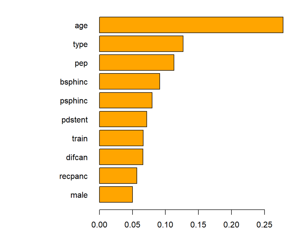
Variable importance of the causal forest can be measured by the relative counts each feature had been used to split on (in the first 4 levels). The most important variable is age.
Main effects
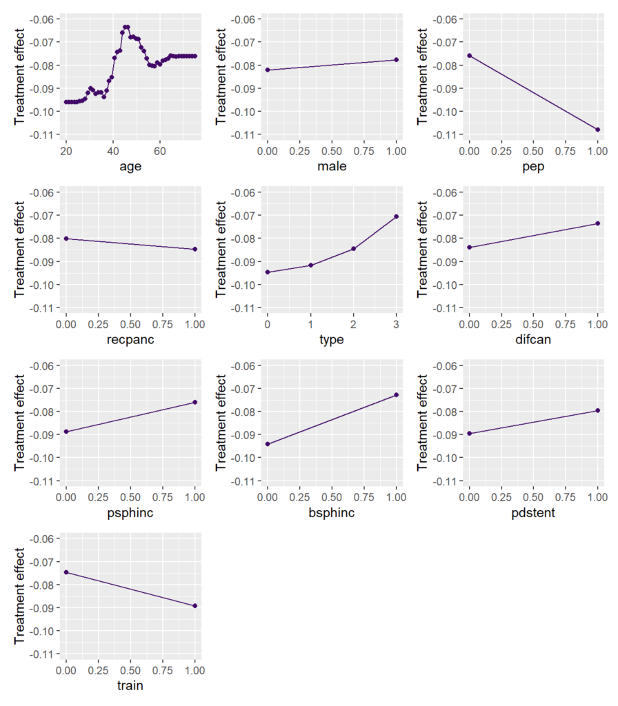
To study the main effects on the CATE, we consider partial dependence plots (PDP). Such plot shows how the average prediction depends on the values of a feature, keeping all other feature values constant (can be unnatural.)
We can see that the treatment effect is strongest for persons up to age 35, then reduces until 45. For older patients, the effect increases again.
Remember: Negative values mean a stronger (positive) treatment effect.
Interaction strength
Between what covariates are there strong interactions?
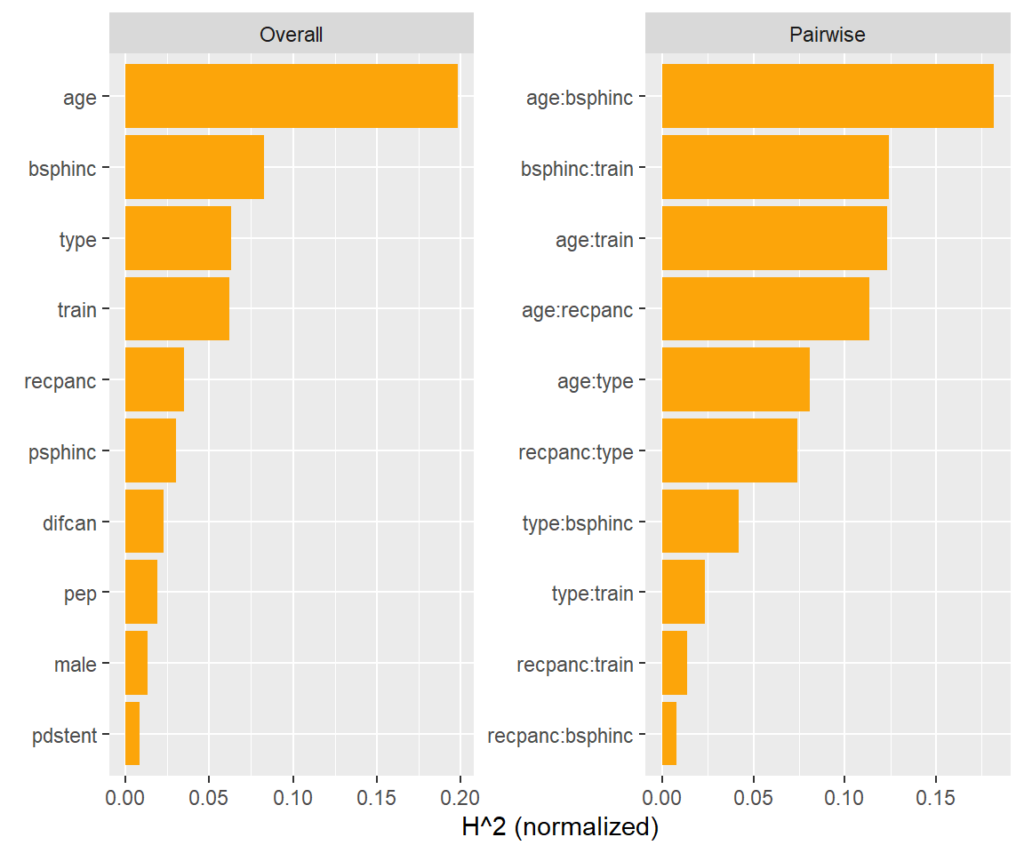
A model agnostic way to assess pairwise interaction strength is Friedman’s H statistic [3]. It measures the error when approximating the two-dimensional partial dependence function of the two features by their univariate partial dependence functions. A value of zero means there is no interaction. A value of α means that about 100α% of the joint effect (variability) comes from the interaction.
This measure is shown on the right hand side of the plot. More than 15% of the joint effect variability of age and biliary sphincterotomy (bsphinc) comes from their interaction.
Typically, pairwise H-statistics are calculated only for the most important variables or those with high overall interaction strength. Overall interaction strength (left hand side of the plot) can be measured by a version of Friedman’s H. It shows how much of the prediction variability comes from interactions with that feature.
Visualize strong interaction
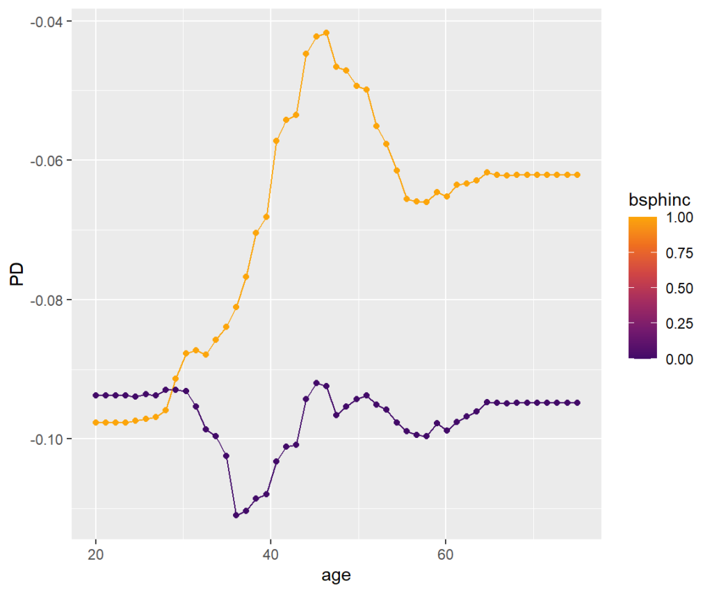
Interactions can be visualized, e.g., by a stratified PDP. We can see that the treatment effect is associated with age mainly for persons with biliary sphincterotomy.
SHAP Analysis
A “modern” way to explain the model is based on SHAP [4]. It decomposes the (centered) predictions into additive contributions of the covariates.
Because there is no TreeSHAP shipped with {grf}, we use the much slower Kernel SHAP algorithm implemented in {kernelshap} that works for any model.
First, we explain the prediction of a single data row, then we decompose many predictions. These decompositions can be analysed by simple descriptive plots to gain insights about the model as a whole.
# Explaining one CATE
kernelshap(fit, X = X[1, ], bg_X = X, pred_fun = pred_fun) |>
  shapviz() |>
  sv_waterfall() +
  xlab("Prediction")

# Explaining all CATEs globally
system.time(  # 13 min
  ks <- kernelshap(fit, X = X, pred_fun = pred_fun)
)
shap_values <- shapviz(ks)

sv_importance(shap_values)
sv_importance(shap_values, kind = "bee")
sv_dependence(shap_values, v = xvars) +
  plot_layout(ncol = 3) &
  ylim(c(-0.04, 0.03))
Explain one CATE
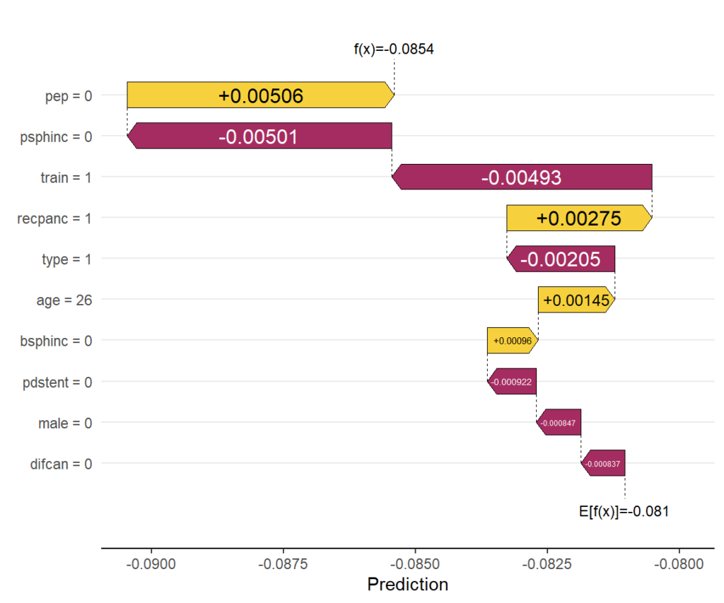
Explaining the CATE corresponding to the feature values of the first patient via waterfall plot.
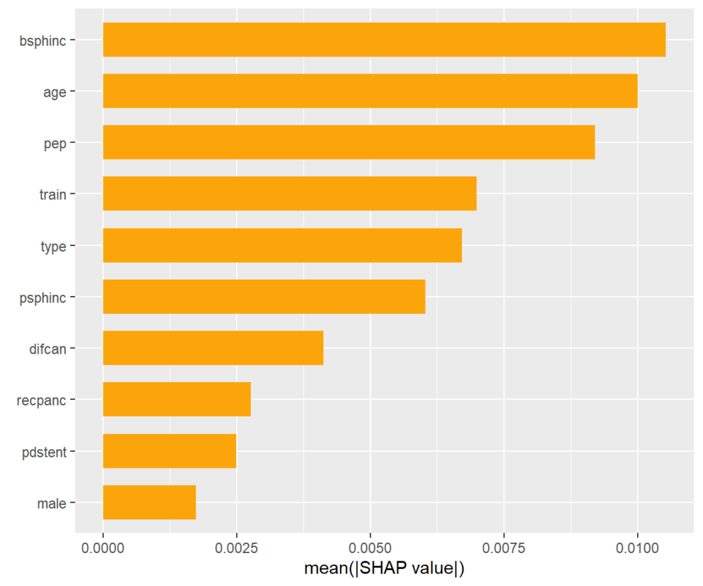
SHAP importance plot
The bars show average absolute SHAP values. For instance, we can say that biliary sphincterotomy impacts the treatment effect on average by more than +- 0.01 (but we don’t see how).
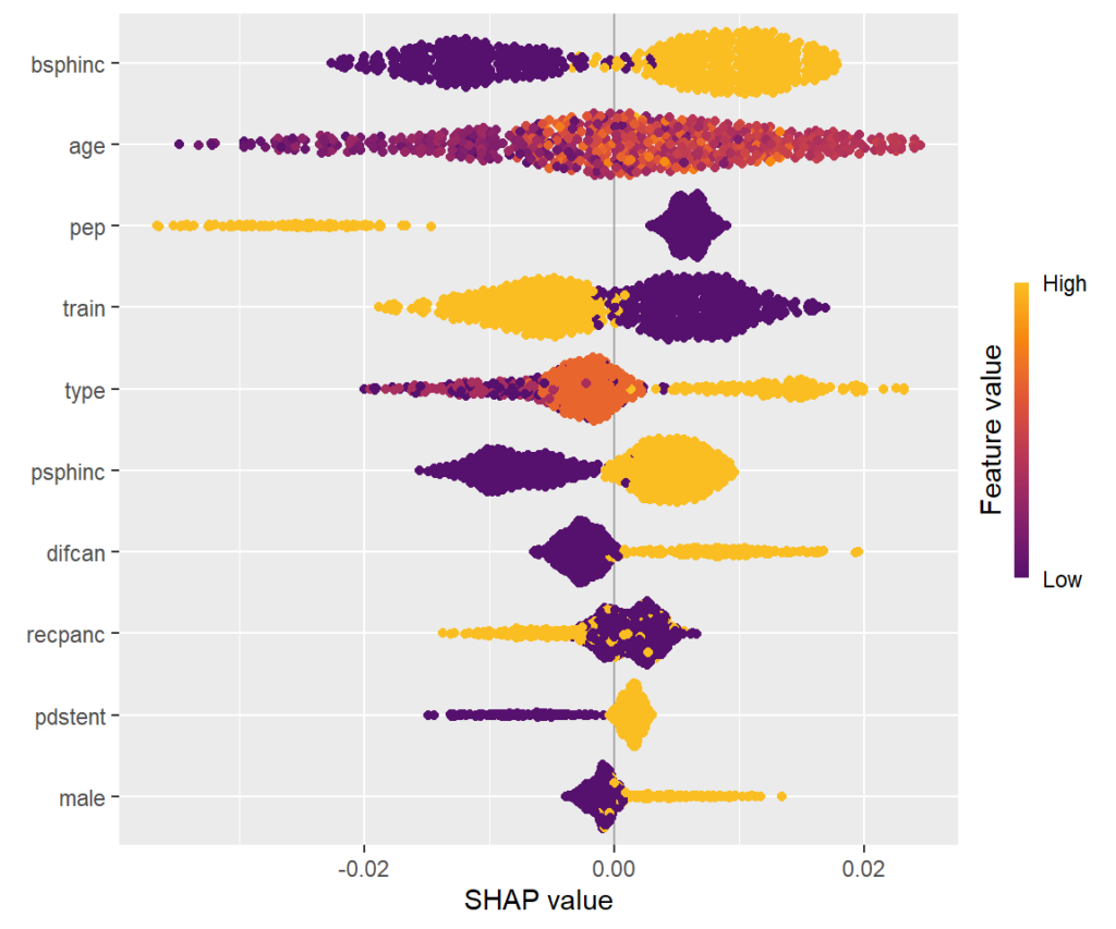
SHAP summary plot
One-dimensional plot of SHAP values with scaled feature values on the color scale, sorted in the same order as the SHAP importance plot. Compared to the SHAP importance barplot, for instance, we can additionally see that biliary sphincterotomy weakens the treatment effect (positive SHAP value).
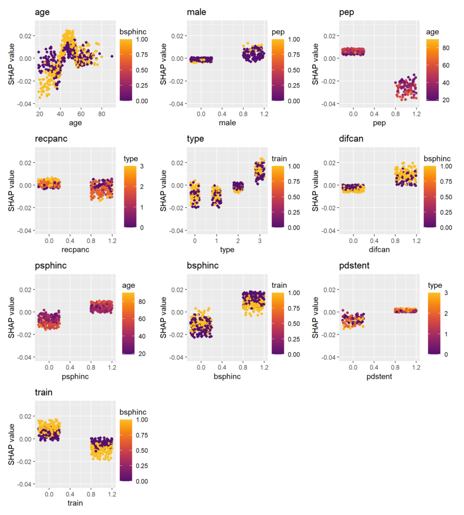
SHAP dependence plots
Scatterplots of SHAP values against corresponding feature values. Vertical scatter (at given x value) indicates presence of interactions. A candidate of an interacting feature is selected on the color scale. For instance, we see a similar pattern in the age effect on the treatment effect as in the partial dependence plot. Thanks to the color scale, we also see that the age effect depends on biliary sphincterotomy.
Remember that SHAP values are on centered prediction scale. Still, a positive value means a weaker treatment effect.
Wrap-up
- {grf} is a fantastic package. You can expect more on it here.
- Causal forests are an interesting way to directly model treatment effects.
- Standard explainability methods can be used to explain the black-box.
References
- Athey, Susan, Julie Tibshirani, and Stefan Wager. “Generalized Random Forests”. Annals of Statistics, 47(2), 2019.
- Elmunzer BJ et al. A randomized trial of rectal indomethacin to prevent post-ERCP pancreatitis. N Engl J Med. 2012 Apr 12;366(15):1414-22. doi: 10.1056/NEJMoa1111103.
- Friedman, Jerome H., and Bogdan E. Popescu. Predictive Learning via Rule Ensembles. The Annals of Applied Statistics 2, no. 3 (2008): 916-54.
- Scott M. Lundberg and Su-In Lee. A Unified Approach to Interpreting Model Predictions. Advances in Neural Information Processing Systems 30 (2017).
Leave a Reply